Industrial kitchen with barnwood
The first thing you notice is the grain. Barnwood runs across the cabinet fronts and side panels, then meets the darker technical parts of the room without softening them. The result is an industrial kitchen that reads through material contrast rather than ornament. A subtle Skylt finish is mentioned in the source material; here it keeps the wood looking natural while adding a protective layer to the surfaces.
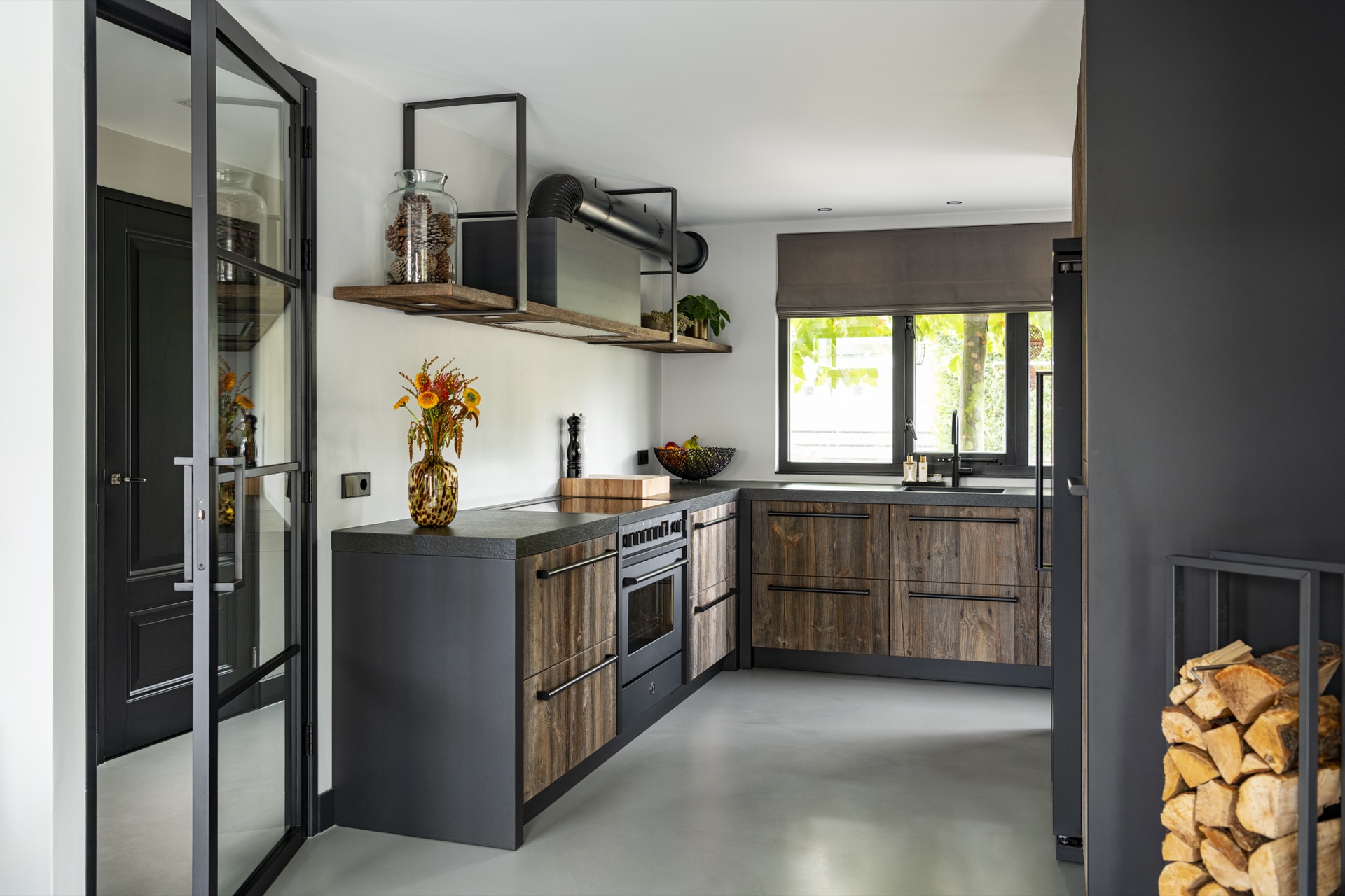
Black appliances sit inside that wood field and keep the composition tight. The steel-and-glass language of the equipment pushes against the textured fronts, while the long horizontal lines stop the room from feeling overworked. A vase of flowers interrupts the darker palette with a small burst of colour, placed where the wood grain stays visible. It is a simple move, but it draws attention back to the cabinet faces and their worn-looking surface.
Barnwood cabinet fronts with visible grain
The barnwood kitchen cabinets are the visual anchor here. Their surface is not treated as a background; it takes up the whole side of the room, including the front panels and the finishing pieces around them. In the images, the vertical grain shows clearly on the lower units, while the upper run creates a continuous band of wood across the wall. That repetition gives the room its rhythm and keeps the eye moving from one module to the next.
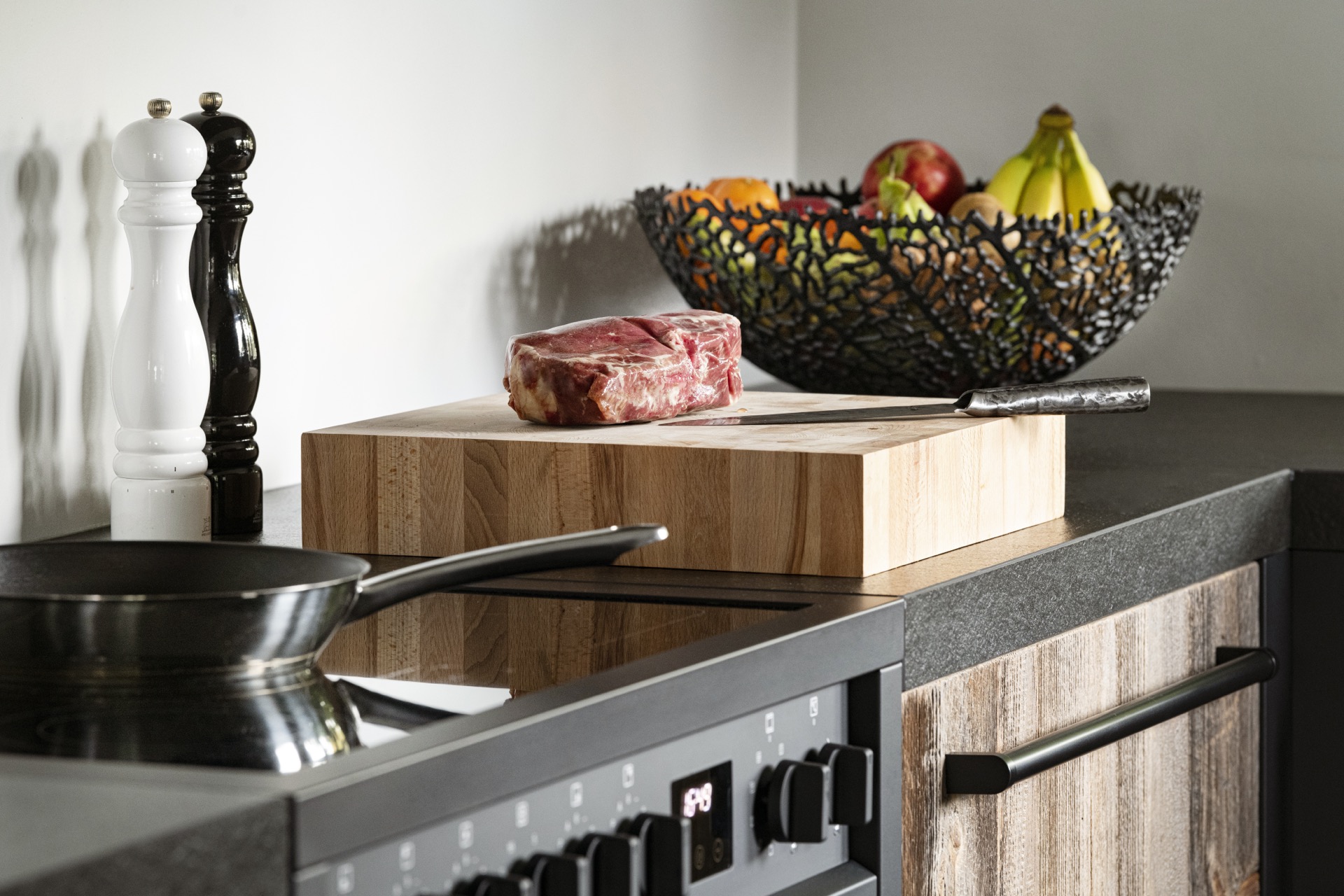
Because the fronts remain visually active, the surrounding details are kept restrained. Long black handles cut across the wood in straight lines. Dark frames around the built-in units echo those handles and make the cabinet wall feel assembled from precise parts rather than broad decorative panels. This is where the kitchen with wood accents becomes more than a material mix; the wood is doing the main visual work, and the dark pieces hold it in place.
A dark ceramic countertop that lowers the tone
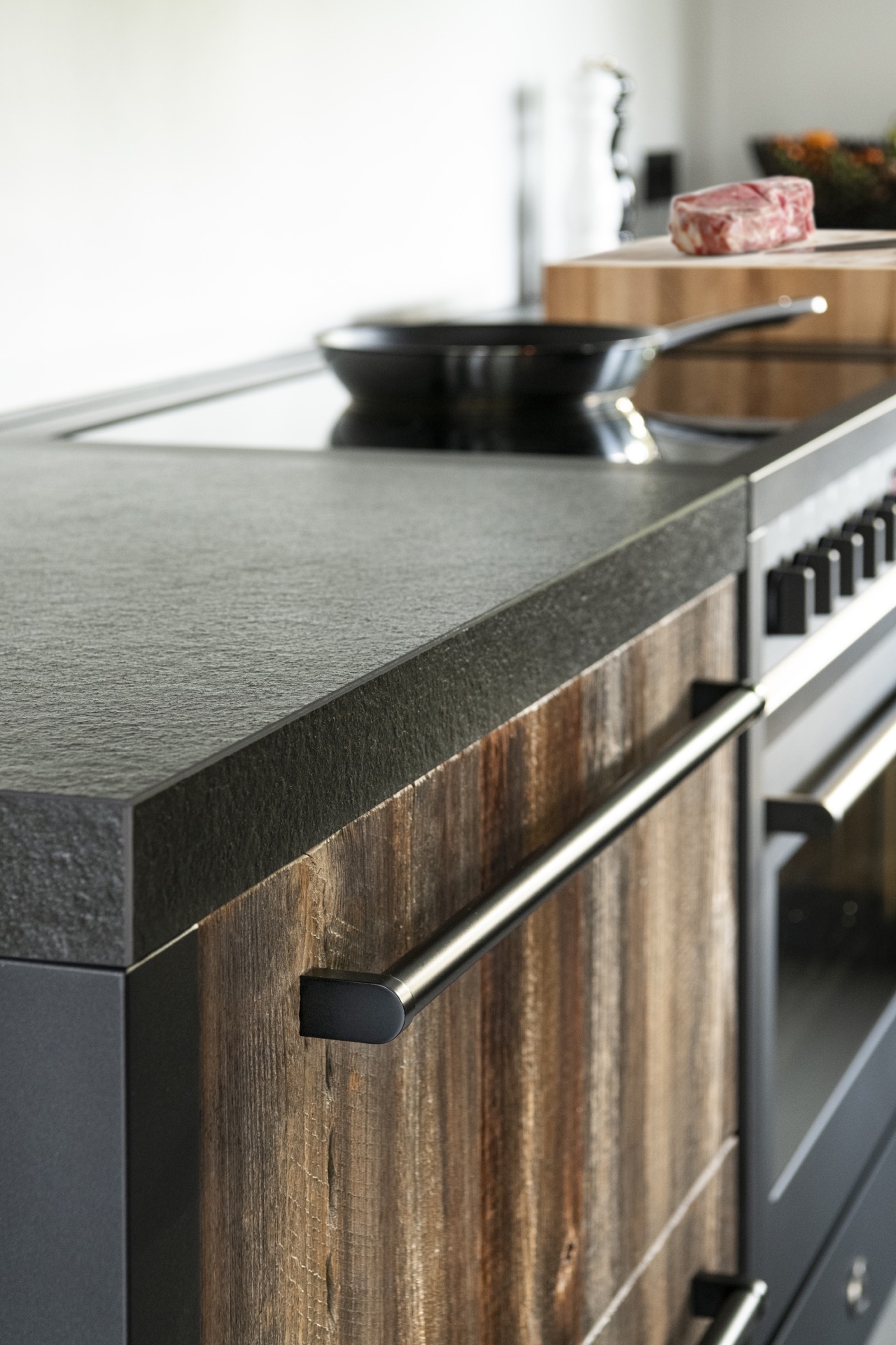
The dark ceramic countertop, identified in the project as Nero Zimbabwe, sits as a heavy horizontal line beneath the warmer timber. Its surface reads as matte and stone-like, with a dense colour that sharpens the edge of the work zone. In the window area, the worktop stretches across the base units and creates a strong ledge for daily use. That long, low band helps the room feel grounded, especially beside the lighter wall reflections coming in from the glass.
Close up, the worktop detail matters. The edge appears carefully resolved, with a dark rim and a slightly raised return that gives the surface depth. It is not decorative in the usual sense. Instead, it acts as a clean break between the cabinet fronts and the objects that land on the counter. The ceramic surface also plays well with the black appliances, which prevents the darker elements from turning into a single flat block.
The window kitchen work zone
By the window, the composition becomes more open. Barnwood lower cabinets sit under the dark worktop, and the natural light makes the vertical grain easier to read. The lighter view outside is not the subject of the room, but it changes the way the materials appear: the wood looks drier and more tactile, while the ceramic top takes on a slight sheen at the edges. This part of the plan is the most straightforward to read, with a clear work surface and a direct line of sight.
The sink and tap area is kept visually calm, allowing the surfaces to carry the scene. A black Quooker Flex Black is listed in the project details, and its dark profile fits into the same restrained palette as the rest of the hardware. Nothing here is trying to disappear completely. The lines remain visible, but they are measured so the window zone can stay open and practical-looking rather than crowded.
An industrial kitchen shaped by metal, wood and equipment
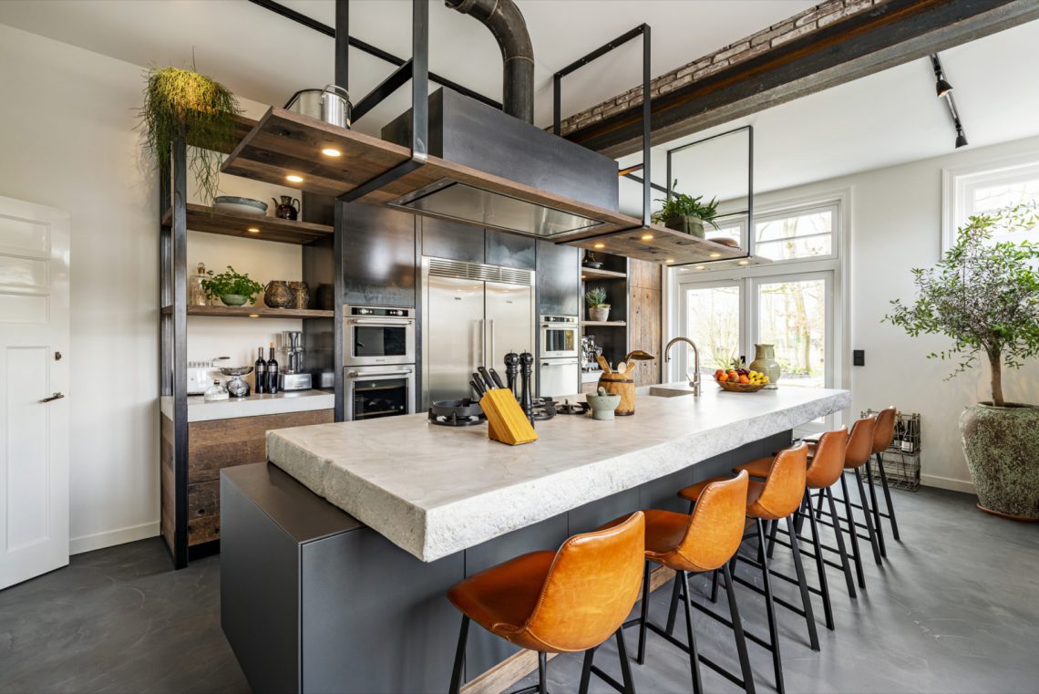
The industrial kitchen label is not carried by one object alone. It comes from the way the appliances, the extractor and the cabinetry are arranged as separate parts of a single field. The Steel Enfasi induction range is named in the project data, alongside a Siemens combi oven and dishwasher. Their dark surfaces and flush placement reinforce the straight geometry of the room. Even when the equipment is partially recessed, it still reads as part of the visual structure.
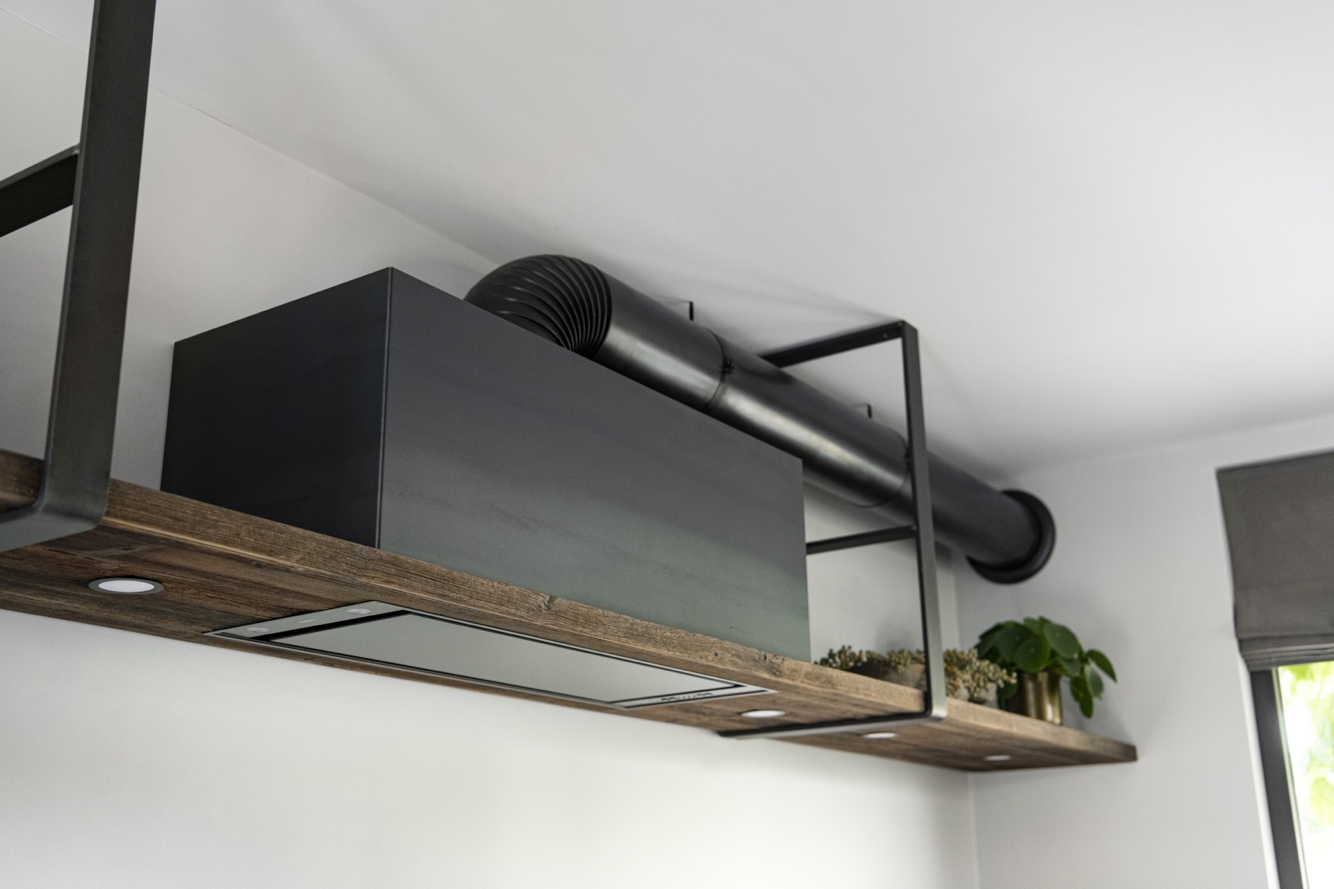
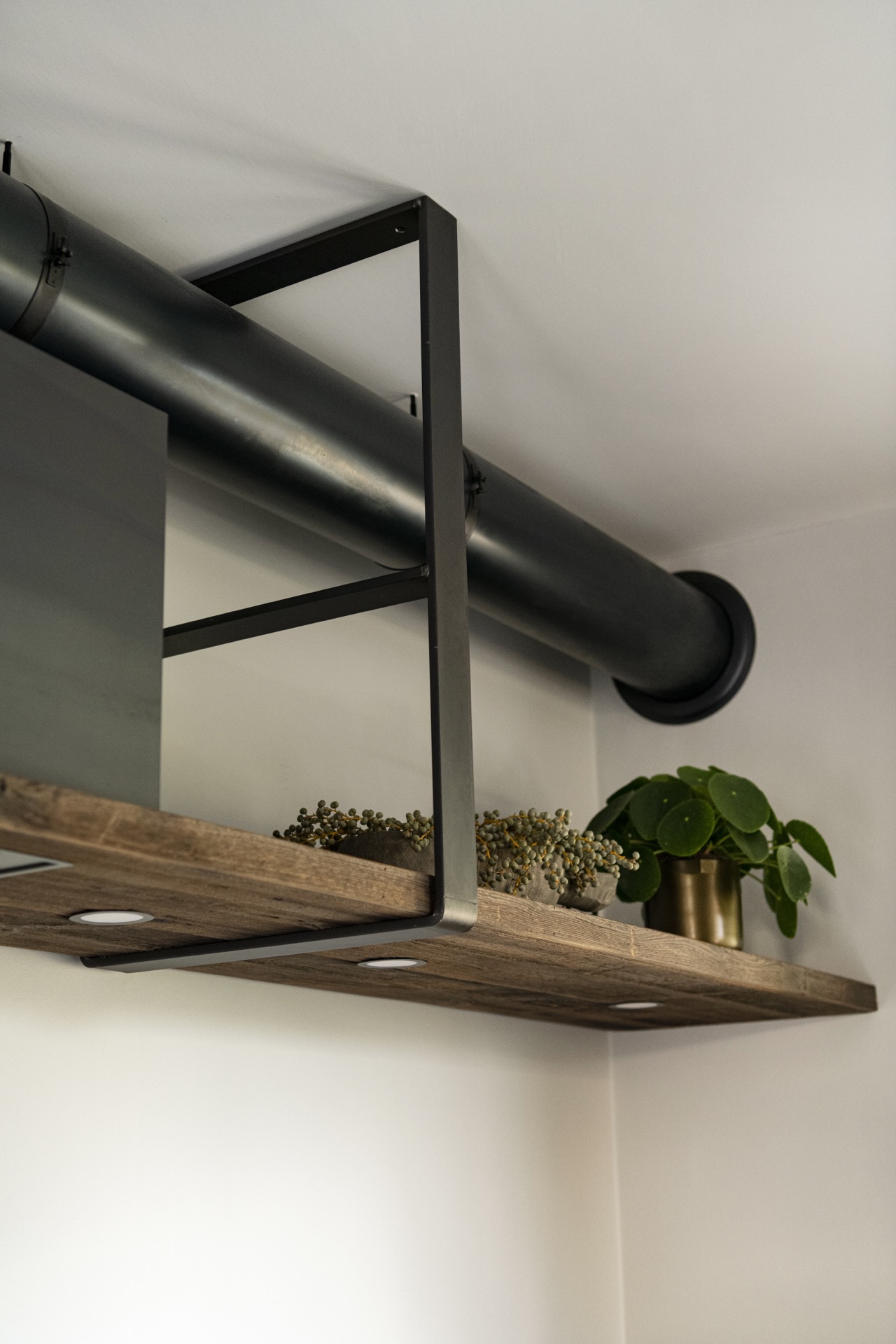
The extractor assembly is one of the clearest references to the industrial character. In the images, a wooden chimney extractor hood is paired with a round metal duct, and the contrast between timber and pipework is direct. The wooden surround softens the mechanical shape only slightly. It does not hide it. Instead, it frames the duct and turns that technical element into a visible line in the room, almost like a structural detail rather than an accessory.
How the hood detail changes the wall
Seen from further back, the hood detail breaks the long cabinet wall and gives the upper zone some depth. The wooden surround projects from the surface, while the metal tube rises above it and catches the light differently from the grain below. In one image, the hood sits against dark frames and a pale backing, which makes the cut-outs and openings in the wood easier to read. It is a compact composition, but it carries a lot of visual weight because of the change in materials.
This is also where the project avoids feeling too uniform. Barnwood kitchen cabinets, black fittings and the metal extractor could easily flatten into a predictable palette. Instead, the hood introduces a change in height and texture. The eye moves from the horizontal worktop to the vertical pipe, then back to the cabinet run. That shift keeps the room active without adding clutter or unnecessary decoration.
Material contrast instead of decoration
The decorative gesture in this kitchen is minimal: a single vase of flowers, placed where it can register against the wood. That small addition matters because the surfaces around it are so disciplined. Barnwood carries the strongest texture, the ceramic top stays dark and dense, and the appliances are mostly reduced to black planes and edges. Nothing competes for attention. The room depends on material contrast, and each finish has a clear role.
Even the ceiling works quietly in support of that structure. The layered ceiling with recessed spotlights adds another plane above the cabinets, but it does not pull the composition away from the wood and stone below. Light falls in a controlled way across the fronts and worktop, revealing the grain at some moments and leaving other parts in shadow. That changing surface is what gives the kitchen its depth. It is a project built from visible joins, not from visual noise.
Across the room, the materials keep repeating in slightly different ways: barnwood on the upper run, barnwood again on the lower units, black hardware cutting across the fronts, and the dark ceramic worktop holding the line between them. The detail shots make that pattern easier to read, especially where the edge of the counter meets the drawer fronts and where the hood surround meets the metal duct. It is a kitchen with wood accents, but the wood never loses its place inside the technical frame. That balance is what makes the project memorable.
Want to see more of Restyle XL? View the page of Restyle XL for even more great projects and company information.




NEW 2026 Jubileum Edition The Best Interior Designers Benelux
Order Now €125