Industrial modern restaurant interior
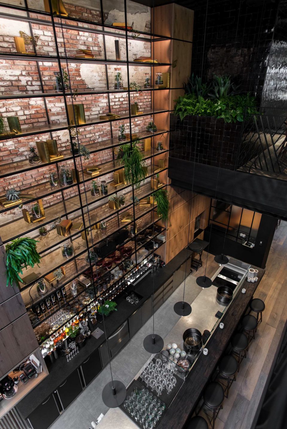
Black steel frames, brick walls and glass shelving set the tone before the tables even come into view. The industrial modern restaurant interior uses those hard materials to shape the room, then softens them with wood, warm light and low seating. The result is not a display of materials for their own sake. Each surface has a job: the bar wall holds glass and stock, the dining area brings in the grain of oak and darker timber, and the black tile wall gives the room a deeper backdrop.
Bar wall with glass shelving and black steel frames
The bar area reads as a working wall rather than a decorative one. Open shelves sit inside black metal frames, with glass catching the light and breaking up the brick behind it. In several views, the shelving runs as a continuous line, so the eye follows the structure across the wall instead of stopping at one point. Warm light lands on the metal edges and the brick surface, which keeps the industrial modern restaurant interior from feeling flat or severe.
That same wall also carries the practical rhythm of the restaurant. Bottles, glassware and small objects sit inside the grid of steel and glass, while the brick gives the whole composition a rougher edge. The contrast between the clear shelves and the darker frame is simple, but it does a lot of work. It gives the bar presence without turning it into a feature wall that competes with the room around it.
Open storage as part of the room
Instead of hiding storage away, the restaurant bar with metal shelving keeps it visible. The open units make the bar feel active, with planes, lines and reflections changing as you move past them. In the photographs, the shelving appears as a repeated structure, almost architectural in how it organizes the wall. Because the frames are black and slim, the glass remains visible and the brick behind it stays part of the composition.
Wooden dining area under warm light
The dining area shifts the mood by bringing in wood at table and chair level. Round and rectangular tables in warm timber tones sit against darker surrounds, and the grain of the wood becomes one of the clearest textures in the room. Chairs and benches keep the material language consistent, so the seating area does not read as an afterthought. It is one of the main anchors of the industrial modern restaurant interior, especially where the light falls across the tabletops.
There is a clear change in pace here. The bar wall is open, reflective and built from frames; the dining zone is lower and calmer, with a more enclosed feeling created by wood surfaces and darker walls. That shift makes the room easy to read. The wooden dining area also prevents the restaurant from becoming too hard-edged. Wood absorbs some of the visual weight of the black steel and tile, so the eye can move from wall to table without a sudden break.
Seating that keeps the material story coherent
Several seating arrangements repeat the same logic: wood first, then darker surroundings. A long bench with fabric upholstery appears in one of the dining views, while other tables are paired with wooden chairs. Nothing feels overdesigned. The furniture stays in line with the architecture of the room, and that makes the interior with wood and steel easy to understand at a glance. It also keeps the focus on the surfaces and proportions rather than on individual objects.
Brick accents beside the black tile wall
Brick appears as a rough counterpoint to the black tile wall, and that tension gives the room its depth. The brick surfaces keep some irregularity, while the dark tile reads smoother and more reflective. Together they create a brick and black tile interior that changes character from one zone to the next. In the bar and service areas, the brick carries warmth through its red-brown tones; in the darker wall sections, the tile pulls the eye into shadow and reflection.
This is where the restaurant moves from material contrast to spatial contrast. The black tile wall works almost like a backdrop, especially where warm light brushes across it and creates small highlights. The brick does something different. It sits more openly in the room, visible behind shelving and structural lines. Seen together, they give the industrial modern restaurant interior a layered surface quality without relying on ornament.
Details that support the whole setting
The staircase detail and the wood-lined niches add another material note, but they stay in support of the main composition. Eiken- and light wood treads show a clearer grain than the darker surfaces around them, and the open niche beside them gives the room a built-in edge. These elements are small, yet they matter because they extend the same language of wood and steel into a transition area rather than treating it as a leftover corner.
In the wash area, black glazed tile, marble and a round mirror bring the palette into a tighter frame. The marble vanity catches light differently from the tile around it, and the bronze-toned tap introduces a warmer metallic note. It is a compact scene, but it reflects the same logic as the rest of the restaurant: dark surfaces, one lighter stone, and a precise metal accent. Even here, the warm industrial interior keeps its material discipline.
Light, reflection and the way the room reads
Lighting is used to sharpen edges instead of washing everything evenly. Along the shelving, small warm fixtures trace the length of the wall and pick out the metal frames. Elsewhere, light lands on the brick and black tile in short reflections rather than broad washes. That makes the room feel active, especially in the bar area, where glass and metal respond to the light at different speeds. The industrial modern restaurant interior depends on that contrast to hold its depth.
What stands out most is the way each zone is legible without losing connection to the others. The bar wall with glass shelving, the wooden dining area and the black tile wall all belong to the same material family, but each one does a different job. Brick gives texture, steel defines the structure, wood slows the pace, and the darker tile sharpens the backdrop. Together they create a restaurant interior that is easy to read in fragments and still clear as a whole.
Photo: Patricia Goijens
Related project directions
This page fits alongside other related interior projects where material contrast and built-in joinery take the lead. It also belongs in a restaurant interior category and an industrial interior category, where the focus stays on bar walls, seating areas and visible storage rather than on decorative styling.
Want to see more of Dieter vander Velpen Architects? View the page of Dieter vander Velpen Architects for even more great projects and company information.





NEW 2026 Jubileum Edition The Best Interior Designers Benelux
Order Now €125


NEW 2026 Jubileum Edition The Best Interior Designers Benelux
Order Now €125


NEW 2026 Jubileum Edition The Best Interior Designers Benelux
Order Now €125