Interior design with natural light in a historic home
Light reaches deep into the rooms before the furniture does. That was the starting point here: a historic home interior preserved in its 17th-century shell, then reworked so the living areas could draw in more daylight. The structure stays recognisable, but the layout has been adjusted with a lighter rhythm between rooms. Openings, sightlines and thresholds guide the eye through the house, while the original character remains present in the walls, frames and proportions.
Rooms repositioned around daylight
The intervention stays inside the existing building fabric. Rather than replacing the historic framework, the plan was reshaped to improve how the rooms receive light and how they connect to one another. That shift is visible in the way the spaces open up, especially where glass and larger openings pull daylight across floors and walls. The result is not a dramatic contrast, but a measured adjustment: a historic interior preservation approach that keeps the old structure legible while giving the house a clearer flow.
Several of the interiors are arranged with long views and clean lines, so the daylight can travel farther than it would in a more compartmentalised plan. The rooms feel linked by movement rather than by repetition of form. A dark stone stair, pale plaster walls and broad window surfaces create a sequence of contrasts that keeps each level readable. This is interior design with natural light used as a spatial tool, not as decoration.
A quiet setting for art and daily use
An extensive eclectic art in home collection shaped the tone of the interior from the start. Instead of competing with it, the rooms give the artwork space through restraint: low-key colour, clear wall surfaces and carefully placed openings. The palette stays calm, with whites, greys, brown wood and dark stone taking most of the visual weight. Fine detailing appears in trim, panel edges and wall junctions, where the finish is precise without drawing attention away from the paintings and objects in the house.
The home is intended for both work and rest, so the rooms need to hold different uses without splitting the interior into separate moods. That dual role shows in the plan and in the furnishings. Some spaces are open and gathered around a table or work surface, while others are left more spare, with enough wall area for art and enough floor area for movement. The house never reads as over-furnished. Instead, it gives each function a clear place within the same palette.
Built-in niches and shelving that keep the walls clear
Built-in niches and shelving appear as part of the architecture rather than as added furniture. Open compartments break up larger wall areas and offer storage without closing the room in. In several images, the shelving sits inside dark frames or beside lighter wall surfaces, so the joinery becomes a measured line in the composition. This approach suits the house well: storage stays close to the structure, and the walls can still carry light, art and shadow.
Those built-in elements also help the rooms hold their order. Shelves, recesses and cabinet fronts line up with doors, windows and panel edges, giving the interiors a calm geometry. The effect is most visible where open shelving meets a darker side wall or where a niche sits beside a broader plaster surface. It is a quiet kind of precision, but it changes how the room is read. The eye moves from one frame to the next, finding pauses in the architecture.
Natural materials for a grounded interior
Natural materials interior choices give the house its weight and tactility. Wood softens the floors and vertical surfaces, while stone appears in steps, worktops and wall accents. Glass keeps the rooms open, and plastered walls hold the light in a softer way. The combination is visible everywhere, but it is never overstated. A dark stone stair has a sharper presence than a painted one would. A wooden panel absorbs daylight differently than a white wall. Together they build a slower reading of the interior.
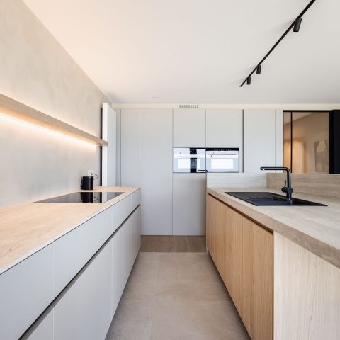
The kitchen and bathroom images make that material mix especially clear. In the kitchen, a broad stone worktop sits against restrained cabinetry and a muted backdrop, letting the slab take on the role of a central surface. In the bathroom, a long vanity with twin basins and a pale stone-look top is set beneath simple mirrors and dark ceiling fittings. These are not isolated rooms. They continue the same interior language: stone and glass interior elements, clean lines and surfaces that hold light without reflecting too much of it.
Glazed roof room at the centre of the plan
At the heart of the house sits the glass skylight sunroom, and it changes the pace of the entire plan. The glazed roof brings in a broad wash of light above the seating area, while the darker floor below keeps the room grounded. In summer, the space opens to the sun. In winter, the roof becomes a frame for the sky. The room connects interior and exterior without forcing them into one view; it works as a pause point between the enclosed rooms and the open air beyond.
The skylit space also gives the house its strongest shift in atmosphere. Black framing around the roof structure sharpens the geometry overhead, while the surrounding wall surfaces remain quiet and light. Nearby, a stone-clad accent wall introduces texture that catches the changing daylight through the day. The effect is straightforward but memorable: a room shaped around the movement of light, with the roof acting as the main architectural gesture rather than a decorative addition.
Details that hold the interior together
What ties the house together is not one single finish but the repetition of measured details. Door frames, panel lines, window grids and cabinet edges are kept consistent, so the eye can move from one room to the next without losing orientation. The architecture stays present in the background, and the finishes never become louder than the structure. Even when the surfaces change from stone to wood or from plaster to glass, the transitions are controlled and clear.
That clarity is what makes the historic interior preservation feel current. The original shell is not treated as a backdrop for contrast. It remains part of the living plan, carrying the weight of the house while the updated layout allows more daylight and more practical use. The interiors work because they respond to the building’s proportions, the art on the walls and the rhythm of daily life. Nothing here is pushed too far. The result is a house where natural materials, bespoke storage and a skylit centre room hold the whole composition together.
Want to see more of Studio Piet Boon? View the page of Studio Piet Boon for even more great projects and company information.



NEW 2026 Jubileum Edition The Best Interior Designers Benelux
Order Now €125


NEW 2026 Jubileum Edition The Best Interior Designers Benelux
Order Now €125


NEW 2026 Jubileum Edition The Best Interior Designers Benelux
Order Now €125