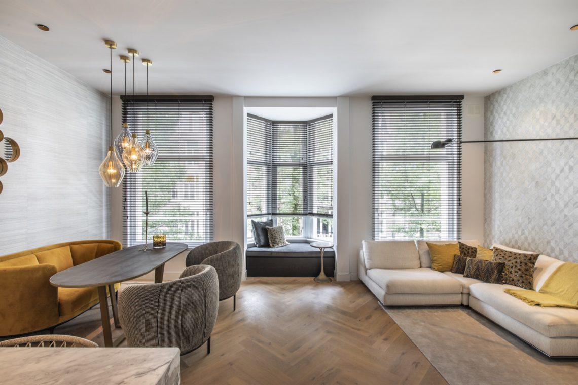
Interior design with shutters and a textured wall
Horizontal shutters set the tone before the room fully opens up. Across several window sections, the same line keeps repeating, filtering daylight and slowing down the view to the outside. That rhythm gives the living area a measured pace. Against the light surface of the windows, parquet flooring and a restrained palette of white, beige, taupe and grey hold everything close together. Small dark accents appear in a lamp base or a furniture edge, enough to break the calm without disturbing it.
Living room shutters as a continuous window layer
In the living room, the shutters read like part of the wall rather than an add-on. Their slats temper the light instead of blocking it, so the room stays bright but never harsh. A large corner sofa sits alongside the windows and follows the long wall, leaving the centre of the room clear. That decision keeps movement open between the seating area and the route toward the dining zone. The living room shutters also give the window wall a steady cadence, especially where several openings sit next to each other.
A low window recess adds another layer. Here, the bench sits directly beneath the shuttered opening and catches daylight at close range. With fewer pieces around it, the niche becomes quieter than the rest of the room. The shutters, curtain edges and deep window line do most of the work. In this setting, the window treatment feels built into the architecture of the room rather than placed in after the fact. The result is a living area that remains clear in outline, with upholstery and timber softening the harder lines.
A textured wallpaper wall that holds the light
One wall shifts the mood through surface rather than colour. The textured wallpaper wall carries a subtle pattern that only becomes visible when light moves across it. It adds depth to an otherwise restrained room and answers the flatness of the windows and the smoothness of the floor. Seen up close, the wall has a finer grain; seen from the seating area, it acts as a backdrop that keeps the space from feeling overexposed. The pattern stays quiet, but it changes the way the room reads.
Behind the seating area, the accent wall with patterned wallpaper anchors the sofa, rug and slim wall light. That combination matters most in the evening, when the daylight fades and the lamp starts to define the surface again. The wall does not compete with the shutters. Instead, it takes the shadow the shutters create and gives it somewhere to land. This is where the interior design with shutters becomes more than a window solution: it is a composition of light, relief and repetition.
Surface, shadow and repetition
The room depends on small shifts. Matte fabric, painted walls, wood and a stone-like tabletop sit close to one another, so even slight changes in daylight show up clearly. A stripe of sun across the parquet, a soft shadow on the wallpaper, a reflection on a glass lamp: each one adds a different layer. The palette stays near white and sand, but the surfaces keep the room from flattening out. That restraint makes the interior easier to read, especially where the living room shutters run across multiple panes and the wall covering catches the changing light.
A neutral living room with parquet and a compact material palette
The parquet floor brings direction to the long room and stops the scheme from feeling cold. It sits well against the light textiles and pale walls, while the rugs create softer transitions between seating and circulation. In a neutral living room with parquet, that kind of sequencing matters. The floor leads the eye forward, the upholstery holds the seating area together, and the darker accents stay small enough to keep the composition measured. Nothing shouts; the interest comes from the way the materials meet.
The dining area stays close to the living space, but it is marked by a different surface. A tabletop with a marble-look finish introduces a smoother, harder plane without leaving the same family of pale tones. Above it, glass and amber-toned pendant lights spread the light rather than dropping it sharply. Their form is simple, yet the glass gives them enough presence to register from across the room. They sit between the seating area and the dining zone, holding both parts together while still allowing each one to keep its own scale.
The window niche bench as a pause in the plan
The window niche bench creates one of the clearest pauses in the layout. It uses the depth of the opening, not extra floor area, to make a place to sit. With a cushion or two and a view to the outside, the niche becomes a small retreat inside the larger living room. The shutters continue across the opening in the same horizontal rhythm, so the niche stays part of the larger window composition. Nothing is overdrawn here. A bench, a ledge and filtered daylight are enough.
That choice says a lot about the planning of the space. Not every surface needs to be occupied, and not every corner needs to become a separate room. The bench under the shutters gives the room another use without changing its footprint. It also creates a stronger transition between the deep window line and the open centre of the living room. In a warm minimalist interior, that kind of restraint matters more than excess. The space works because it leaves room for light to settle.
How the seating area stays open
The sofa arrangement helps the room stay legible. The corner sofa follows the wall instead of cutting across the floor, and loose seating elements keep the centre less fixed. Kussens in the same muted palette soften the edges, while the open route toward the dining area remains visible. This is especially important beside the shuttered windows, where the repeated panels already bring enough structure. The furniture does not fight that line; it leaves it visible and lets the room breathe through its plan.
Evening light, glass and a quieter bedroom line
In the evening, the room shifts again. The wall light and pendant lamps pick up the wallpaper texture, and the shutters turn the windows into darker bands instead of bright openings. The living room shutters still read clearly, but now the emphasis moves to the furniture edges and the material changes in the room. Glass on the lamps and the marble-look tabletop catch just enough reflection to keep the scene from becoming flat. The palette stays calm, but the contrasts become easier to see.
The bedroom follows the same language. Shutters sit beside curtains at the window, shaping the daylight in a softer way while the bed remains low and simple in the frame. Pale bedding and light wall surfaces keep the room aligned with the rest of the interior, and the window treatment remains part of that same visual logic. What changes is the pace: less movement, fewer layers, more enclosure around the bed. Even here, the interior design with shutters keeps the room tied to the living spaces through material and light.
What gives the project its clarity is the repetition without sameness. The shutters return in the living room, the niche and the bedroom, but each time they play a slightly different role. The textured wallpaper wall moves from background to counterpoint. The parquet floor stays steady beneath the whole plan. Together they form a warm minimalist interior that relies on line, surface and filtered daylight instead of decoration for its effect. The room remains calm because every part has a clear place in the sequence.
Want to see more of Maaike van Diemen? View the page of Maaike van Diemen for even more great projects and company information.





NEW 2026 Jubileum Edition The Best Interior Designers Benelux
Order Now €125