Interior project with an exposed concrete ceiling and open-plan kitchen living
Exposed concrete runs across the ceiling first, then the room opens out in pale greys and white walls. The contrast is quiet but direct: a hard structural surface above, soft upholstery below, and a clean line of sight toward the kitchen. In this home renovation, the material change does most of the work. It sets the tone for the living area before the eye reaches the framed botanicals, the light wood kitchen fronts, or the shutters filtering daylight in the bedroom.
Concrete overhead, softness at eye level
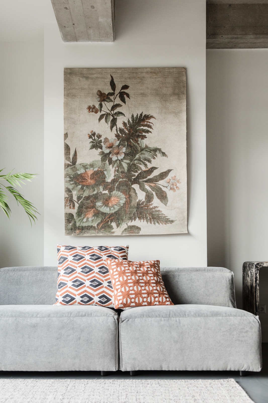
The exposed concrete ceiling interior gives the living room its clearest gesture. Beams and cut-outs break up the plane and leave the structure visible, while the rest of the room stays restrained. A grey sofa sits against white walls, layered with cushions in black, white, and a muted orange tone. That small shift of color keeps the seating area from flattening into the background. The botanical wall art in a black frame anchors the wall and adds a graphic edge without competing with the concrete above.
What makes the room readable is the spacing between those elements. The sofa faces the print, not a television wall or a decorative niche, so the arrangement feels built around the artwork and the open floor rather than around one dominant object. Light falls evenly across the pale surfaces, letting the concrete texture stay visible. The result is an interior that relies on surface changes instead of ornament. Every element has a clear role: structure overhead, fabric at the center, framed image on the wall.
An open-plan living kitchen with a clear sightline
The open-plan living kitchen is visible in one continuous view, and that matters more than any single finish. From the seating area, the kitchen sits at the end of the room as a lighter block of cabinetry and counter surfaces. The light wood kitchen fronts soften the line of the cabinets, while the counter reads as a pale stone-like plane. Together they keep the kitchen present but not heavy. The rattan pendant lamp hangs in the living zone and helps mark the transition without closing it off.
Because the ceiling remains exposed across both zones, the room keeps its long view intact. The concrete above ties the living space and kitchen together, but the materials below still shift enough to separate them. Wood, stone-look surfaces, fabric, and painted walls each take their own place. That is what gives the open-plan living kitchen its clarity: the eye moves from one finish to another without losing the route through the room. Nothing is overdrawn, and nothing has to pretend to be another material.
Light wood fronts against pale surfaces
The kitchen reads through its fronts first. The light wood finish sits comfortably beside the white walls and the grey-white base of the apartment, and the cabinetry lines stay straight and unbroken. There is no visual noise here, only a steady rhythm of horizontal planes. The counters, in a lighter stone-like tone, keep the whole composition calm and practical-looking without turning it cold. Because the palette remains close to grey, white, and pale wood, the kitchen feels continuous with the rest of the home rather than isolated from it.
That continuity is reinforced by what is not shown. There are no dense upper layers or decorative shelves crowding the wall. Instead, the kitchen fronts and worktop sit in a stripped-back frame of concrete and paint. It is a compact lesson in contrast: warm wood grain under a raw ceiling, smooth light counters beside matte walls. The open-plan living kitchen uses those contrasts to hold the room together while still letting each zone keep its own character.
Wall art as a measured accent
The botanical wall art in a black frame appears more than once, and each time it gives the living area a different edge. On the sofa wall, the print stretches the room vertically and breaks the white surface with dark lines and plant shapes. It is a simple move, but a strong one. The frame outline echoes other black accents in the interior, including the bedroom art and the darker window details, so the eye finds a consistent thread as it moves from room to room.
There is no attempt to fill the walls. The large print sits with enough breathing room around it to keep the sofa zone open, and the image itself brings a natural motif into a room dominated by concrete, paint, and wood. That contrast is what makes the artwork useful here. It does not decorate a finished scene; it helps define the seating area. The black frame gives it weight, and the botanical subject softens that weight without turning sentimental.
How framed prints shape the seating area
The framed botanical print works almost like a second plane behind the sofa. It gives the seating group a boundary without adding a partition, and it lets the pale wall carry some of the composition. The cushions below repeat the black, white, and rust tones already present in the print and the rest of the room, but only in small amounts. Because the palette is held back, the eye keeps returning to the ceiling structure and the outline of the room. The wall art is a marker, not a distraction.
Horizontal shutters and a darker bedroom note
The bedroom shifts the mood through detail rather than through a different palette. Horizontal window shutters control the light and create thin bands across the opening, which gives the room a quieter rhythm than the living area. Nearby, black-framed black-and-white wall art continues the graphic line seen elsewhere in the home. A wall lamp with a gold-toned accent appears beside the bed area, and its small metal presence stands out against the pale wall. The room stays restrained, but the layers are carefully placed.
Another bedroom corner shows the shutters again, this time with a round side table that has a light stone- or marble-look top. That circular shape breaks the straight lines of the shutters and frames, so the room does not become too rigid. The small table, the wall fitting, and the filtered daylight all work together through scale. The black window shutters bedroom detail is not loud, but it changes the way the room receives light. It turns the opening into part of the composition instead of a blank edge.
The bedroom also carries the project’s strongest habit: using one dark line to register against a pale field. Whether it is the shutter slats, the black photo frames, or the gold-accented lamp bracket, each element is narrow and deliberate. The room depends on those precise contrasts. It does not need extra color or extra volume. A careful mix of grey-white surfaces, black framing, and a few reflective details is enough to hold the space together and keep it visually legible.
Across the whole home renovation, the same strategy repeats in different registers. Concrete stays visible overhead, wood lightens the kitchen, framed art sharpens the walls, and shutters shape daylight where privacy matters. The rooms remain open, but they are not blank. Each surface has a role that can be seen at once: the ceiling carries structure, the kitchen carries warmth in tone, the living area carries the art, and the bedroom carries the light control. That directness is what makes the interior easy to read and worth revisiting.
Want to see more of Maaike van Diemen? View the page of Maaike van Diemen for even more great projects and company information.





NEW 2026 Jubileum Edition The Best Interior Designers Benelux
Order Now €125