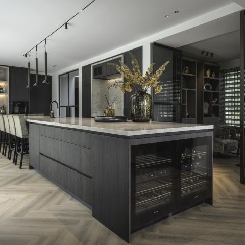
Modern interior design with contrasts
Dark built-in cabinets sit against pale surfaces and a stone-look wall, so the room reads in layers rather than in one flat finish. That contrast is the thread running through the interior design of this new-build home. Advice on colours, materials, floors and layout shaped the plan, but the result is defined by what you can see: straight lines, tactile surfaces and a shift between smooth joinery and rawer materials such as leather, oak and stone details.
The main living area opens with long sightlines. Glazed divisions keep the rooms connected, while the darker frames and cabinetry hold the composition together. In the seating area, the wall finish has the rougher tone of stone and gives the fireplace niche a clear setting. Nearby, a large window brings daylight across the floor, making the grey-black tiles and the darker timber elements read differently as the light changes during the day.
Colour and material choices set the tone
Colour is used sparingly, which makes the materials carry the story. Beige and white surfaces sit beside black framing and deep timber tones. A leather chair, oak wood and stone details appear as part of the interior rather than as decoration. The effect is calm, but not soft. Edges stay visible, and the texture of each surface is allowed to register. That is where the interior advice becomes tangible: not in a list of finishes, but in the way the materials are placed next to one another.
The stone-look wall finish is one of the strongest visual elements. It breaks the smoothness of the surrounding joinery and gives the seating area more weight. In the images, the finish appears in grey-green tones, sometimes in block-like sections near the transition to the hall. Against that surface, the dark built-in cabinets become more graphic, with vertical handles and a closed, measured rhythm. The room depends on those shifts in texture.
An open-plan living space with clear routes
The open-plan living space is arranged so that the eye can move from one room to the next without losing orientation. The living room, kitchen and entry are linked through glass and light partitions, yet each area keeps its own surface treatment. Tiles in grey and black guide the route underfoot, while the openings between the spaces prevent the interior from feeling boxed in. This is layout design that works through visibility as much as through circulation.
That sense of movement is especially clear where the open staircase appears through the room. The metal railing is thin and direct, while the wooden treads add a warmer note without softening the overall line. From some angles, the staircase reads almost like a frame inside the space. It also reinforces the contrast already present in the floor and wall finishes, where smooth glazed surfaces meet rougher textures and darker accents.
Fireplace niche and wall texture
A rectangular fireplace niche cuts into the wall as a simple void. It is not overloaded with detailing, which makes the opening itself the feature. Around it, the stone-look finish pulls the eye inward and gives the seating area a clear centre. The nearby furniture remains low and restrained, so the wall can do the work. This part of the interior design shows how a single inset opening can shape the reading of an entire living room.
The transition to the hall is handled in the same measured way. A glass door in a black frame and a darker tiled floor mark the passage without adding visual noise. Even the block pattern in the wall tiles contributes to that change of pace. It is a compact sequence of surfaces, but it prevents the interior from becoming repetitive. The material shifts tell you where you are.
The kitchen keeps the palette restrained
The modern kitchen design follows the same logic. White cabinet fronts set up a clean base, and the dark worktop draws a sharp line through the composition. Underfoot, large grey tiles continue the project’s emphasis on stone and mineral tones. The kitchen does not separate itself from the rest of the home with a dramatic gesture; it sits inside the open-plan living space as another clear volume, defined by finish and proportion.
Light from the window changes the way the kitchen reads. The white fronts stay bright, while the worktop and floor deepen in tone closer to the glazing. In one view, a glass zone and integrated lighting add a thin reflective strip above the work surface. In another, the blinds at the window soften the daylight just enough to keep the room from becoming harsh. The result is practical, but it is the material contrast that gives the kitchen its presence.
Details that keep the room grounded
The floor ties the kitchen back to the rest of the house. Darker tiles with a grey-black pattern continue across the space and keep the architecture grounded. That matters in a home where straight lines dominate the planning. Without the floor’s texture, the white fronts and black frames would feel too bare. Here, the pattern and the sheen of the tiles add just enough variation to keep the room from flattening out.
Across the project, the same vocabulary returns in different ways: oak, leather, stone, black frames, white cabinets, grey tiles. None of them are used as ornament. Each one has a visible function in the composition. The studio’s interior advice is therefore not abstract; it shows up in the placement of materials, in the route through the rooms and in the balance between polished surfaces and rougher finishes. That is what gives the project its clarity.
Seen as a whole, the interior is built from contrast rather than from decoration. The rougher floor finish sits under a pared-back layout. Natural materials soften the lines of the architecture without hiding them. The exterior trace of the home, with its oak door and projecting lead dormer window, extends that same language outside, but the strongest reading remains inside: a modern interior shaped by careful colour and material choices, with layout design used to keep every room legible.
Want to see more of Studio van Strijdhoven | Interior Design Studio? View the page of Studio van Strijdhoven | Interior Design Studio for even more great projects and company information.



NEW 2026 Jubileum Edition The Best Interior Designers Benelux
Order Now €125


NEW 2026 Jubileum Edition The Best Interior Designers Benelux
Order Now €125