










Interior finishes with texture and character
Texture does most of the talking here. Across the rooms, the surfaces shift from rougher, fabric-like walls to smoother mineral finishes, so each space catches light in a different way. The result is not a single look repeated from room to room, but a sequence of finishes that changes with use and with the amount of daylight on the wall.
Crushed velvet across the main rooms
The living room, ironing room, bedroom and wine cabinet all use a crushed velvet wall finish on rougher surfaces. That choice gives the walls a visible grain, especially where the light moves across the paneling. In the larger rooms, the finish keeps the surfaces from reading as flat. On the wine cabinet, it tightens the object into the room and gives the storage wall more presence without adding ornament.
Because the same material appears in several places, the plan reads through texture rather than repetition of furniture or color. The finish sits well beside the clean lines of the built-in elements and the minimal joints visible in the panels. Where the surface changes direction, the light breaks a little sooner, which makes the wall feel less closed and more alive to shadow.
A lighter bathroom surface that lifts the room
In the bathroom, microtopping brings in a lighter surface that reflects more of the available light. Its fine texture softens the larger planes and keeps the room from feeling heavy. The finish also works well with the restrained palette of the space, where the surface detail matters more than decoration. Even a small change in tone or sheen becomes visible once water, tile and plaster sit close together.
The bathroom shows how a matte plaster surface can carry a room without asking for much else. The finish stays quiet, but it is not blank. Its fine grain gives the walls a subtle depth, and that is enough to make the room feel less rigid. Compared with the rougher rooms, this one turns more toward clarity, with the surface doing the work that a stronger color would otherwise have to do.
Decorative lime plaster in the toilet
The toilet takes a darker decorative lime plaster, and that change in tone immediately closes the room in a little. The surface has enough movement to stay interesting at close range, but it remains restrained. In a compact space, that matters: the wall finish becomes the main visual element, so the texture has to hold up when seen from only a short distance. Here, the plaster does that without looking busy.
What stands out is the way the darker finish gathers the light rather than spreading it. The room feels more enclosed, but not in a heavy way. The decorative plaster gives the small space a denser visual layer, especially along the plain wall areas where there is little else to interrupt the surface. The result is precise and direct, with the material itself carrying the mood.
Bronze patina in the kitchen
The kitchen is finished with bronze patina, which shifts the room away from the softer plaster tones used elsewhere. Against the cleaner wall surfaces, the patina adds a deeper, warmer metal note and gives the kitchen a stronger edge. It is the most reflective of the finishes in the house, yet it still sits within the same quiet palette because the material is used with restraint.
Seen next to the other rooms, the kitchen finish works as a change of density. The surface does not need pattern or profiling to stand out; the color and sheen already do the job. That makes the room feel distinct without breaking the rhythm of the home. The bronze patina kitchen finish also links back to the broader approach of the project: one finish after another, each tuned to the space it serves.
Walls, panels and openings seen up close
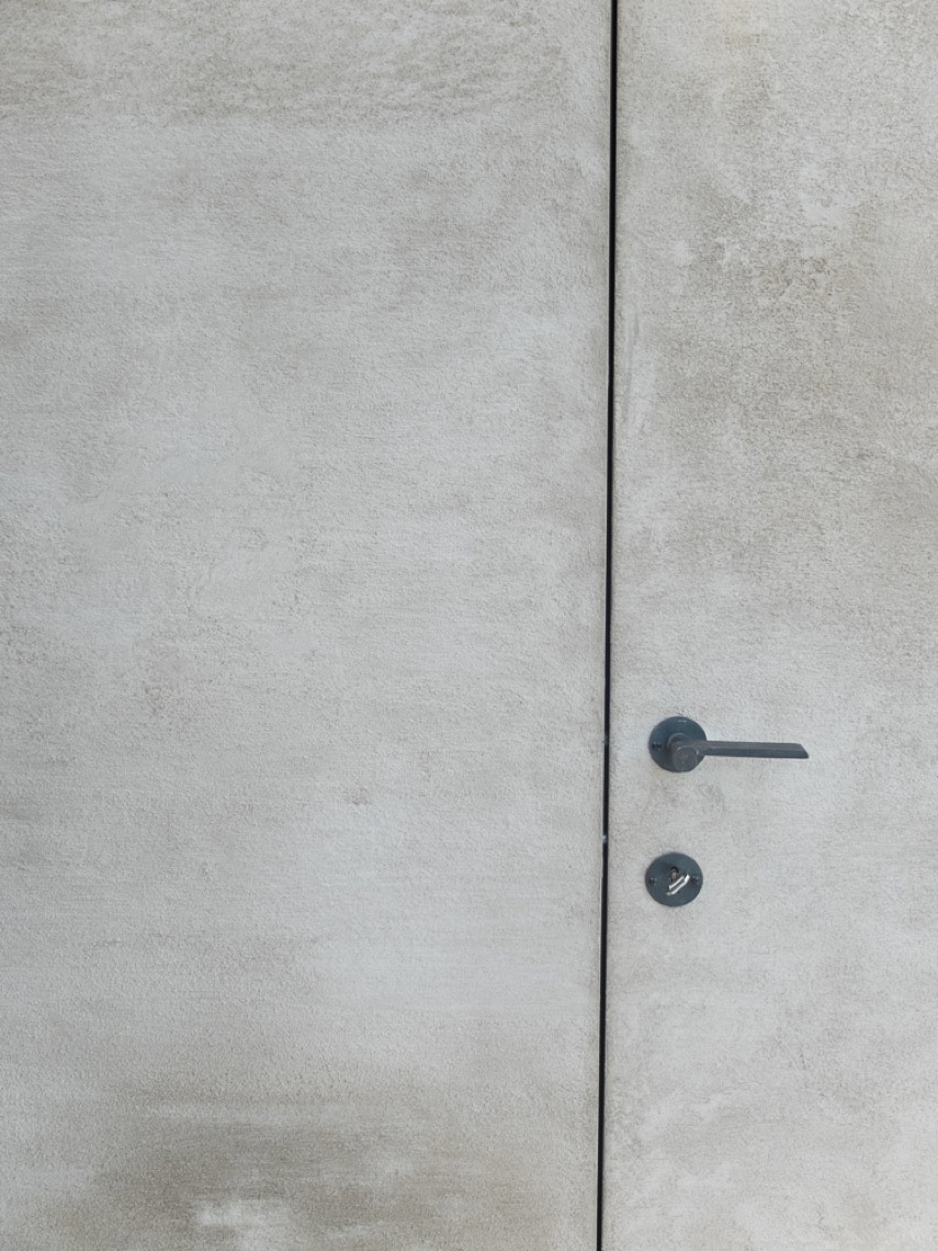
The image details show textured matte wall panels with hidden joints and a uniform color field. Two large surfaces include round openings, and those circular cut-outs interrupt the flat plane in a way that feels deliberate rather than decorative. The paneling remains minimal, but the openings give it a clearer function and a more tactile reading. That is where the project becomes especially legible: in the meeting point between surface and use.
Up close, the plasterwork has a fine, grainy structure that catches light across the face of the wall. The surface does not aim for polish; it holds a soft irregularity instead. That quality suits the project well, because the finishes are meant to be seen as materials first. The result is a home where the wall finish changes the room as much as the room changes the finish.
Different rooms, one material-led language
What connects the living room, bathroom, toilet and kitchen is not a single color or a repeated detail. It is the way each surface has been chosen for the room around it. Crushed velvet gives the larger rooms and the wine cabinet a rougher tactility. Microtopping lightens the bathroom. Decorative lime plaster deepens the toilet. Bronze patina gives the kitchen its own finish. Together, they form a material-led sequence that stays clear at every step.
That approach makes the project easy to read even without decorative elements. The walls, panels and built-in surfaces do the visual work. Some catch light softly, others absorb it, and a few add a slight metallic sheen. The variation is enough to keep each room distinct, while the shared attention to texture keeps the whole interior grounded in surface and touch.
Want to see more of Texture Painting? View the page of Texture Painting for even more great projects and company information.




NEW 2026 Jubileum Edition The Best Interior Designers Benelux
Order Now €125


NEW 2026 Jubileum Edition The Best Interior Designers Benelux
Order Now €125


NEW 2026 Jubileum Edition The Best Interior Designers Benelux
Order Now €125


