Interior renovation with bespoke built-in wardrobes and refined details
The first thing you notice is how the joinery takes over the walls without closing them in. Panels run from floor to ceiling, doors sit flush, and the lines keep pulling the eye through the rooms. In this renovation, custom built-in wardrobes set the pace for the interior, while the original character remains visible in the mouldings, ceiling edges, and the measured way new materials meet old ones.
A cabinet wall that works room by room
The bespoke cabinet wall is built as more than storage. In the hall, it reads as a long plane of vertical and horizontal divisions, with shallow reveals that break up the surface just enough to give it rhythm. Elsewhere, the same discipline returns in calmer panels and tighter joints. The effect is practical first: coats, objects, and everyday items disappear behind fitted fronts. But the construction also shapes the room, because each line is placed to align with doors, skirting, and the surrounding wall detail.
Seen up close, the finishes are restrained and exact. A dark plinth anchors the lower edge. Metal trims catch the light at the sides. The cabinetry does not compete with the architecture around it; it follows it. That makes the custom built-in wardrobes feel integrated rather than added, especially where the panel structure echoes the proportions of the existing walls and the ceiling moulding above.
Function hidden inside the fronts
Inside the wardrobes, the layout is divided by use. Shelves, hanging space, and smaller compartments are arranged so clothing and accessories each have a clear place. The source material mentions ties and jewellery in the dressing area, and that level of sorting shows in the joinery logic throughout the home. Nothing looks improvised. Doors open to a measured interior, and the outer calm is supported by a practical plan behind it. This is where the bespoke cabinet wall becomes more than a visual line.
The dressing table as a small piece of architecture
The built-in dressing table receives the same attention as the larger storage runs. Its surface is precise, but the hardware gives it character: a recessed walnut wood handle, finished with aged brass accents, sits where the hand naturally reaches. That detail is small enough to miss from across the room, yet it changes how the piece reads. The timber warms the touchpoint, while the brass carries a muted gleam that sits well beside the darker wood and pale panel work nearby.
The drawers are organised with specific items in mind, from ties to jewellery. That practical order is visible in the way the compartments are set out and in the clean front faces that keep the composition steady. Because the dressing table is built in, it does not stand apart as furniture. It belongs to the wall line, and the wall line in turn gives the room its pace. The result is controlled, but not stiff. Every edge seems to know where the next one begins.
Walnut, brass, and a quiet hand
The walnut wood handle is the most tactile part of the whole piece. Its recessed placement keeps the front uninterrupted, while the grain is enough to mark the gesture of opening and closing. Aged brass accents soften the transition between timber and painted surface. They do not flash. They sit low and matte, which suits the rest of the interior, where white paneling, darker wood, and stone are allowed to share the same frame without fighting for attention.
Marble fireplace details that carry the wall line
The fireplace design turns on a small shift in the marble. The offsets in the stone are deliberate, and they echo the wainscoting line so that the marble seems to continue the wall rather than interrupt it. That move gives the fireplace a clear place in the room without isolating it as a separate object. The surrounding mouldings, the pale wall field, and the stone surface all remain visible at once. The marble fireplace detail is therefore less about display than about alignment.
Several rooms show this same interest in edge and transition. A black marble sill, a stone surround, or a panel junction is treated as part of the composition instead of a closing note. In the living spaces, those details sit beneath a tall ceiling with a decorative moulding, so the vertical scale stays open while the lower zone carries the heavier materials. That contrast makes the stone feel grounded, especially where it meets the lighter wall planes and the dark timber accents nearby.
Light, niches, and the pauses between surfaces
Lit wall niches bring another layer to the interior. They are narrow and controlled, with integrated lighting that picks out texture rather than flooding the room. In the hallway and adjoining spaces, the niches hold decorative objects against darker back panels, so the light lands softly and stops before it spreads too far. These openings break up the larger wall surfaces and give the joinery somewhere to breathe. The fitted storage remains dominant, but the niches create pauses that keep the rooms from becoming visually flat.
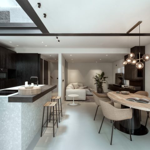
Across the apartment, the palette shifts between white panels, dark timber, brass tones, and stone. The images show how those materials are used in different rooms: a marble dining surface with pendant light above it, a bedroom with a wooden headboard and a built-in wall panel, a bathroom where blue patterned shower tiles meet chrome fixtures, and a vanity with grey stone and small metal pulls. Each space uses a slightly different mix, but the material language stays consistent enough to tie the rooms together.
Art on the wall, colour in the room
The residents’ art collection guided the choice of colours and materials, and that influence can be read in the quieter parts of the interior. Some rooms hold a stronger contrast, with dark wood against white paneling or blue tile against chrome. Others stay lighter, using pale walls and stone surfaces to give the artworks room to sit visually. The palette is not decorative in a general sense; it is adjusted space by space, so the joinery, wall finishes, and stone details support the works without overwhelming them.
That restraint is visible even where the rooms differ. In the dining area, the marble table surface reflects the warm pendant light. In the bedroom, the built-in wall runs behind the bed with a calm, measured face. In the bathroom, the patterned blue tiles give the shower a stronger graphic note, while the basin area stays more subdued with wood and stone. The house does not repeat a single formula. It lets each room answer to the same set of materials in a different register.
Photography: Myrthe Slootjes
Related project themes
Bespoke joinery & built-in storage
Renovation with preservation of original features
Custom interior details
Want to see more of Studio Wendy Mahieu? View the page of Studio Wendy Mahieu for even more great projects and company information.
Contributors



NEW 2026 Jubileum Edition The Best Interior Designers Benelux
Order Now €125


NEW 2026 Jubileum Edition The Best Interior Designers Benelux
Order Now €125


NEW 2026 Jubileum Edition The Best Interior Designers Benelux
Order Now €125