Japandi kitchen with terrazzo countertop
Warm wood fronts set the tone immediately, but the terrazzo countertop is what holds the eye. In this Japandi kitchen with terrazzo countertop, straight cabinet lines meet a surface full of small stone fragments and soft colour shifts. The result feels restrained at first glance, then more detailed the longer you look. Natural materials do most of the work here: wood, terrazzo and light wall tiles, each one kept close to its own texture.
Wood fronts and a clear line through the room
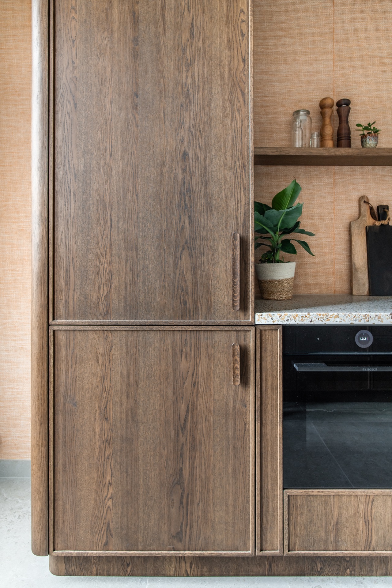
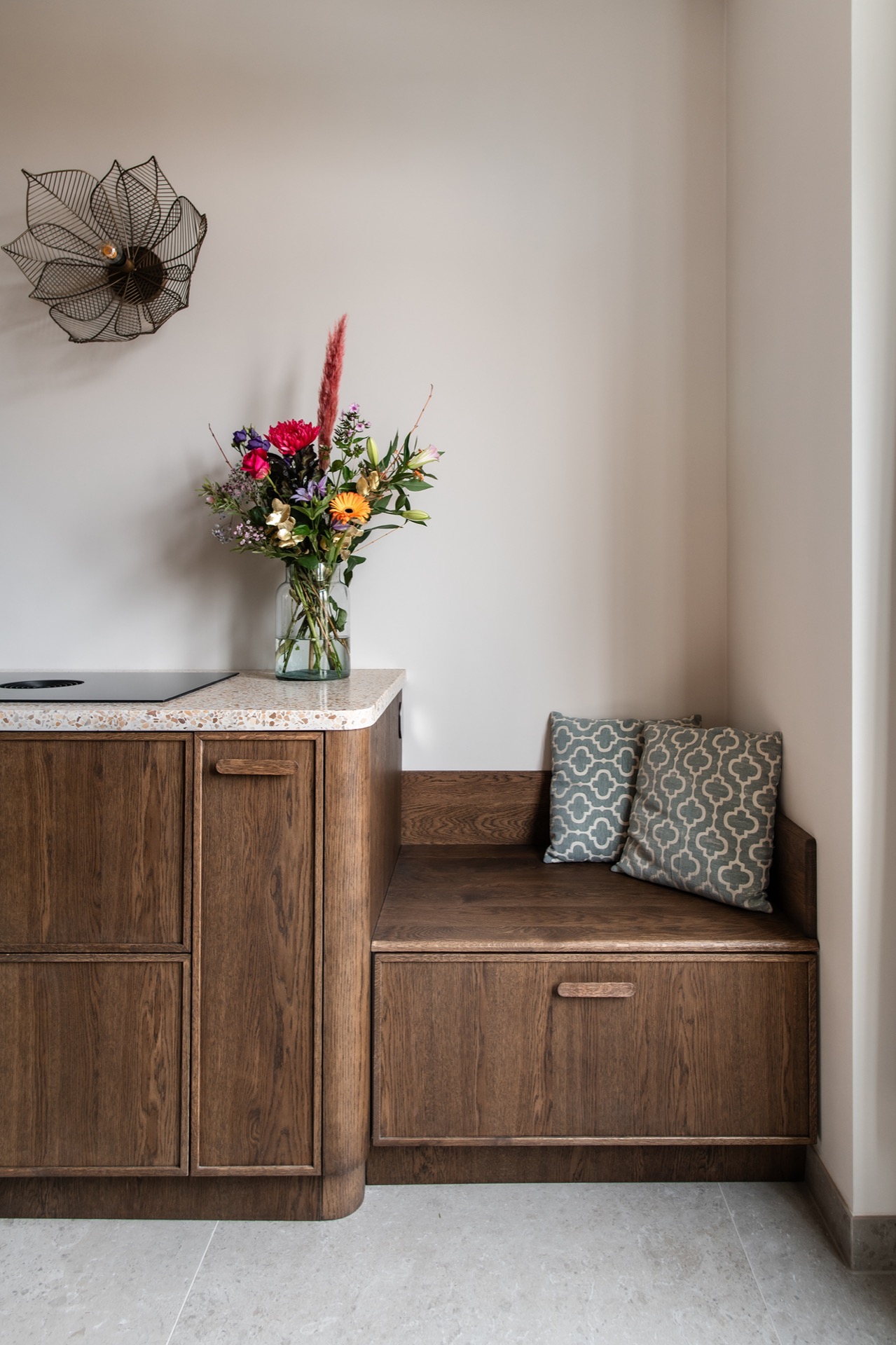
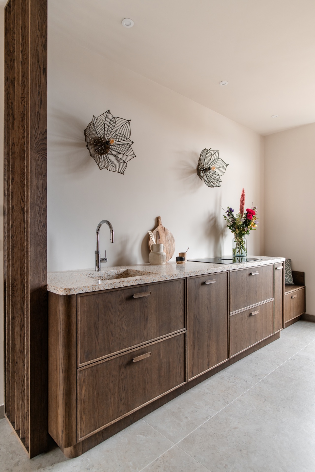
The cabinetry runs in clean horizontal bands, with matte wooden fronts that show their grain instead of hiding it. Visible handles or a defined handle line interrupt the surface only where needed, so the longer runs of timber stay calm. That rhythm suits the Japandi kitchen with terrazzo countertop well, because the eye can move from the front panels to the worktop without stopping at decorative details. Even the darker appliances sit low and quiet beneath the counter, leaving the material contrast to do the talking.
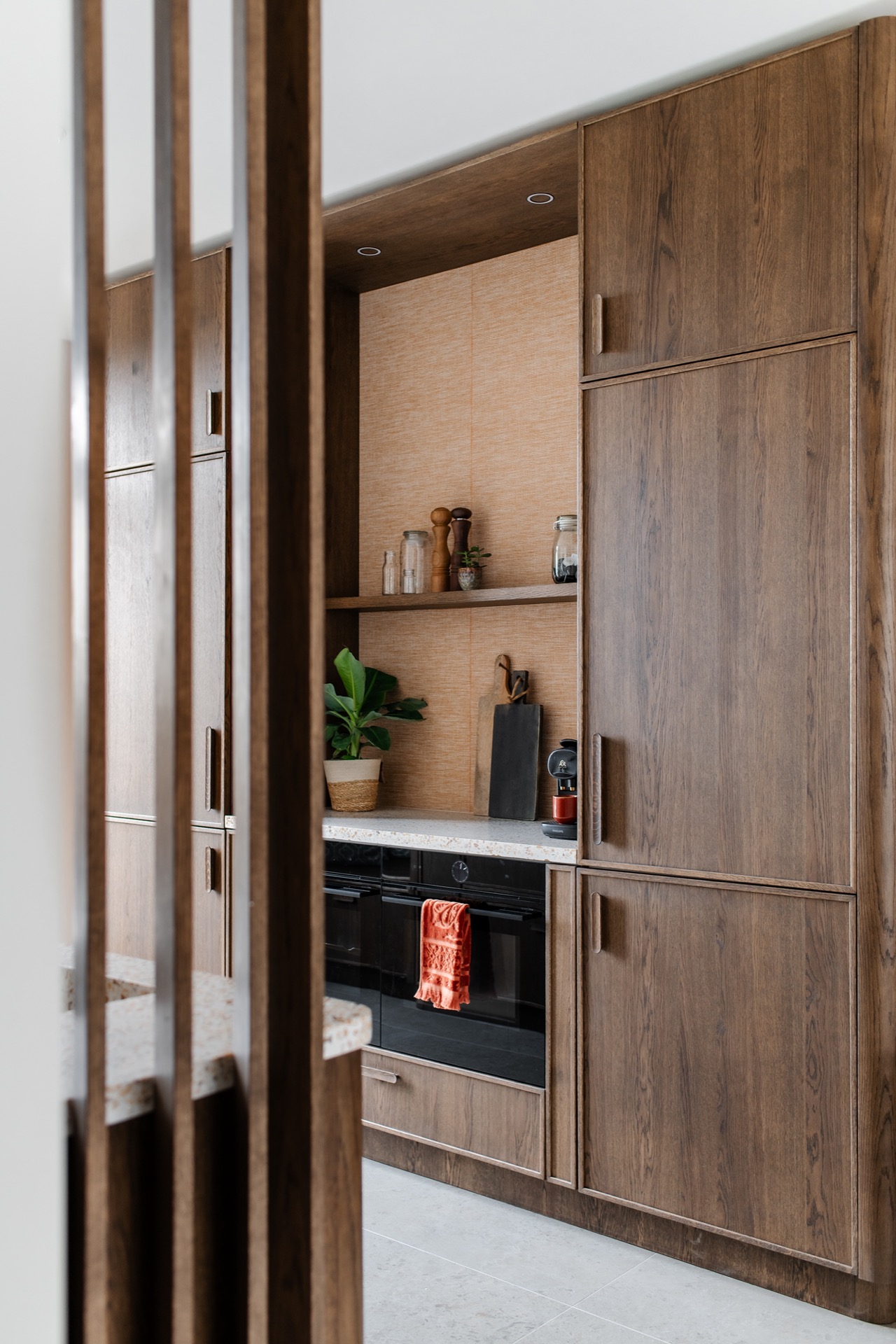
From the wider view, the kitchen reads as a sequence of volumes rather than a busy composition. Tall front panels, lower storage, and the work zone are all placed to keep the line of sight open. The wood tone is warm but not glossy, and that matte finish softens the sharper edges of the terrazzo. In the photographs, this gives the kitchen a grounded look: solid, legible, and built around the meeting point between timber and stone.
The terrazzo countertop as the centre of attention
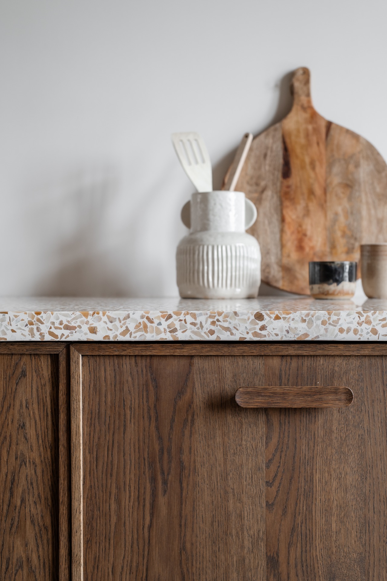
The terrazzo countertop kitchen detail is where the project becomes more expressive. The stone mix is visible in the surface itself, with a scatter of colours and chips that was developed together with the client. It is not a flat background material. The pattern carries across the top, then changes slightly at the edge, where seams and transitions become part of the view. In close-up, the countertop feels almost architectural, because the finish is just as important as the colour.
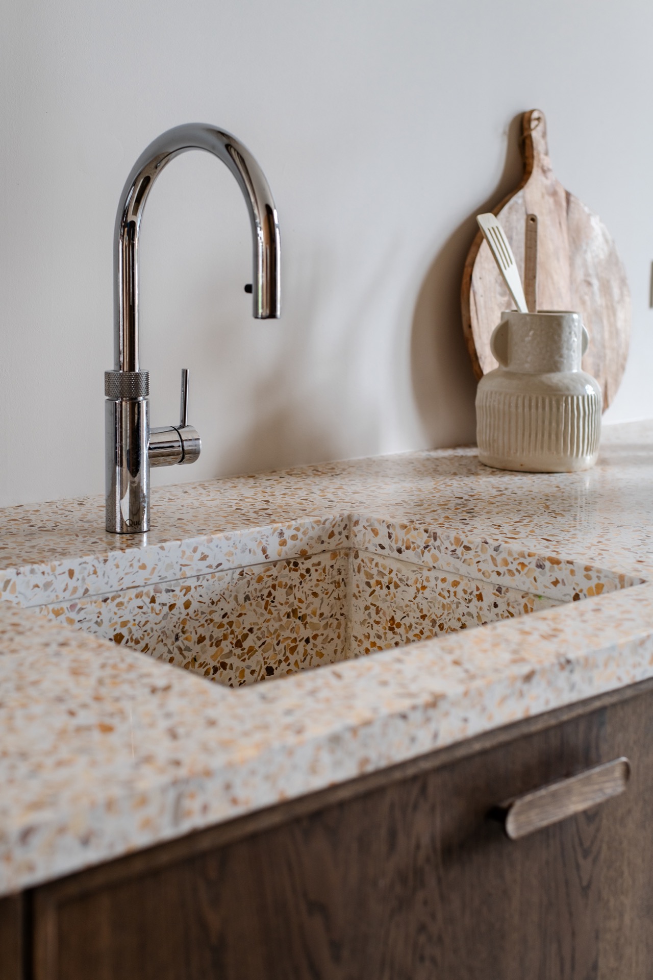
Several images focus on the terrazzo edge close-up, and that is where the worktop shows its character best. The surface wraps around the sink area with a clear boundary, so the cut-out and the surrounding slab can be read separately. This is especially effective in the terrazzo sink area details, where the chrome mixer tap, the stone chips, and the darker opening of the basin create a tight composition. Nothing is overdesigned; the strength of the material comes from the way it is cut and placed.
Pattern, edge and sink zone
Seen from above, the terrazzo surface has a lively grain without becoming loud. The stones are small enough to keep the countertop coherent, yet varied enough to stop it from feeling uniform. Around the sink zone, the edge detail matters just as much as the surface pattern. The transition from worktop to basin is crisp, and that precision keeps the material from looking heavy. In a kitchen of this kind, those small junctions decide whether the room feels blurred or sharply drawn.
That same detail also gives the room an easy visual anchor. The worktop collects light differently from the matte fronts, so the surface reads as the brightest point in the kitchen without becoming reflective. The colour mix in the terrazzo picks up the wood tones and the pale wall finish, which is why the countertop can stand out while still fitting the rest of the room. It is the central gesture, but it does not overpower the cabinetry.
Light beige wall tiles keep the background quiet
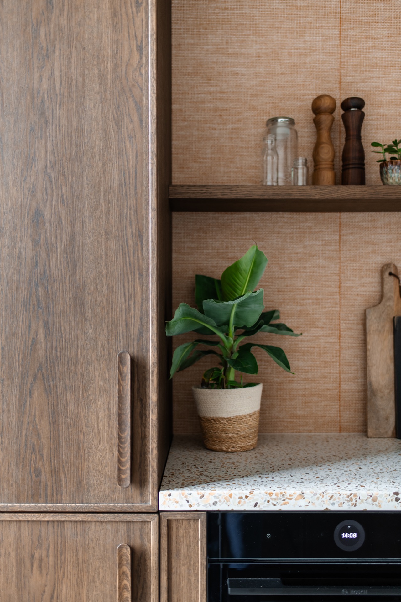
Behind the worktop, light beige wall tiles form a soft, structured backdrop. They add a subtle grid and a slight shift in sheen, enough to separate the cooking area from the smoother wooden fronts. In the images, the tiles also appear around a niche opening, where the wall treatment becomes more architectural. That opening breaks the plane without making the room feel busier, and it gives the Japandi kitchen niche tiles a practical role in the composition.
The beige tone is important because it sits between the wood and the terrazzo. It does not compete with either surface. Instead, it lets the countertop pattern stay visible while giving the cabinetry a lighter frame. In some shots, the wall feels almost powdery, which helps the darker appliances and metal tap read more clearly. The contrast is gentle, but it keeps the kitchen from becoming monochrome.
A niche that works with the materials
The niche opening brings another layer to the wall. It creates a pause in the tiled surface and introduces a small shelf-like moment, useful for the eye as much as for objects. Because the surrounding tiles stay light and calm, the niche reads as a deliberate cut into the wall rather than a decorative insert. That restraint suits the rest of the project, where every change in material has a clear reason and a visible function.
Seen together, the wall tiles and the terrazzo countertop create the most nuanced part of the room. One is soft and repeatable; the other is active and varied. The seam between them is neat, which makes the countertop feel embedded rather than added on. That is the kind of detail that gives this Japandi kitchen with terrazzo countertop its clear identity: the materials are allowed to differ, but they are always meeting on a precise line.
Front details, handles and the darker pieces below
The front details are easy to miss at first, yet they shape how the kitchen is read from across the room. On the larger cabinet runs, the handles or greeplijn sit flat against the wood, preserving the long horizontal bands. Below the counter, the darker appliances introduce a pause in tone and stop the lower section from disappearing into one block. This keeps the layout practical to read, especially in the wider kitchen views where the cabinetry stretches across the frame.
Matte wood, terrazzo, light tiles and dark equipment form a compact palette, but the room never feels thin because each material has a different surface behaviour. Wood absorbs light, tiles scatter it softly, terrazzo catches it in the stone fragments, and the metal tap adds a sharper note near the sink. That change from surface to surface is what makes the kitchen interesting in both the wide and close-up shots. The room does not rely on ornament. It relies on contrast, cut, and the way materials meet.
A kitchen that reads clearly in every view
What stays with you is the clarity of the whole arrangement. The Japandi kitchen with terrazzo countertop is built from simple pieces, but each one is treated with enough attention to give the room depth. From the long wooden fronts to the terrazzo sink area details and the light beige wall tiles kitchen backdrop, the composition stays controlled and legible. Even the close-ups hold that same calm, because the edge of the counter, the grain of the timber, and the tile joints all speak the same material language.
The project works best when seen as a series of close readings. A countertop edge. A handle line. A tiled niche. A stone-filled surface next to a matte cabinet front. Those details do not shout, but they stay visible, which is what makes the kitchen memorable in photographs and in plan. The result is a room where the materials have room to show their own texture, and where the terrazzo countertop remains the clear centre of gravity.
Photography – Studiokeeelly
Contributors: Verkade Meubelmakerij – cabinets and fronts
Pronck – countertop and sink
Want to see more of Pronck? View the page of Pronck for even more great projects and company information.



NEW 2026 Jubileum Edition The Best Interior Designers Benelux
Order Now €125