









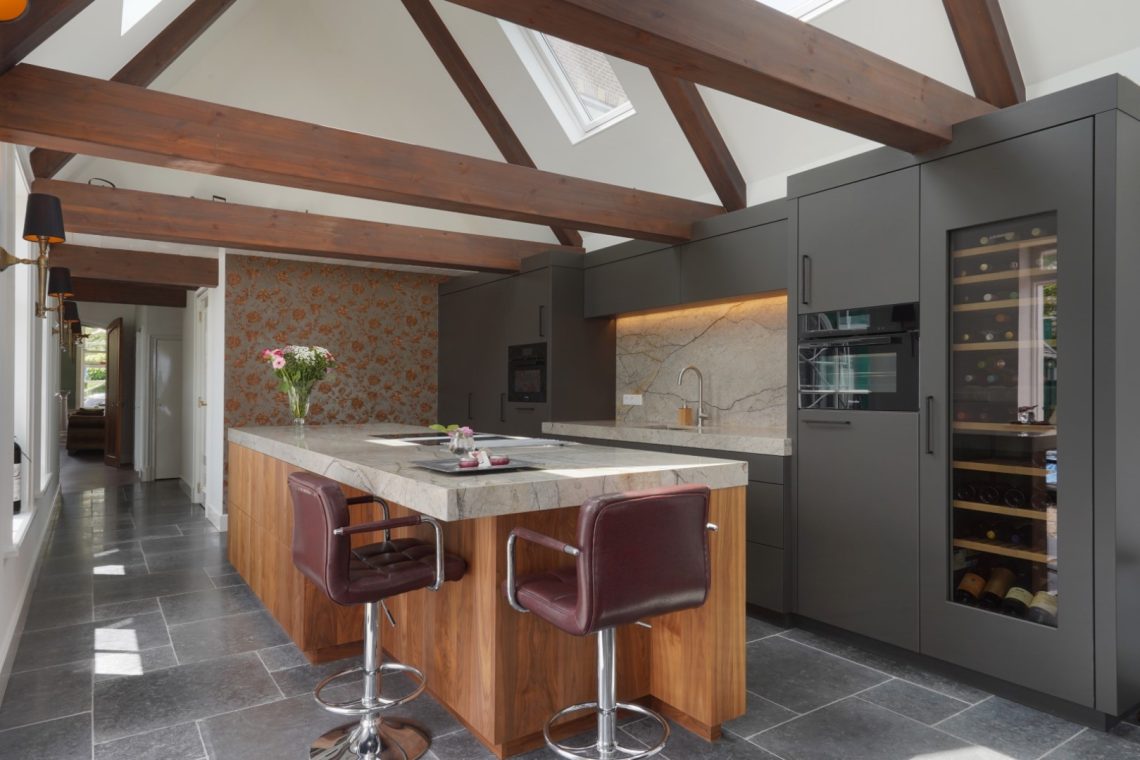
Modern kitchen with island and custom interior
The kitchen island sets the tone immediately: a long stone-look surface, a built-in sink and cook zone, and white fronts that keep the composition clear. The darker edge of the worktop cuts across the room, while the wood accents soften the surrounding cabinetry without turning decorative. Light lands evenly across the island and the nearby wall units, so the joinery reads as one continuous set of volumes rather than separate pieces.
White fronts, wood details and a steady line of storage
Along the kitchen wall, the custom kitchen is built from flat fronts, tall cabinets and recessed openings that break up the storage run. White panels reflect the daylight from the windows, while wood sections add depth at handle height and around the lower zones. The result is practical in use, but what stands out visually is the way the cabinetry holds a straight line from one end of the room to the other, with no unnecessary interruption.
Dark appliances sit within the cabinet wall and pull the eye to the deepest part of the room. Above them, the joinery is kept calm and unornamented, letting the structure of doors, seams and openings do the work. This is where the interior joinery becomes most visible: not as decoration, but as a measured frame for storage, equipment and circulation. The materials stay close to the essentials, which gives the kitchen island and its surrounding built-ins a strong visual order.
Black window frames and a room shaped by light
Black window frames with a grid pattern bring a sharper rhythm to the interior. The glazing is large enough to open the wall, but the profiled divisions give it a graphic presence that sits well beside the pale cabinetry and stone surfaces. From several angles, the windows act like a dark outline around the room, tightening the composition and separating the bright kitchen from the deeper tones of the neighbouring interior.
That contrast becomes especially clear where the wooden cabinet fronts meet the black profiles. The materials do not compete; they mark different parts of the room. A wood-lined niche glows under discreet lighting, and nearby the stone-look countertop repeats the matte weight seen on the island. The black window frames are not just background elements here. They structure the view, hold the brightness in place and make the cabinetry read against a sharper border.
Built-in cabinets and recessed niches
Several parts of the project rely on built-in cabinets that sit flush with the walls. Some are closed, some open, and some appear as shallow niches with lighting tucked into the top or side. That mix keeps the interior from becoming monotonous. In the sloped upper room, the same approach returns in a more compact form: a niche and shelving set into the wall under the roofline, with the slope shaping the upper edge of the composition.
The built-in storage is also what ties the rooms together. Instead of presenting each wall as a separate object, the joinery follows the geometry of the house and makes use of corners, openings and low areas. Even the surfaces that seem secondary, such as the shelving beside the kitchen or the small recessed displays, carry the same clear finish as the main cabinets. It is a restrained way of building a room, but one that gives every surface a role.
A darker appliance zone and a quieter backdrop
In the appliance wall, darker finishes anchor the room and break the sequence of white panels. The ovens sit in a vertical stack, and the surrounding fronts keep their lines level and even. This darker zone works like a pause in the plan, especially when seen against the bright glazing and the pale cabinet runs nearby. The kitchen island remains the visual centre, but the wall composition gives the room its practical rhythm.
From the opposite angle, the kitchen reads as a careful balance of open and closed storage, with the stone-look countertop and wood detailing preventing the white fronts from feeling flat. The island surface carries most of the daily use, yet it is the surrounding joinery that defines the room’s edge. That relationship is what makes the custom kitchen convincing: the island is prominent, but it belongs to a larger system of built-in cabinets, framed openings and measured surfaces.
Bathroom surfaces kept stripped back
The bathroom changes the mood without leaving the project’s language of plain surfaces and precise edges. A glass shower enclosure stands in front of tiled walls, and the clear partition keeps the room visually open while still marking the shower area. The basin unit is white, with a stone-like top and integrated storage below. Small recessed niches in the wall handle bottles and everyday items, so the surfaces stay relatively calm and uninterrupted.
Black profiles return here in a more subdued way, tying the room back to the window framing seen elsewhere in the interior. The floor and wall tiles keep their straight joints, and the shower glass reflects the light without adding visual weight. As a secondary space in the project, the bathroom follows the same principle as the kitchen island and the built-in cabinets: useful parts are folded into the architecture, leaving the room to read through surfaces, edges and light rather than ornament.
What stays with you is the way the project moves between white fronts, wood detail, stone-like surfaces and black framing. None of those elements is used for effect alone. Each one has a visible job. The kitchen island gathers the room around a solid centre, the cabinetry keeps the walls ordered, and the bathroom repeats the same discipline in a smaller register. Together they form an interior that is defined less by decoration than by the clarity of its joinery and the way the light moves across it.
Want to see more of Martin Van Essen exclusieve keuken? View the page of Martin Van Essen exclusieve keuken for even more great projects and company information.




NEW 2026 Jubileum Edition The Best Interior Designers Benelux
Order Now €125


NEW 2026 Jubileum Edition The Best Interior Designers Benelux
Order Now €125


NEW 2026 Jubileum Edition The Best Interior Designers Benelux
Order Now €125


