Kitchen showroom experience with live cooking demos
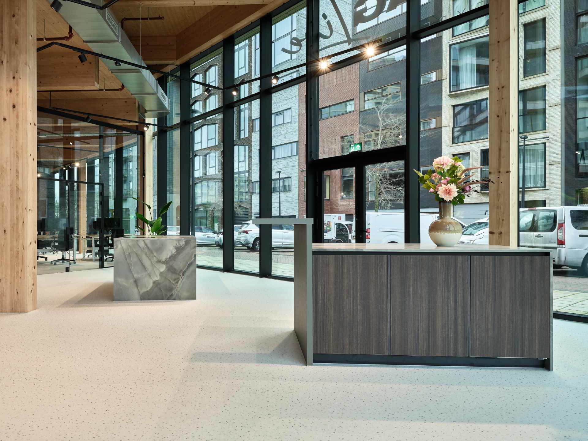
Glass, timber, and a long run of kitchen fronts set the tone for this kitchen showroom experience. The spaces are open rather than staged, with wide sightlines, built-in appliances, and seating placed close to the work surface. That arrangement makes the room feel active even when nothing is happening on the stove. Live cooking demos sit naturally in the plan, and the display areas are shaped for conversation as much as for presentation.
A showroom kitchen built around live cooking
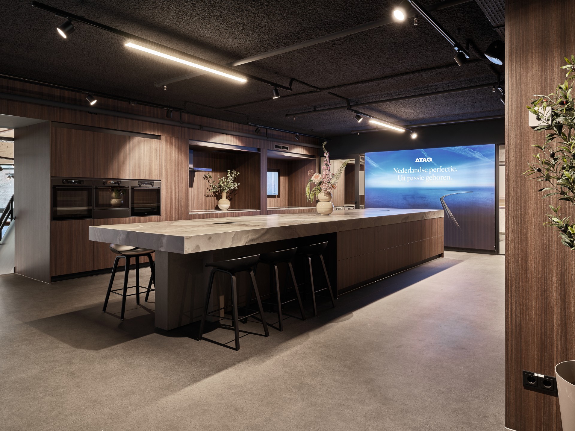
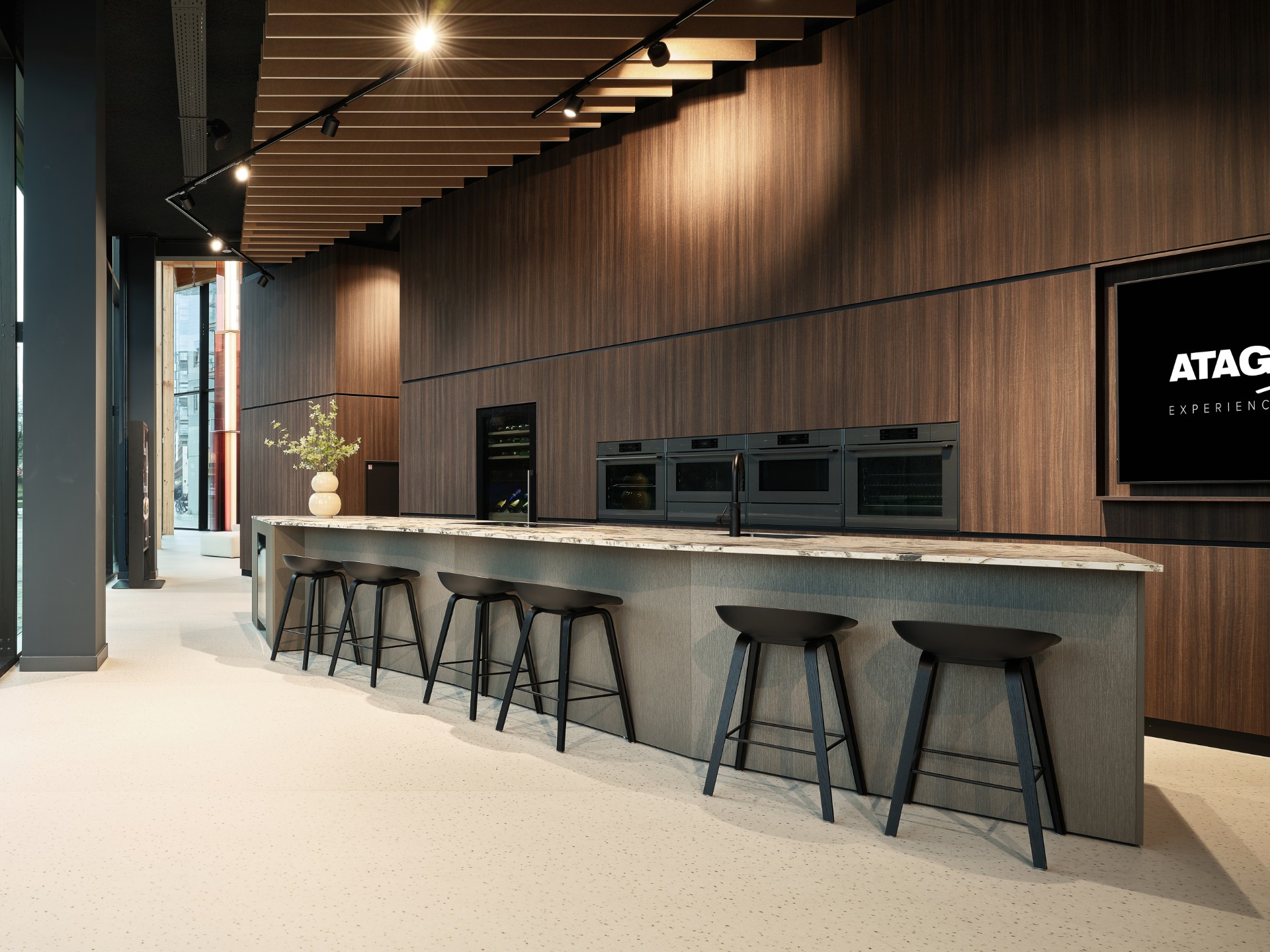
The central kitchen setup reads like a working stage. A stone-look counter holds a dark cooking zone, while bar stools line the edge of the longer island so visitors can stay close to the action. In the wall behind it, multiple ovens sit in a straight row inside pale timber joinery. The result is practical to read at a glance: one zone for preparation, one for display, and one for people who want to watch, ask, or taste during live cooking demos.
That clear layout suits the wider kitchen showroom experience. Rather than hiding equipment, the interior places it in full view, with equipment and surfaces arranged to be discussed. The built-in appliances are framed by clean horizontal lines, and the wood finish softens the technical look of the ovens and controls. It is the kind of kitchen experience center where visitors can move from one surface to the next without losing sight of the demonstration.
Advice is part of the visit, not an add-on
Personal kitchen appliance advice is built into the way the rooms are used. A visitor can stand at the island, look across the worktop, and see the appliances at eye level instead of reading about them from a distance. That matters in a showroom kitchen, because scale, handle positions, oven placement, and the relation between worktop and wall unit are easier to understand when they are placed in context. The setting supports direct questions and side-by-side comparisons.
The page also makes the visit feel open. It is free to enter, and appointments are possible, but the invitation to walk in means the place operates like a public room rather than a closed consultation suite. A coffee cup on the counter, a stool pulled up to the island, and a clear route through the interior all point to a setting that is ready for informal visits as well as scheduled meetings. That mix gives the kitchen showroom experience a relaxed rhythm without losing focus.
Glass, timber, and light shape the interior
Large panes of glass define much of the interior. They pull daylight across the floor and leave the kitchen walls easy to read, while timber columns and slatted surfaces break up the brightness with a more tactile edge. In the entrance areas, glass doors and tall openings keep the transitions visible from one room to the next. The interior never feels sealed off; it moves in layers, from the entry hall to the kitchen walls and then toward the lounge-like areas beyond.
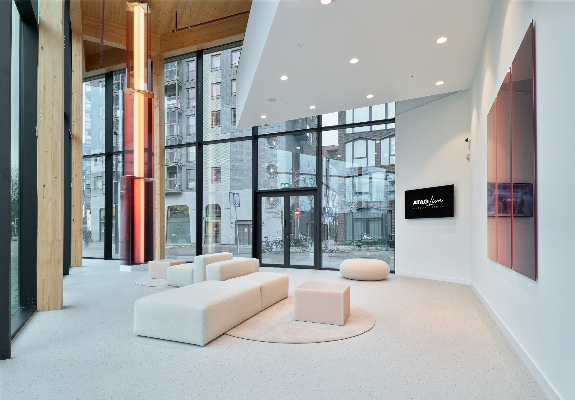
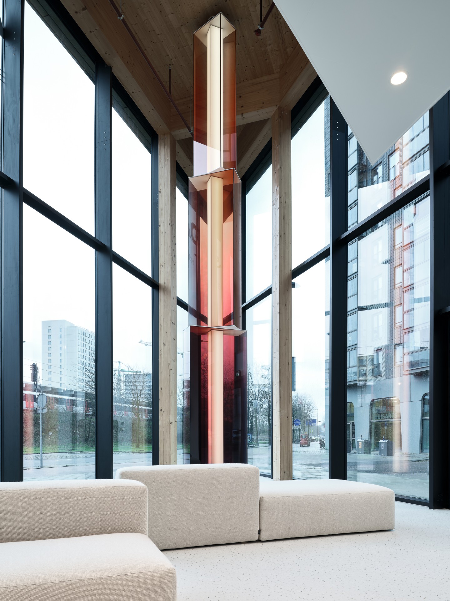
Several photo angles show how the modern kitchen with wood and glass is not limited to one corner of the project. A waiting area with upholstered wall panels sits beside broad glazing. Elsewhere, a light-filled hall uses vertical timber elements and a luminous column to guide the eye upward. These details matter because the experience center is not only about appliances. It is also about how a visitor moves through a building where display, reception, and demonstration space sit close together.
Built-in ovens and clean-lined walls
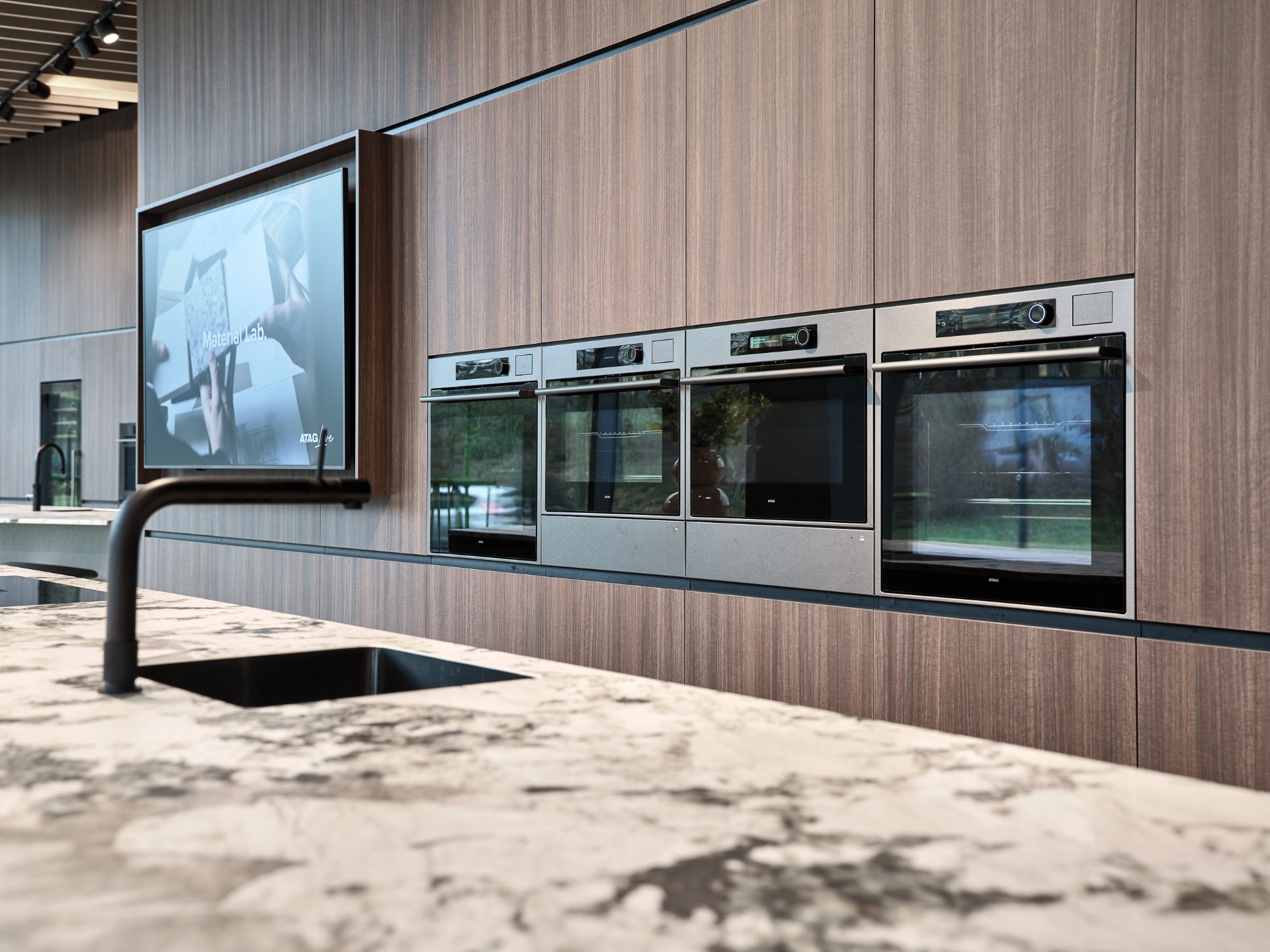
One of the strongest visual threads is the kitchen wall with multiple built-in ovens. Set into timber panelling, the appliances form a strict horizontal composition that feels precise without becoming cold. A separate close-up shows a similar approach: stacked glass fronts, slim metallic details, and a wood-lined surround that keeps the equipment readable from a distance. The repetition of oven doors and control strips gives the showroom kitchen a measured, almost architectural rhythm.
There is no attempt to disguise the technical side of the room. Instead, the appliances are arranged as part of the interior order. That is useful in a kitchen experience center, where visitors need to see how a wall unit, a worktop, and a cooking surface relate to one another. The materials do the quiet work here. Timber blocks excess glare, stone-look surfaces carry the weight of daily use, and the glass around them keeps the whole setting open.
An interior designed for movement and conversation
Another image shows a long island with bar seating and a panelled backdrop behind it. From that angle, the room feels designed for pauses as much as for cooking. People can sit at the counter, watch a chef work, or stand close enough to follow a demonstration without crowding the surface. The rail lighting above the island supports that setup, throwing a steady line of light across the work zone and keeping the main surfaces clear.
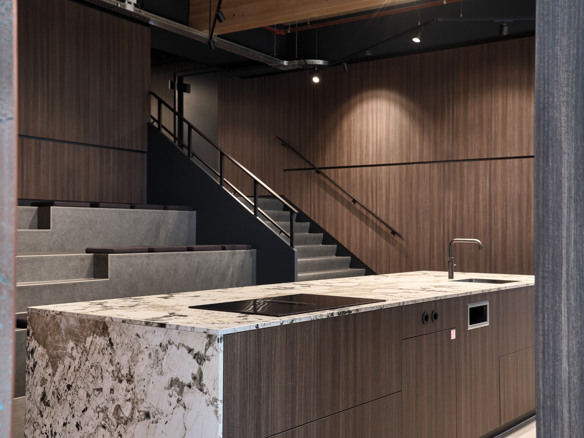
The stair hall reinforces the same idea of movement. Black metal handrails, wood-clad walls, and broad treads lead the eye upward while preserving the openness of the plan. In a nearby frame, a glowing column with red and amber tones cuts through the glass and timber palette. It is a small but striking interruption, one that gives the interior a sense of direction and marks the route through the building without relying on signage or ornament.
Even the lounge and waiting areas stay tied to the kitchen experience center. Rounded seating blocks sit in front of layered wall panels, and the large windows keep the outside visible as a backdrop rather than a distraction. That balance between soft seating and technical kitchen equipment is what gives the project its character. Visitors can linger, move, or sit down with an adviser, while the room keeps its focus on cooking, materials, and practical demonstration.
What the photos reveal about the project
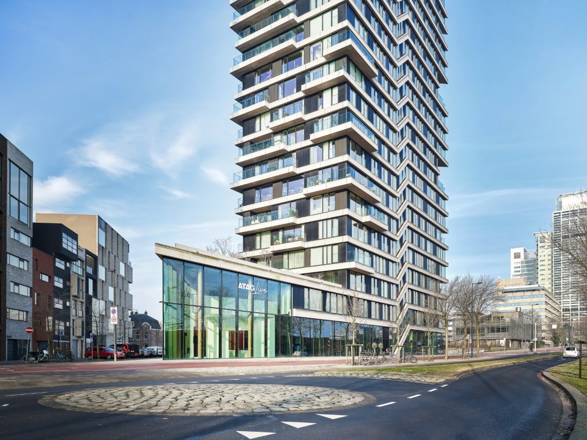
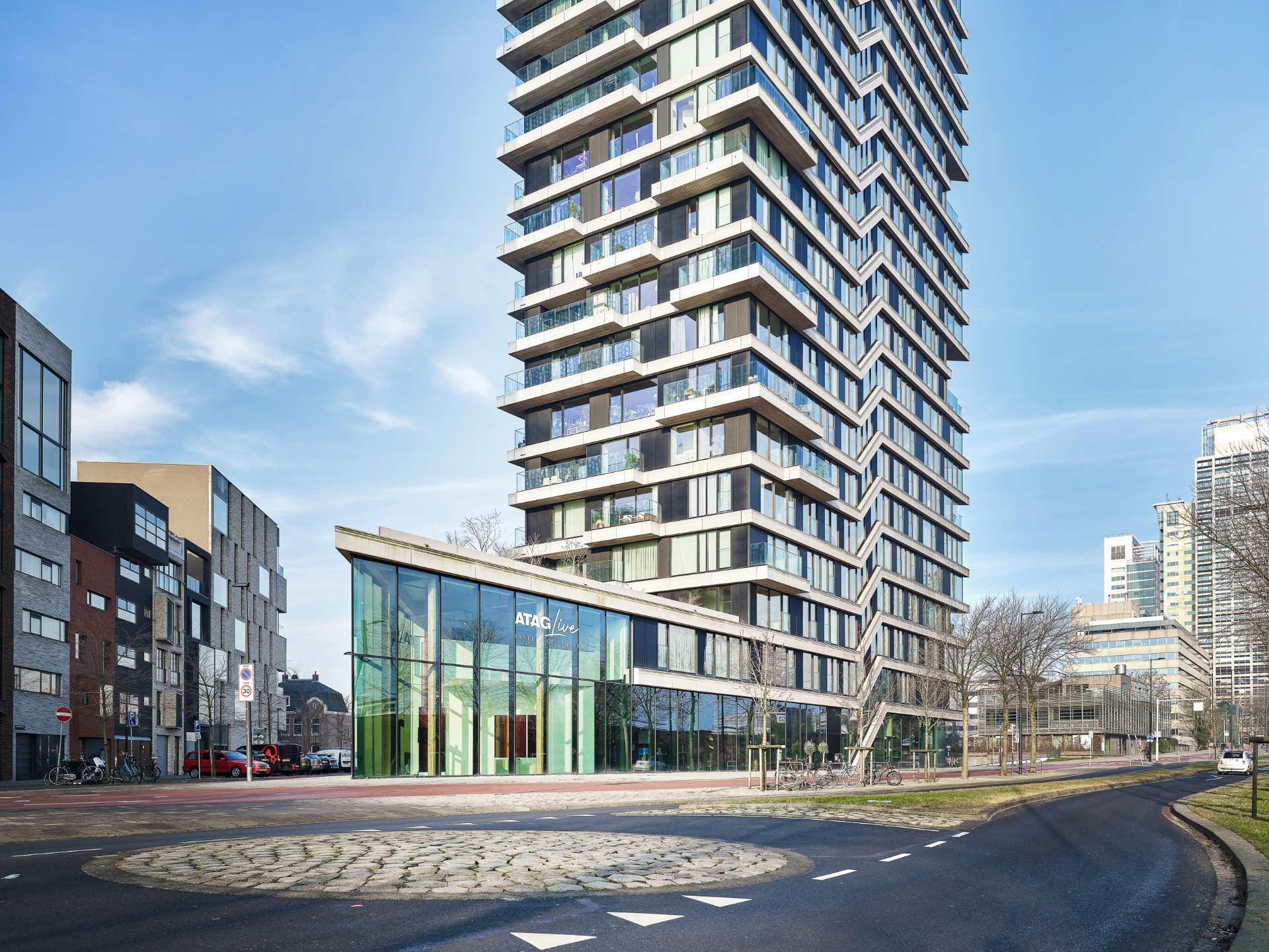
The exterior view shows a glass-rich urban building with stacked balcony-like volumes and an entrance set into the lower level. It reads as part of the city, not as a separate showroom box. Inside, the same openness continues through tall glazing, timber structure, and a pale floor that reflects light instead of absorbing it. The photographs of the kitchen showroom experience make one thing clear: this is a place where visitors can see appliances in context, ask direct questions, and watch cooking happen at close range.
That clarity is what the page delivers best. Live cooking demos, personal appliance advice, and free visits are all supported by an interior that is easy to move through and easy to read. Glass gives depth, timber gives structure, and the built-in ovens and island layouts keep the focus on how a kitchen works in use. For anyone looking into a showroom kitchen or a kitchen experience center, the project presents its purpose without overstatement.
The same measured approach carries through the material choices. Timber joins the technical elements, glass opens up the rooms, and stone-like surfaces ground the kitchen work zones. The result is a showroom kitchen that feels active, legible, and made for conversation. Visitors can come by appointment or walk in, stand by the island, and see how the appliances, walls, and light work together during a live cooking session.
Want to see more of ATAG? View the page of ATAG for even more great projects and company information.


NEW 2026 Jubileum Edition The Best Interior Designers Benelux
Order Now €125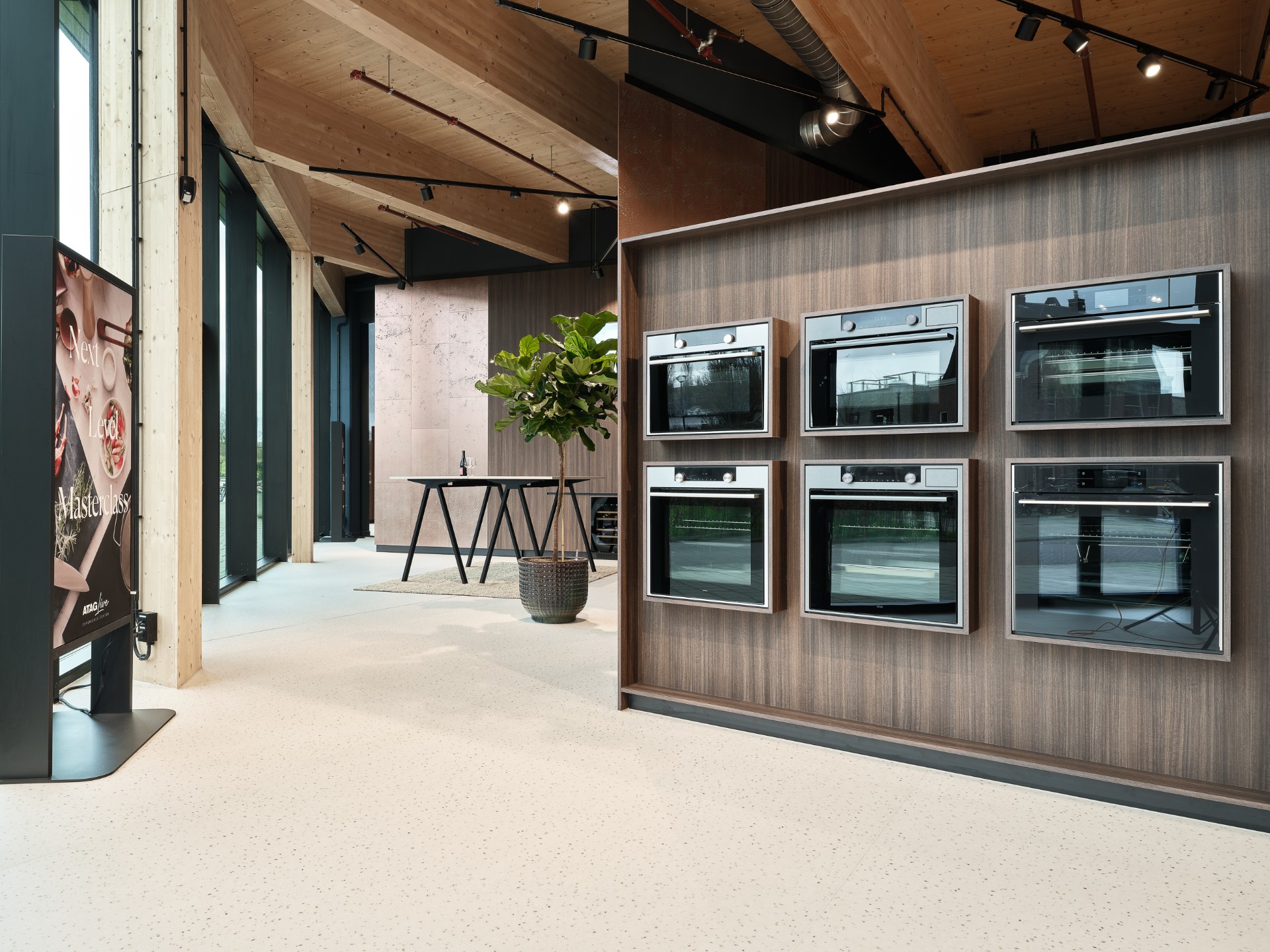
NEW 2026 Jubileum Edition The Best Interior Designers Benelux
Order Now €125