










Light classic interior with soft colors
Large windows set the tone from the first step inside. Daylight hits the pale walls, the parketvloer and the white panel doors, so the house no longer feels weighed down by its older finishes. A soft color palette came out of the renovation of the woodwork, floors and walls, and that lighter base gives the rooms space to breathe. Against it, a dark sofa and a few sharper accents stand out clearly rather than fighting for attention.
Daylight, pale walls and a softer base
The living areas are built around light rather than decoration. White paneled doors, painted wall sections and broad openings make the rooms read as one continuous sequence, while the surfaces themselves stay calm: plastered walls, wood flooring and glass all catch the light in different ways. The result is a light classic interior that feels considered through proportion and finish, not through ornament. Even the darker seating looks measured here, because the pale envelope keeps every piece in view.
That pale envelope did not appear by chance. It was created by working through the basics first, with the existing woodwork, floors and walls repaired and refreshed before any furniture entered the rooms. Once those surfaces were treated, the house could take on a gentler range of tones. The palette is soft, but it is not washed out. It leaves room for contrast, which is why the darker upholstery and black details can sit comfortably alongside the white doors and painted panelling.
White paneled doors and room dividers that stay visible
The white paneled doors do more than open and close rooms. They act as part of the interior language, repeating the same vertical rhythm across different views. In the photographs, the doors and wall detailing help frame the rooms instead of hiding them, so the eye keeps moving from one opening to the next. This is where the renovation feels most deliberate: the house keeps its classic structure, but the surfaces have been cleaned back to a lighter, quieter register.
That sense of order also comes from the way the rooms are held together by simple lines. The panel work sits flat against the wall, the floor runs through in long boards, and the windows bring in broad sheets of daylight. Nothing is overworked. The architecture is allowed to show its outlines, and the furniture sits inside that outline with room to spare. It is a light classic interior, but one that relies on measured details rather than decorative gestures.
Modern dark seating against a pastel color palette
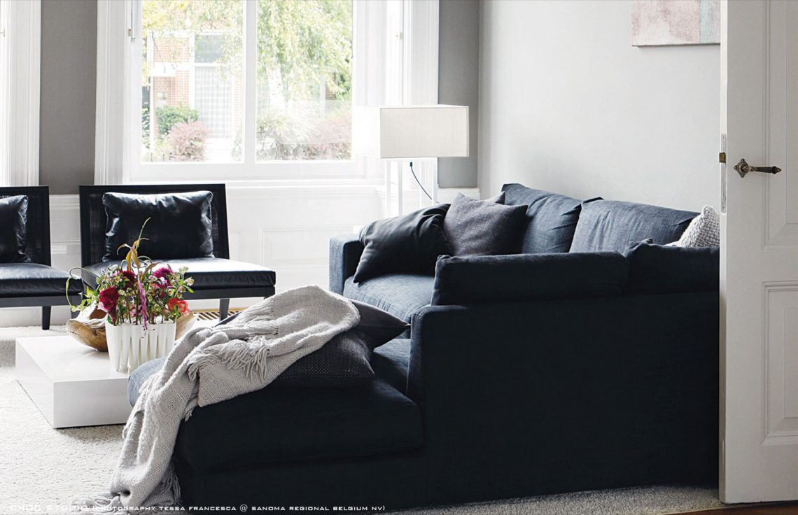
Dark seating gives the brightest rooms a necessary edge. A modern dark sofa, stacked with cushions, interrupts the paler setting and keeps the palette from drifting into sameness. Nearby, the upholstery, tables and textiles introduce more texture than color, which suits the restrained base of the house. The dark pieces are especially effective because they sit low and grounded against the lighter walls, making the room feel more anchored without adding visual weight to every corner.
In several views, the contrast between light surfaces and darker furniture is what defines the space. The pastel colors work as a backdrop, not as a theme in themselves. They make the white doors, the pale walls and the dark seating read in the same frame. That is also why the renovation feels more architectural than decorative. The colors are not the point on their own; they support the way the house is experienced, from the first bright room to the quieter, more enclosed corners.
A dark kitchen backsplash inside the overall interior
The kitchen keeps the same logic, but shifts the tone with a darker wall. A black kitchen backsplash runs behind the work zone and gives the room a stronger edge than the living areas. Metal-look fronts and the reflective surfaces around them catch the light differently from the painted rooms, so the kitchen reads as a separate layer inside the house rather than a break from it. Even here, the pale base from the rest of the home remains visible in the surrounding surfaces.
Because the kitchen is tucked into the broader interior story, it never takes over the page. The dark kitchen backsplash works as a contrast point, not a separate concept. Light counters and lighter surrounding finishes keep it from becoming heavy, and the result is more about tension between materials than about a single statement. That mix of dark cabinetry and light counters gives the room a clear outline, while still fitting the calm tone set by the renovation elsewhere.
Materials that keep the room legible
Glass, tiles, painted walls and wood all appear in the project images, but they are used in ways that stay readable. The surfaces are not competing for effect. Instead, each one has a simple job: the wood floor brings length, the painted walls flatten the background, the glass opens the view, and the tiled kitchen wall adds a harder surface where the room needs it. That clarity is what lets the classic details remain visible without making the interior feel formal or stiff.
A classic fireplace corner with a clear outline
The fireplace corner shows the same restrained approach in a smaller setting. A white surround frames the open fire, and the shape is sharp enough to stand out against the light room around it. A darker wall beside it adds contrast, so the hearth becomes a focal point without turning into a decorative feature. The nearby seating stays low and pale, which keeps the corner open and lets the fireplace read as part of the room’s structure.
Across the house, the same pattern returns: light walls, paneled doors, a softened base and then one or two darker elements to sharpen the view. That is visible in the living room, in the kitchen and in the fireplace corner. The house feels newly edited rather than over-restored, with the original shell made clearer through surface work and the furniture used to underline the proportions. The publication in Stijlvol Wonen in spring 2010 marked the result, but the strength of the project is already visible in the rooms themselves.
Bedroom layers, curtains and a quieter finish
The bedroom continues the same palette in a softer key. A large bed with a quilted upholstered headboard sits against white bedding and pale walls, while the curtains introduce a darker vertical band beside a lighter translucent layer. That pairing gives the room depth without adding clutter. Here too, the classic structure stays in view: the textiles sit neatly within the frame of the room, and the light that enters through the window keeps the surfaces from feeling flat.
What ties the whole house together is not a single color, but the way the renovation uses light classic interior principles room by room. The pastel colors come from the renewed woodwork, floors and walls; the white paneled doors keep the architecture legible; the dark kitchen backsplash and darker seating bring tension where it is needed. The house moves from bright to restrained to slightly deeper tones, yet the transition always follows the same clear surfaces. That is what makes the interior easy to read, even as each room has its own mood.
Want to see more of Choc Studio? View the page of Choc Studio for even more great projects and company information.




NEW 2026 Jubileum Edition The Best Interior Designers Benelux
Order Now €125


