Lighting That Connects the Rooms
Large panes of glass, a run of glazed pivot doors and a line of black fixture details set the tone on the ground floor. Here, lighting connects rooms by echoing the window frames and door hardware with slim rosettes, cables and other dark accents. The result is not loud; it is drawn through the interior in small repeated gestures. Across the open living area, the fixtures help the eye move from one zone to the next without breaking the long sightlines.
One open floor, three distinct living zones
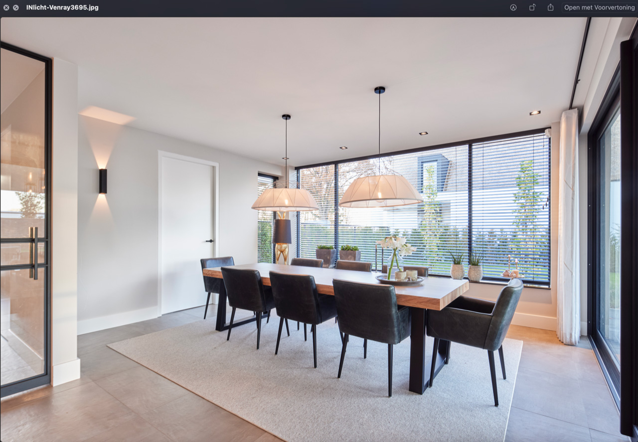
The living room, kitchen and dining area sit in a single open space, yet the building layout gives each part a clear edge. Ceiling lines shift, wall planes turn and openings frame the transitions. That is why the lighting plan had to do more than provide general light. It needed to carry the same rhythm across the entire ground floor, so the open living area lighting reads as one sequence while still leaving room for each zone to feel distinct.
For the dining and sitting areas, the same wall fixture was chosen on both sides. Its light pattern repeats from one room edge to the other, which gives the space a quiet link without flattening the individual rooms. Because the fittings sit within the architecture rather than on top of it, the walls stay clear and the room proportions remain visible. The light reaches across the surfaces and makes the separation between the zones easier to read.
Pendant lighting over the kitchen island
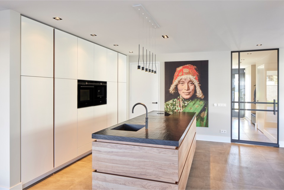
Above the kitchen island, six pendant lights form a steady row. They sit lightly in the room and leave the worktop and floor around them open. Each pendant has a black interior as standard, but this kitchen uses a golden-yellow inner cylinder, which picks up the other accessories nearby. The flat custom rosette keeps the ceiling detail restrained, so the row reads as one clear line rather than a cluster of objects.
This pendant lighting kitchen island arrangement also gives the kitchen a different tempo from the rest of the floor. The pendants hang in a rhythm that matches the length of the island and sits comfortably below the larger ceiling plane. In the wide room, they act as a marker for the cooking zone without closing it off. Their slim profile works well against the straight cabinet fronts and the darker details around the room.
Black details carried through the interior lighting plan
Throughout the house, black details return in the rosettes, cables and fixture finishes. They echo the darker window and door frames and keep the lighting tied to the rest of the joinery. This is where the interior lighting plan becomes noticeable: not through a single statement lamp, but through repetition. A black line on the ceiling, a dark connection at the wall, and a matching frame around glass all help the rooms read as part of the same interior language.
The choice matters most where the interior opens toward the large glazed doors. There, the fixtures do not compete with the glass. Instead, they sit back and let the structure of the openings remain visible. The dark accents are small, but they stitch together the ceiling, the frame edges and the moving view through the ground floor.
Recessed square ceiling spots trace the edges
To counter the lighter, more elegant finish of the rooms, the project uses robust square ceiling spots set fully flush into the ceiling. They run in a row along the edges of the spaces, where they pick up the contours of the plan and leave the centre areas open. That placement gives the ceiling a clear order. It also lets the light spill across the floor and wall surfaces without crowding the room with visible fittings.
The same recessed square ceiling spots continue from the entrance into the kitchen, so the glazed pivot door between those areas is lit from both sides. The light does not announce itself. It simply makes the opening legible and keeps the passage between the two rooms bright enough to feel connected. In an open layout, that continuity matters: the eye reads the route before the body reaches it.
Matching wall fixtures at the entrance
The entrance has no daylight of its own when the living space is seen beyond it, so it needed its own layer of light. Besides the ceiling spots, two recessed wall fixtures were placed just above the skirting. They wash the wall from low down, which gives the entrance depth and a stronger sense of volume. At night, the light falls softly across the plaster and makes the transition from hall to living area easier to read.
Because the fixtures are set into the wall rather than mounted proud of it, the surfaces stay clean. The low angle also changes the feeling of the space: instead of lighting only the floor, the wall lamps with glass shades of another kind are absent here, and the recess itself becomes the feature. The entrance is small, but the light gives it a clear role in the interior sequence.
Stair light strip and the quieter parts of the plan
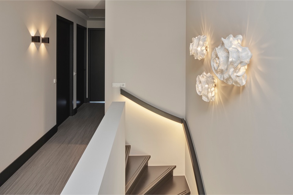
The staircase is lit from beneath the handrail, where a continuous light strip throws warm, diffused grazing light across the treads. It is a simple move, but it changes the stair from a circulation element into a visible line within the house. The dark steps stand out more clearly against the white wall, and the handrail reads almost like a drawn line in space. The stair light strip also supports the route at night without flooding the whole zone with light.
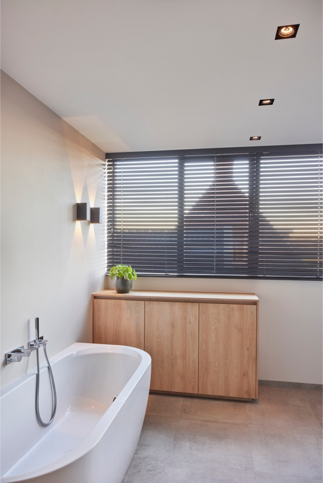
In the bathroom, the ceiling spots are moved away from the edges and placed in the centre of the ceiling instead. That avoids reflections above the bath and keeps the light where it is needed most. The room shows a different logic from the rest of the house, yet it still belongs to the same lighting system. The fixtures are adjusted to the surfaces they meet, not repeated mechanically from one room to the next.
Glass shades outside, light continuity at the threshold
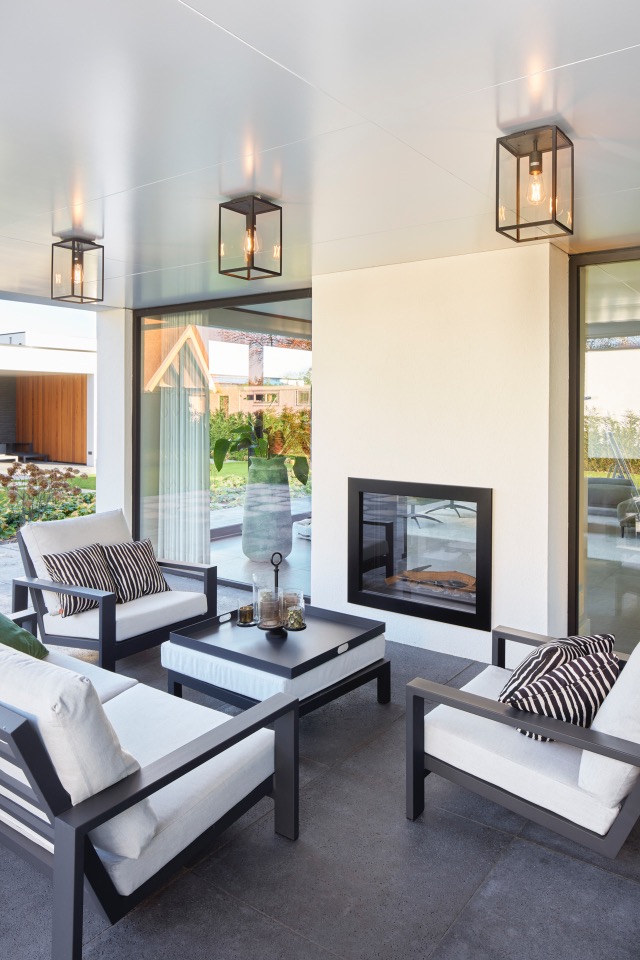
For the exterior side of the house, wall and ceiling fittings from the same series were used. Their steel and glass housing gives them the look of a contemporary lantern, with a filament source visible inside. At the front door, they are placed on both sides of the entrance, where the black frame and the clear glass repeat the dark detailing found inside. The same family of fittings continues in the covered outdoor room at the back, where three ceiling fixtures are arranged in a row instead of using recessed spots.
That decision keeps the threshold areas linked to the interior lighting plan. The glass shades catch the eye first, then the structure of the fitting becomes visible. Outside, as inside, the lights are not treated as separate objects. They extend the same visual language from the open living area to the covered exterior room, and they hold the transition between inside and out in one clear line.
A lighting scheme built from repeated gestures
What makes this ground floor readable is not a single dramatic fixture, but the way different types of light repeat and overlap. Wall fixtures connect the dining and sitting areas. Pendant lighting defines the kitchen island. Recessed square ceiling spots map the edges and the passage between rooms. The stair light strip adds one more line, lower and softer than the rest. Each layer serves a different part of the plan, yet the visual code stays consistent through black details and controlled placement.
That consistency gives the rooms a clear relationship even where the architecture separates them. Glass, plaster, timber, dark frames and light all stay in view at the same time. The lighting connects rooms by working with those materials rather than competing with them. It is a measured approach, but it leaves a strong trace across the whole ground floor.
Want to see more of INlicht? View the page of INlicht for even more great projects and company information.




NEW 2026 Jubileum Edition The Best Interior Designers Benelux
Order Now €125


NEW 2026 Jubileum Edition The Best Interior Designers Benelux
Order Now €125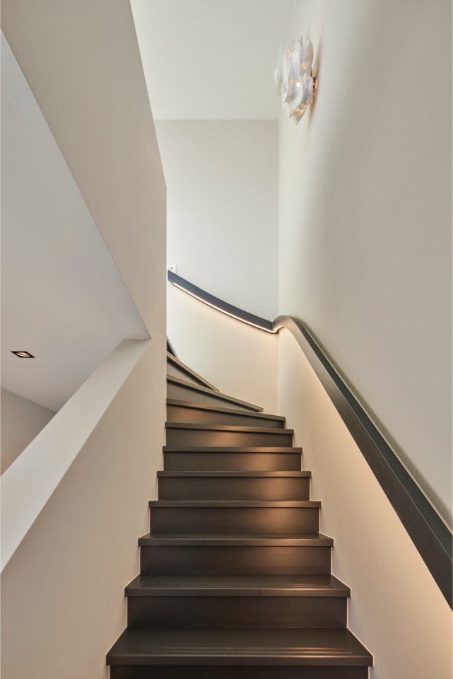
NEW 2026 Jubileum Edition The Best Interior Designers Benelux
Order Now €125