









Lime plaster–style textured walls: wet rooms and living spaces
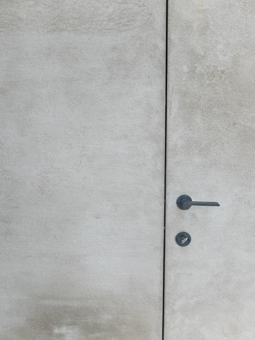
The first thing you notice is the wall surface. In the living areas it catches light in a soft, chalky way, while the bathrooms switch to smoother planes that read almost monolithic. That contrast gives the house its rhythm: textured walls in one zone, clean wet-room finishes in another, and a steady thread of color that changes from room to room.
Textured walls that shift with the light
The lime plaster interior walls run through the kitchen, living room, stair hall, and master bedroom, but they never feel repetitive. The finish changes character as the daylight moves across it. In one room it leans muted and quiet; in another, especially near the orange living area, it takes on more presence. The color choice is doing real work here. It gives each space its own register without relying on heavy decoration or extra layers.
That approach is visible in the open living zones, where the wall texture sits next to large spans of glazing, dark furnishings, and restrained ceiling lines. The orange-toned walls in the living and dining areas pull the eye across the room, then stop it at a darker wood table base or a slim light fixture above. The result is not loud, but it is direct. Surface, color, and light are carrying the interior together.
Wet rooms with a smooth, continuous surface
In the bathrooms, the tone changes completely. The textured bathroom walls give way to a seamless smooth wall finish in bathrooms, which is exactly what the wet rooms ask for. The surfaces read as one plane, especially around the shower wall smooth plaster finish and the bath zone. Instead of multiple visual breaks, the eye moves across a single field of material, interrupted only by fittings, a curved tub edge, or a narrow shadow line.
A stone-look bathroom wall anchors one of the bathing spaces. Its veining introduces a harder, mineral note against the pale surrounding surfaces. Nearby, built-in cabinetry with niches keeps the room visually quiet while also giving the wall depth. The storage is folded into the architecture rather than added on top of it, and the recessed lighting in those niches picks out the edges without turning the room into a display.
A bathroom that reads in layers, not clutter
The shower area is drawn with a minimal set of controls and a smooth surrounding wall, so the focus stays on the planes themselves. A second bath image shows a wide, light wall panel behind the tub, with a calm reflection from the daylight entering from more than one side. The surfaces feel solid and pared back, but they are not flat in a dead sense. Texture is still there, only held down enough to let the fittings and the proportions speak first.
Material shifts from room to room
The project uses color as a structural device. The same lime plaster interior walls can feel cooler in one room and warmer in another, depending on the palette around them. In the kitchen, the finish sits near pale cabinetry and a long, simple work surface. In the master bedroom, it takes on a more enclosed reading. In the stair hall, the light wood treads and pale wall surface turn the passage into a measured transition rather than a blank corridor.
That stair hall is one of the quietest parts of the interior. The steps have crisp edges, the wall finish stays restrained, and the grey floor tiles keep the ground plane steady. Nothing competes for attention. The details are small, but they matter: a clean joint, a shadow line under a tread, a narrow reveal where the wall turns. These are the kinds of elements that keep a textured interior from feeling overworked.
Light, niches, and the edge of the room
Several images show how integrated lighting changes the reading of the walls. Small ceiling spotlights punctuate the ceiling in a measured line, and in the built-in storage they drop a warm glow into open niches. This is where the interior becomes more specific than a simple plaster-and-paint story. The spots do not just brighten the room; they define the ceiling edge and pull attention toward the wall geometry beneath them.
In the hallway storage, the wood fronts have a subtle profile that catches light along each vertical line. Open compartments break up the mass of cabinetry and make room for objects without crowding the wall. The lighting inside those recesses adds depth, especially next to the smoother plaster surfaces nearby. It is a small move, but it gives the whole sequence of spaces a clearer sense of order.
An organic table in a restrained kitchen
The living kitchen is where the project allows one object to loosen the geometry. A custom table with an organic shape and an imperfect surface sits among clean lines and straight edges. It feels deliberately made by hand rather than tuned to match everything around it. That difference matters. Against the smoother surrounding finishes, the table brings a softer contour and a more tactile reading of the room.
Seen with the round dining table, the large window openings, and the linear ceiling spots, the kitchen settles into a calm but not sterile composition. The table does not try to echo the wall finish or disappear into the background. It acts as a counterpoint, one that keeps the room from becoming too polished. The result is a kitchen that holds texture, light, and use in the same frame.
Across the villa, the most consistent idea is not a material alone but the way the surfaces respond to their setting. Textured walls, smooth wet-room finishes, a stone-look bathroom wall, and built-in cabinetry with niches all play different roles. Together they give each room its own temperature. The house never depends on one visual trick. It uses surface changes, light, and restrained detailing to keep the interior moving from space to space.
That is why the project reads so clearly in the images. The orange living space, the pale bathrooms, the stair hall, and the kitchen each hold the same material discipline but use it differently. One room is open and warm, another pared back and reflective, another shaped by storage and lighting. The lime plaster interior walls tie those scenes together without flattening them. They leave room for color, shadow, and the objects that sit against them.
Want to see more of Texture Painting? View the page of Texture Painting for even more great projects and company information.




NEW 2026 Jubileum Edition The Best Interior Designers Benelux
Order Now €125


NEW 2026 Jubileum Edition The Best Interior Designers Benelux
Order Now €125


