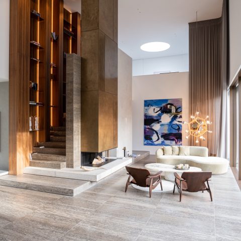
Loft renovation with light, sliding doors and marble details
Light falls deep into the room, where a former artist loft has been recast as a contemporary home with a clear sequence of spaces. The loft renovation keeps the volume open, but it does not leave everything exposed. Tall openings, a long line of joinery and a restrained palette of wood, stone and plaster guide the eye from one zone to the next. The result is a light-filled loft that feels organised without losing the broadness of the original shell.
Space held open, then set aside
The most visible move is the set of 3.5-metre-high sliding doors. When they move, they disappear behind an oak bookcase divider, so the room can shift from open plan to a more private arrangement. That mechanism gives the home a clear night zone separation without adding a heavy wall. It also keeps the loft renovation readable at a glance: one line of storage, one line of movement, and a room that can change its use as needed.
Behind that oak bookcase divider, the night area can be closed off from the living spaces while the main volume stays bright. The doors do not sit there as an afterthought; they are part of the spatial sequence. Their height reinforces the vertical scale of the loft, while the bookcase gives the division a domestic edge. In a room of this size, that kind of split matters. It allows the plan to remain generous and still gives each zone a clear role.
Sliding doors in a loft as a spatial line
The sliding doors in a loft work here as more than a partition. Because they glide away behind the oak shelving, they leave no visual clutter across the room. The opening stays legible, and the transition from living area to night zone feels controlled. The oak surface softens the technical function of the doors, turning a practical move into part of the interior composition. In a project built around light, that restraint helps the room stay open in daylight and contained after dark.
Joinery that carries the plan
The oak bookcase divider does a lot of quiet work. It stores, frames and conceals in a single gesture, and its length gives the space a horizontal anchor against the height of the doors. Rather than filling the loft with separate cabinets, the design uses one built-in element to organise the room. This makes the loft renovation feel disciplined: clear circulation, fewer interruptions, and a joinery piece that reads as architecture rather than furniture placed against a wall.
Seen from inside, the surfaces stay measured. Wood, white plaster and the pale tone of the bathroom finishes keep the palette controlled, so the apartment does not rely on contrast for effect. Instead, the details carry the project. A recessed door. A long shelf line. A stone surface that catches daylight. These are the elements that shape the interior, and they are what give the light-filled loft its pace from one end to the other.
A bathroom built around one long stone gesture
The bathroom shifts the tone with a 3-metre-long white marble vanity. Carved from Statuarietto marble, it runs across the room in a single, continuous plane. That length gives the wash area a strong horizontal presence, while the material keeps the surface visually calm. The vanity was made in Belgium and shipped to New York by sea container, a practical journey that ends in a piece with exact edges and a clean, pale surface.
Alongside the marble vanity, the bathroom marble finish on the walls introduces a softer, more textured reading of the room. Mortex finishes were used on the wall surfaces, giving the bathroom a material character that differs from the main living areas without breaking the overall language of the apartment. The room remains spare in its layout, but the finishes do the work of defining depth, edge and reflection.
Marble vanity and wall finish in one room
What stands out in the bathroom is the relationship between the long vanity and the wall surface behind it. The marble vanity is crisp and continuous; the wall finish is quieter and more tactile. Together they create a room that depends on proportion more than decoration. The long washbasin line also ties the bathroom to the wider loft renovation, where the same discipline appears in the joinery and the sliding partition. Nothing is overloaded, and every material has a clear role.
Light, view and the urban backdrop
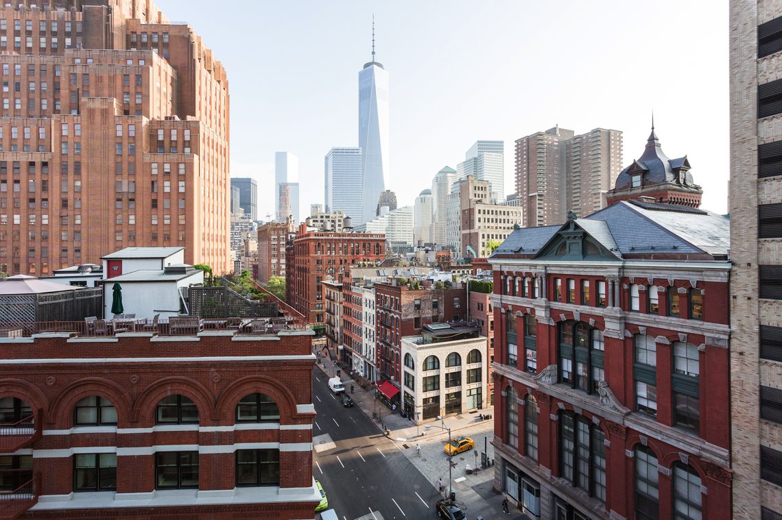
A window view adds another layer to the project. Brick buildings sit in the foreground, with taller structures beyond them, and the city view from the loft becomes part of the interior atmosphere without taking over the page. From inside, the framed outlook reinforces the sense of height and the urban setting, while the glass keeps the room connected to what lies outside. The view is not the subject of the project, but it does explain why the bright, open plan reads so strongly.
That urban backdrop also makes the interior materials feel more grounded. Brick, glass and stone appear in the visual field, while the apartment itself responds with oak, white marble and smooth wall surfaces. The contrast is not loud. It is built through scale and surface. The loft renovation turns that contrast into a clear domestic sequence: open living area, sliding partition, private night zone, and a bathroom with a long stone feature that holds its place at the end of the plan.
What remains after the bigger moves is a room that lets its structure show. The former artist loft is still generous in volume, but the added elements give it order. Tall sliding doors in a loft, the oak bookcase divider and the marble vanity each define a different part of daily use. Together they shape a home that reads as one continuous interior, yet still gives the night zone and bathroom their own distinct character within the larger space.
Want to see more of Dieter vander Velpen Architects? View the page of Dieter vander Velpen Architects for even more great projects and company information.





NEW 2026 Jubileum Edition The Best Interior Designers Benelux
Order Now €125


NEW 2026 Jubileum Edition The Best Interior Designers Benelux
Order Now €125


NEW 2026 Jubileum Edition The Best Interior Designers Benelux
Order Now €125