Loft renovation with open-plan reconfiguration
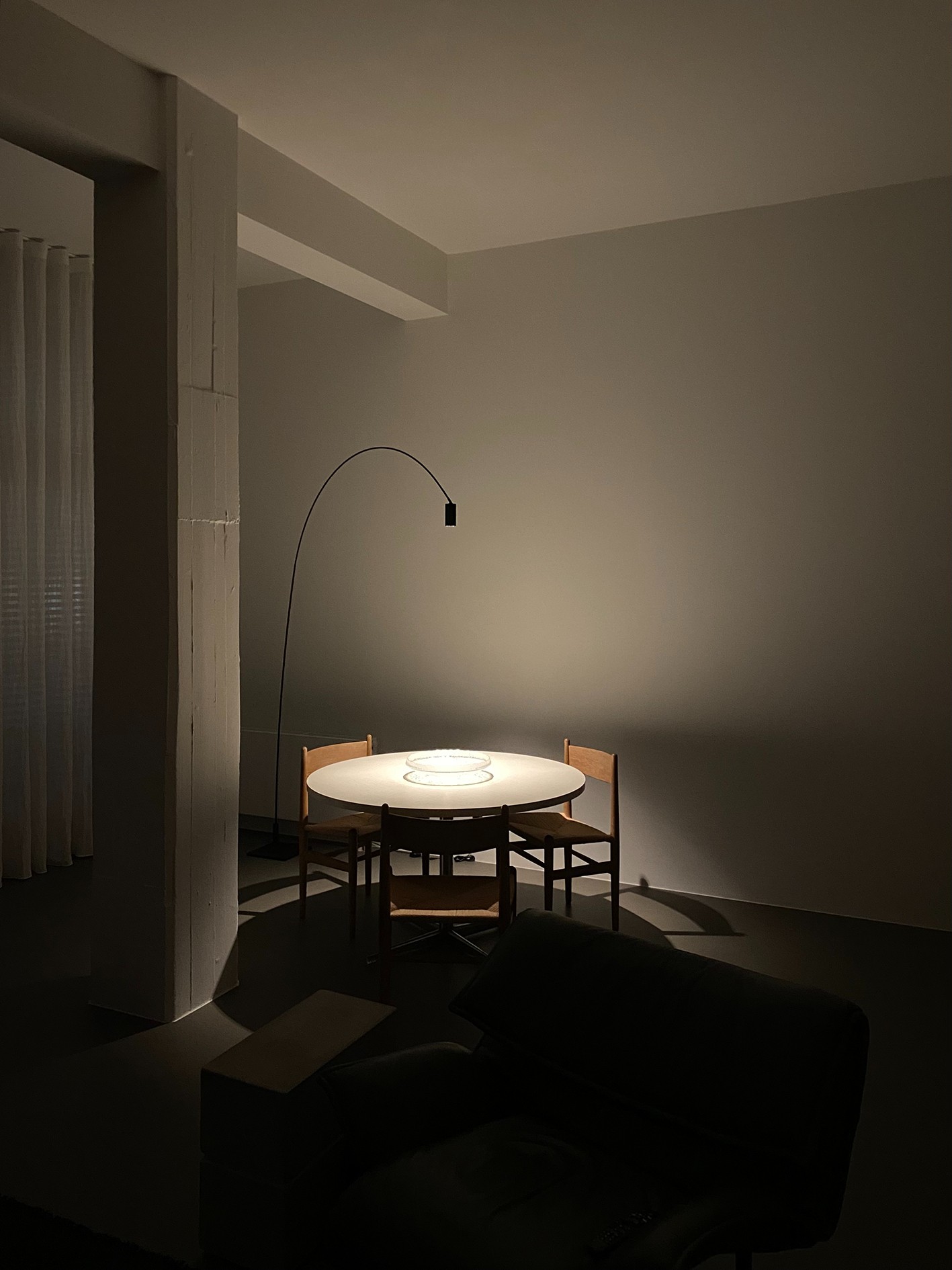
White plaster catches the light first, then the steel, then the darker floor and wall finishes. In this loft renovation, the open volume has been reworked so the room reads differently from one side to the next, without losing its sense of length and air. The former spice factory apartment, last renovated in 1991, needed a full update, and the new layout gives that large shell a sharper order.
Walls that divide without cutting off the room
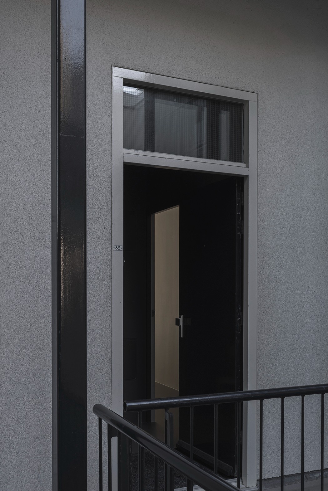
The most visible change sits in the plan. A series of strategically placed walls reshapes the open interior and makes room for two extra spaces, yet no additional doors were added. That means the circulation stays direct, while the new partitions still give each zone a clear edge. The result is not a closed-up plan, but an open-plan layout with walls that guides movement through the apartment in a calmer way.
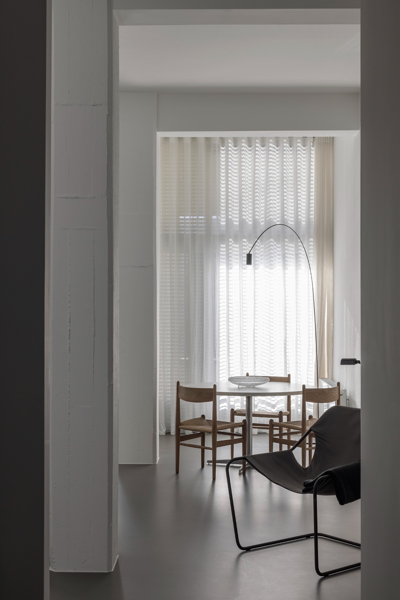
Seen across the main living area, those walls do more than divide. They frame long views, catch daylight from the large window openings, and give the white surfaces somewhere to stop and start. The changes are subtle from a distance, but the effect is practical: the apartment now has more defined rooms, while the original loft volume remains easy to read.
White plaster and grey tones set the pace
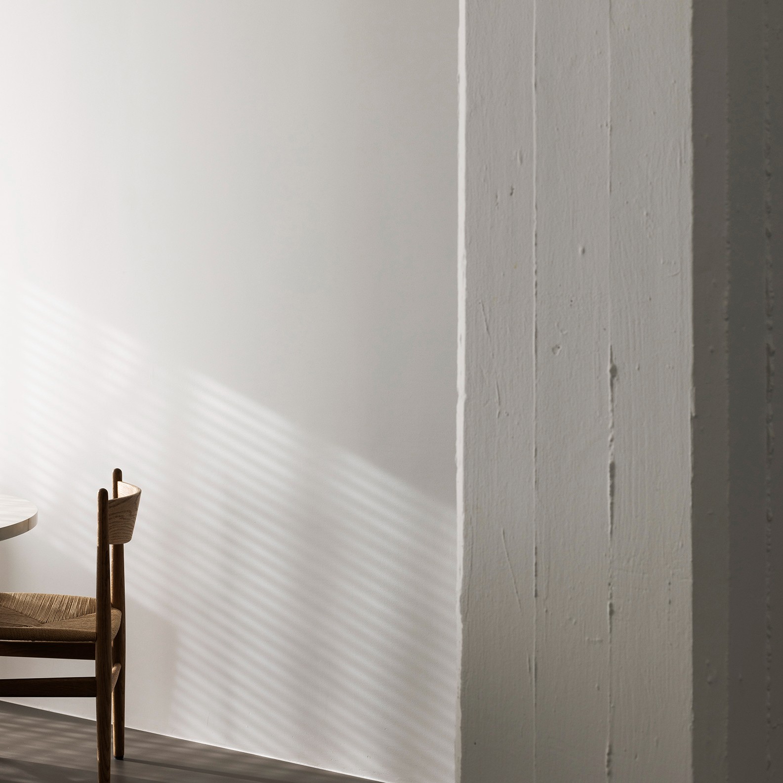
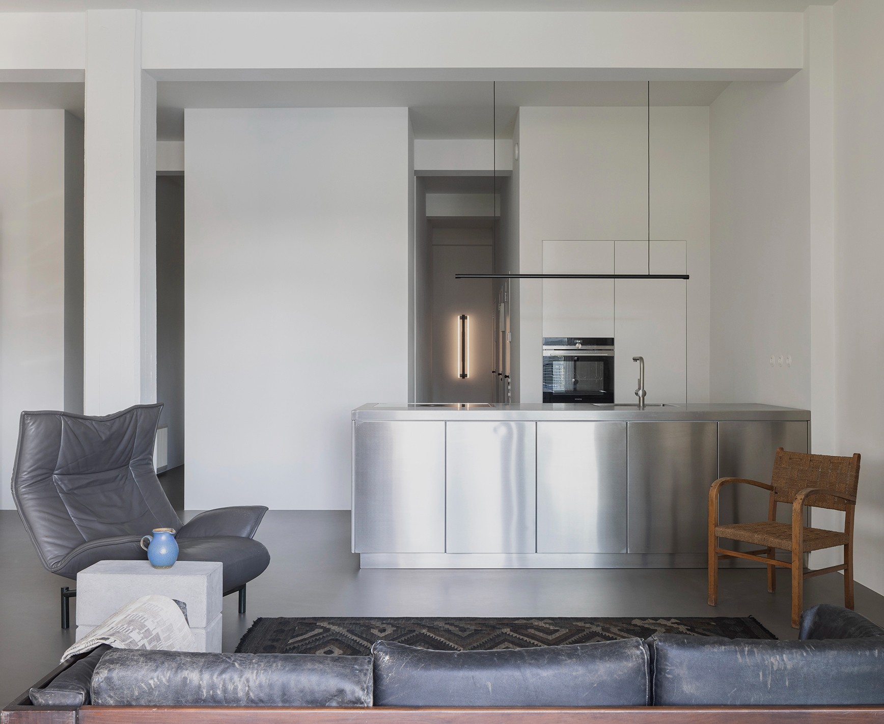
The material palette stays restrained. Bright white plaster covers the larger surfaces, while brushed stainless steel brings a cooler note to the kitchen and fixtures. Grey tones continue underfoot and across the wall finishes, so the apartment avoids sharp jumps in colour. The contrast is strongest where light hits a plastered wall and leaves a soft shadow line; in those moments the surfaces look almost architectural rather than decorative.
That palette also keeps the scale legible. In a room of this size, a heavy finish would flatten the space, but the combination of white plaster and grey tones keeps the walls receding and the openings visible. The brushed metal picks up reflections instead of demanding attention. It is a quiet shift, but it gives the apartment a clearer surface rhythm from one end to the other.
A stainless steel kitchen with a direct line
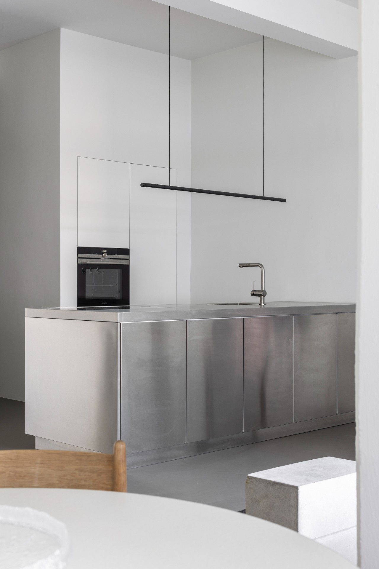
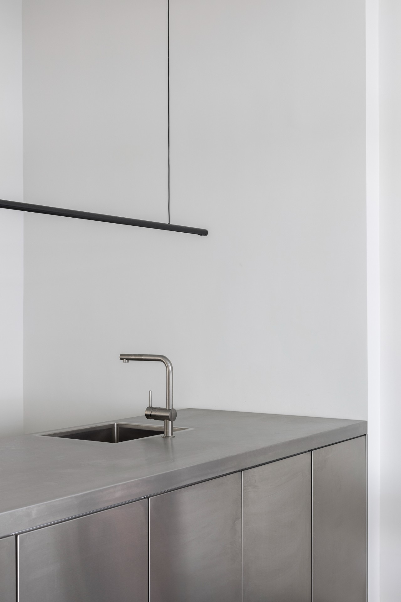
The kitchen follows the same discipline. White cabinetry sits against stainless steel elements, and the built-in oven appears as a black rectangle set into a niche. A linear pendant lighting piece hangs above the work zone, drawing a clean line through the room. The kitchen does not break away from the rest of the interior; instead, it uses the same white and grey register so the cabinetry, wall planes and ceiling line stay visually connected.
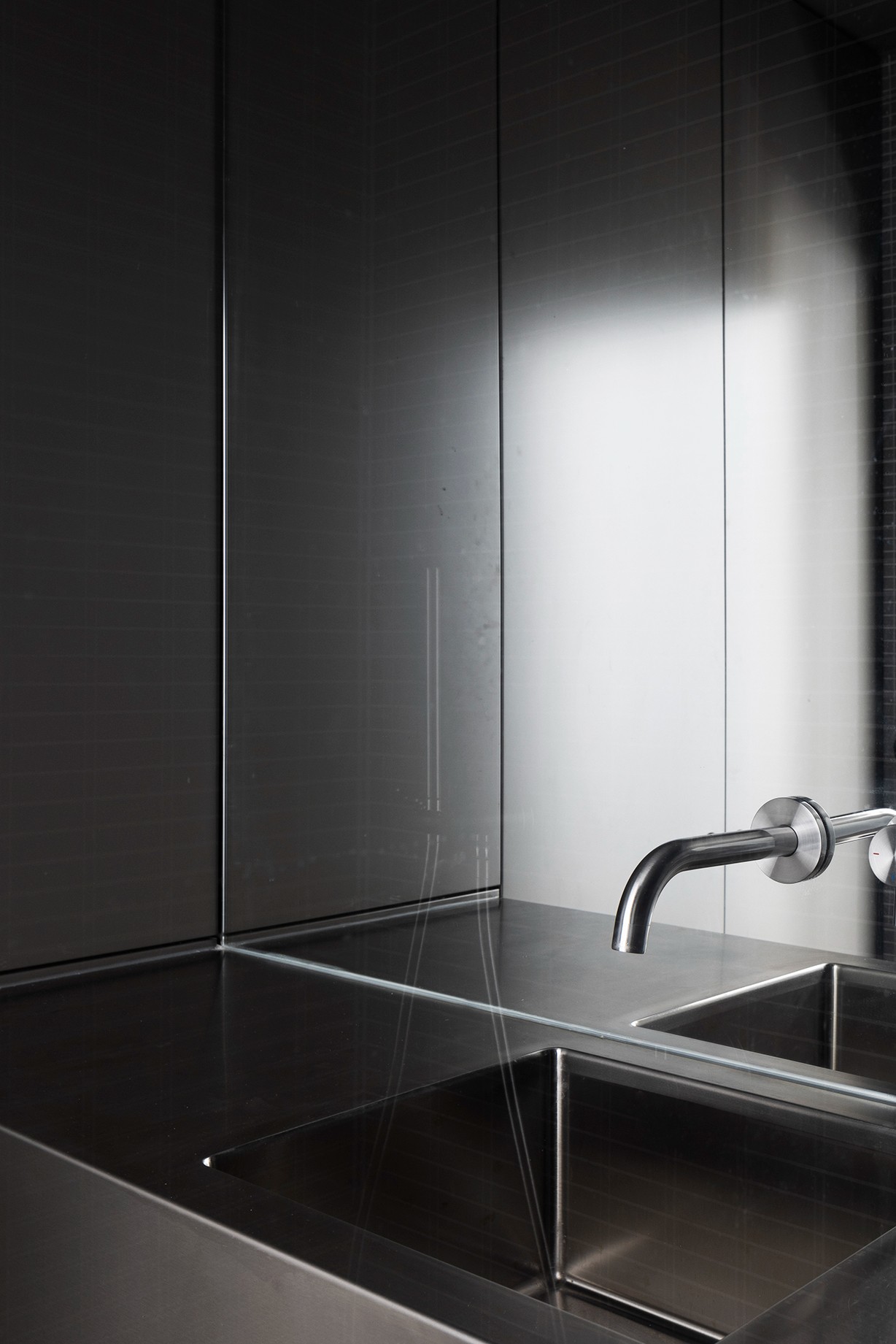
Close-up details make the kitchen feel exact rather than glossy. The sink, tap and steel worktop read as functional surfaces, while the straight lamp above them adds a narrow band of darkness to the lighter field of plaster and cabinet fronts. In one view, the apartment’s broader idea becomes very clear: create rooms without doors, then keep the materials calm enough that the transitions still feel open.
Light, fixture, and reflection in one strip
The line of the pendant matters because it repeats the apartment’s larger geometry. It runs parallel to edges, openings and cabinet fronts, so the eye keeps following the same direction. That is useful in a loft renovation where the volume is large and the partitions are new; the light fixture helps hold the composition together without adding visual weight. In the kitchen, the steel and the lamp do a lot of the same work: they mark the zone, then let the rest remain open.
The bathroom turns to darker surfaces
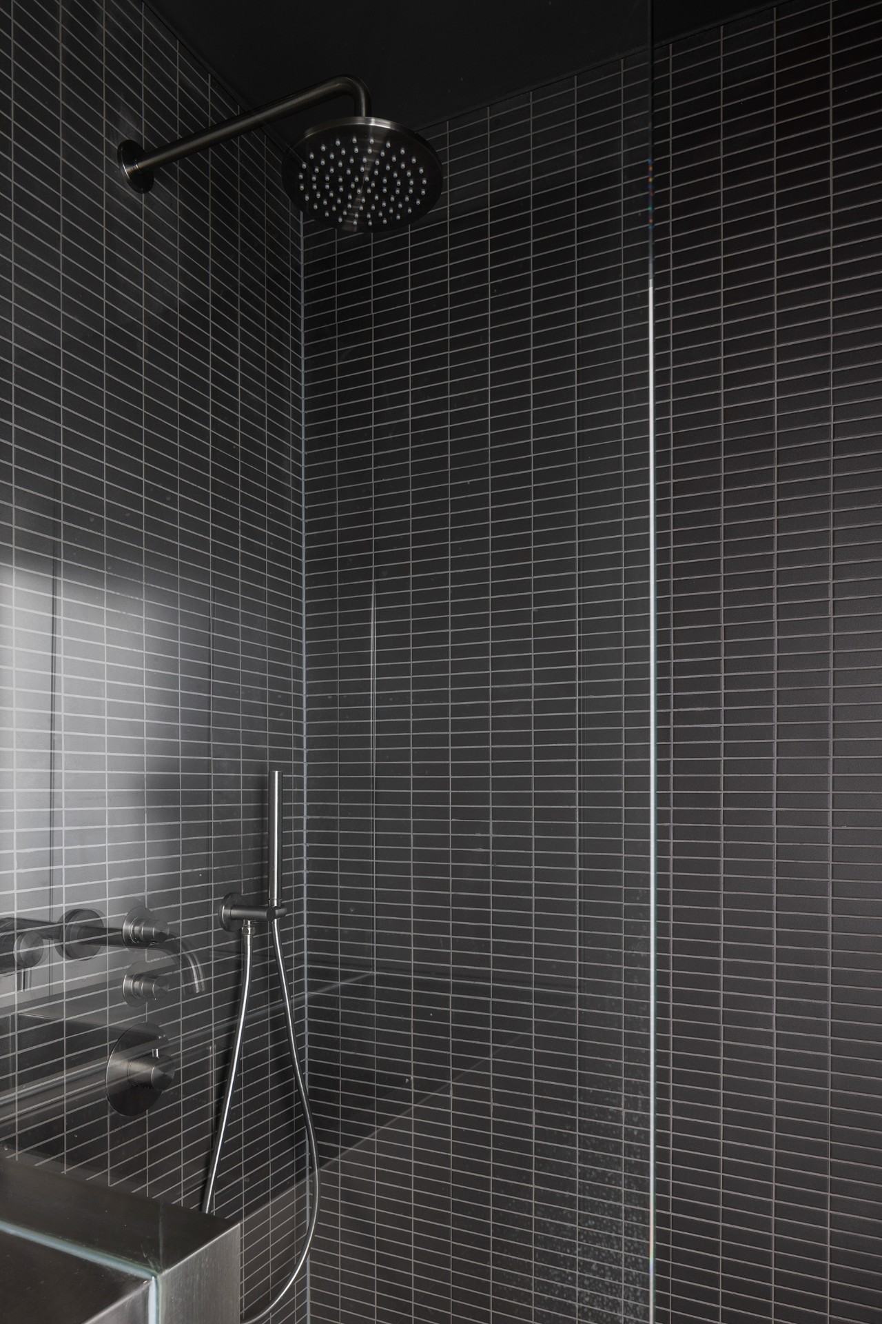
The bathroom takes a different tone. A dark tiled shower wall builds a denser backdrop, and the glass shower screen keeps the enclosure visible instead of hiding it. The tile grid is small and regular, with thin grout lines that sharpen the surface. A round shower head and compact fittings sit against that dark plane, so the room reads through edges and reflections rather than ornament. The change in mood is immediate, but it still belongs to the same renovation language.
Because the shower screen is clear, the eye keeps moving through the space instead of stopping at a solid partition. That transparency is important next to the darker tile field: it prevents the bathroom from feeling closed in and lets the floor and wall junctions remain readable. In a project built around open-plan layout with walls, this is one of the places where the new order is most precise.
Small moves that make the surfaces matter
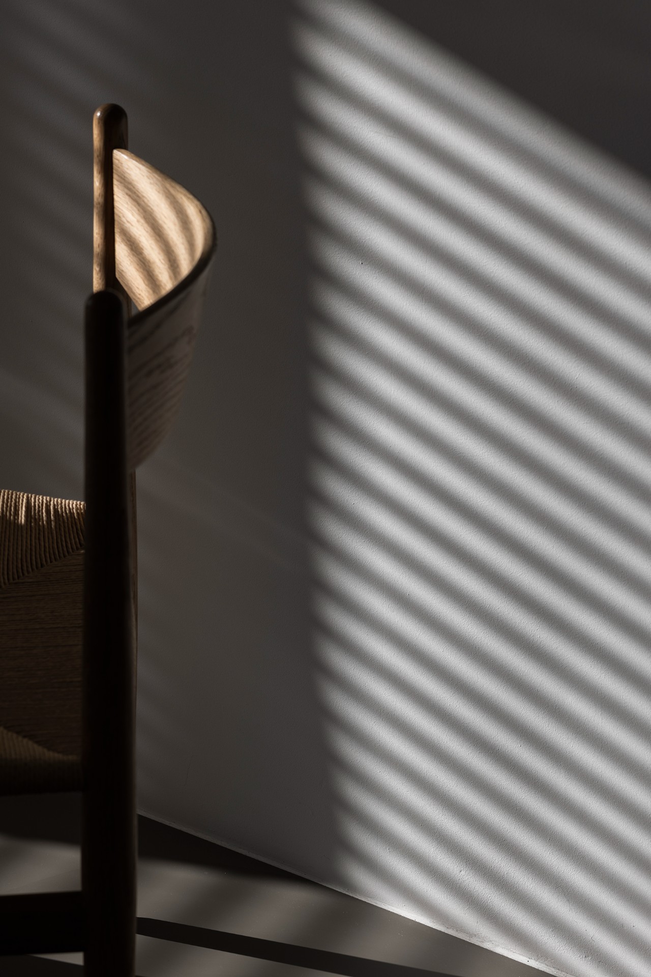
Several images focus on details rather than the whole room, and those close-ups are essential. A stucwork wall carries a band of shadow from the window light. A tiled floor shows a repeated grid, almost like a measured drawing made physical. Elsewhere, a black line of light hangs against white ceiling and wall planes, leaving a narrow contrast rather than a statement piece. These are modest elements, but they show how the renovation relies on edge, texture and repetition.
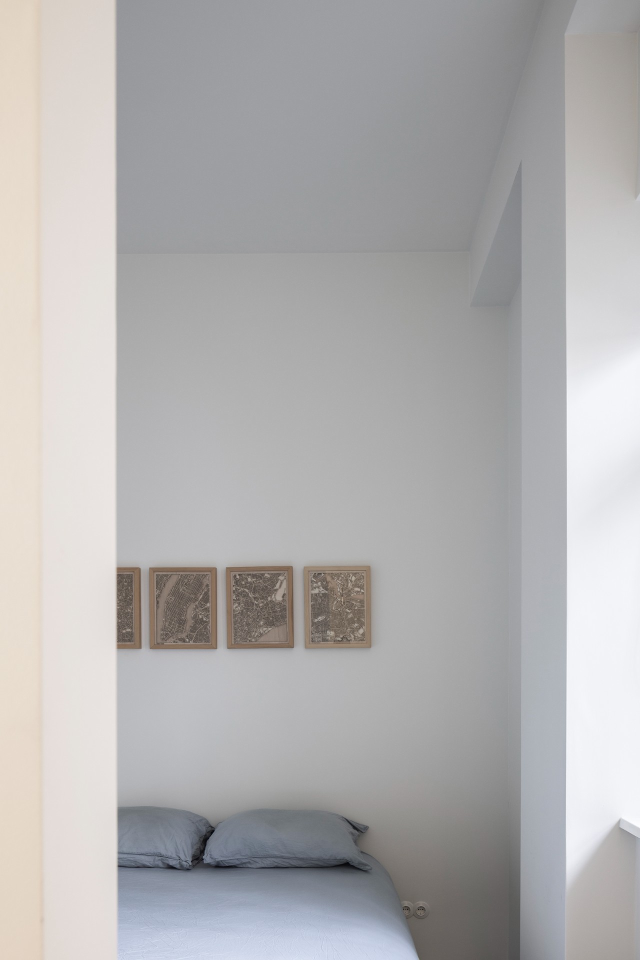
The bedroom view follows the same logic. White plaster walls and an inset niche above the bed zone give the room a clear horizontal cut, while the light floor trim keeps the base line neat. Nothing in the room pushes forward too hard. The surfaces stay present, and the niche adds a notch of depth that breaks the wall plane without cluttering it.
Daylight across white walls and floor coverings
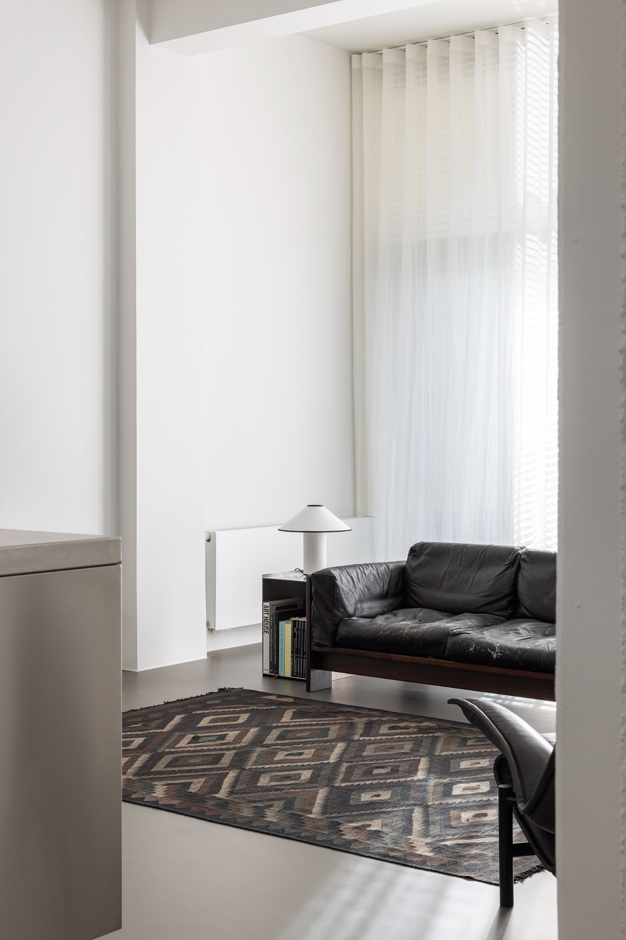
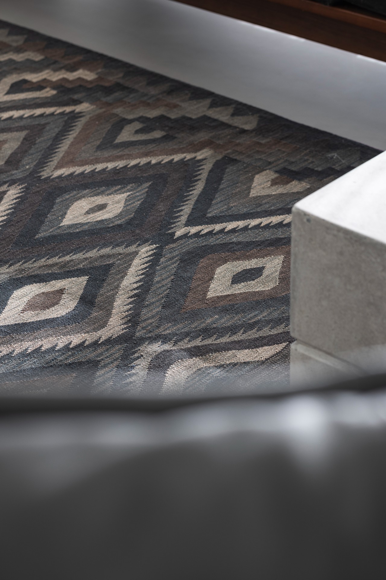
In the living area, daylight enters through a large window opening and runs across the white walls in long stripes. Curtains soften the opening, but they do not erase it. A patterned rug sits on the pale floor and holds the centre of the room, while the wall surfaces continue to frame the space in a steady way. Even in the broader views, the renovation keeps returning to the same idea: clear lines, measured partitions, and materials that let the loft stay legible.
What remains after the changes is an interior that reads as one project rather than a collection of parts. The open-plan layout with walls gives the apartment its new sequence, while the white plaster and grey tones keep that sequence calm enough to follow. Stainless steel, glass, and dark tile then provide the sharper notes. The result is a loft renovation where the new rooms are felt first through movement and light, and only then through their finishes.
Want to see more of kleinmann architecture? View the page of kleinmann architecture for even more great projects and company information.


NEW 2026 Jubileum Edition The Best Interior Designers Benelux
Order Now €125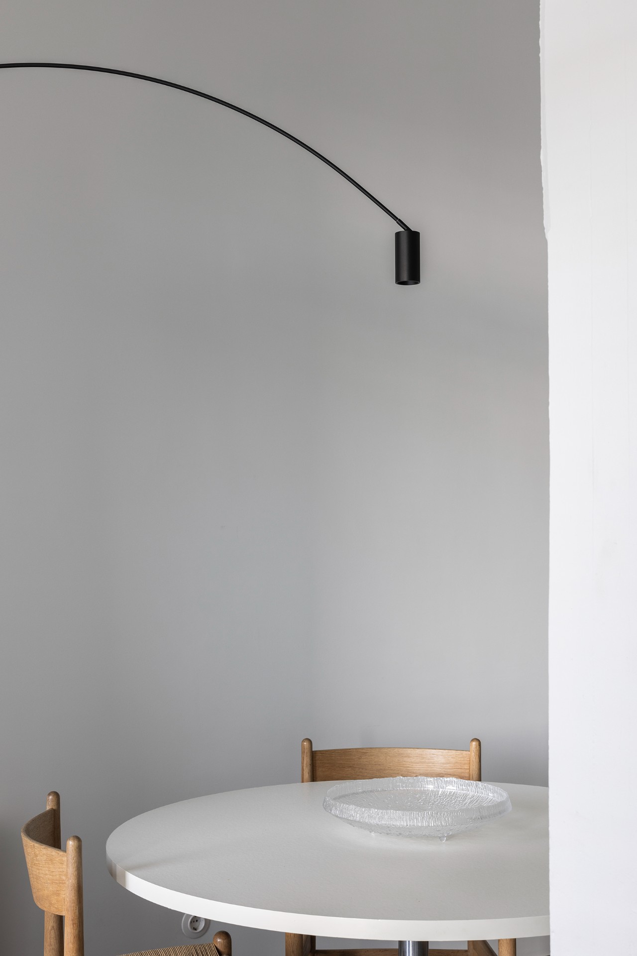
NEW 2026 Jubileum Edition The Best Interior Designers Benelux
Order Now €125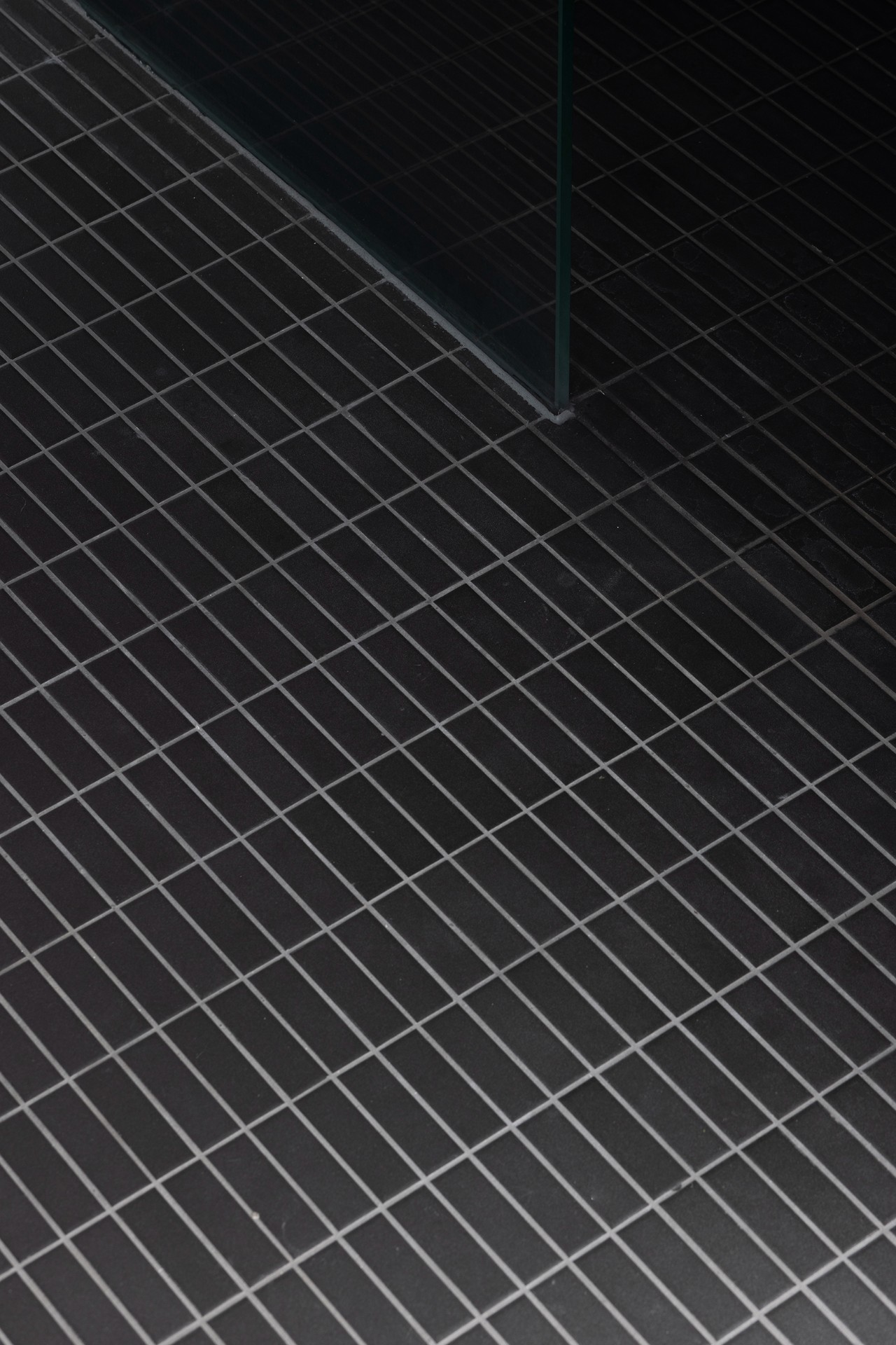
NEW 2026 Jubileum Edition The Best Interior Designers Benelux
Order Now €125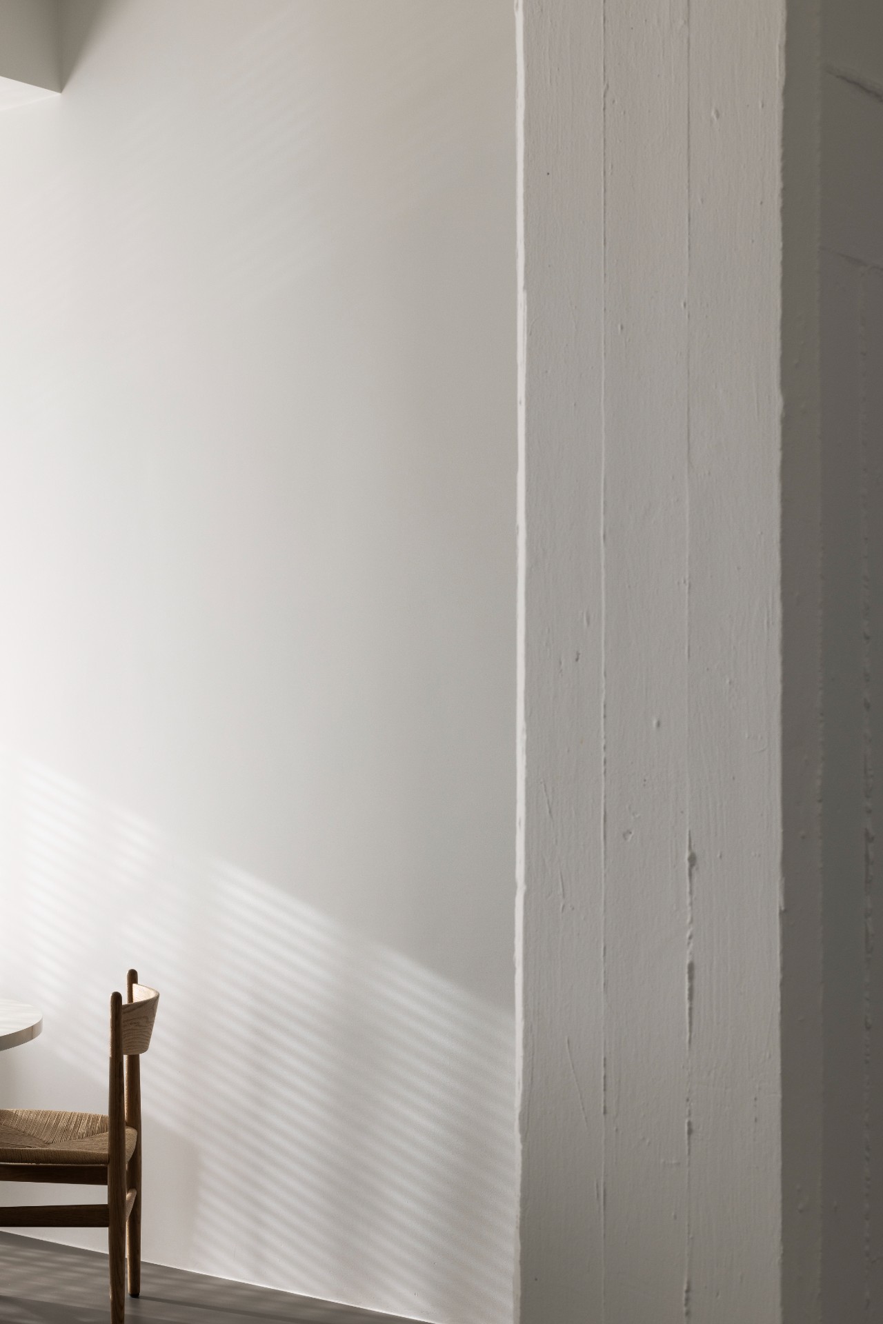
NEW 2026 Jubileum Edition The Best Interior Designers Benelux
Order Now €125