Luxury custom interior in a modern new-build home
The warm tone of the wood floor sets the pace from the first step. Against that surface, dark cabinetry, stone-look panels and a built-in fireplace wall shape a luxury custom interior that feels drawn around daily use rather than around display. The project was produced entirely to the design of the interior stylist mentioned in the source text, with decorative board material chosen for its rich, warm effect.
A fireplace wall that anchors the living room
In the living area, the fireplace wall reads as the main fixed point. A built-in fire sits within a surround of board material, with spots set around the opening and wall-mounted storage extending the line across the room. The dark finish gives weight to the wall, while the lighter floor keeps the room from closing in. Through the windows, layered curtains and horizontal blinds soften the large openings without hiding them.
The modern luxury living room is not built on one gesture alone. A chandelier hangs above the seating area, catching the light from the recessed lighting in the ceiling. Nearby, a low sofa and a wall with round mirrors introduce a different rhythm: softer, lower, more reflective. The result is a room where the fireplace wall stays central, but never works alone.
Dark custom cabinetry with open niches
Across the living and circulation areas, dark custom cabinetry appears in long runs with open niches cut into the fronts. Some sections remain closed and flat; others frame objects or equipment in shallow recesses. That shift between solid panels and open voids gives the walls a measured cadence. In the hallway, the cabinets line up with the sightline, so the joinery shapes how the rooms connect as much as how they store.
The same discipline appears in the kitchen zone, where tall fronts conceal appliances and open pockets interrupt the vertical plane. The stone-look kitchen backsplash sits behind the worktop like a single sheet, adding contrast without breaking the line of the cabinetry. It is a practical arrangement, but also a visual one: dark volumes, pale surface, and the hard edge of the counter meeting the softer pattern of the wood floor.
Warm wood herringbone floor and darker accents
The floor carries a clear pattern, with the warm wood herringbone floor visible in several rooms. That pattern gives movement to spaces that are otherwise sharply drawn. Along the haardwand and through the kitchen, the floor catches light differently at each angle, which makes the room feel less static than a flat surface would. Dark wood accents return in the cabinetry and shelving, repeating the contrast in a more solid form.
Natural light reaches the interior through broad windows, but the project does not rely on daylight alone. Recessed lighting is set into the ceiling and along wall lines, so the rooms hold their shape after dark. In the hall and on the ceiling edges, the small downlights mark the route through the house. They also pick up the texture of the decorative board material, which looks smoother in some areas and denser in others.
A kitchen that holds the same material language
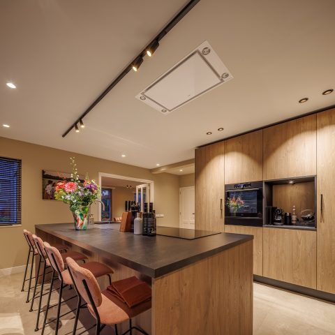
The kitchen keeps to the same palette as the living room, though in a quieter register. Dark base units sit below the work surface, while the tall cabinets rise with a clean vertical line. The stone-look kitchen backsplash introduces a pale, veined surface that breaks up the darker joinery. Seen beside the dining table, it helps the kitchen read as part of the larger interior rather than as a separate zone. The transition is direct: worktop, cabinetry, window, table.
One image shows the kitchen from the side, where the high fronts include integrated appliances and open shelves. Another frames the room from the dining end, with horizontal blinds filtering the window and a glimpse of the passage beyond. These views make the luxury custom interior feel assembled from linked rooms, not isolated features. Every line is doing more than one job, from storage to sightline to light control.
Details that pull the eye through the plan
What stands out most in the kitchen and adjacent areas is how the surfaces meet. The dark cabinetry stops cleanly at the edge of the backsplash. The floor pattern runs underneath without interruption. Even the opening between the kitchen and dining space is treated as a clear frame, so the eye can move from one zone to the next without losing the structure of the interior. That clarity suits a custom interior project where the joinery has to guide the room.
In the circulation area, a mirrored wall and repeated circular mirrors add reflection without turning decorative. They catch fragments of the room: the sofa, the light fittings, the darker wall planes. Set against the more restrained cabinetry, those reflections break up the surface and keep the living area from reading as too enclosed. The effect depends on spacing as much as on finish, with each element placed to support the next view.
A walk-in dressing room with full-height storage
The walk-in dressing room brings the same custom approach into a more contained setting. Full-height storage rises to the ceiling, leaving only narrow gaps for display and access. Recessed lighting runs across the ceiling, and a window with curtains adds a softer edge to the straight cabinet fronts. Here, the joinery is not background; it defines the room. The storage volumes set the width of the passage and decide where the eye lands first.
Because the surfaces stay dark and flat, the dressing room relies on line and proportion rather than ornament. Open niches interrupt the cabinet fronts, and their lighter interiors keep the wall from feeling continuous. The room connects to the broader custom interior through the same board material and the same disciplined use of light. It is the quietest space in the project, but also one of the most exact.
Materials that do the visual work
The source text points to decorative board material as a defining element, and the images show why. It gives depth to the fireplace wall, the cabinetry and the built-in storage, while the wood floor and stone-look surfaces keep the palette from becoming one-note. In this luxury custom interior, the materials are not layered for effect alone. They are used to separate zones, sharpen edges and hold the rooms together through repeated tones of brown, black, beige and silver-grey.
Viewed as a whole, the project moves between openness and enclosure with very few gestures. A window with blinds, a shelf cut into a dark wall, a fire placed low in its surround, a strip of light in the ceiling: each detail is modest on its own. Together they give the new-build home its measured feel and make the custom-made interior legible from room to room.
Want to see more of SANT Interiors? View the page of SANT Interiors for even more great projects and company information.

Contributors



NEW 2026 Jubileum Edition The Best Interior Designers Benelux
Order Now €125


NEW 2026 Jubileum Edition The Best Interior Designers Benelux
Order Now €125