Luxury interior with custom joinery and wellness
Large panes of glass set the tone before the joinery does. Light runs across dark wall units, stone-look surfaces and pale floors, while the built-in pieces hold the room together without drawing attention to themselves. In this luxury interior with custom joinery, the clearest move is the way storage, openings and finishes are folded into the architecture of each space. The result is not about excess. It is about control, line and the quiet presence of wall-to-wall storage.
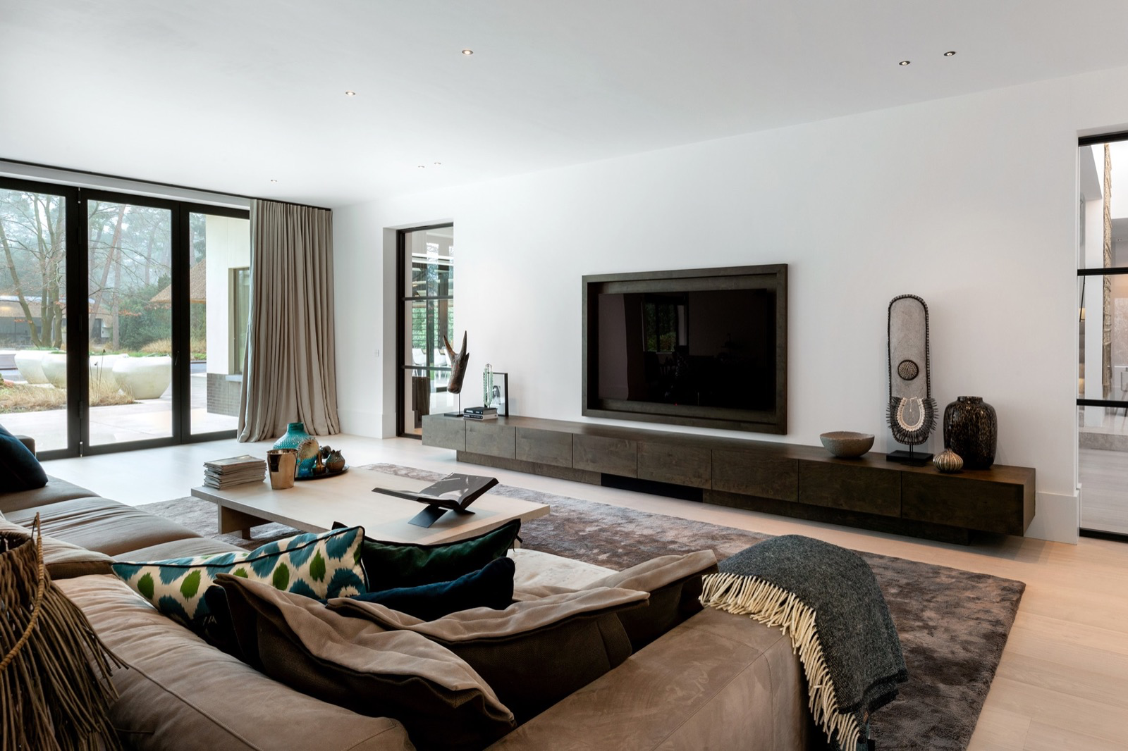
That approach appears first in the living spaces, where custom built-in wardrobes and low cabinetry stretch across the wall in long, level bands. Dark fronts break up the white surfaces and keep the room visually grounded. A rectangular opening in one wall reads almost like a frame, giving the television zone and the storage behind it a more precise edge. Around it, the modern luxury living room stays open to the outside, with large windows bringing the garden into the same field of view as the furniture.
Built-in storage that follows the room
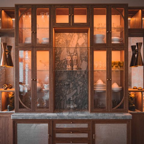
The joinery is doing more than filling empty space. It sets the rhythm of the interior. In hallway-like zones and along the main walls, built-in cabinetry turns unused surfaces into storage and display. Some fronts are dark and closed, others open into niches or recessed voids with hidden light. Those details keep the wall length from feeling flat. Instead, the eye moves from panel to panel, from matte surface to illuminated recess, from closed volume to open cut-out.
Wood is used to soften that geometry. It appears in long horizontal runs, in ceiling elements, and in parts of the cladding that meet the glass. Against the stone-look and glass, the timber adds a visible grain and a warmer tone, but it never becomes decorative noise. In several rooms the finish remains restrained, letting the joinery, the glazing and the clean floor surfaces do the work. That restraint gives the luxury interior joinery its clarity.
A glass spa partition beside the pool
The wellness zone shifts the atmosphere without changing the language of the project. A glass spa partition separates the indoor pool area from the sauna side, so the spaces remain visually connected while still clearly divided. The glass reflects the light and exposes the lines of the adjacent room. Warm illumination picks up the edges of the walls and the ceiling, and the pool water adds another moving surface to an otherwise controlled interior. It is a practical separation, but it also keeps sightlines open.
Here the material palette stays factual and direct: glass, plastered or microcement-like walls, and wood above or around the sauna elements. The surfaces are smooth, but not blank. Light catches on them at different depths, especially where the partition meets the water and where darker framing outlines the openings. The wellness interior does not interrupt the rest of the house; it sits within it as another carefully detailed room, built around transparency and enclosed heat.
Why the wellness interior reads so clearly
The answer is the contrast between enclosure and visibility. From one side, the glass division makes the pool zone readable at a glance. From the other, the darker frames and wooden finishes give the sauna area a stronger edge. Nothing is over-modeled. The eye reads surface, line and reflection first. That is what keeps the spa area connected to the rest of the project rather than turning it into a separate scene.
Light, wood and stone-look surfaces in the main rooms
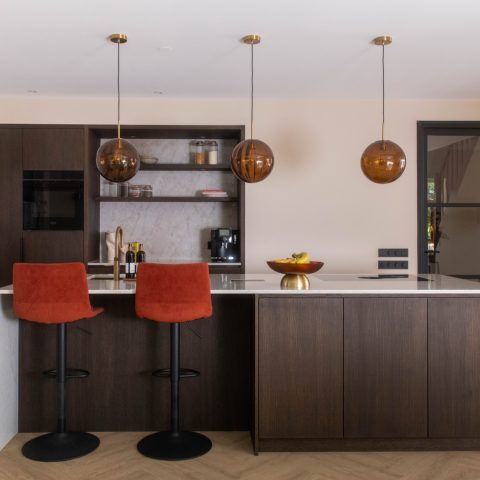
In the main living areas, the windows do most of the spatial lifting. They pull daylight across the floor and make the joinery sit flatter against the wall. A kitchen-dining zone appears with a long table or island element, paired with a row of glazed openings and built-in storage in the background. The proportions are generous, but the detailing stays disciplined. White seating, dark framing and warm wood elements keep the room from feeling visually loose. It reads as a modern luxury living room and dining space built around straight lines and measured contrasts.
Elsewhere, the same material order repeats in a quieter key. Dark panelled walls create depth in a bedroom-like space, while integrated openings and recessed shelves keep storage close to the surface. A large glazed passage and a long line of floor material continue the project’s preference for clear routes. The custom interior joinery is not treated as an isolated product; it is what allows the rooms to hold their shape as the plan moves from one zone to the next.
Bathroom pieces with a restrained edge
The bathroom details push the palette into a tighter frame. A dark vanity sits beneath a round mirror with a black rim, and the curved tap softens the geometry without turning decorative. Stone-look surfaces keep the block-like console visually heavy enough to anchor the wall. Above it, small ceiling spots pick out the mirror and the countertop. The room relies on a few measured moves: round against square, dark against white, reflective against matte. That is enough for the built-in cabinetry to feel integrated rather than added.
Another bathroom view shows a larger rectangular mirror and a wider stone-look console, again with integrated storage below. The surfaces are smooth, but the joint lines remain visible. Nothing is over-finished to the point of disappearing. That matters in a project like this, where the custom interior joinery has to work with glass, stone-look materials and controlled lighting rather than compete with them. Even the smallest cabinet plane contributes to the room’s overall reading.
Wine storage behind glass and metal
The wine room gives the project a more technical note. Bottle storage runs across the wall in illuminated rows, and glass doors or a glass enclosure hold the collection in view. The shelving lines are tight and repetitive, which makes the bottles themselves part of the composition. Nearby, a separate technical-looking zone with metal tanks and pipework adds another layer of utility, but the same principle remains: visible order, clear edges and materials that show their function. The wall-to-wall storage idea continues here in a different scale.
Seen together, the rooms build a consistent interior language. Custom built-in wardrobes, dark wall units, glass partitions and illuminated niches create a sequence where each space has its own use, but the detailing stays connected. The project is strongest when the joinery is allowed to define the room rather than decorate it. That gives the house its precision. It also keeps the wellness interior, the living areas and the private rooms tied together through material, light and repeated lines.
Joinery that shapes the way the house is read
What stands out across the project is the role of the fitted work itself. Cabinets disappear into long walls, niches cut through dark panels, and glass keeps the spa and storage zones visible without exposing everything at once. The use of wood, stone-look finishes and black framing gives the interiors weight where they need it, while the large windows pull the spaces back toward daylight. For anyone looking at custom interior joinery, this project shows how built-in cabinetry can set the tone of an entire residence without needing to dominate it.
The strongest images do not show isolated objects. They show how a wall unit meets a window line, how a glass spa partition lines up with the pool edge, how a vanity sits into a white wall, and how illuminated wine storage sits behind clear panels. That is where the work has its impact: in the joins, the recesses and the measured surfaces that make the rooms legible. Luxury interior joinery here is not about ornament. It is about giving each space a clear frame and a useful edge.
Want to see more of Boreas? View the page of Boreas for even more great projects and company information.





NEW 2026 Jubileum Edition The Best Interior Designers Benelux
Order Now €125


NEW 2026 Jubileum Edition The Best Interior Designers Benelux
Order Now €125


NEW 2026 Jubileum Edition The Best Interior Designers Benelux
Order Now €125