









Microtopping wall finish with a microcement look (video explanation)
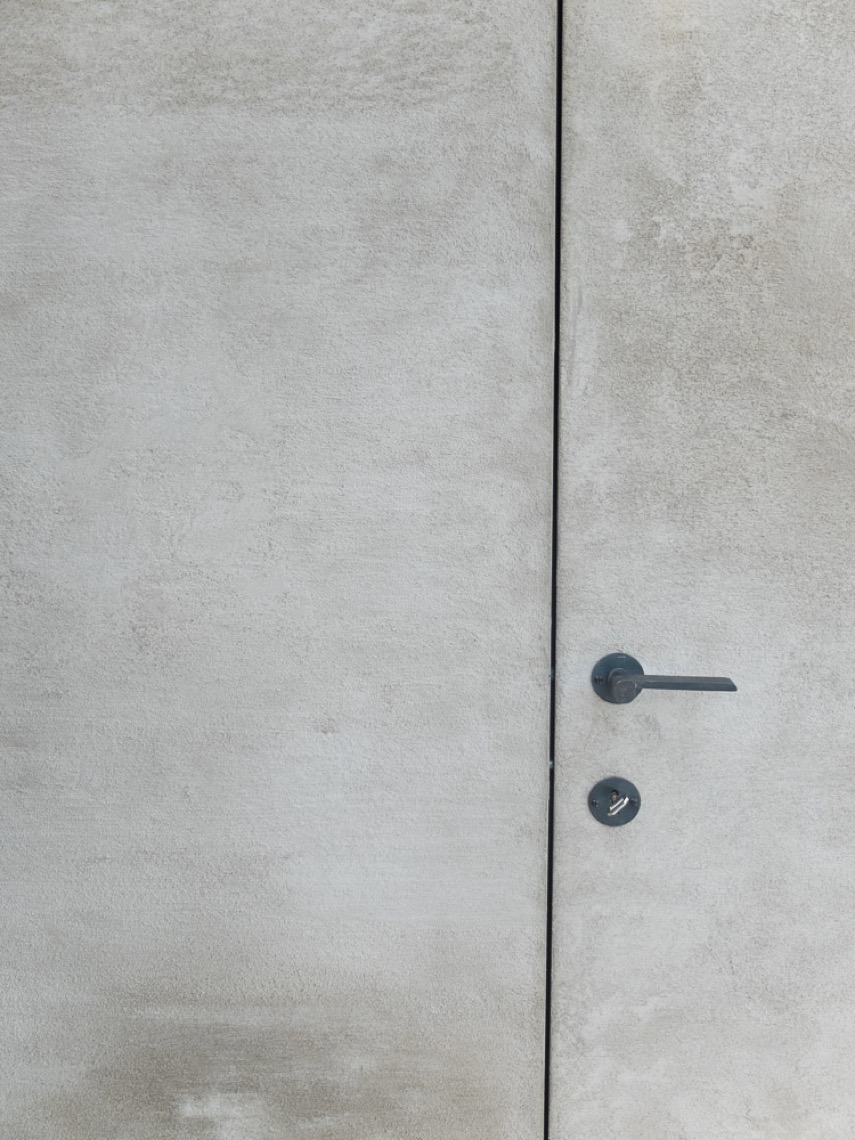
Matte texture catches the light first. The wall reads as a microtopping wall finish, with a fine speckled surface that shifts from sand beige to light grey as the angle changes. A recessed round detail sits close to the edge, while a slim vertical line runs beside it and gives the surface a measured rhythm. It is a small interior study, but the material carries most of the scene.
A surface that does more than cover a wall
In this project, microtopping is presented as a finish with a wide field of use. The source links it to worktops, floors and bathrooms, but the wall image makes the material feel even more direct: thin, matte and tightly drawn across the plane. That microtopping wall finish does not compete with the room around it. It frames a few precise gestures instead, and that restraint gives the detail weight. The result reads close to a microcement look, though the emphasis stays on the surface itself rather than on a product label.
The wall detail also shows how a finish can hold hardware and lines without losing clarity. The black circular inset breaks the beige field cleanly, and the pale vertical strip beside it adds a narrow axis. Together they make the wall feel measured, almost diagrammed, yet still tactile. This is where the matte wall texture matters most: it softens the geometry enough for the eye to stay on the material, not only on the cut-outs.
Video context, not a step-by-step lesson
The page is introduced through a video explanation, which places the material in an editorial rather than instructional frame. Nothing in the source suggests a DIY walkthrough or a technical sequence, so the emphasis stays on how microtopping is presented and where it can be applied. That broader view matters. It connects the wall finish to the same family of uses mentioned in the text: worktops, floors, bathrooms and custom furniture. The video simply anchors the subject in a concrete example.
Seen that way, the microtopping wall finish becomes part of a larger interior language. It can move from a horizontal work surface to a vertical plane without losing its character. The page does not overstate the process; instead, it lets the material and the image carry the explanation. The surface remains calm, but the small recess and the vertical line show that this kind of finish can handle details without becoming visually noisy.
The Clouds table as a precise application
The source points to a recent creation from the atelier: the Clouds table. It is mentioned as an example of custom microtopping furniture, and that reference helps place the finish beyond walls and wet rooms. A table in this material has to work at close range, where hands, edges and joins are read immediately. That is why the project mention matters. It shows microtopping not as a surface reserved for one room, but as a material that can be shaped for furniture with a tailored profile.
What connects the table and the wall detail is the treatment of the plane. Both rely on a stable skin with a quiet surface movement. The wall photo suggests that same approach through its fine grain and the rounded inset. The table is named in the source, but the page keeps the focus on the idea it represents: custom microtopping furniture can sit within the same visual language as a microtopping wall finish, even when the application changes.
From worktops to bathrooms, one material language
Microtopping is described in the source as versatile, and the listed applications give that claim substance. Worktops bring the material into close contact with use. Floors stretch it across a larger field. Bathrooms ask it to meet water and edges. The page does not need to explain each setting in detail to make the point. Instead, it shows a finish that can travel from one interior condition to another while keeping the same matte reading and the same controlled surface depth.
That breadth also explains why the image matters. A wall is usually read quickly, yet here the texture slows the eye down. The recessed round detail and the vertical line give the surface a second layer of reading, so the wall becomes more than a backdrop. It becomes a test case for the material. Seen beside the source text, the image makes the microcement look feel practical rather than decorative, tied to real uses rather than abstract styling.
What the close-up reveals
The colour range is restrained: sand beige, light grey and black. That limited palette lets the texture do most of the work. The matte wall texture absorbs reflections, so the surface looks almost powdered until the light moves across it. Then the fine speckling appears. The black inset reads as a crisp counterpoint, while the pale vertical strip trims the edge of the frame. Together they create a compact composition built from surface, shape and line.
This is also where the recessed wall detail becomes important. It breaks the plane without interrupting it, which suits a finish like microtopping. The detail is not decorative in itself; it is simply a cut into the wall that gives the material a point of emphasis. Because the finish is so even, every small opening stands out. The visual effect is modest, but it is enough to show how the material responds to inbuilt elements and narrow profile changes.
A finish that keeps the focus on proportion
Microtopping often works best when the room stays quiet around it. In this project page, the surface is allowed to do that job. The wall spans the frame with almost no interruption, and the few interruptions that remain are deliberate: one round black inset, one slim vertical line, one subtle change in tone. The composition depends on proportion rather than decoration, which is why the finish reads clearly even in a close crop.
That same discipline makes the material easy to imagine in other interior uses named by the source. On a worktop, the edge would matter. On a floor, the field would widen. In a bathroom, the joins would become part of the reading. On custom furniture, the surface would have to carry the object’s shape. The project does not spell out those scenarios in technical terms, but it gives enough clues to see how the material behaves across them.
Why this project page matters for interior finishes
As a project spotlight, the page works because it stays close to the visible facts. It shows a microtopping wall finish with a microcement look, then widens the frame through the video explanation and the Clouds table reference. The result is a compact introduction to a material that can move between wall, furniture and other interior surfaces without changing its basic character. What remains constant is the matte surface and the way it takes light.
That consistency is what the image finally makes clear. The wall is not polished into reflection. It holds texture. The inset and the vertical line sharpen the reading without turning the detail into a pattern. In that sense, the page is less about presentation than about attention: to a surface, to a cut in the wall, to a piece of custom furniture, and to the small shifts that make microtopping useful across different interior settings.
Want to see more of Texture Painting? View the page of Texture Painting for even more great projects and company information.






%20-%20)