Mid century modern interior with custom details and warm oak accents
Warm oak, white walls and broad panes of glass set the tone before the room’s details come into view. The layout moves from one zone to the next without hard breaks, so the living area, kitchen and adjoining spaces read as one route rather than a series of separate rooms. In this mid century modern interior, the quieter elements do most of the work: fitted storage, slim lighting lines and surfaces that keep their edges clean.
Custom wall storage and niche lighting
The living room is anchored by custom wall storage with a clear grid of open and closed sections. Recessed light washes the niches and picks out the depth of the shelving, while the darker back panels make the objects stand forward instead of disappearing into the wall. Across the room, the storage runs beside a lowered seating area and a broad rug, so the built-in joinery becomes part of the room’s structure rather than an add-on. That measured approach gives the mid century modern interior its strongest line.
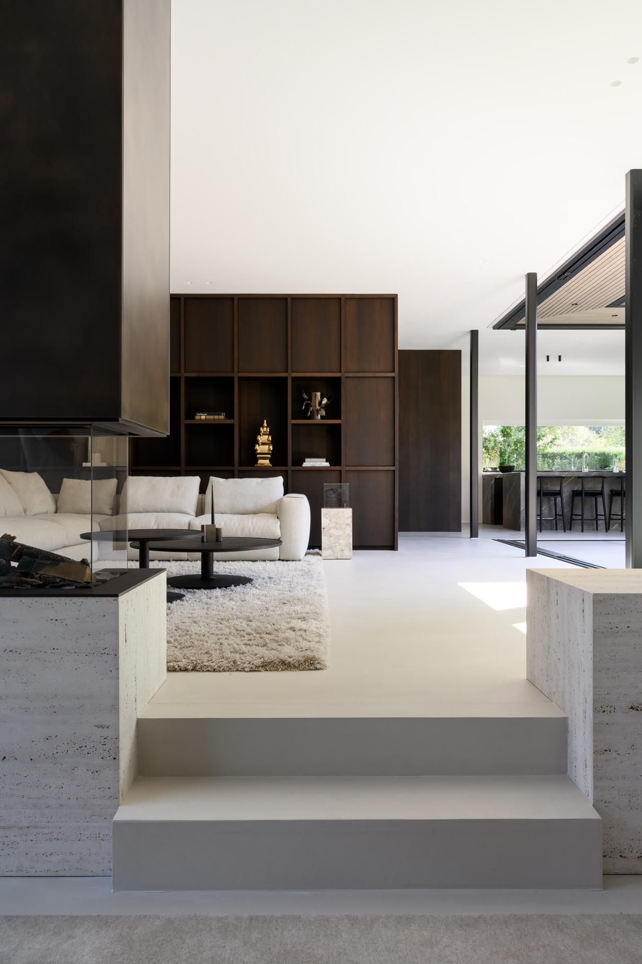
Small shifts in level shape how the space is read. A raised platform in one view introduces a slight pause before the eye moves toward the doorway and the large glass opening beyond. The sequence is calm but not flat. White surfaces keep the volume open, while oak details interrupt that brightness with a softer grain. The result is a room that relies on proportion and placement, not ornament, to hold attention.
Warm oak tones against white walls
Oak appears as trim, panels and cabinet faces, often in smoked or deeper tones that sit well against the white walls. The wood is not used as a broad decorative layer. It appears where the hand meets the room: around a niche, along a storage run, beside a corridor wall. Those measured insertions give the interior a grounded rhythm, and they also connect the different parts of the house through a shared material language. In this mid century modern interior, the oak does more than soften the surfaces; it sets the pace.
In the corridor, the contrast is especially clear. White plastered walls hold the light, while timber panels mark the route toward the stair. A slim dark support element cuts through the composition and keeps the passage from becoming merely transitional. Nearby, a rectangular framed niche in wood tones opens into a darker recess, a small detail that shows how the project handles storage and display with the same restraint as the larger rooms.
Stone fireplace wall in the seating area
The fireplace sits inside a stone-like wall that reads as one of the few rougher surfaces in the house. Its texture gives the lounge a firmer centre, especially beside the pale upholstery and the smooth joinery opposite it. In one view, the fire is set into a dark plane that makes the opening feel precise and deep. In another, the hearth is paired with a broad corner sofa and a timber wall section to the side, so the room shifts between softness and structure without losing its clarity. The stone fireplace wall is the visual weight that holds the lounge together.
Large glass openings keep pulling the room outward. One image looks across the seating area to greenery outside, where the edge of the house dissolves into the view. Another shows the living room opening toward a covered outdoor zone, making the inside-outside transition easy to read. Vertical slats and slim lines in the architecture frame that movement, while round ceiling spots keep the ceiling plane quiet. The whole sequence depends on transparency and restraint, not spectacle.
Kitchen bar with a stone look
The kitchen bar is set against a large window, so the countertop and the view sit side by side. The stone-look surface stretches out in a pale slab, supported by dark-framed stools that keep the profile light. Above and around it, timber panels divide the wall into narrow vertical sections and a built-in niche carries appliances and glass-fronted storage. The kitchen bar stone look gives the room a firmer centre, while the surrounding wood keeps the setting from feeling severe.
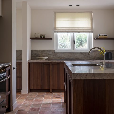
Elsewhere in the kitchen, the joinery is more enclosed. A wall of wood panels contains a recessed opening with integrated storage and black-fronted equipment, and the marble-like edge of the worktop catches a thin strip of light. The composition is careful but not fussy. It uses straight lines, concealed functions and a clear material contrast to make the kitchen read as part of the larger interior, not as a separate stage set.
Wine storage, bar details and the lower level
One of the more distinctive parts of the scheme sits below the main living spaces: a dedicated entertaining area with wine storage behind glass doors. The bottles are arranged in ordered racks, and the internal lighting makes the storage visible at once without turning it into display for its own sake. That same sense of controlled visibility appears in the bar details elsewhere in the project, where illuminated niches, ribbed vertical panels and a stone-like work surface create a compact, layered composition.
Built-in bar lighting that stays quiet
The bar wall is less about decoration than about how surfaces meet. Ribbed panels give the vertical plane a fine texture, while the lit openings bring depth to the storage. Glass, metal and stone-like finishes sit close together, but none of them overwhelms the others. The lighting is tucked into the joins and shelf recesses, so it marks the objects and the bottles without washing the whole wall in glare. That restraint suits the rest of the mid century modern interior, where every visible line seems to have a job.
Across the project, the same pattern repeats in different forms: fitted storage that sits flush with the wall, dark recesses that make lighter objects stand out, and glazing that keeps the house open to the garden. Even the entertainment level follows that logic. It is a practical addition, but it is handled with the same material discipline as the main rooms, so the lower floor does not feel detached from the life above.
Glass, level changes and a composed route through the villa
The house is at its strongest when it lets one surface lead to the next. Glass openings connect the interior to the terrace and greenery outside, while the raised floor sections and corridor shifts keep the route from becoming static. The villa’s angular shape and mix of transparent and solid parts appear most clearly in these transitions. A window wall, a timber panel, a stone fireplace, a niche with light: each piece has its own role, but all of them stay tied to the same calm visual order.
That order carries through the entire mid century modern interior. Oak, stone, glass and white plaster are used in measured amounts, and the details stay close to the architecture. Nothing is overstated. The rooms rely on fitted joinery, discreet lighting and clear sightlines to create their rhythm, from the living room to the kitchen and down to the wine storage below. What remains is a house where the plan, the materials and the light keep working together in plain view.
Want to see more of I+Y Interior Architecture? View the page of I+Y Interior Architecture for even more great projects and company information.




NEW 2026 Jubileum Edition The Best Interior Designers Benelux
Order Now €125


NEW 2026 Jubileum Edition The Best Interior Designers Benelux
Order Now €125


NEW 2026 Jubileum Edition The Best Interior Designers Benelux
Order Now €125


NEW 2026 Jubileum Edition The Best Interior Designers Benelux
Order Now €125