Minimalist house architecture with wood and light brick
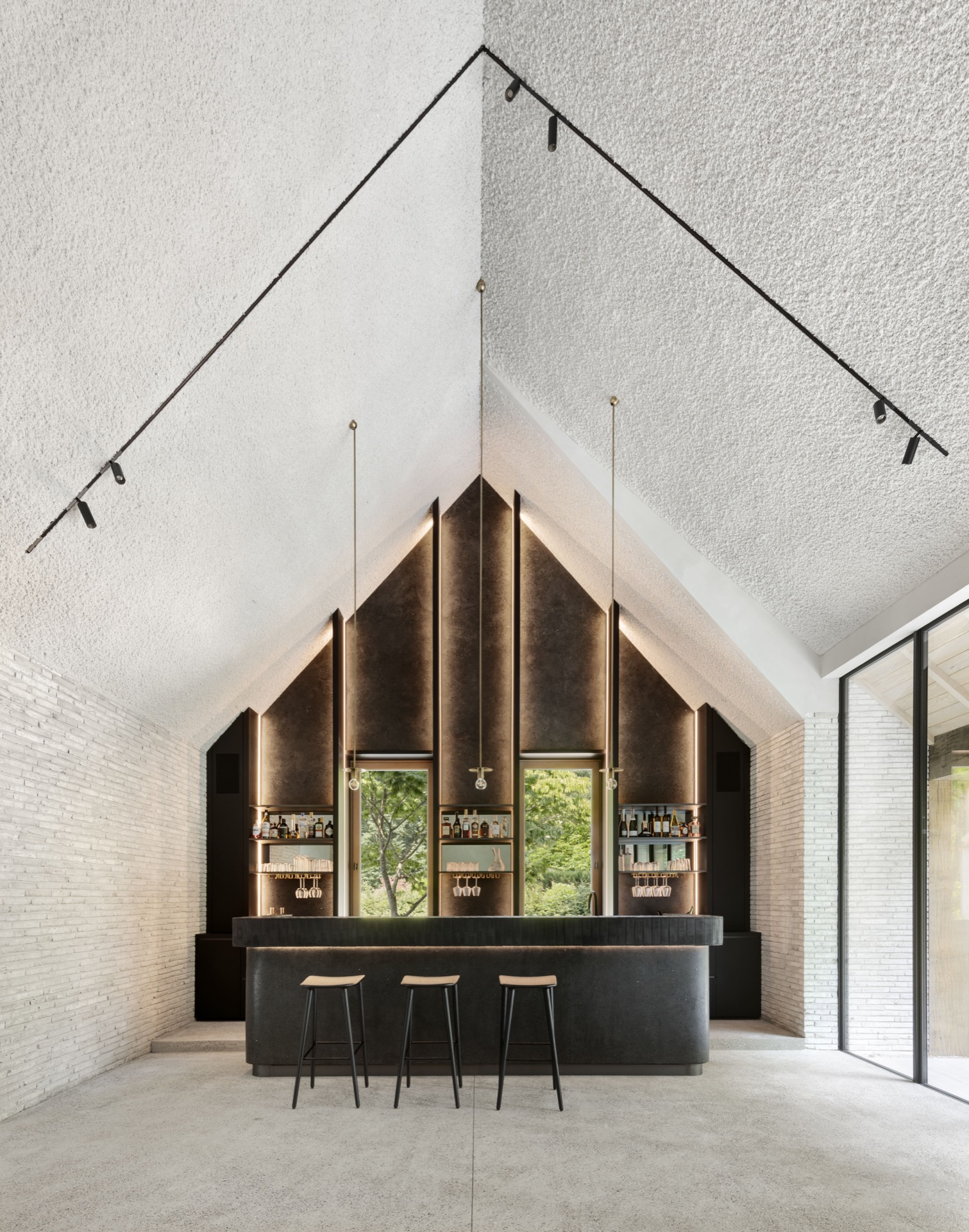
Minimalist house architecture comes into focus here through a clear split of volumes, a narrow linking zone, and materials that keep changing from one side of the house to the other. The connection between the two main parts is not hidden away. It is marked by an entrance space with a generous cloakroom and an arched ceiling that immediately shifts the tone. From there, the route opens either toward the private part of the home or toward the more public sequence with the event room, pool house and guest accommodation.
That first move gives the project its structure. Instead of one block, the house is read as a set of pieces held together by a carefully placed threshold. The arched entrance ceiling is visible as soon as you arrive, and it softens the transition before the plan divides. This is where the minimalist house architecture becomes more than a façade exercise: the spatial order is built around choice, privacy and orientation, with each zone reading clearly from the entrance.
Minimalist house architecture shaped by a linking threshold
The linking volume is the quiet pivot in the composition. It carries the entrance, the storage space and the first sense of direction. From that point, the house turns either inward or outward, and the difference is legible in the way the plan is described. The private side is set apart, while the street-facing side takes on a more open role. That distinction is not underlined with decoration; it is expressed through the way the volumes meet and how the circulation is held in the middle.
Seen as a whole, the house relies on simple geometry and restrained joins. The volumes are placed with a clean logic, so the project reads as a contemporary take on a familiar house type without leaning on ornament. The minimalist house architecture is strongest when the connecting part is considered alongside the two main masses: one handles arrival, one anchors domestic privacy, and the other opens toward a more social use. The plan keeps those relationships visible.
Wood façade cladding on the sides, light brick on the front and back
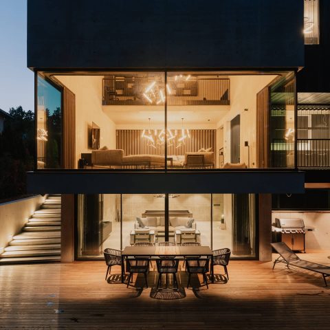
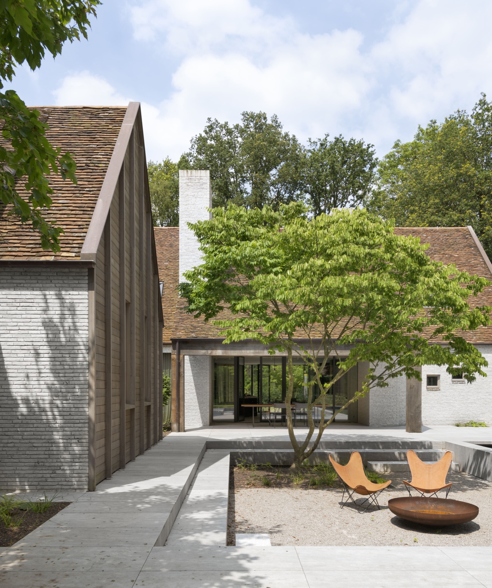
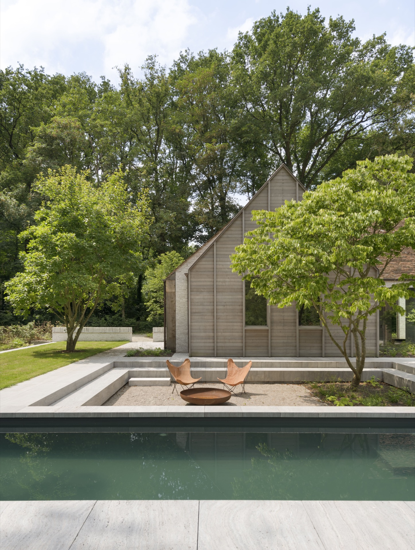
The exterior surfaces are handled with a clear material rule. The side elevations are wrapped in wood façade cladding, set up with a vertical rhythm that aligns with the window openings. This gives the long sides a measured order, where frames and boards fall into step rather than competing for attention. The front and rear elevations are built in light brick façades, which gives the main ends a different texture and weight. The contrast is direct, but it stays controlled.
What matters is the way the openings sit within that system. On the timber sides, the windows are placed inside the vertical structure, while the brick elevations read as more solid planes. In several spots, the brickwork is pulled inward so the boundary between inside and outside is less fixed. That gesture is subtle, but it affects how the house reads at the threshold. The same material can be seen moving across that edge, which strengthens the indoor-outdoor continuity without making it theatrical.
Tall windows with dark frames and a courtyard with pond edge
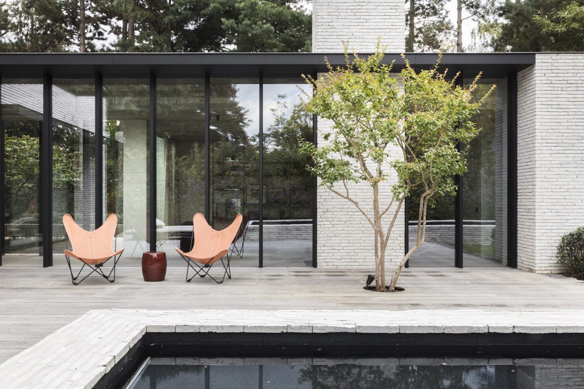
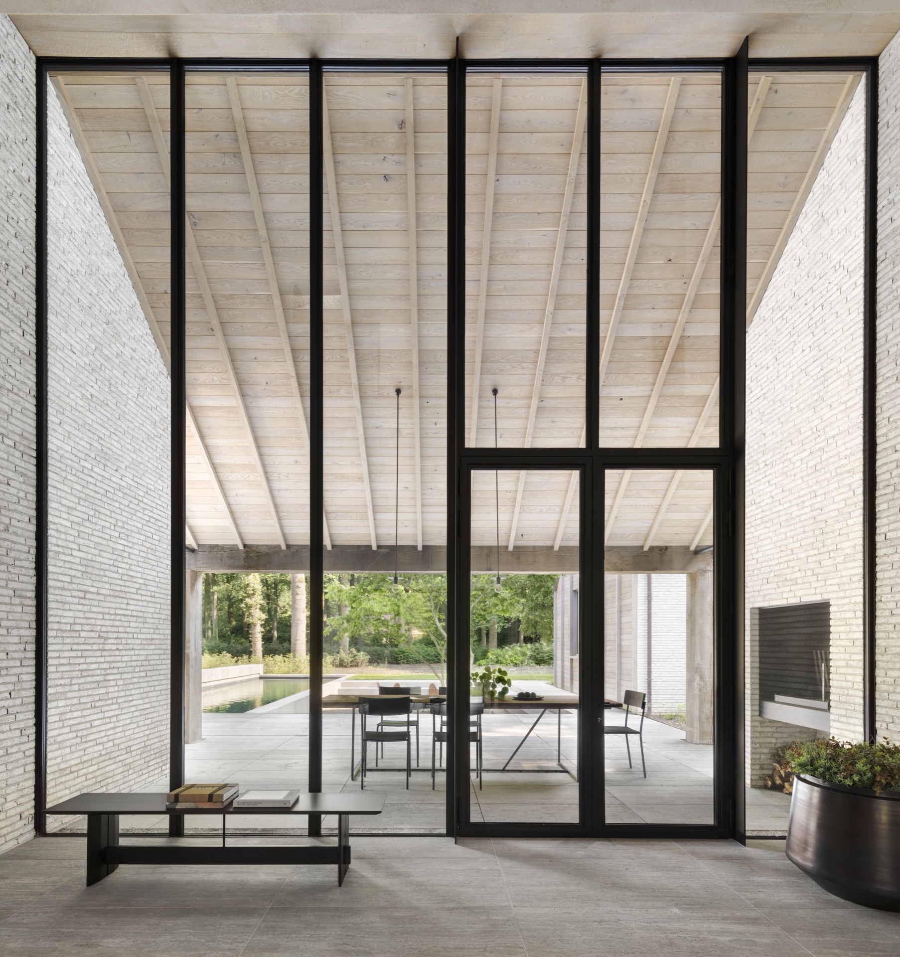
The glazing adds another layer to the composition. Tall windows with dark frames cut into the elevations and bring a crisp outline to the masonry and timber. In the interior images, these openings do more than admit light. They extend the sightlines toward greenery and toward the courtyard garden. One view shows the pond edge close to the terrace, where water, paving and planting sit in a tight arrangement. The result is a calm exterior field rather than a decorative backdrop.
The courtyard works as part of the architectural reading, not as a separate garden scene. Low steps, paved platforms and the water line give the open space a precise edge, and the house responds to that with large panes and framed views. Because the openings are so clear, the shift from the brick and wood envelope to the outdoor setting feels deliberate. The house does not dissolve into the garden; it sets up a sequence between enclosure, glass and open ground.
Smoked oak built-ins and continuous travertine flooring inside
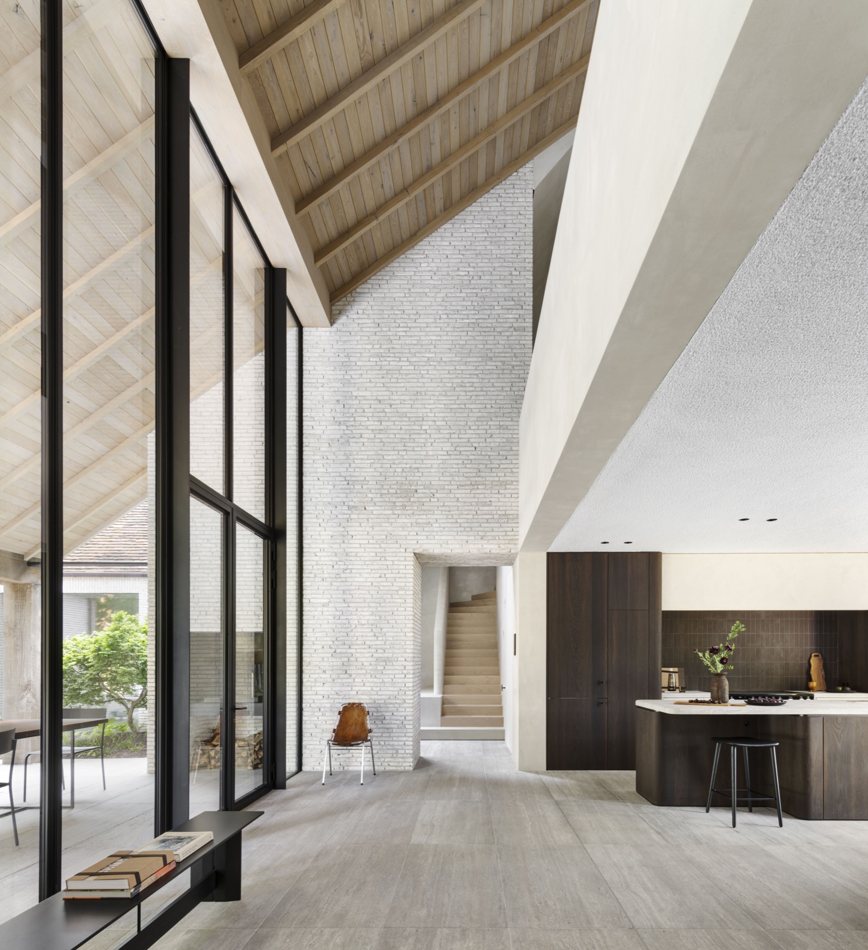
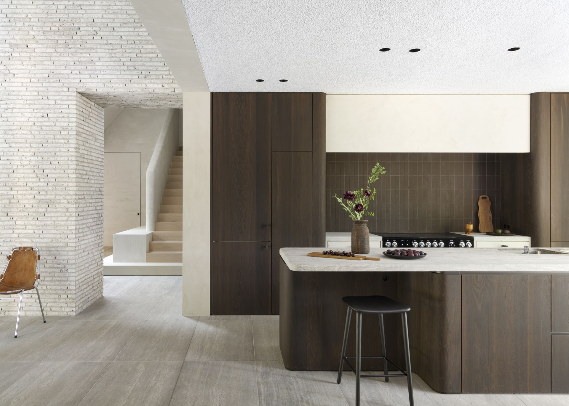
Inside, the material palette becomes quieter and denser at the same time. Smoked oak built-ins define much of the fixed furniture, and the brown tones in the wood give cabinets, shelving and joinery a grounded presence. That warmth is reinforced by continuous travertine flooring, which runs from one side of the house to the other and continues toward the outside. The floor is one of the few elements that binds the interior spaces so directly to the exterior terraces.
The joinery is not treated as a background layer. In the kitchen, the wood cabinets stand beside a lighter tiled wall, while other rooms show built-in panels and closed volumes that keep clutter out of sight. The same calm comes through in the detailing around the hearth, the kitchen island and the stair rail, where the edges are gently rounded. These softened lines break up the straight geometry and make the route through the house feel less abrupt.
Material continuity from the brickwork to the floor line
The project gains much of its character from the way materials are carried through the thresholds. Brickwork is pulled indoors at selected points, while the travertine continues outside, so the separation between shell and interior is never absolute. That exchange is visible in the way walls, floor and openings meet. It keeps the house focused on continuity without turning the whole scheme into one undifferentiated space. The shifts remain readable, which is what gives the composition its clarity.
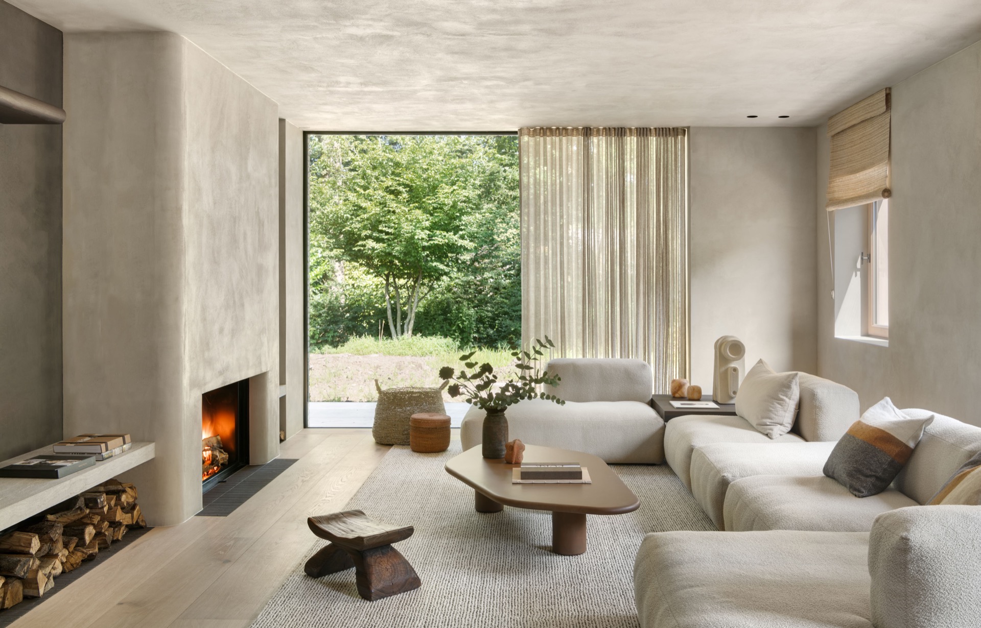
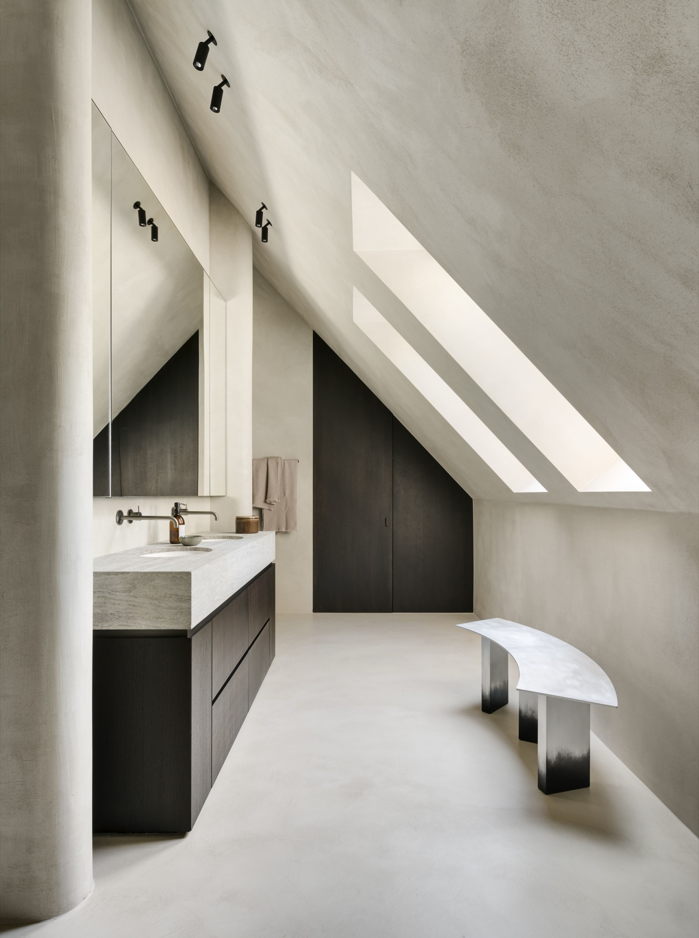
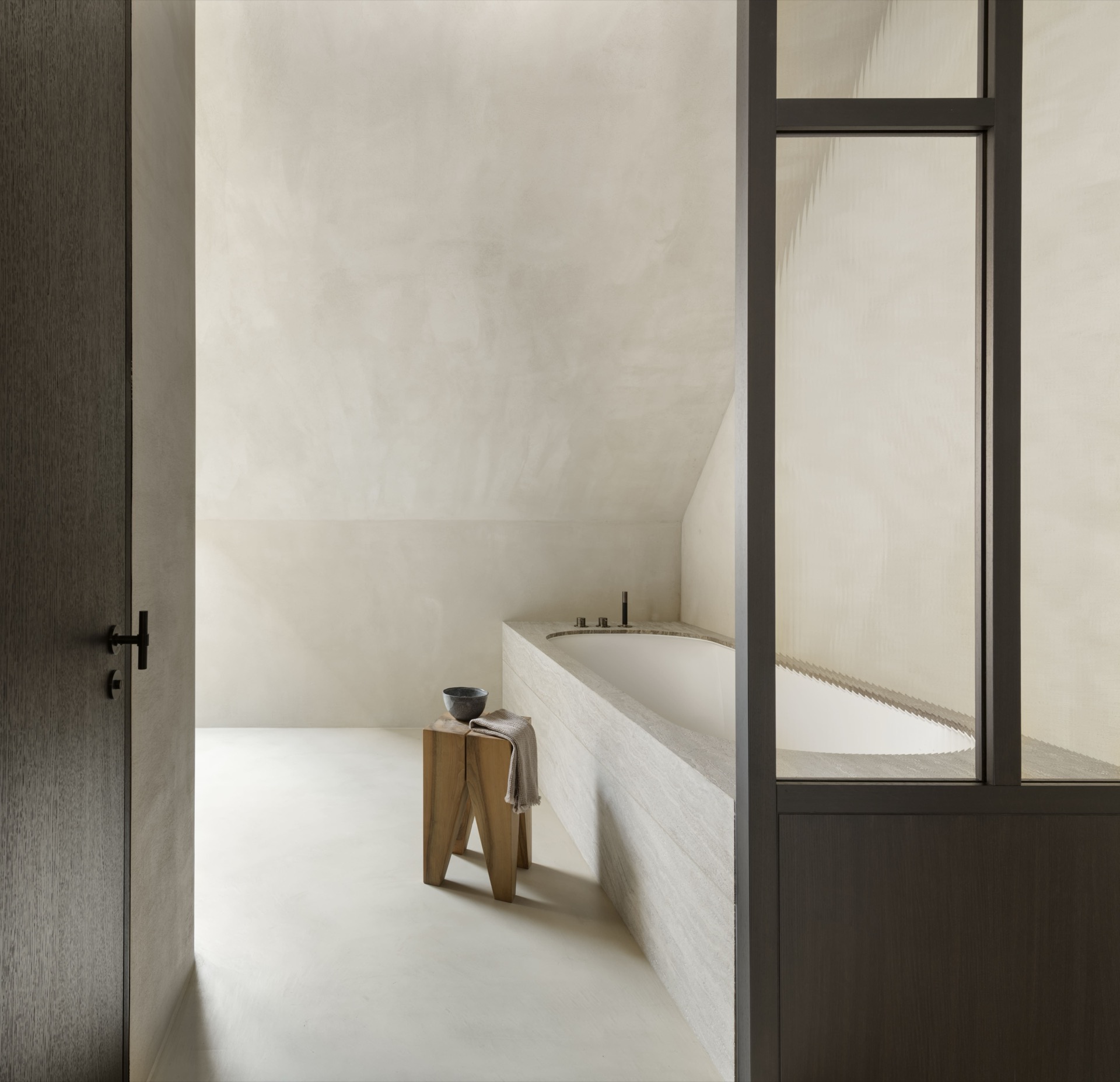
The interior photographs underline this through the contrast between dark panels, light floor surfaces and the measured glow of daylight. A high room with a ribbed timber ceiling structure frames the kitchen and living areas, while another view shows a fireplace niche set into a broad wall. Even the bathroom image follows the same logic: a rounded bath edge, a dark-framed opening and plain plastered walls. Each room keeps its own scale, but the materials keep tying them back to the larger architectural idea.
Rounded details that slow the straight lines
Across the house, the rounded details are easy to miss at first and then hard to unsee. They appear in the fireplace surround, along the kitchen island and on the stair rail, where the edges stop short of being sharp. These are small moves, but they matter because the rest of the composition is so precise. Against the vertical timber rhythm, the brick planes and the rectilinear glazing, those curves interrupt the hard lines just enough to change the pace of the interior.
The effect is not decorative in the usual sense. It is more about touch and movement. A hand meets a softer edge on the railing, the island reads as a piece that has been eased rather than cut, and the fireplace sits in its niche with a slightly gentler contour. Combined with the travertine floor and smoked oak built-ins, these details keep the interior grounded. They also echo the arched entrance ceiling at the front, linking the arrival space back to the rest of the house.
Photographer: Eugeni Pons
Related reading can be explored through the partner profile for JUMA architects, more residential architecture projects, the architecture category page, and a material and detailing project article page.
Want to see more of JUMA architects? View the page of JUMA architects for even more great projects and company information.


NEW 2026 Jubileum Edition The Best Interior Designers Benelux
Order Now €125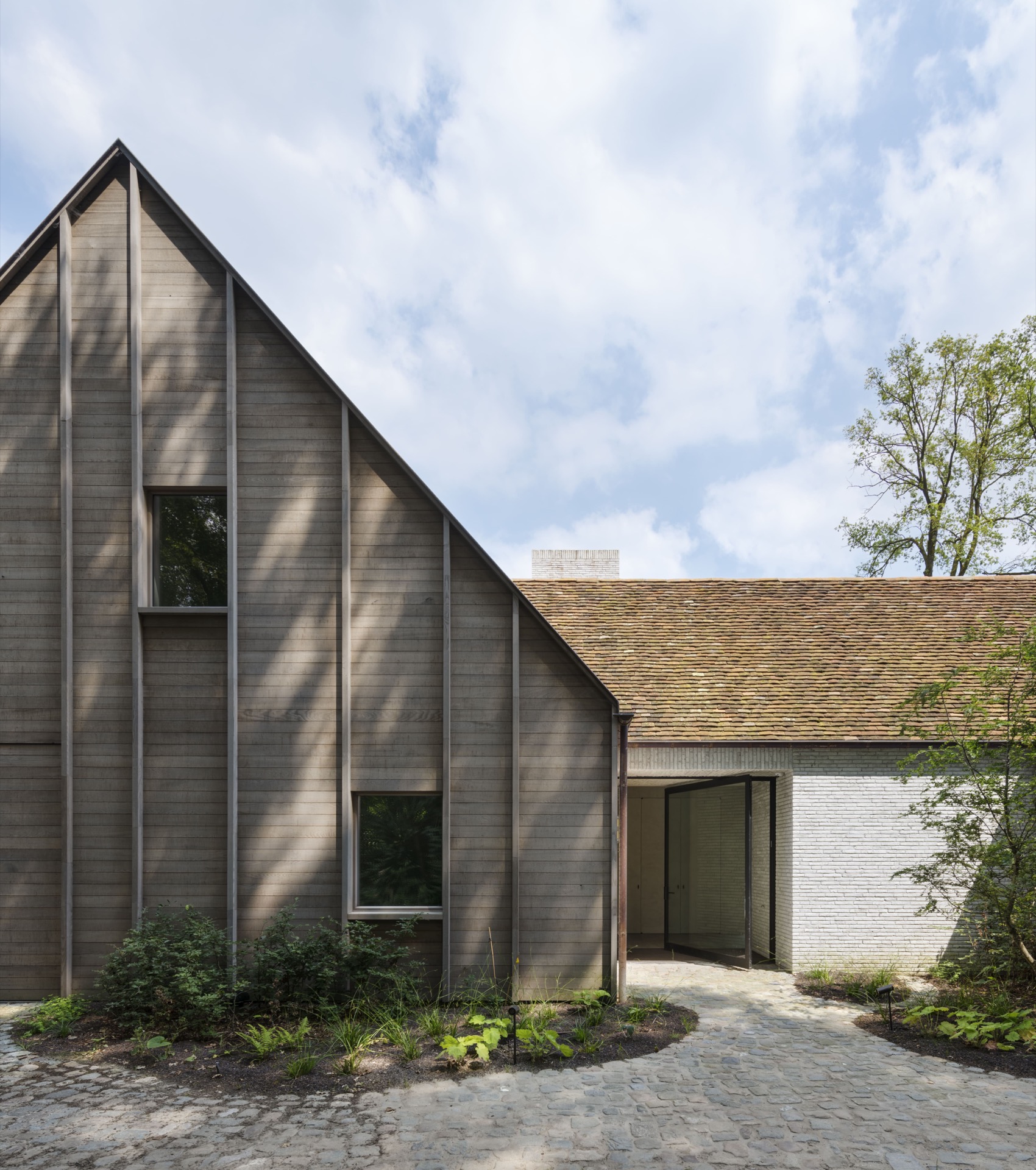
NEW 2026 Jubileum Edition The Best Interior Designers Benelux
Order Now €125