Minimalist house with three light-shifted volumes
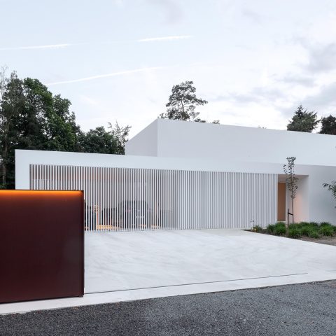
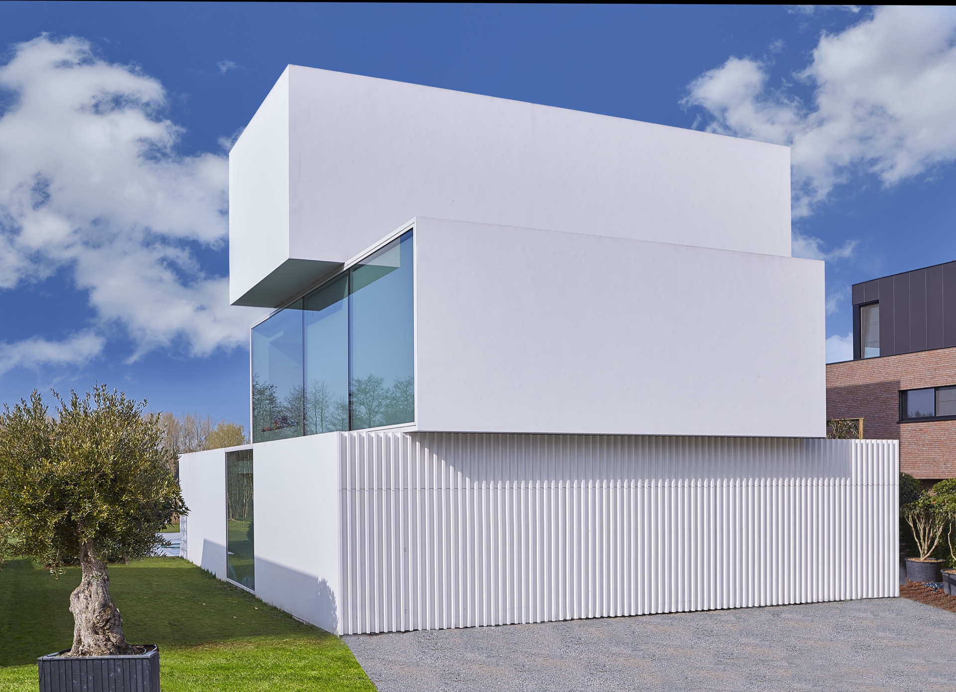
Three white volumes slip past one another by a few inches, and that small offset gives the house its entire presence. The composition stays inside a strict outline, yet it never reads as static. On the plot, the south-facing garden opens toward a natural area, while the street side remains almost sealed. That contrast sets the tone for this minimalist house with three shifted volumes: controlled from the road, open where the light and view are strongest.
A strict outline, reworked with just enough movement
The building rules asked for a 12-metre façade width, two storeys and a pitched roof. Instead of copying that frame literally, the architects stacked three volumes and shifted them slightly against each other. The result is precise, but not stiff. Each block keeps to the allowed profile, while the offsets create shadow gaps and a subtle tension between the parts. From a distance, the house still reads as one clear figure. Up close, the joints and steps between volumes do the real work.
That play of alignment is one of the reasons this modern minimalist home feels so composed. The massing is simple to read, yet every edge has been negotiated. The white surfaces catch light differently as the volumes move forward and back, and the roofline follows that same discipline without becoming decorative. It is a project built from restraint, but the restraint is active rather than blank.
Closed to the street, exact in every detail
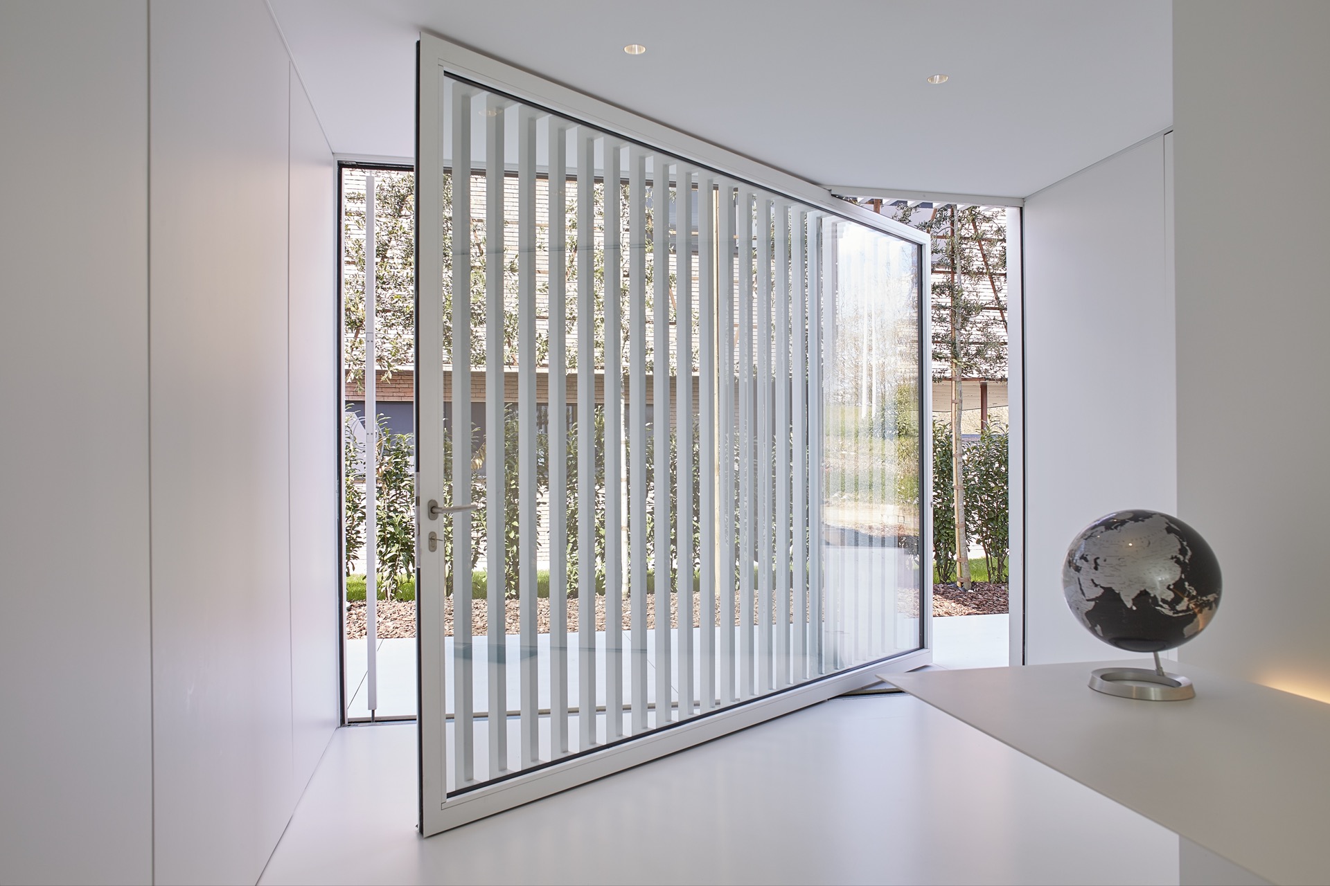
From the street, the house stays shut. The ground floor is wrapped in white lacquered profiled steel, and the three sectional garage doors disappear into that plane. The entrance is not placed in front but along the side, where a 3.80-metre-wide pivot door in steel marks a much larger opening than the street view suggests. The move keeps the front elevation calm and compact, with access shifted away from the main frontage.
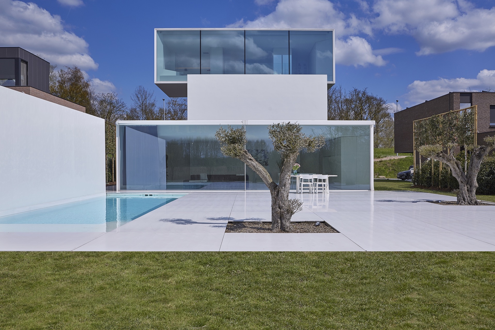
Above that plinth, the outer walls are finished in glossy white plaster with no visible roof edge. A roof-edge profile is there, but the façade treatment hides it completely. The line is clean because the detail is hidden, not because it was easy to execute. That same logic continues across the white facade with large glazing at the garden side, where the openings expand while the road-facing side stays closed.
The glazing itself is handled with unusually slim profiles. The sliding windows are finished in white powder-coated aluminium and were made manual because there was no room for motors in such narrow frames. Each sash weighs about two tonnes, so the movement had to be engineered carefully. With sun-protective glass and passive cooling, the large panes also help moderate the indoor temperature without adding visible hardware to the composition.
Three blocks, three ways of living
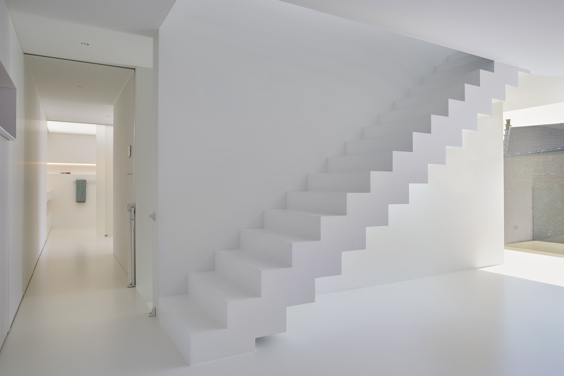
Inside, the three shifted volumes organise the plan clearly. On the ground floor, the entrance, cloakroom, guest toilet, home office and living room with kitchen and salon are grouped together. The circulation feels direct, helped by a single continuous stair that links all three blocks. Its treads are cast in white polyurethane, so the stair reads more like a sculpted strip than a separate piece of furniture.
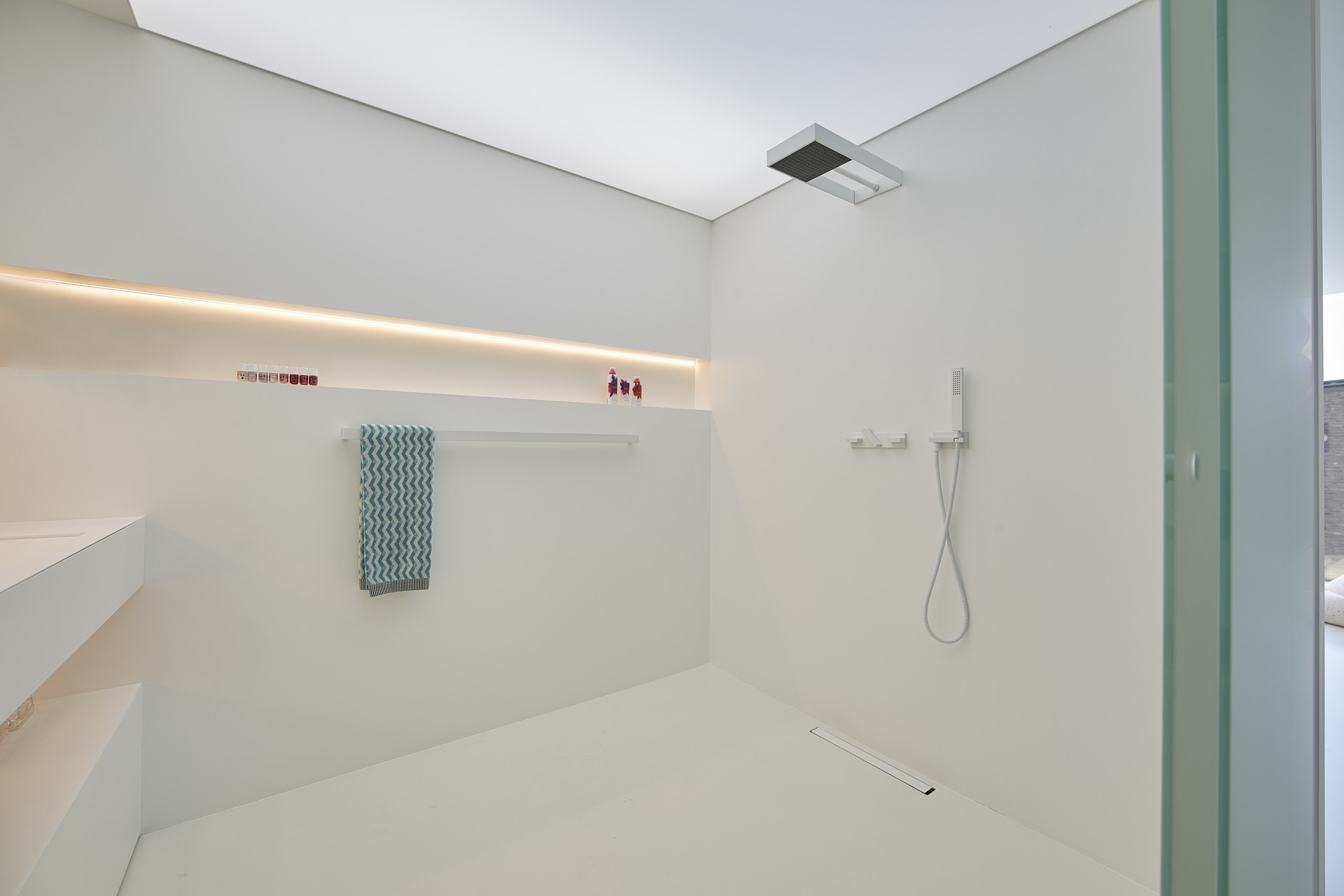
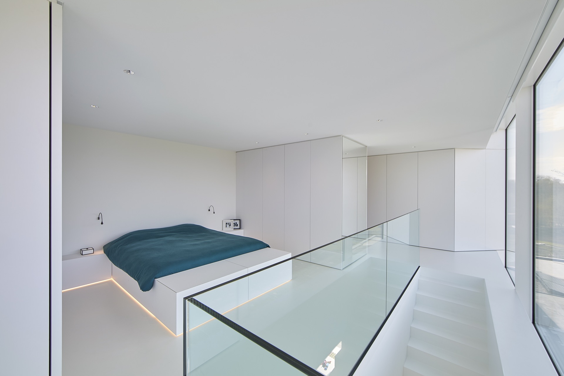
The middle volume is reserved for the children. It contains two bedrooms, open showers and a multipurpose room. Its windows face the side of the house rather than the main garden orientation, which gives this block a different rhythm from the others. That shift in outlook is small, but it changes the way the rooms are read. The upper volume is for the parents, with the master bedroom, a night hall with a glass balustrade, a bathroom with open showers and a dressing area that is partly open, partly closed.
Because the house is divided into three clear zones, the circulation never feels vague. Rooms are stacked with purpose, but the transitions stay open enough to let light travel through the plan. The staircase acts as the spine, and the three blocks hold the daily functions without needing extra corridors or visual noise.
A white interior built from planes, joints and light
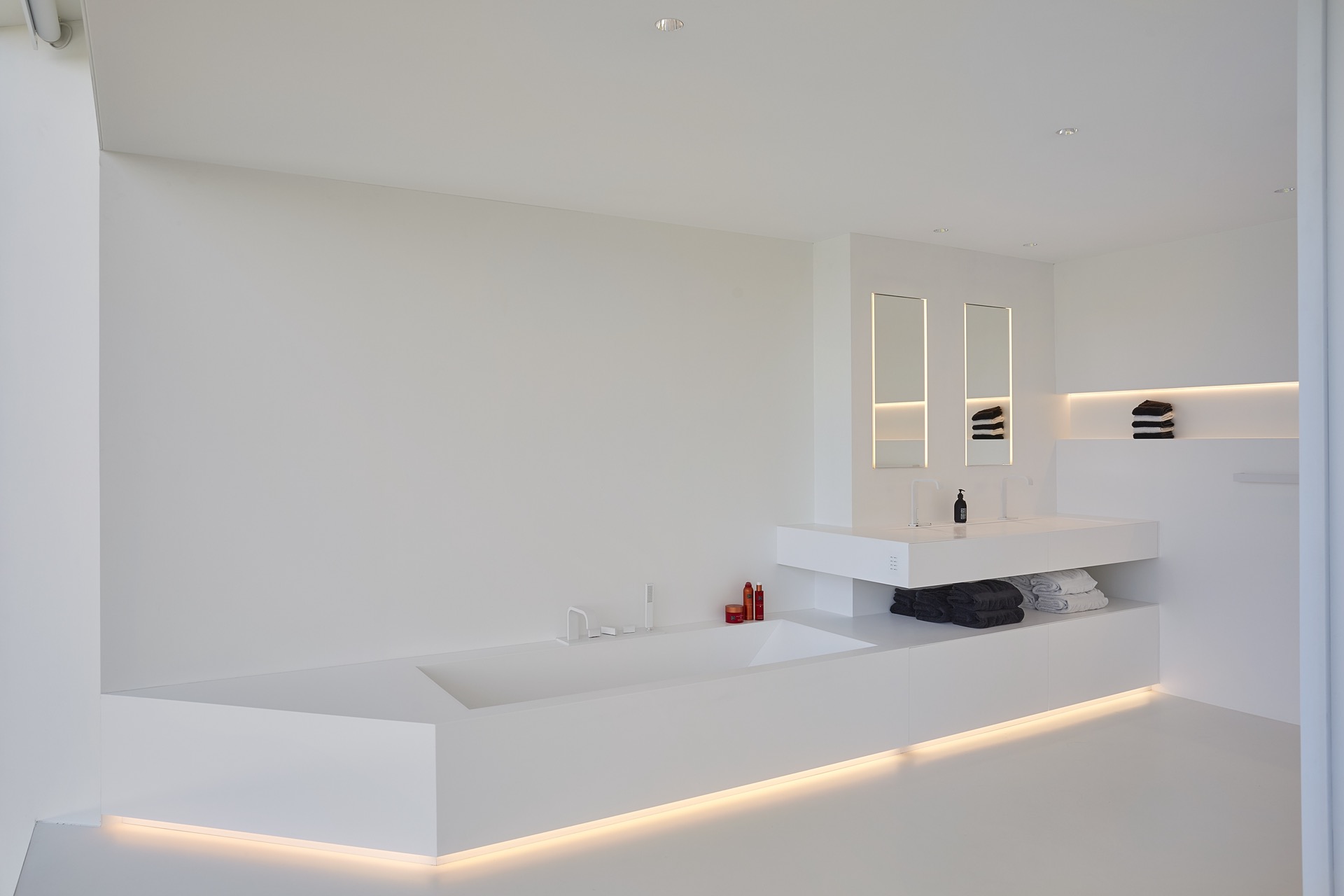
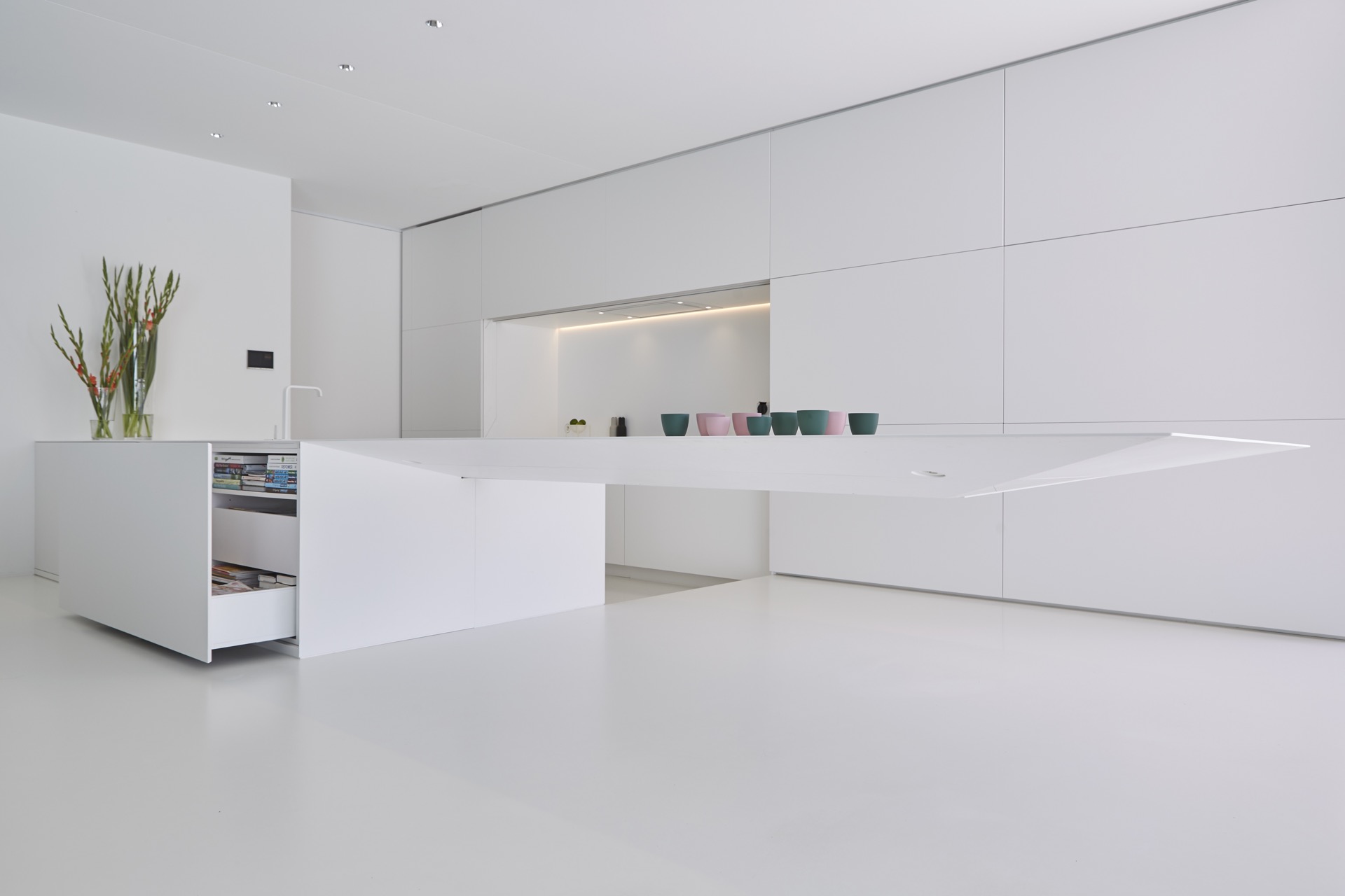
The palette inside is almost entirely white, but the interest lies in the surfaces rather than the colour itself. White polyurethane screed floors run through the rooms, while the staircase, joinery, doors and cabinet walls follow the same tone. Countertops and basins are custom-made in white Hi-Macs, and the bathroom floors and walls continue in white polyurethane. The effect is not sterile; it simply removes distraction so the edges, openings and built-ins remain readable.
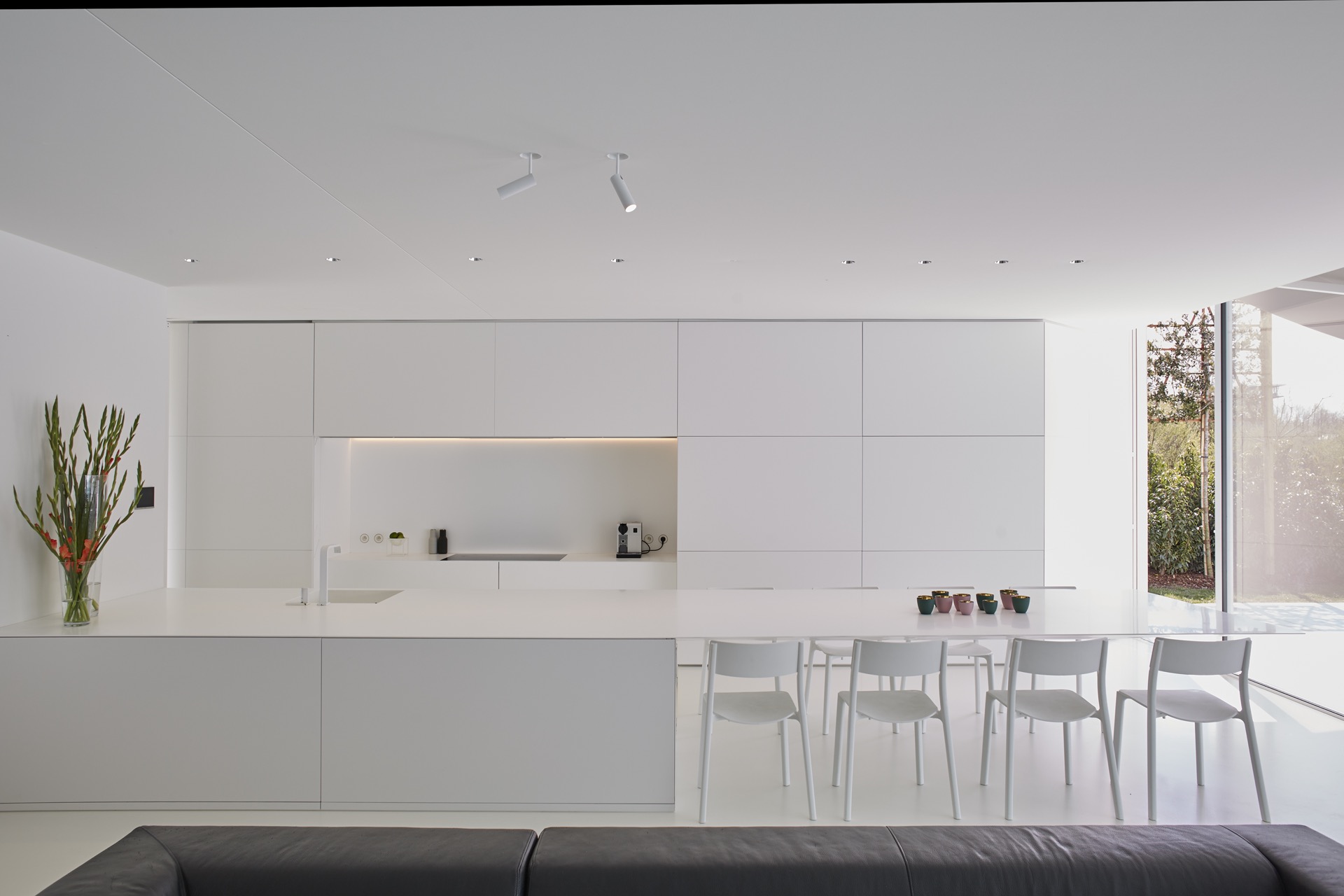
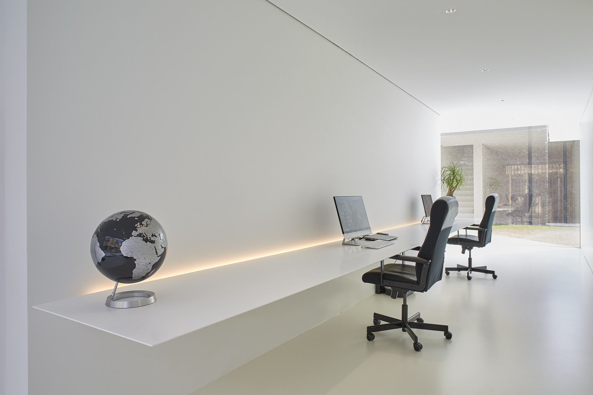
In several spaces, the lighting is drawn as a line rather than a fixture. The suspended acoustic ceilings are fitted with recessed spots, and the image sequence shows indirect LED light lines along walls, work zones and cabinet fronts. That kind of lighting suits the house’s geometry. It traces the room instead of interrupting it, especially in the kitchen, where the illumination sits behind or below the work surface.
A kitchen measured from the chair height
The kitchen is open but can be closed off with a sliding door. Its island extends into a long dining table, and the proportions are set around the ideal sitting height for eating. Seen from the salon, the island appears unusually low. To keep the cooking zone usable, a slightly lowered work area sits behind it. The arrangement turns the kitchen into a carefully calibrated piece of joinery, with the white tapware matching the rest of the room rather than standing out from it.
That same precision appears in the office corner and in the bathroom details visible in the images: built-in storage, flush surfaces, and thin light lines that run along the walls. The monolithic white staircase remains the strongest vertical element, but the smaller interventions repeat its logic. Openings are cut cleanly, storage disappears into planes, and nothing is allowed to break the reading of the room unless it serves a function.
Terrace, pool and the long glass edge at the garden side
At the rear boundary, a longitudinal volume holds storage and the technical equipment for the adjacent pool. It also forms a private white wall that screens the garden. In front of it, the terrace is paved with large glass tiles measuring 163 by 240 centimetres. Two openings are left in that surface for old olive trees, giving the hard geometry a few vertical breaks without softening the layout. The result feels sharp, but not empty.
The pool terrace and large glass opening turn the garden side into the most open part of the house. The glazing reaches toward the terrace, and the edge between inside and outside stays visually low. Seen together with the white walls, the tiles and the olive trees, the outdoor zone carries the same discipline as the interior. The materials are few, the lines are direct, and the volumes stay legible from every angle.
Beyond the visible design, the house also relies on a ventilation system without visible grilles, underfloor heating and cooling via a heat pump, and home automation. Those systems stay out of sight, which suits a project that already depends on exact proportions and clean transitions. Here, the architecture does not ask for ornament. It works through offset volumes, hidden edges, slim frames and the measured handling of light across white surfaces.
Want to see more of EX-IT Architectuur? View the page of EX-IT Architectuur for even more great projects and company information.

NEW 2026 Jubileum Edition The Best Interior Designers Benelux
Order Now €125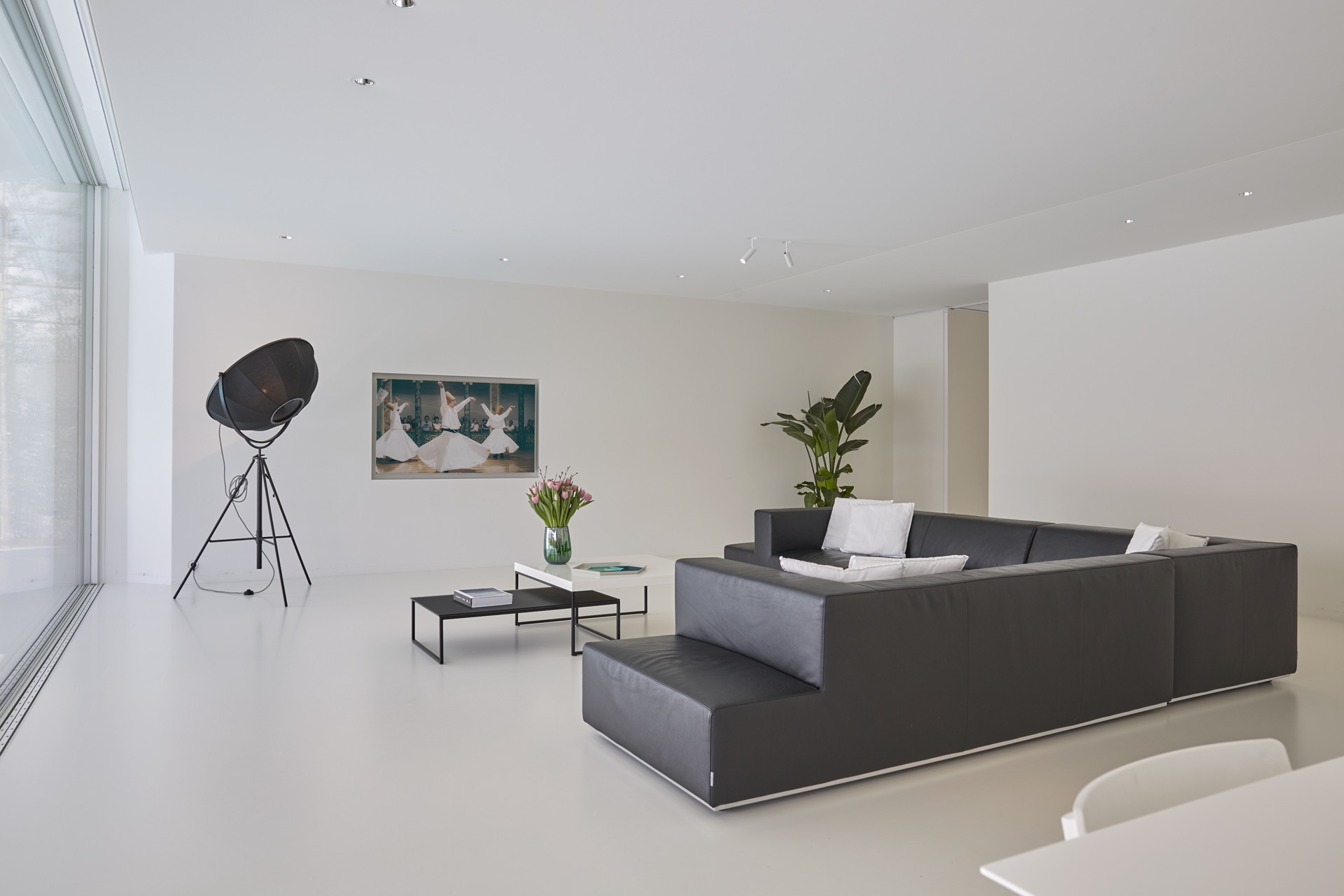
NEW 2026 Jubileum Edition The Best Interior Designers Benelux
Order Now €125