Minimalist Interior Design
Muted white planes, dark floor tones and long lines give this minimalist interior design its first impression. The house is arranged as one continuous interior, with each room tuned to the next: the staircase, kitchen, wardrobe areas, home office and living spaces all share the same restrained palette. In the living room, daylight falls across large windows and a low seating arrangement, while the built-in fireplace sits as a dark cut-out in the wall. Nothing feels added at the end; every element seems placed to keep the architecture clear.
A living space drawn with light and contrast
The main living room is open and calm, but not empty. Large glazed openings bring in a bright wash of daylight, and the white ceiling keeps the room visually open. Against that light background, the darker floor and the fireplace niche give the room structure. Horizontal slats near one window add a measured rhythm without breaking the quiet line of the walls. It is a modern minimalist interior that relies on proportion and surface rather than decoration.
Custom cabinetry runs through the plan and keeps storage close to the architecture. Built-in panels sit flush with the walls, and a recessed niche appears where a more ordinary solution might have broken the line. The result is a modern minimalist interior that reads as a whole house rather than a sequence of separate rooms. Even the transition between sitting area and circulation space stays visually light, with minimal frames and narrow edges doing most of the work.
The staircase as a clear centrepiece
The staircase carries more visual weight than many other elements in the house. Its black-and-white contrast is sharp, but the detail is controlled: dark treads, white enclosing surfaces and a fine line of indirect light along the side. That light traces the stair run instead of flooding it, which gives the ascent a quiet emphasis. Above the stairs, a hatch leads to another room, a practical detail that is built into the composition rather than hidden from it.
The stair hall also frames the entrance sequence. Dark glazing, mirror-like panels and crisp wall edges create a clear threshold between spaces, while round pendant lights soften the geometry overhead. Seen from different angles, the stair remains the anchor of the home. It connects the upper floor to the rest of the interior without interrupting the material rhythm established elsewhere, which is exactly where the strength of this minimalist interior design becomes visible.
Indirect light, dark edges and a practical detail
The light strip beside the staircase does more than mark the route upward. It separates the stair from the wall and makes the profile of each step easier to read. Because the surrounding surfaces stay pale, the contrast is immediate. The hatch at the top introduces a second layer of circulation, and that detail gives the staircase a functional precision that suits the rest of the house.
A touch-to-open kitchen with stone surfaces
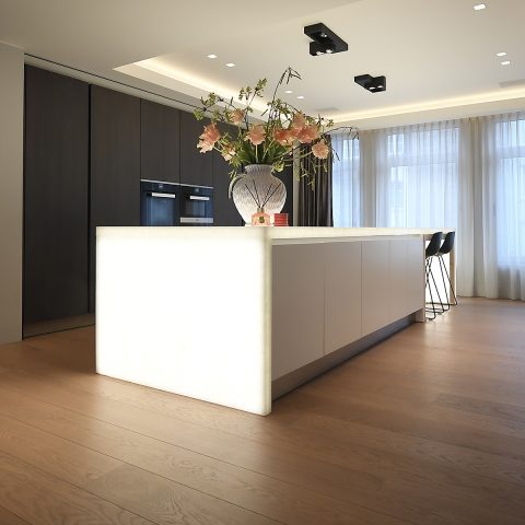
The kitchen follows the same discipline. Handleless fronts keep the wall visually flat, while tip-on and push-open fittings replace visible pulls. White cabinet faces create a clean backdrop, and the stone-look worktop and splashback add a harder surface with a pale, mineral pattern. The appliances sit into that composition rather than competing with it. This touch-to-open kitchen is less about display than about a clear sequence of surfaces that can stand up to daily use.
From the side, the kitchen reads as one composed band of storage and working surface. The cabinetry continues the custom cabinetry language seen elsewhere in the house, and the white fronts keep the room bright even when the daylight is lower. Openings in the wall and the nearby slatted detailing prevent the room from feeling sealed in. It is a kitchen that belongs to the house instead of standing apart from it.
Handles removed, lines kept visible
Without handles, the cabinet fronts depend on alignment. That makes the edges and panel joints more important, and here they are kept straight and consistent. The stone surface carries a subtle texture that becomes more visible near the window light. Together, those decisions give the room its calm surface and make the touch-to-open kitchen feel precise without becoming cold.
Custom cabinetry that continues into the quieter rooms
The same custom cabinetry language appears in the wardrobe and the home office, where built-in storage follows the walls instead of interrupting them. A neatly finished wardrobe area gives the circulation zone a clear edge, while the study keeps the same white-panelled discipline. This is where the project’s minimalist living room approach extends into the rooms that usually collect loose objects and visual noise. Here, they are absorbed into the architecture.
In the bedroom, the slope of the ceiling meets a full-height white storage wall, and the window is treated with the same slatted detail seen elsewhere. The room stays visually simple, but the joinery is doing a lot of work. Panels, seams and inset handles are arranged so that storage remains present without taking over the room. That approach runs through the whole house and gives the minimalist interior design a consistent reading from one space to the next.
The fireplace and joinery keep the material register low
The built-in fireplace is finished with bronze, which introduces a darker, warmer note without turning decorative. Set into the wall, it reads as a measured insert rather than a separate object. Nearby, the custom storage pieces carry the same restraint: flat faces, clean corners and no visual clutter around the edges. The materials stay limited, but the surfaces are not monotonous. Bronze, white lacquer-like planes and stone introduce enough variation to keep the interior from flattening out.
This careful coordination also solved technical issues that are easy to miss in the finished images. Services had to be concealed, and the project involved guiding other trades through those practical points. That sort of coordination shows in the final result: outlets are out of sight, the wall planes stay uninterrupted, and the joinery can do its work without visual compromise. The house looks calm because the technical layer has been absorbed into the building.
Room by room, the same language holds
What remains after moving through the house is the consistency of the surfaces. Large windows, white walls, dark floors, built-in storage and the fireplace niche repeat in different combinations, but the tone never shifts far. The home office, bedroom, kitchen and living area all belong to the same modern minimalist interior, and that link is reinforced by the fitted details rather than by a single statement object. The house does not depend on ornament to hold attention.
Instead, the project uses joinery, light and circulation to shape the experience of the rooms. The staircase with indirect light gives the house its strongest vertical moment, the touch-to-open kitchen anchors the daily centre, and the built-in fireplace keeps the living area visually grounded. Together they form a minimalist interior design that is readable in a glance, but rewards a slower look through the details.
Want to see more of Altivello? View the page of Altivello for even more great projects and company information.




NEW 2026 Jubileum Edition The Best Interior Designers Benelux
Order Now €125


NEW 2026 Jubileum Edition The Best Interior Designers Benelux
Order Now €125


NEW 2026 Jubileum Edition The Best Interior Designers Benelux
Order Now €125


NEW 2026 Jubileum Edition The Best Interior Designers Benelux
Order Now €125