Minimalist interior with natural stone and custom joinery
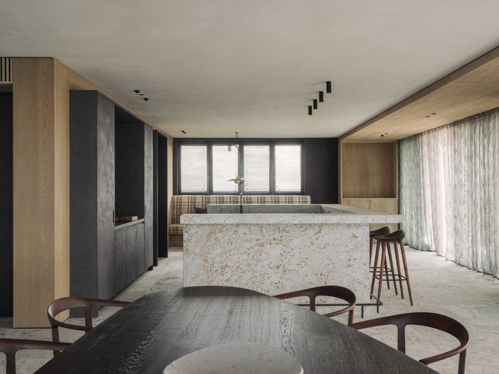
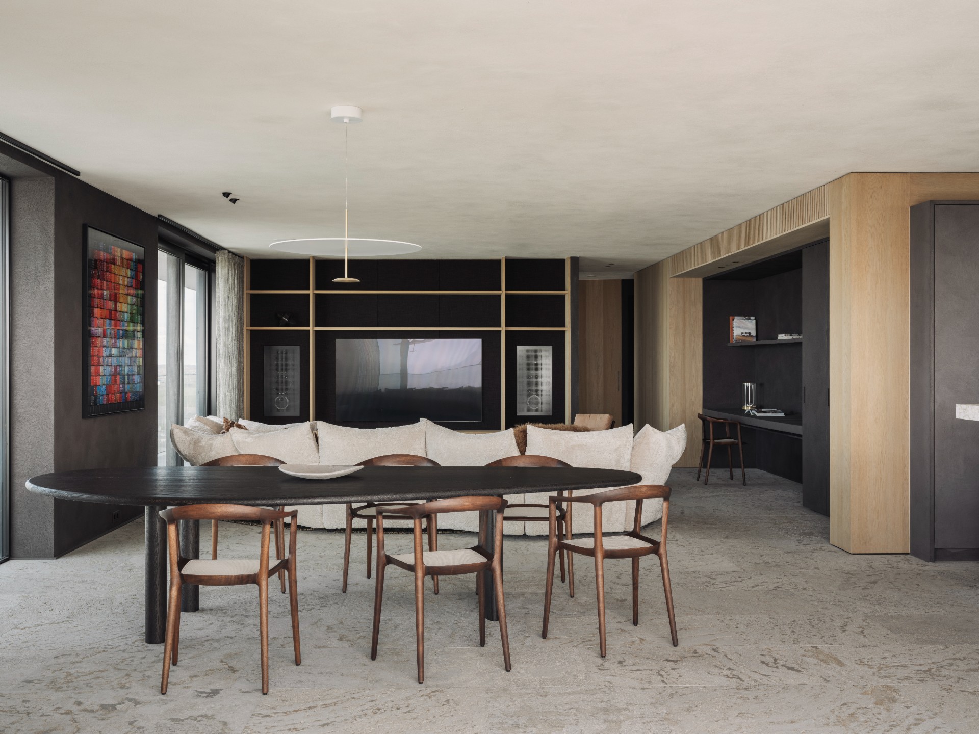
The first thing that registers is the stone: a dark, grounded surface cutting through pale walls and light timber. Around it, the room stays restrained. The minimalist interior relies on custom built-in cabinetry, recessed shelving, and a measured palette of wood, stone, and metal. Nothing competes for attention. Lines stay straight, edges stay clean, and the eye moves from the kitchen zone to the larger living area without interruption.
Cabinetry that reads as part of the wall
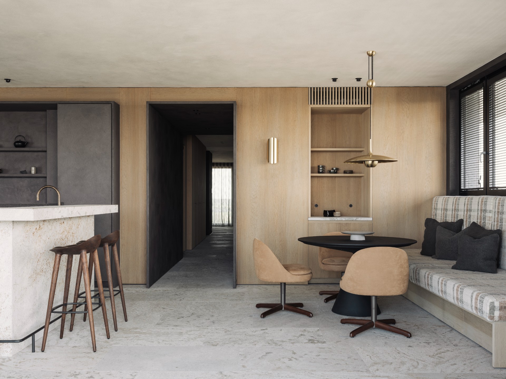
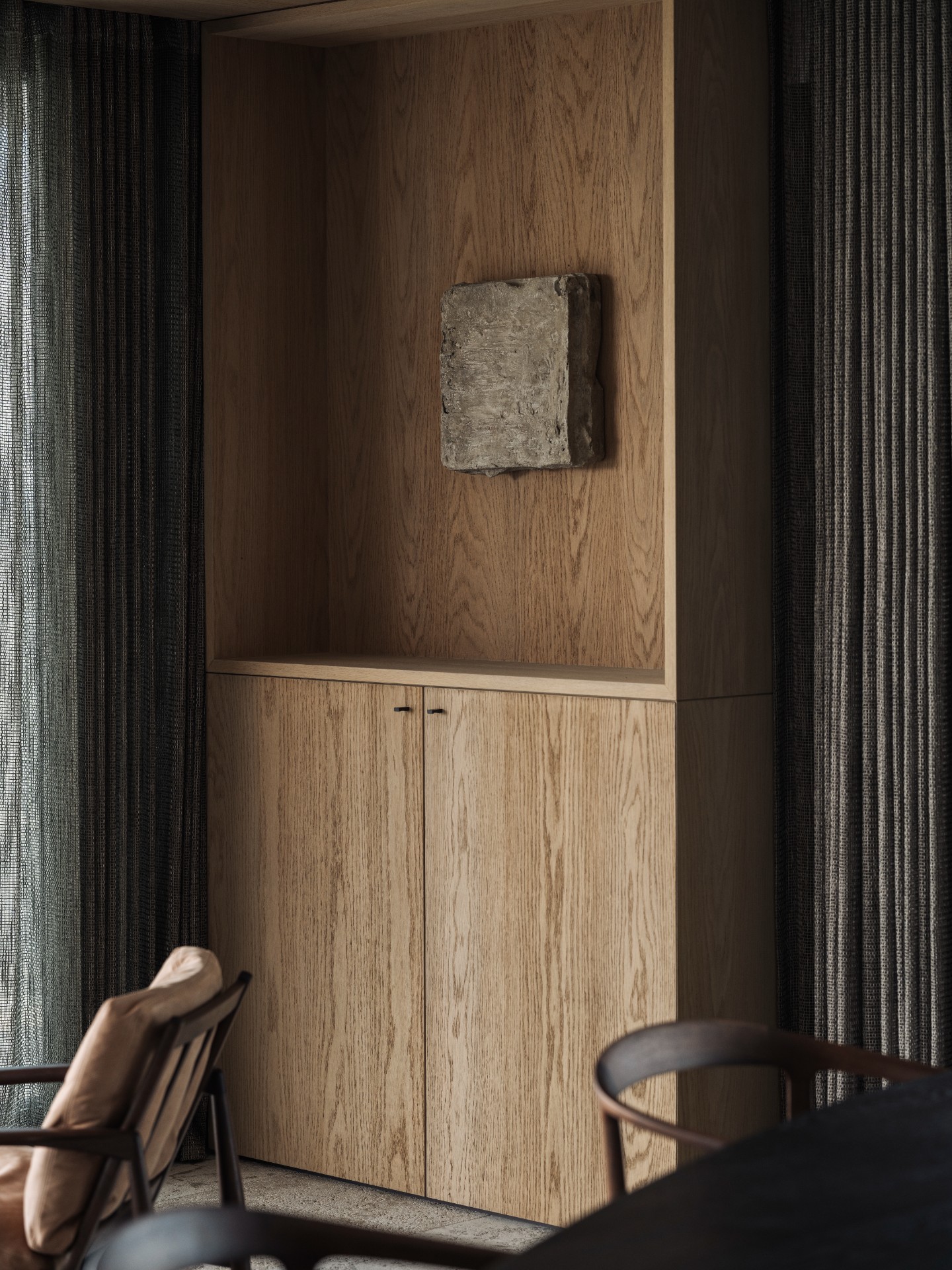
Much of the project is absorbed into the architecture itself. Tall storage runs sit flush with the wall panels, while open compartments break the surface at regular intervals. Those built-in niches are not decorative extras; they create pauses in the long planes of joinery and give the wall a more deliberate rhythm. The effect is quiet, but never flat. Wood grain, darker inserts, and shadow lines keep the composition active as the light shifts across it.
That precision is visible in the way each panel is set out. Door seams align with the surrounding volumes, and the cabinetry does not drift away from the room as a separate object. It holds the wall together. In a minimalist interior, that kind of restraint matters, because the material edges do the work that ornament would normally do. Here, the joinery shapes the room just as much as the plan does.
Open niches and closed storage in one field
The open shelves sit beside closed fronts instead of being treated as an afterthought. That contrast adds depth to the built-in cabinetry and prevents the wall from becoming a single blank plane. Some niches are tucked into darker recesses, others sit within lighter wood framing, so the storage reads in layers. The arrangement feels carefully edited, with enough openness to show objects and enough enclosure to keep the surface calm.
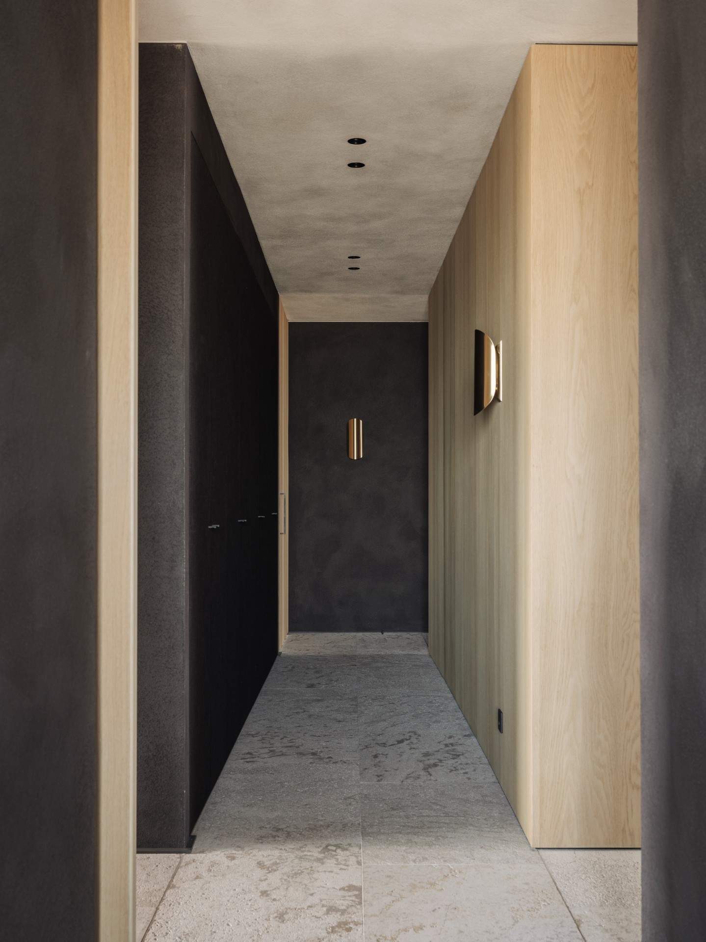
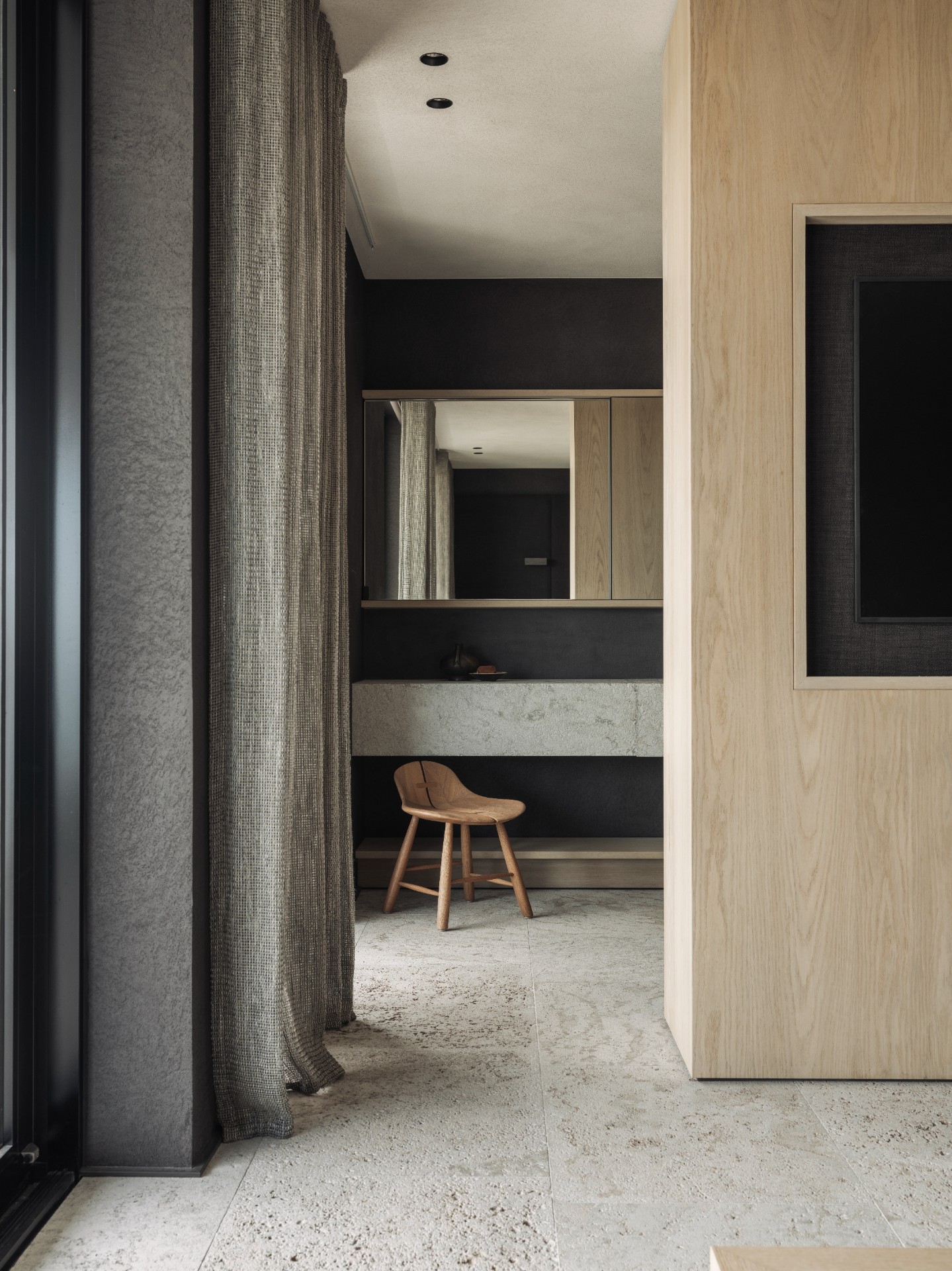
Large floor tiles extend under the joinery and into the adjoining spaces, reinforcing the sense of continuity. Their pale grey tone softens the darker cabinetry and the stone worktop nearby. Above, round downlights are set into the ceiling edge, leaving the main surfaces clean. The light is practical, but it also traces the geometry of the room, picking out the verticals of the cabinetry and the horizontal lines of the shelving.
A kitchen built around stone and dark fronts
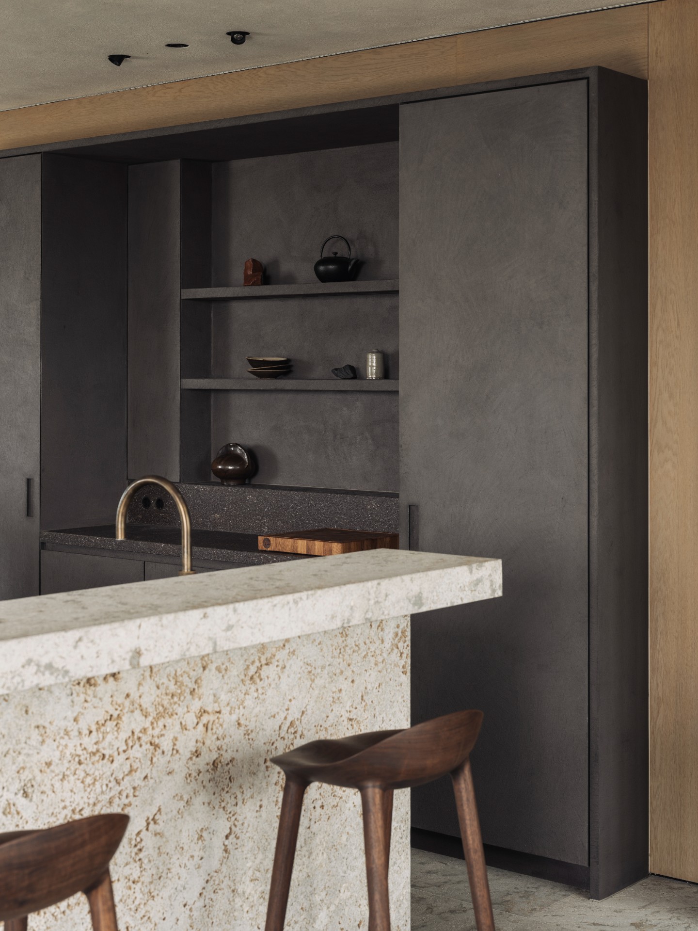
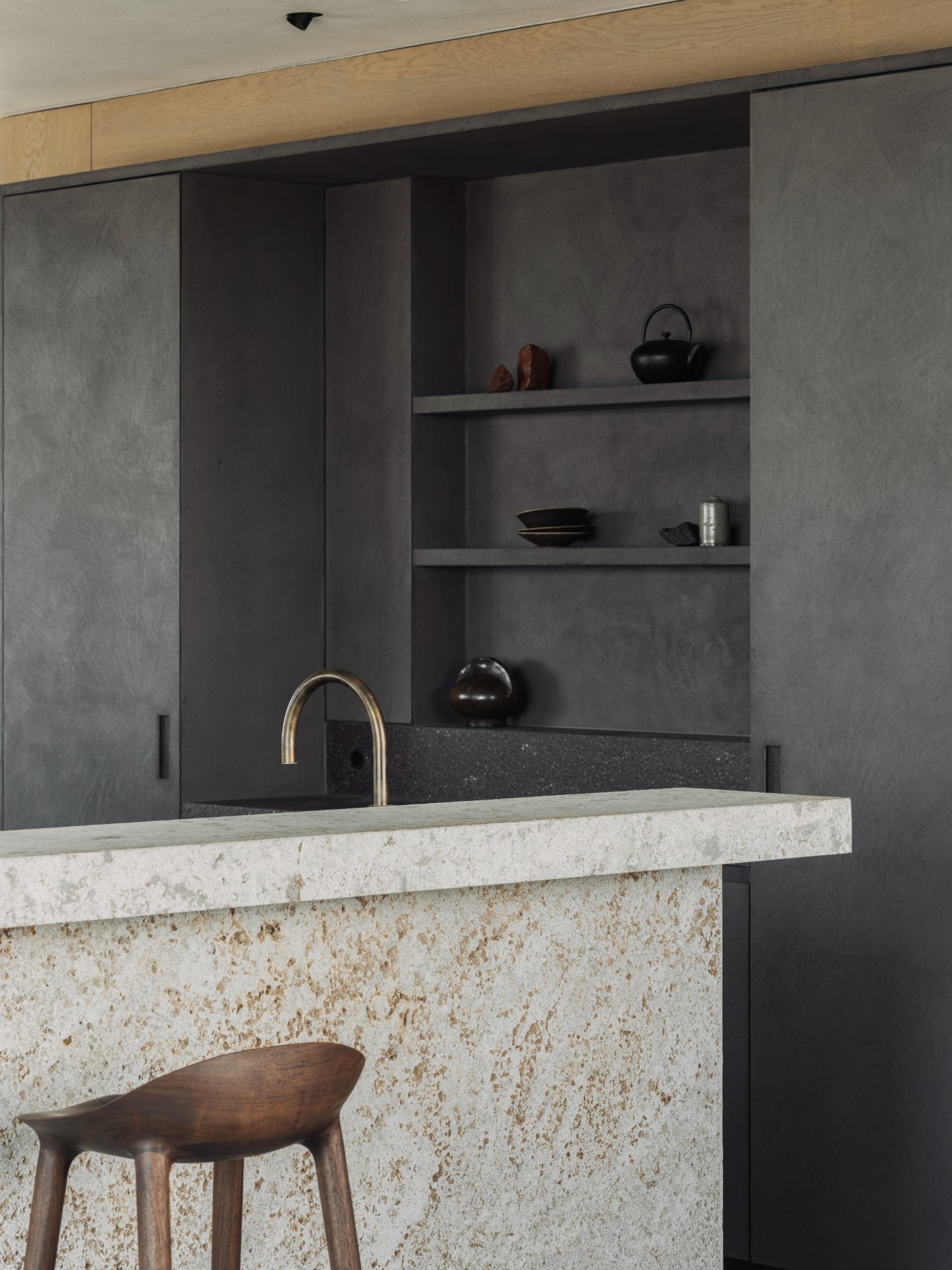
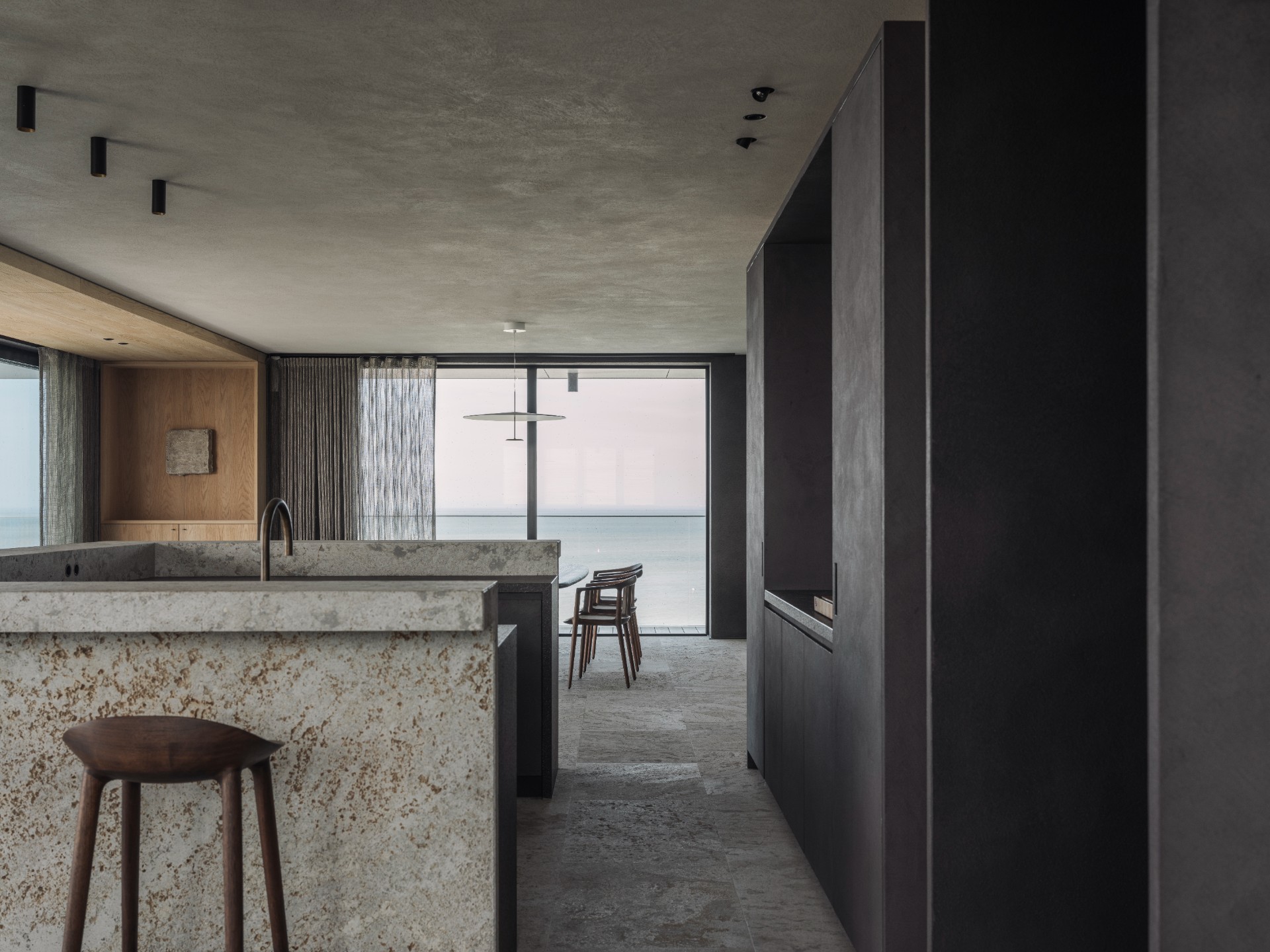
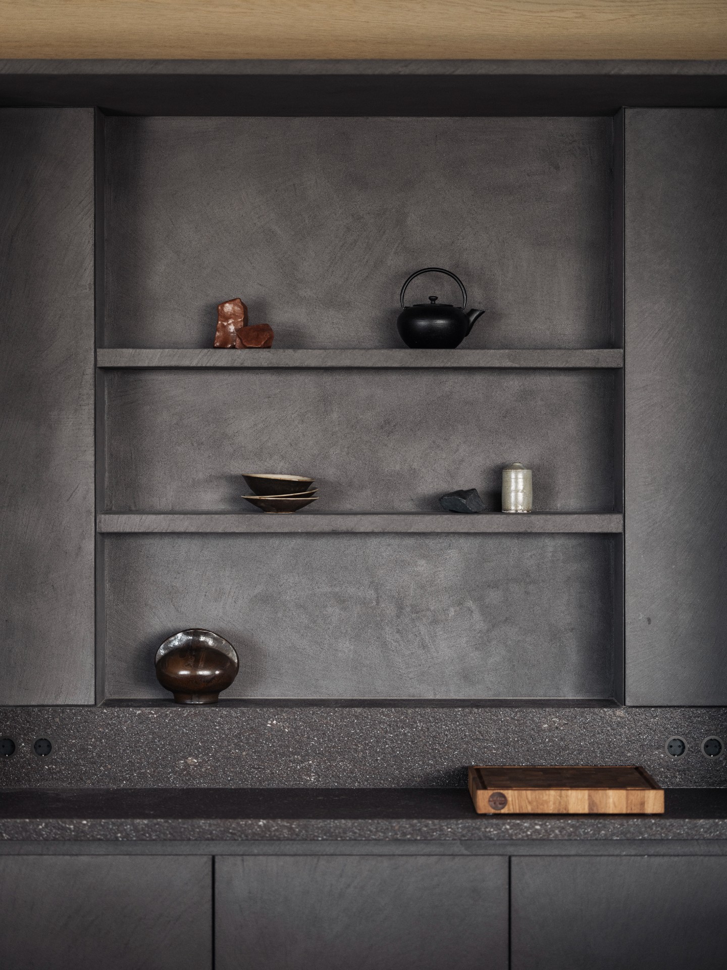
The kitchen zone is anchored by a natural stone countertop with a pronounced edge and a dense, almost monolithic presence. Dark fronts sit below it, keeping the base visually grounded. Seen from a distance, the whole composition reads as a single block cut with a few precise openings. That is where the kitchen with natural stone countertop stands out: not through display, but through restraint and material weight. The stone surface catches light differently from the matte panels beneath it.
Behind the work area, the wall continues the same controlled language. Recessed shelves, dark voids, and narrow horizontal planes create a field of storage and surface that supports the kitchen rather than separating it from the rest of the interior. The material shift from wood to stone to dark painted fronts is subtle, yet it keeps the room from feeling uniform. The contrast is strongest at the edges, where one surface meets another and the junction stays visible.
Dark fronts, open shelves, and a clear working line
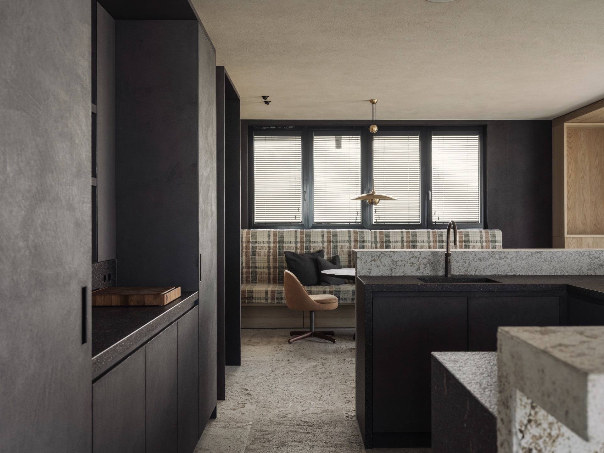
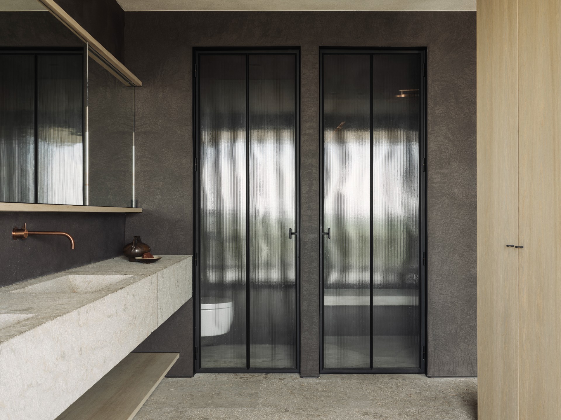
Seen in closer detail, the kitchen has a strong horizontal logic. The worktop runs in a clean line, the open compartments are stacked above it, and the dark cabinetry below holds the visual weight. This is where the project’s focus on wood stone and metal becomes most legible. Wood brings grain and warmth in the literal sense of texture, stone gives the counter its mass, and metal appears in slim accents that sharpen the larger surfaces. No single material dominates the scene.
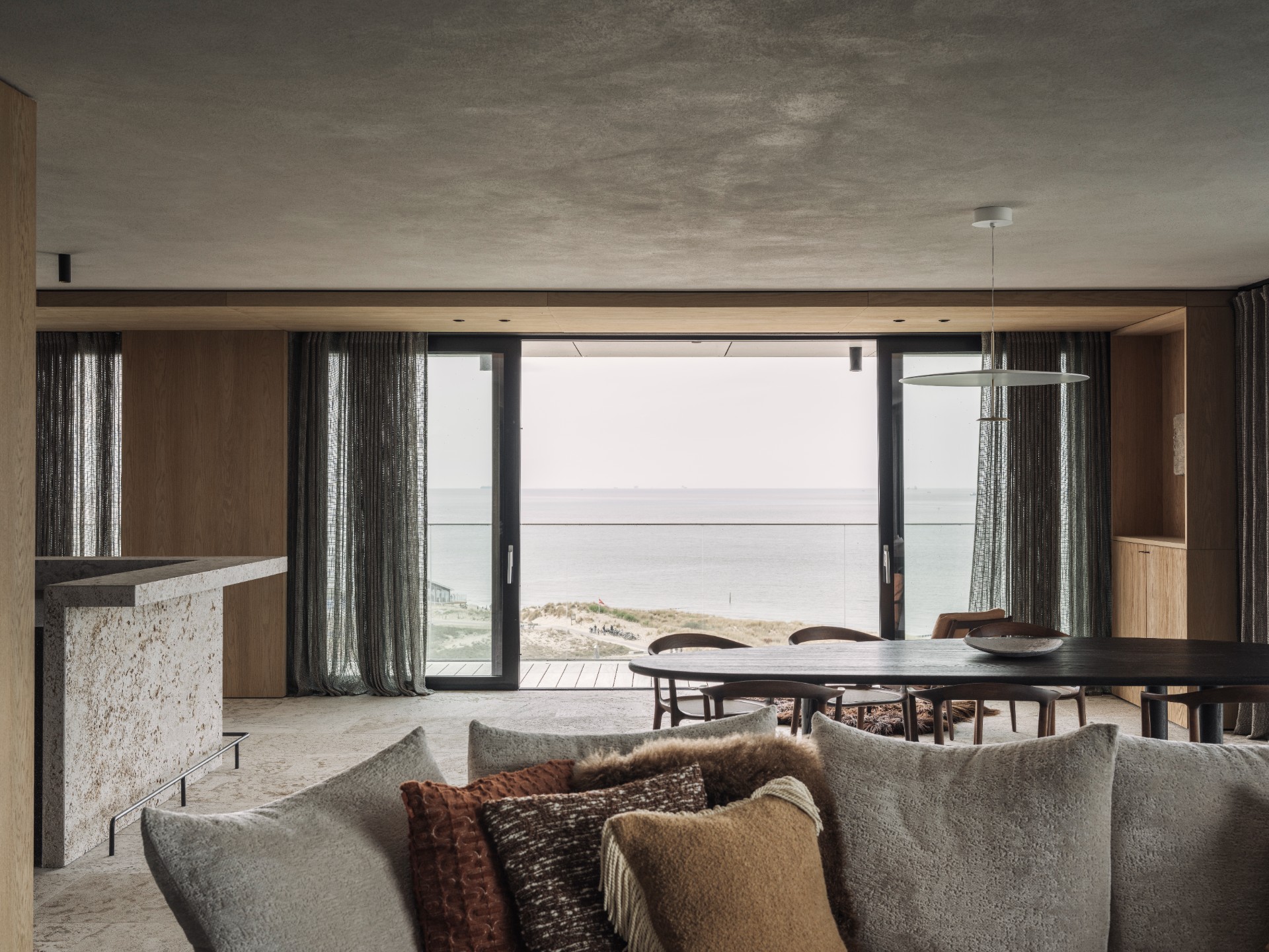
Horizontal window elements bring another layer into the room. In one view, the blinds sit behind the kitchen zone and filter daylight across the fronts. The light is not theatrical. It falls in bands, making the matte doors and the stone edge read differently over the course of the day. That indoor-outdoor view is not framed as a dramatic reveal; it is part of how the room breathes, with openings that let the exterior sit quietly behind the interior layout.
Texture does the talking
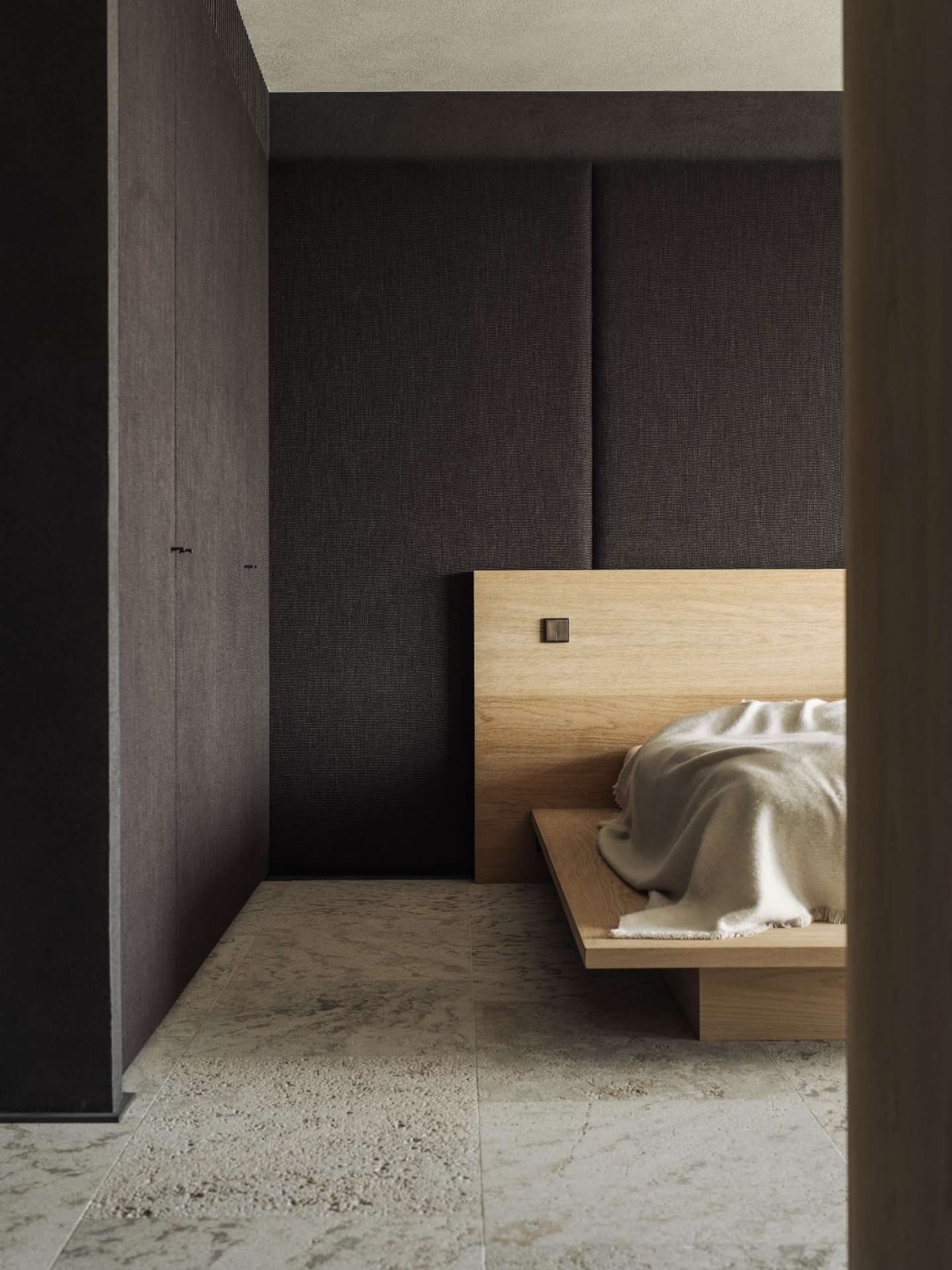
Concrete-look surfaces, wood grain, and stone veins are left visible rather than softened away. The project depends on those finishes to create depth, because the forms themselves are so controlled. A pale plaster-like wall, a darker panel, and a timber edge can look almost severe on their own. Together they become readable and layered. The contrast between concrete-look and wood textures is especially clear in the larger wall planes, where the finish changes before the line of the room does.
That material discipline also explains the project’s calm tone. The interior does not need extra gesture. Its interest comes from proportion, from the spacing of the niches, from the way the cabinets stop and start, and from the shift between open and closed storage. Even the metal details remain lean. They act as a trim line or a junction rather than as decoration. The result is a minimalist interior that feels measured rather than bare.
Light, openings, and the room beyond
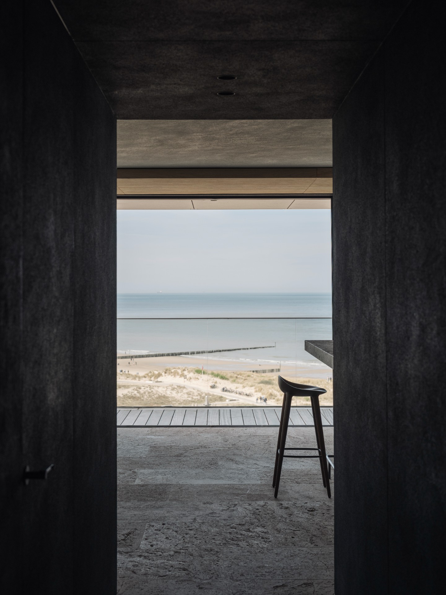
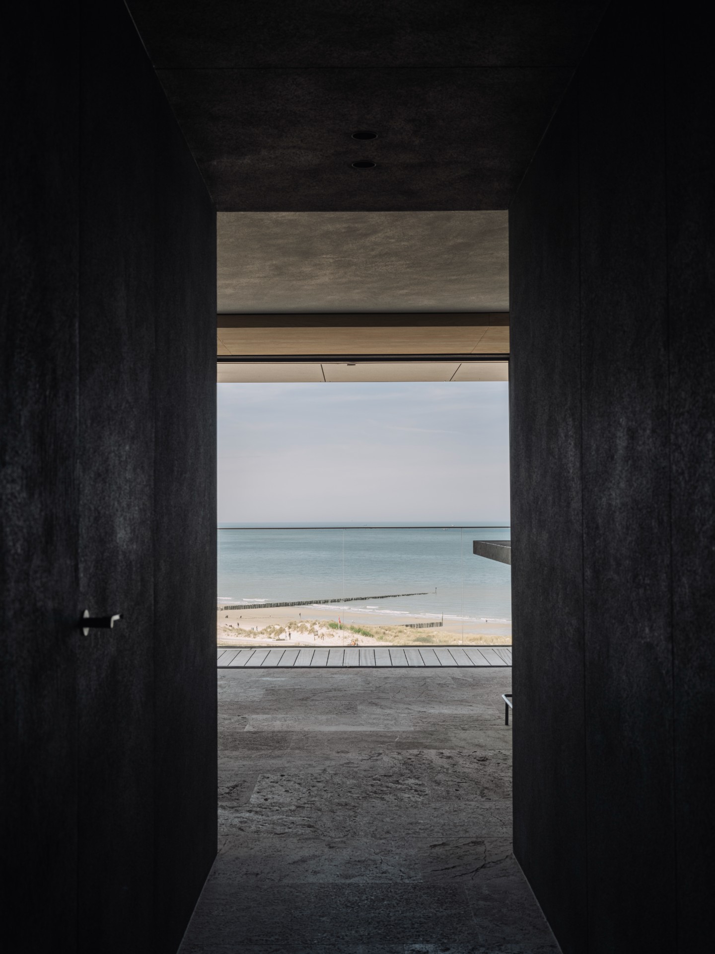
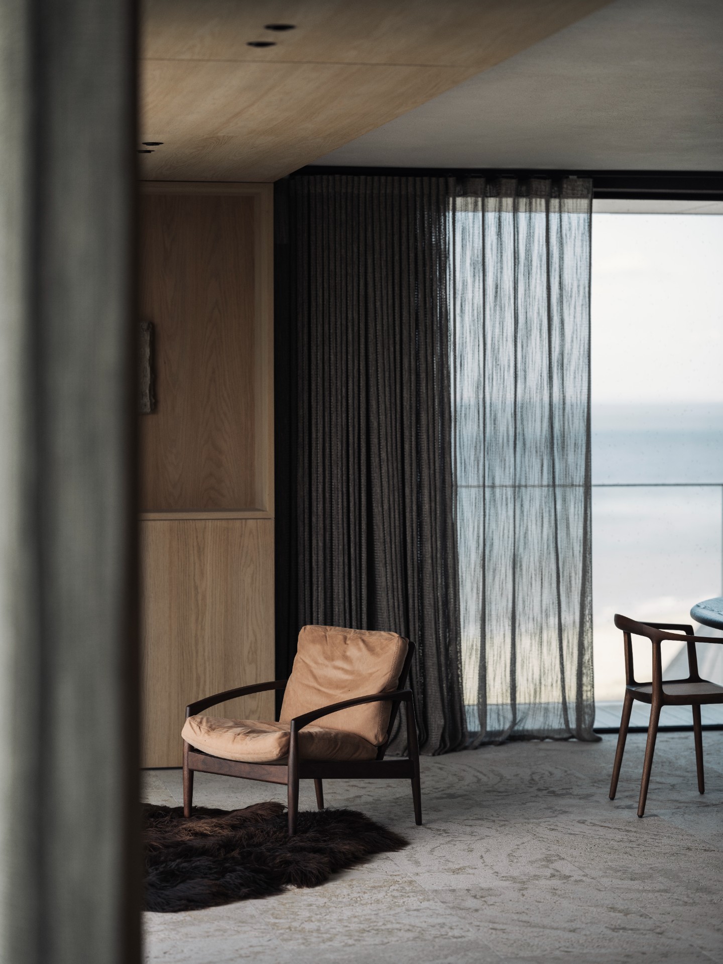
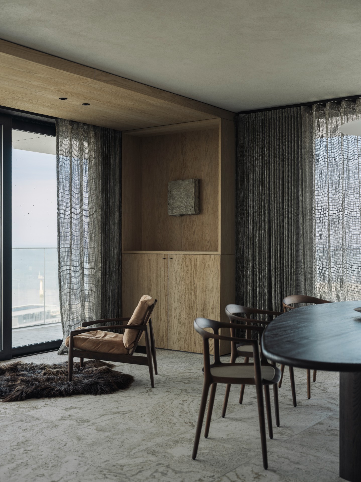
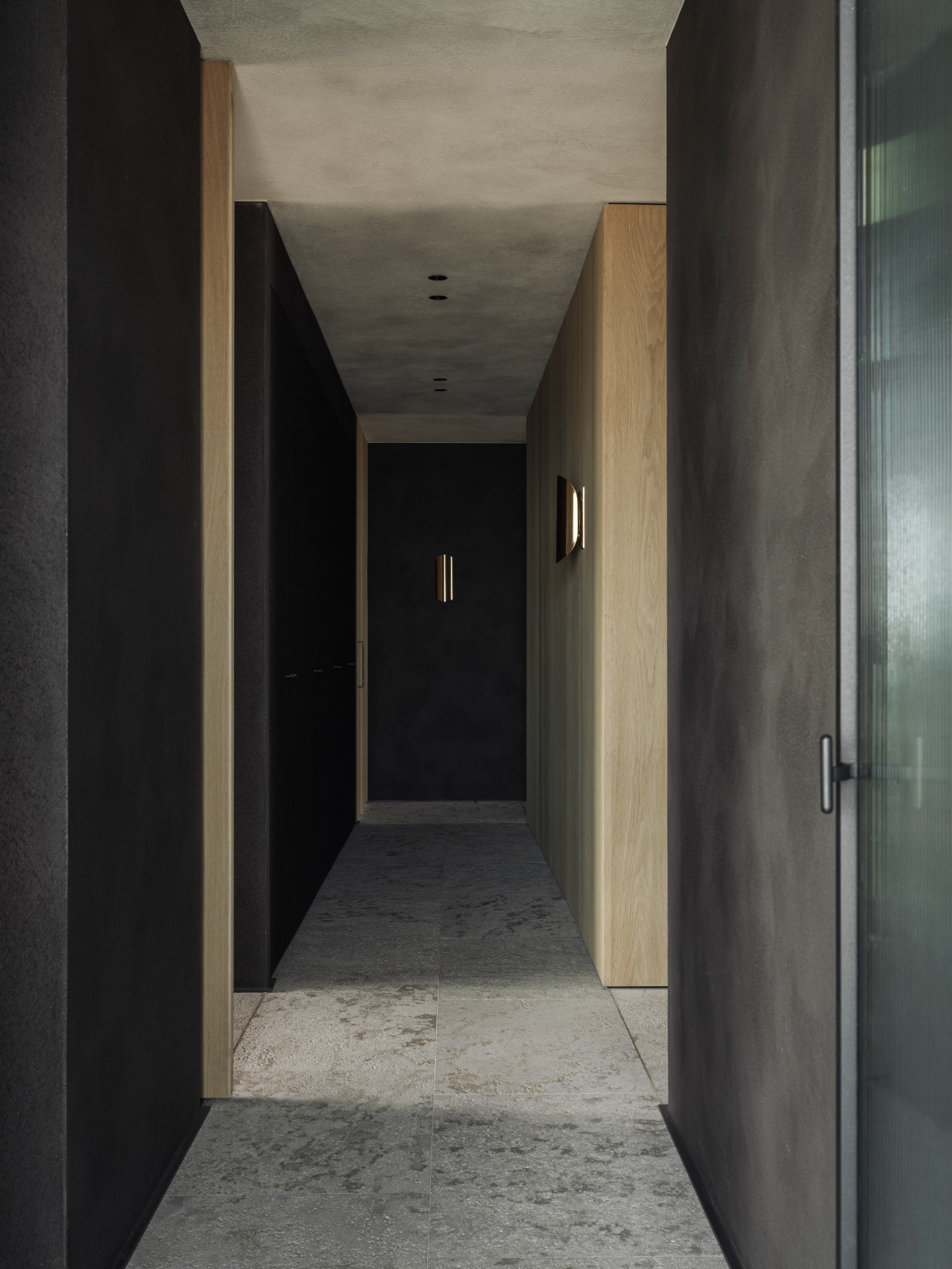
One of the strongest moments in the project is the opening toward the outside. A large glazed section extends the view and pulls daylight deep into the room. Curtains soften the edge of the opening in some views, while the surrounding wood panels and ceiling spots keep the interior grounded. The line between inside and out stays legible, but it is not loud. You see the connection in the reflection on the floor tiles, in the way the light lands on the cabinetry, and in the depth of the room behind it.
From the darker passage areas, the kitchen appears as a second layer in the plan, visible through openings and across aligned surfaces. That sense of sightline matters here. It lets the built-in cabinetry, the stone worktop, and the open niches register as part of one spatial sequence rather than isolated elements. The room is calm because it is connected. Every threshold is doing a bit of work, even when it looks almost invisible.
The final impression comes from control, not display. Millimeter-level decisions are suggested in the way the panels meet, the way the niches are cut, and the way the finishes change without abrupt transitions. Nothing is left loose. Yet the space never feels rigid, because the natural materials keep small variations alive: grain in the wood, veining in the stone, a faint shift in the concrete-look surfaces. It is a minimalist interior that relies on detail, but never feels crowded by it.
Want to see more of Stuyts NV? View the page of Stuyts NV for even more great projects and company information.



NEW 2026 Jubileum Edition The Best Interior Designers Benelux
Order Now €125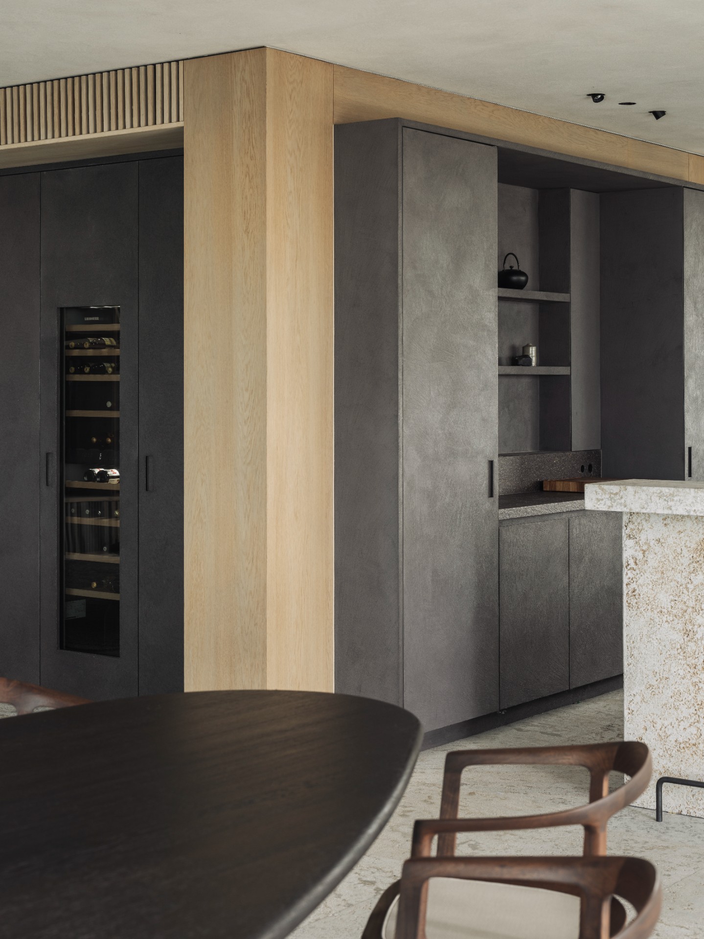
NEW 2026 Jubileum Edition The Best Interior Designers Benelux
Order Now €125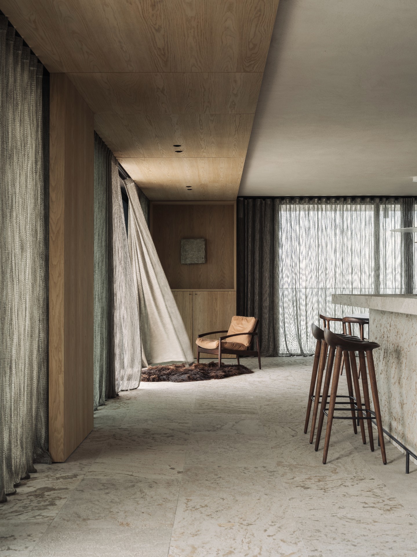
NEW 2026 Jubileum Edition The Best Interior Designers Benelux
Order Now €125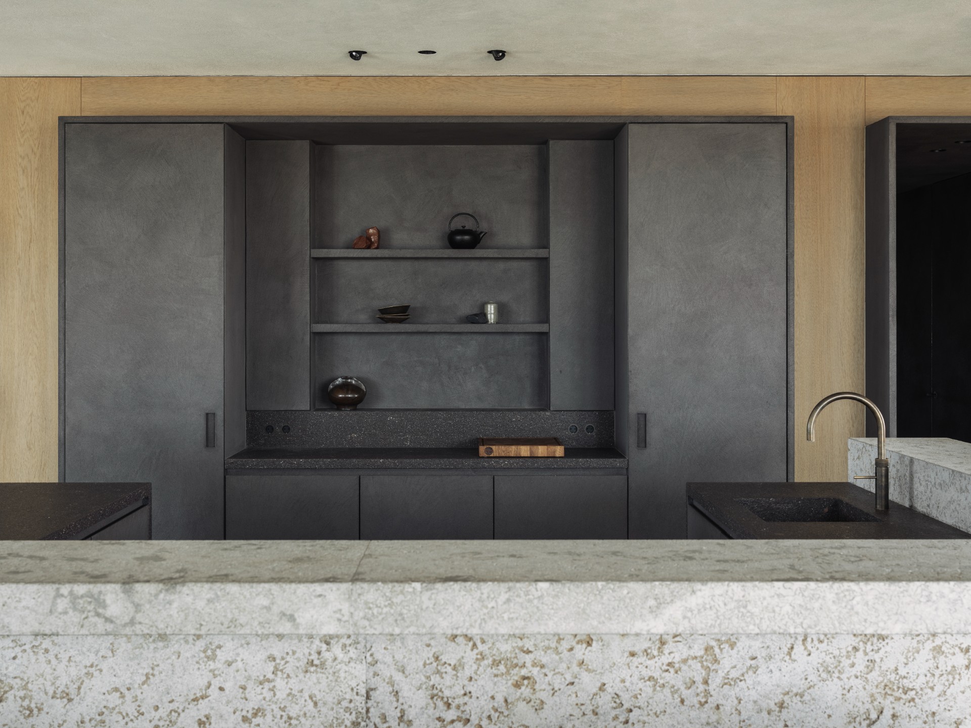
NEW 2026 Jubileum Edition The Best Interior Designers Benelux
Order Now €125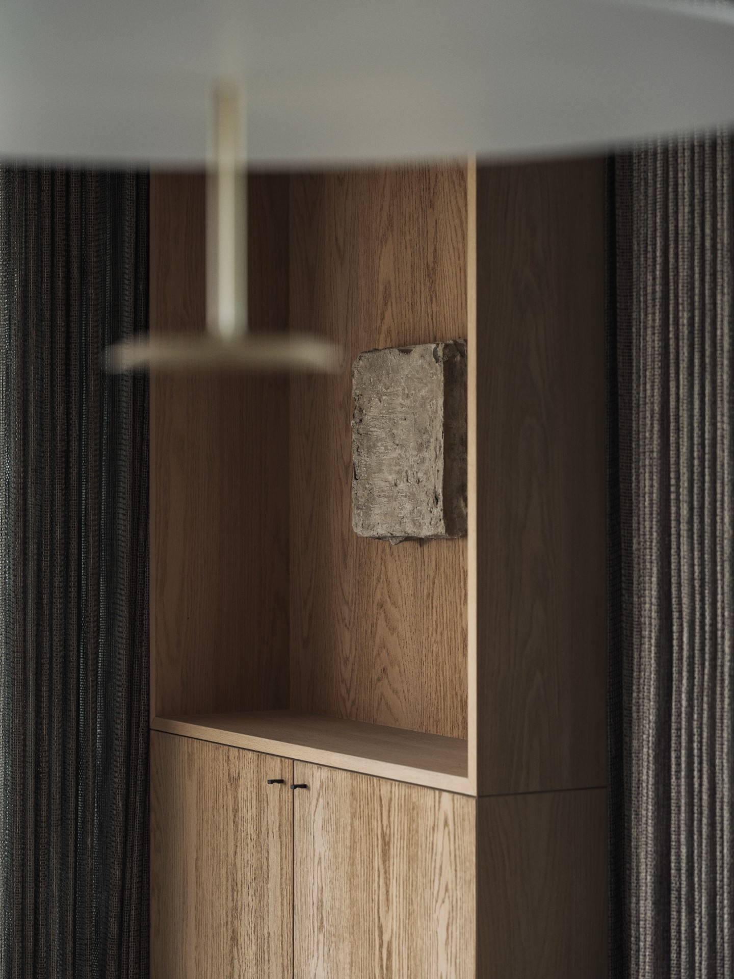
NEW 2026 Jubileum Edition The Best Interior Designers Benelux
Order Now €125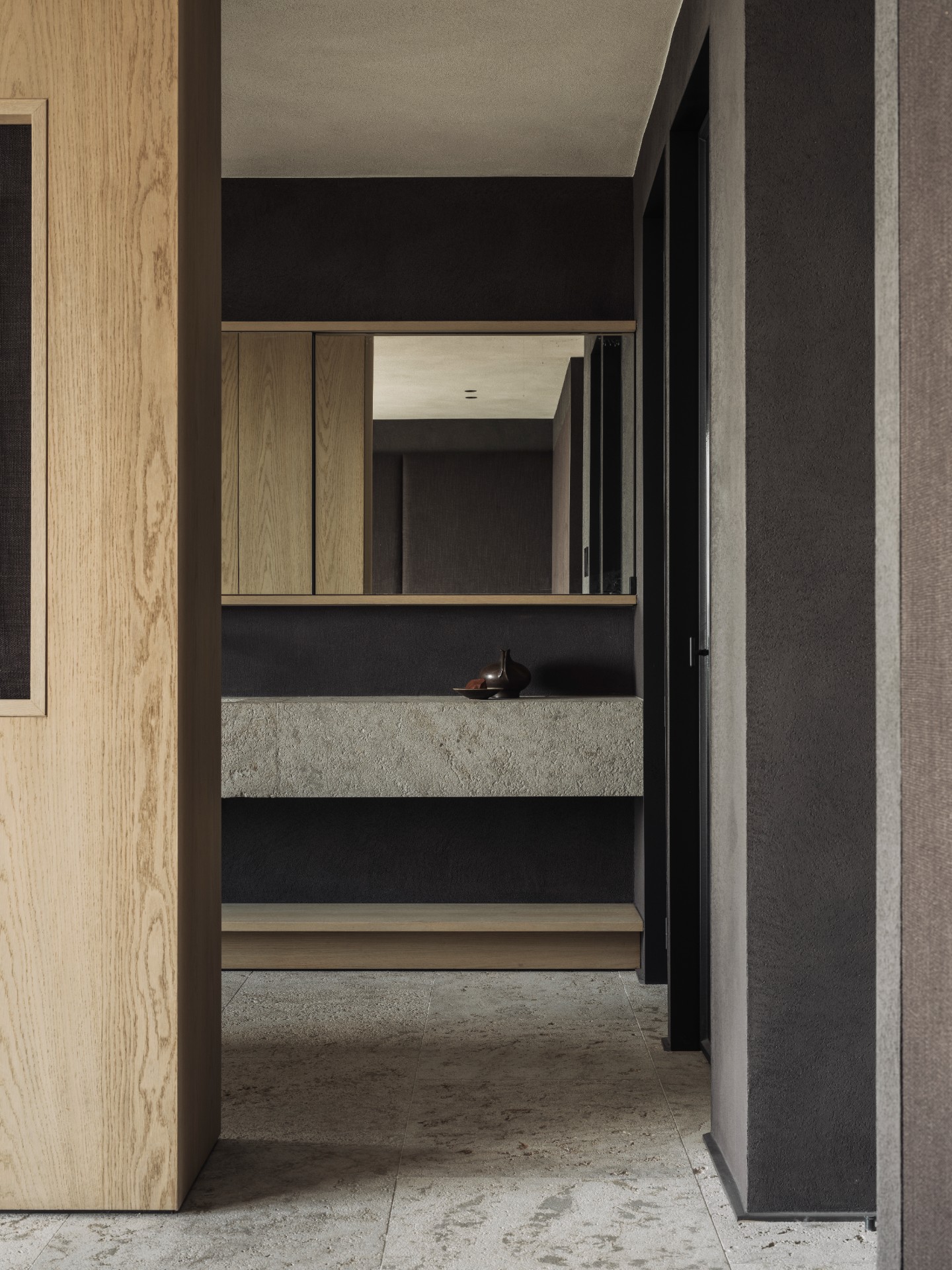
NEW 2026 Jubileum Edition The Best Interior Designers Benelux
Order Now €125