









Modern 1930s House
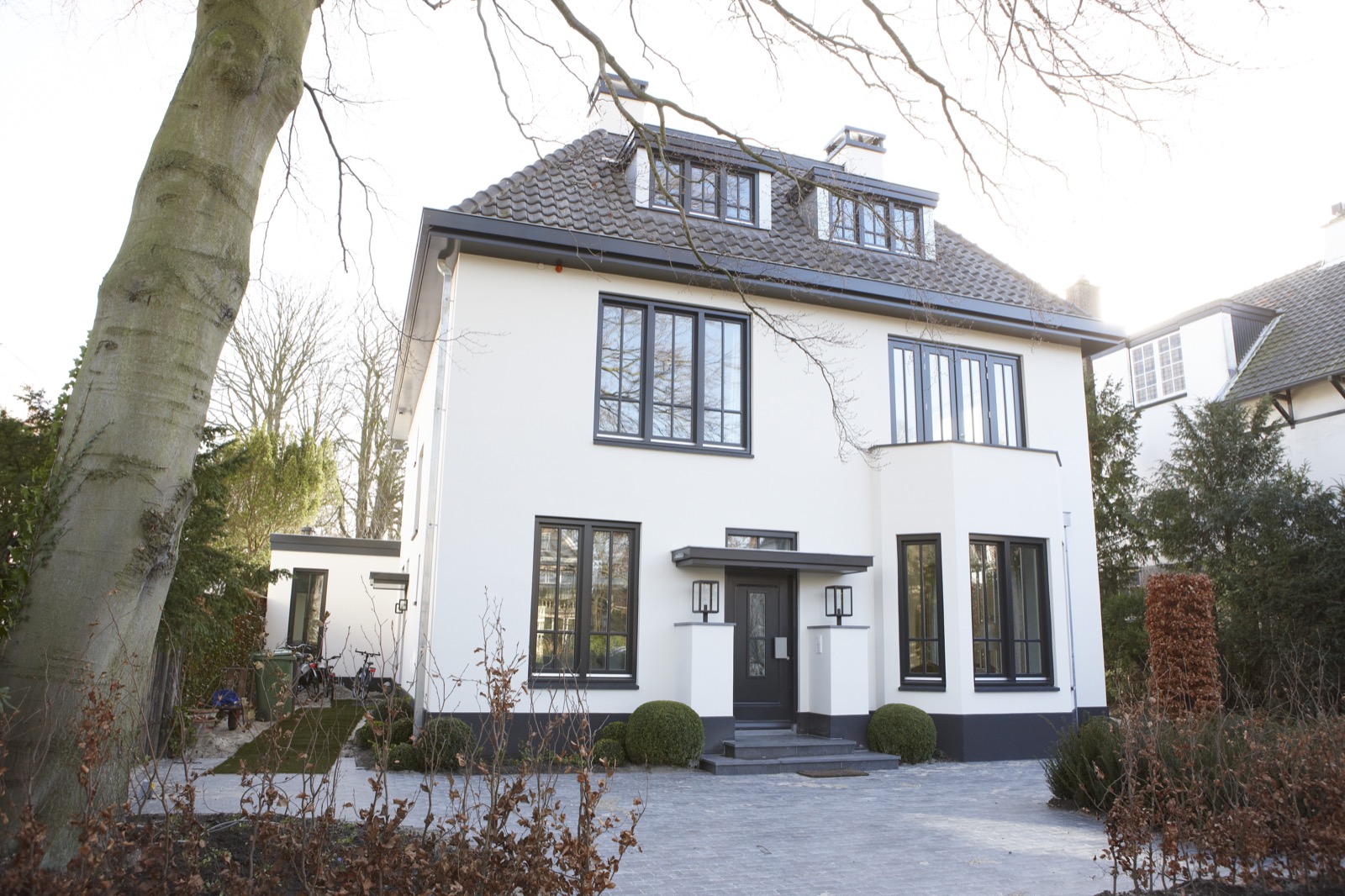
Dark window frames cut a sharp line through the white exterior, while the lower band of deep gray gives the house a grounded look. The renovation turns an old villa into a modern 1930s house without losing the familiar pitched roof profile. Brickwork, stuccoed outer walls, and the older roof tiles keep the shell rooted in the original body, but the cleaner openings and reduced detailing change the reading of the whole front.
Black windows and a pared-back front elevation
The first impression comes from the contrast: white stucco above, dark surfaces below, and black windows set into narrow profiles. That limited palette keeps the facade calm even with several openings across two levels. The masonry and facade finish sit close to the window line, so the frames read as precise cuts rather than decorative additions. This is where the modern facade stucco meets the darker joinery and gives the house its clear outline.
At the entrance, a projecting canopy marks the door and adds a small shadow line before the threshold. The front door sits neatly under that overhang, with side glazing and steps lifting the entry above the path. It is a modest move, but it gives the entrance a stronger address and keeps the frontage from feeling flat. Seen from outside, the details are restrained; seen up close, they organize the approach.
A dormer and extension that change the roofline
The renovation adds a new dormer and a larger extension, both working quietly with the existing volume. The dormer breaks the roof plane and brings more usable light into the upper level, while the extended volume gives the plan more breadth at ground floor level. Nothing about the added parts tries to imitate the original villa in a literal way. Instead, the massing stays simple, and the older roof tiles keep the silhouette tied to the house’s earlier form.
That roofline matters because it keeps the modern 1930s house legible as a whole. The new pieces do not crowd the existing structure; they stretch it. Openings are placed with a measured rhythm, and the dark frames repeat from one elevation to another, so the additions feel part of the same sequence. In profile, the house reads as a clear combination of old volume, renewed shell, and a more generous ground-floor reach.
Inside, the plan opens around stone-colored floors and dark joinery
Inside, large gray tile flooring runs through the hall and into the circulation spaces, setting a cool base under the white walls. The floor surface does a lot of work here: it holds the route, reflects daylight in a muted way, and keeps the transitions between rooms visually calm. Along both sides, dark window and door frames sharpen the edges of the space, while the plastered walls stay plain enough to let the floor pattern and openings carry the composition.
The hallway shows the project’s spatial discipline at its clearest. Symmetrical sightlines pull the eye forward, with the tiled surface leading toward the deeper rooms. The same black windows that define the exterior return inside as dark frames around the openings, so the house keeps one language from front to back. It is a modern interior, but one that still feels connected to the proportions of the renovated villa rather than stripped away from them.
A kitchen with island at the center of the ground floor
The kitchen is built around an island that sits squarely in the middle of the room. Dark cabinets anchor the lower sections, while lighter recesses and walls keep the working zone from becoming too heavy. The island gives the space a clear center and leaves room for movement on either side. Here the interior leans into contrast again: pale surfaces, dark joinery, and the hard shine of tile underfoot.
Small changes in depth make the kitchen feel composed rather than crowded. The worktops line up with the island, and the surrounding cabinetry is kept flush and understated. Because the room connects to the rest of the house, the kitchen does not present as a closed-off service space. It reads as part of the broader modern interior, with the same calm geometry, straight edges, and controlled palette found in the hall and living areas.
Gray tile flooring and built-in rhythm
The gray tile flooring continues the project’s preference for surfaces that do not compete with the architecture. In the hall and kitchen zones, the tiles form a measured grid that supports the long views through the house. Their scale is large enough to reduce visual noise, yet detailed enough to register the joints and direction of the space. That balance gives the interior a steady pace, especially where daylight falls across the floor and meets the dark frames around the openings.
A living room fireplace set into white walls
The living room centers on an open fireplace with a white surround and a dark insert. The contrast is simple, but it gives the room an obvious focal point without adding clutter. Low shelving and wood accents sit close to the hearth, so the wall around it becomes a measured composition of recess, line, and material change. The fireplace is not oversized; it is set into the room as a fixed point, with the rest of the space arranged around it.
Seen in relation to the rest of the house, the living room continues the same restrained approach. White walls, dark trims, and a few warmer timber surfaces keep the room from feeling overworked. The result is a modern interior that depends on proportion more than decoration. Light moves across the flat surfaces, catches the fireplace opening, and then slips back toward the deeper parts of the plan.
Slim roof windows and a bright upper ceiling
Above, slim roof windows break into the ceiling with narrow strips of blue-tinted glass. The framing is white and deliberate, almost graphic, and the beams around them make the roof structure feel drawn in lines rather than hidden away. This detail brings daylight into the upper volume without changing the straightforward character of the rooms below. It is one of the few places where the ceiling itself becomes part of the composition.
The new dormer works with these roof windows, but the effect is not dramatic for its own sake. It simply extends the usable light and gives the upper areas more depth. That practicality shows in the way the ceiling planes meet the openings: clean edges, tight junctions, and no extra ornament to soften the geometry. The whole house holds to that discipline, from the black windows outside to the tiled floors and fireplace inside.
A renovation defined by clear lines, not excess
What holds this modern 1930s house together is the repetition of a few strong moves: black windows, a white-and-gray shell, a larger extension, and an interior with very little visual noise. The older roof tiles and the masonry help preserve a sense of the original villa, but the sharper openings and the stripped-back interior shift the house into something more direct. Each part is visible. Each part has a role. That is why the renovation reads so clearly from the street and just as clearly once you step inside.
Want to see more of Villabouw Van der Windt? View the page of Villabouw Van der Windt for even more great projects and company information.




NEW 2026 Jubileum Edition The Best Interior Designers Benelux
Order Now €125


