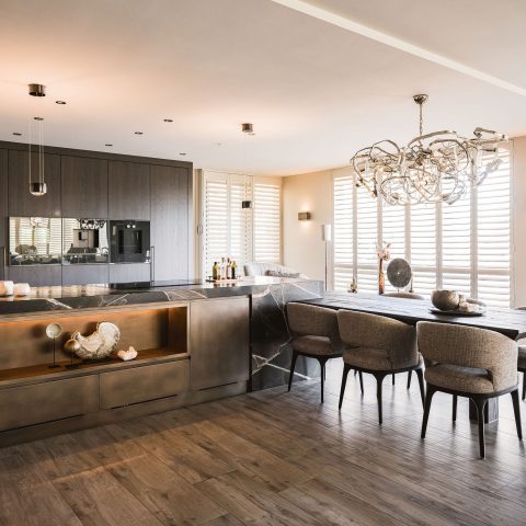
Modern built-in kitchen with custom cabinet wall
Light falls across the oak-look fronts before it reaches the dark worktop zone, where the kitchen shifts into a sharper contrast. The built-in composition keeps appliances tucked into a dark front panel, with the oven and microwave opening into the wall rather than standing apart from it. White surrounds and black-grey modules break the run of cabinetry into clear sections, so the modern built-in kitchen reads as one measured line of storage, preparation, and display.
Built-in kitchen with oak-look fronts and dark worktop zone
The kitchen uses a restrained palette: pale wall surfaces, oak look cabinet fronts, and darker panels that pull the eye toward the appliance bank. That contrast is strongest where the tall units meet the work surface. A dark stone-like countertop zone runs in front, giving the lower line more weight and making the integrated appliances feel set into the architecture rather than added later. The result is direct and legible, with each part of the run doing a specific job.
Visible grain in the front finish softens the straight geometry of the room. It gives the cabinetry a more tactile surface without breaking the clean lines. The white framing around the opening and the pale adjacent walls keep the kitchen bright, while the dark appliance panel anchors the composition. This is where the modern built-in kitchen is most present: not as a separate unit, but as part of the room’s structure and circulation.
Custom cabinet wall with open niches and glass
The custom cabinet wall is built up from closed modules, open niches and glass sections, which prevents the tall storage from reading as a flat block. In several images, the shelving is divided into geometric compartments with straight rails and horizontal lines. Some areas are open and light, others close off behind darker fronts. That shift from open niches and glass to solid storage gives the wall depth and keeps it from becoming visually heavy.
Glass appears in a few cabinet sections and door parts, catching light from the adjoining spaces. It also helps the passage between rooms feel less abrupt. Behind the darker frames, the shelves and open compartments create small pauses in the wall. Decorative objects sit within those niches, but the structure itself stays in focus: a carefully arranged cabinet wall that combines display, storage and route in a single built form.
Dark modules, straight rails and open storage
Several detail images show the same discipline at a closer scale. The modules are stacked vertically, the drawers use straight handle rails, and the fronts sit flush. Where the units open up, the shelves are thin and level, set against a dark backing. That contrast helps each compartment read clearly. It is a practical layout, but also a visual one, because the repetition of rectangles and clean edges gives the wall its rhythm.
Integrated appliances set into a darker panel
The appliance bank is treated as part of the cabinetry rather than a separate technical zone. Oven and microwave openings sit in a dark front panel, with the surrounding storage kept simple and plain. By narrowing the colour range around these built-in elements, the room avoids visual clutter. The eye reads the appliance column as a vertical slice within the larger composition, not as an interruption. That makes the modern built-in kitchen feel measured from top to bottom.
In the same area, the worktop zone appears in a dark stone or composite finish, extending the darker tone across the lower section. This line grounds the kitchen and draws a clear boundary between preparation surface and taller storage. The arrangement also reinforces the room’s geometry: horizontal work surface, vertical appliance stack, and adjacent white framing. Nothing is decorative for its own sake. Each surface serves the layout the image reveals.
Rectangular fireplace opening and clear room transitions
Elsewhere in the interior, a rectangular fireplace wall opening cuts into a plain wall like a framed void. The opening is strict and geometric, with the fire visible behind glass. It echoes the same rectangular language used in the kitchen modules and the cabinet wall, so the living area feels connected through shape rather than by matching finishes. The fireplace is not oversized; it sits in the wall as a clean cut-out that marks the transition between areas.
White surrounds and light grey floors guide the movement from the kitchen toward the living spaces. The openings between rooms are broad, but the wall edges stay crisp, which keeps each zone readable. In one view, the passage leads toward a work nook with dark cabinetry and a large window beside it. That sequence of openings, frames and views gives the interior a clear route without closing it off.
Light from large windows and ceiling spots
Large windows appear throughout the project, and they matter as much as the cabinetry. They bring daylight across the matte fronts, the glass inserts and the pale wall surfaces. Ceiling spots add another layer of control, especially in the kitchen and circulation areas, where the light is precise and even. Together they keep the darker modules from dominating and make the contrast between oak tones, white framing and black-grey panels easier to read.
The work nook visible in one of the images continues that same logic. A dark built-in composition sits beneath a broad window, with the desk and storage tucked into a niche rather than standing separately. It is a small but telling detail: the room uses the same language of enclosed modules, open sightlines and controlled light, only on a smaller scale. That repetition ties the interior together without resorting to identical room types.
Across the whole project, the strongest impression comes from the way storage, openings and light are handled as one sequence. The modern built-in kitchen sets the tone with oak-look fronts and integrated appliances. The custom cabinet wall extends it with open niches and glass. The fireplace opening, the framed passages and the daylight from the windows keep the interior clear and layered, so each part remains visible as the eye moves through the rooms.
Want to see more of Kembra? View the page of Kembra for even more great projects and company information.




NEW 2026 Jubileum Edition The Best Interior Designers Benelux
Order Now €125


NEW 2026 Jubileum Edition The Best Interior Designers Benelux
Order Now €125


NEW 2026 Jubileum Edition The Best Interior Designers Benelux
Order Now €125


NEW 2026 Jubileum Edition The Best Interior Designers Benelux
Order Now €125


NEW 2026 Jubileum Edition The Best Interior Designers Benelux
Order Now €125


NEW 2026 Jubileum Edition The Best Interior Designers Benelux
Order Now €125


NEW 2026 Jubileum Edition The Best Interior Designers Benelux
Order Now €125


NEW 2026 Jubileum Edition The Best Interior Designers Benelux
Order Now €125