Modern custom interior
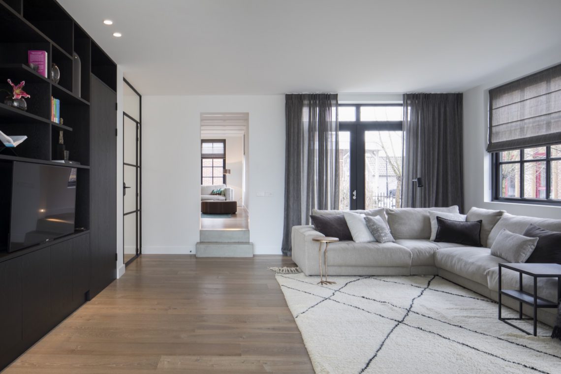
Light lands first on the pale floorboards, then on the dark joinery wall with its open niches and small integrated lights. That contrast sets the tone for this modern custom interior: crisp lines, controlled daylight and storage that is built into the room rather than added to it. The plan stays open, but each zone has a clear edge, marked by glass, metal and a shift in material.
Built-in storage that shapes the room
The most present piece in the living area is the cabinet wall. It combines closed fronts with open shelves, so the surface reads as one long plane, interrupted by pockets for objects and light. In the evening, the recessed lighting pulls the darker finish forward and gives depth to the wall. This custom built-in storage does more than hold things; it sets the scale of the room and keeps the seating area visually calm.
Near the sofa, the joinery continues in a measured way rather than filling every wall. That restraint leaves room for the grey upholstery, the patterned rug and the round side table with its thin metal base. The furniture sits lightly against the stronger architectural elements, so the room never feels overloaded. It is a quiet arrangement, but not an empty one.
An open-plan living space with clear sightlines
The layout moves easily from kitchen to dining area to lounge. In this open-plan living space, the eye can travel across the room without hitting a series of closed partitions. A wooden dining table sits under a linear pendant, while the seating area is anchored by a large rug with black linework. The arrangement keeps the conversation between zones visible, even when each zone serves a different use.
That openness is reinforced by the large windows. Grey curtains soften the edges of the openings, but the glazing still brings in a generous amount of daylight and keeps the interior connected to the exterior view. Black frames appear again at the windows and in the glass divider, so the room gains structure without losing brightness. The overall effect is measured rather than theatrical: open, but clearly composed.
Black framed glass partition as a visual hinge
One of the strongest details is the black framed glass partition. It works as a transparent boundary, defining the circulation while keeping sightlines intact. Through the glass, the sofa remains visible, and the white wall surfaces around the opening sharpen the contrast. The frame reads like a drawn line in the room, using metal and glass to divide space without closing it off.
That same black line returns in the staircase with black railing. The stair is not treated as a hidden transition, but as part of the interior sequence. Black metal rails, glass panels and white plastered walls create a clear vertical movement, with the stair landing opening back into the rest of the home. It is a practical route, yet it also carries the project’s visual language from one level to the next.
A white minimalist kitchen set into the plan
The kitchen keeps to white fronts, a central extractor above the cooking zone and a pared-back surface treatment. In the context of the whole plan, this white minimalist kitchen does not compete with the living area. Instead, it sits neatly inside the open volume, with ceiling spots drawing a clean line above it. Black window profiles nearby add contrast and echo the darker joinery elsewhere in the interior.
The kitchen island and the dining table sit close enough to read as one social field, yet each surface has its own job. The timber table introduces a warmer tone against the white cabinetry, while the hanging light above it marks the dining zone without blocking the view. Nothing feels overdesigned. The room relies on proportion, repetition of finishes and a few strong edges.
Large windows and curtains that soften the geometry
Daylight is one of the main materials in the project. The large windows bring brightness deep into the plan, and the curtains take the edge off the glazing when a softer finish is needed. In the living room, they frame the openings rather than hiding them. In the kitchen, the black profiles around the windows keep the look sharp and tie the opening back to the darker metal details seen elsewhere in the house.
Across the interior, ceiling spots and concealed lighting keep the surfaces readable after dark. The wall textures stay restrained, with white plaster, dark joinery and the occasional stone or tile finish doing most of the work. Because the palette is limited, the room changes character through light and shadow instead of through decoration. That gives the modern custom interior a steady rhythm from one zone to the next.
Bathroom details kept in the background
The bathroom appears as a supporting space rather than the main subject, but the details are clear. A walk-in shower is set behind glass, with roof windows bringing daylight into the sloped ceiling. Green wall tiles appear in a separate corner, adding a different note to the otherwise pale bathroom surfaces. The fittings stay simple, so the tile colour and the light from above remain the main features.
Seen together, the bath area follows the same logic as the rest of the project: direct lines, limited materials and a careful use of openings. The shower enclosure, the skylights and the clean tile joints keep the space bright and legible. It is a room that relies on precise placement rather than on decorative gestures.
Materials, structure and a calm finish
Wood floors, glass, metal and smooth painted walls carry the interior from one area to the next. The darker joinery wall gives weight to the living room, while the staircase and glass divider keep the circulation open. In the background, the cabinet panels and open niches show how storage can be part of the architecture instead of an afterthought. This is what gives the project its clarity: every visible element has a role, and most of those roles are shared across rooms.
What remains after moving through the photographs is a clear reading of space. The house uses the same language in different ways: black frames, pale surfaces, integrated storage and daylight from large openings. That repetition is not decorative repetition; it is the structure that ties the rooms together. The result is a modern custom interior that feels measured from the first view in the living room to the final detail in the bathroom.
Want to see more of Clairz Interior Design? View the page of Clairz Interior Design for even more great projects and company information.





NEW 2026 Jubileum Edition The Best Interior Designers Benelux
Order Now €125


NEW 2026 Jubileum Edition The Best Interior Designers Benelux
Order Now €125


NEW 2026 Jubileum Edition The Best Interior Designers Benelux
Order Now €125


NEW 2026 Jubileum Edition The Best Interior Designers Benelux
Order Now €125