Modern detached house with light brick accents, a dark gable roof, and large glass openings
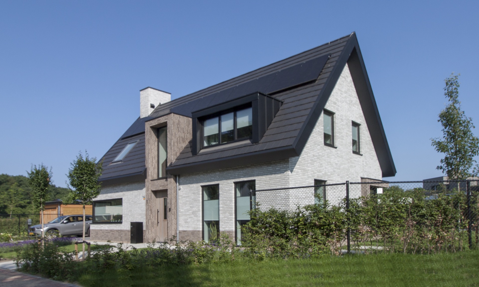
A light brick wall catches the eye first, then the dark gable roof sharpens the outline above it. The house starts from a clear, solid form, but the masonry does more than hold the shape together. At the entrance, a slender projecting element marks the door. Further along, a corner window sits inside a brick frame, and the contrast between the pale masonry and the deep roofline keeps the composition crisp.
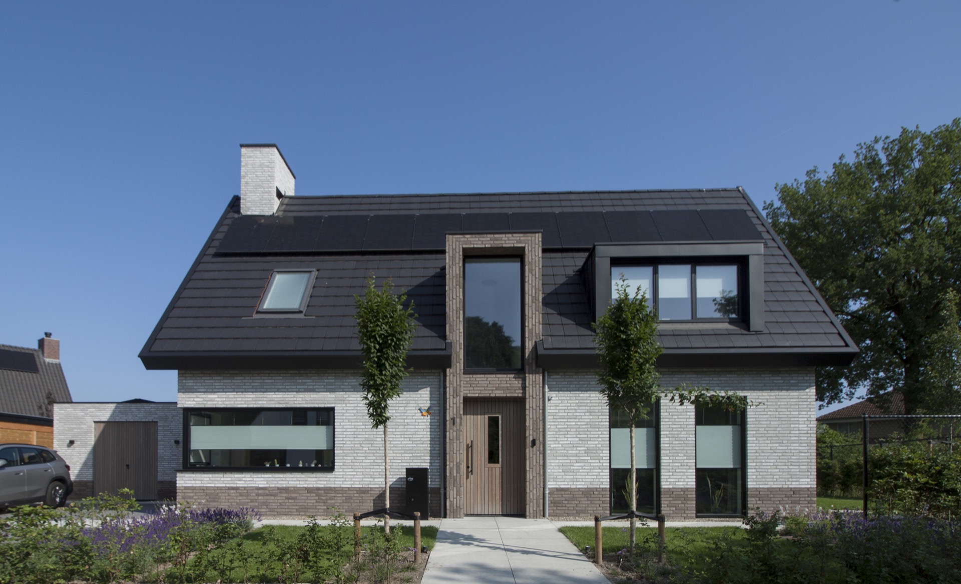
Seen from the front, the modern detached house is built around a few strong moves rather than a surplus of detail. Brickwork accents point to the places where the plan opens up: the front door, the dining area, and the covered outdoor corner. Those elements are not decorative additions after the fact. They are part of how the elevation is read. A vertical masonry column under the overhang repeats the same language in a heavier, more grounded form.
A brick entrance that stands slightly forward
The entrance is easy to read because it steps out from the main volume. That slender risalit gives the front door a clear position without breaking the calm wall surface. Around it, the masonry shifts from plain plane to framed opening, so the door feels set into the building rather than simply cut into it. The gesture is small, but it changes how the whole front elevation is approached. You move toward a marked threshold instead of a flat facade.
That same idea returns around the windows. The brick window surround at the dining area projects beyond the wall face and gives the glazing a thicker edge. It turns the opening into a defined part of the composition. Rather than letting the glass disappear into the elevation, the masonry draws a line around it. From the outside, that makes the opening feel measured and deliberate; from inside, it suggests a stronger connection between table, view, and garden.
The corner window and the deep frame around it
The corner window is one of the clearest moments in the design. It opens the house at the dining area and pulls light in from two directions. The projecting brick frame around it gives the glass a precise outline, so the opening reads as a crafted detail instead of a wide cut-out. This is where the brickwork accents become most visible: they add depth to the wall and give the facade a rhythm that shifts between solid surface and transparent corner.
That rhythm is especially noticeable in the daylight images, where the large glass openings sit back from the masonry and the dark window frames seem to hover inside the heavier brick edges. The effect is quiet but specific. You can read where the wall ends, where the opening begins, and where the frame takes over. It is a simple change in depth, yet it gives the modern detached house a sharper profile.
Light brick walls, dark roofline
The contrast between the light brick facade and the dark gable roof sets the tone for the entire house. The walls stay pale and restrained, while the roof adds weight and outline. Because the roof is detailed so cleanly, the shape of the building stays legible from every angle. On the side views, the dark roof surfaces form a clear cap above the lighter masonry, and the openings cut into that mass without softening it.
In the images, the roof reads as a dark, disciplined plane rather than a separate ornament. That matters because it allows the masonry accents to do their job. The projecting brick frame at the entrance, the deep window surrounds, and the vertical column under the overhang all sit against a strong roofline. Together they make the house look drawn from a few materials only: brick, glass, and a dark roof finish.
What the masonry column does under the overhang
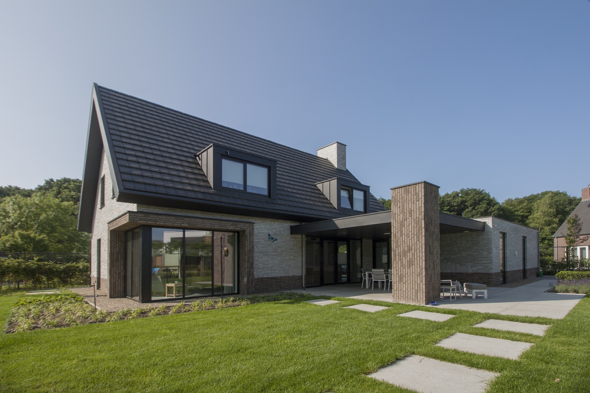
Under the overhang, a massy vertical masonry column gives the covered corner a clear anchor. It is not simply a support hidden in the structure. It is part of the visual language that runs through the whole project. The column repeats the brick surface in a denser form and gives the covered zone a heavier edge. In the side and rear views, this detail helps tie the outdoor area back to the house without closing it off.
The column also changes the way the covered space is read. Instead of a light canopy floating above the terrace, the overhang meets a grounded brick element. That makes the transition from inside to outside feel specific and architectural. It is one of the few places where the wall material moves out of the main volume and into the outdoor setting, so the detail stays visible from the garden side as well.
Glass openings that connect the house to the garden
Large glass openings give the garden side a different pace. The rear and side elevations show broad panes, sliding openings, and dark frames that open the rooms toward the terrace. The garden layout is simple: clean paving stones, a strip of lawn, and the glazed wall beside them. Nothing is overworked. The space is allowed to read in clear bands, with hard paving at ground level and larger glass surfaces above it.
That plain relationship between paving and glazing makes the modern garden terrace feel like an extension of the plan rather than a separate outdoor room. The house does not rely on ornamental steps or layered thresholds. Instead, the terrace sits close to the openings, and the lawn softens the edge beyond the paving. The result is easy to read in the photos: a controlled outdoor zone framed by masonry and glass.
Side views with a sharper roof profile
The side view shows how the dark gable roof folds over the lighter walls and how the openings are placed with restraint. A high opening in the roof plane adds another point of light without disturbing the main geometry. Below it, the brick surfaces keep their calm mass, and the dark window frames sit back inside the wall thickness. The whole composition depends on depth, shadow, and a few measured cuts in the masonry.
What stands out most from this angle is the clarity of the massing. The roof lines are crisp, the walls remain pale, and the openings are positioned to break up the volume only where needed. That gives the modern detached house a quiet certainty in profile. The building looks composed from the outside, but the details show where it opens, where it turns, and where the brickwork takes over to mark those points.
Material changes that keep the elevation legible
Every visible material has a role in the composition. The light brick facade carries the main body of the house. The dark roof fixes the outline. Glass openings cut into both and bring light toward the interior. Even the smaller changes in brickwork matter, because they identify the entrance, the dining corner, and the sheltered outdoor zone. Without those shifts in texture and depth, the front and side elevations would flatten out.
Instead, the building is read in layers. There is the plain wall surface, then the projecting frame, then the deeper glass line behind it. There is the roof edge, then the wall below it, then the column under the overhang. Those overlaps are modest, but they keep the modern detached house visually active. The project uses masonry accents not as decoration, but as markers for the parts of the house that matter most in daily use.
From the first front view to the garden side, the composition stays consistent: pale masonry, dark roof surfaces, and openings that are carefully given depth. The corner window, the brick window surround, and the projecting entrance element all work in the same direction. They sharpen the volumes and give the house a clear reading from the street and the terrace alike.
Want to see more of Spanjers Architect? View the page of Spanjers Architect for even more great projects and company information.




NEW 2026 Jubileum Edition The Best Interior Designers Benelux
Order Now €125