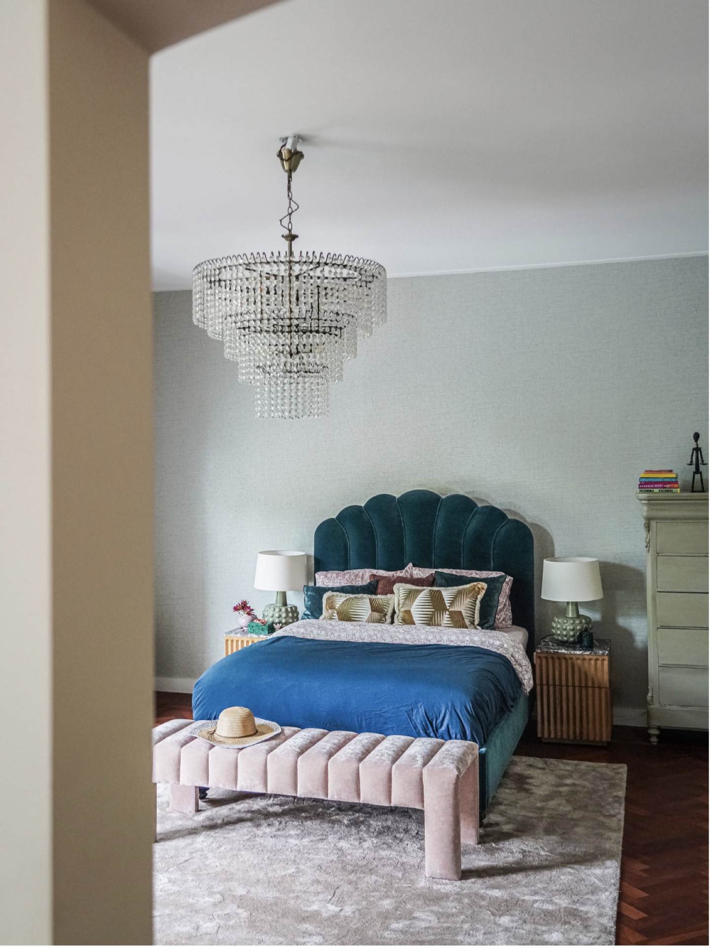
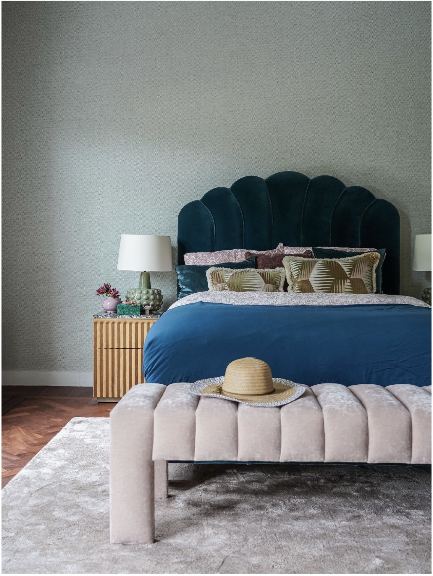
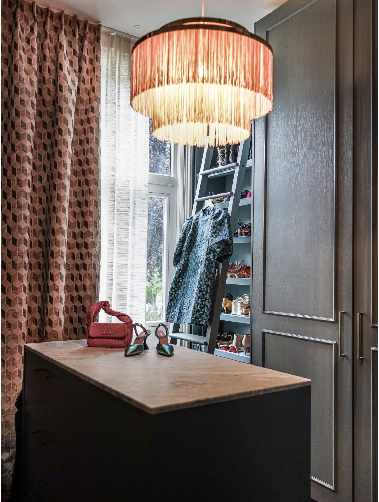
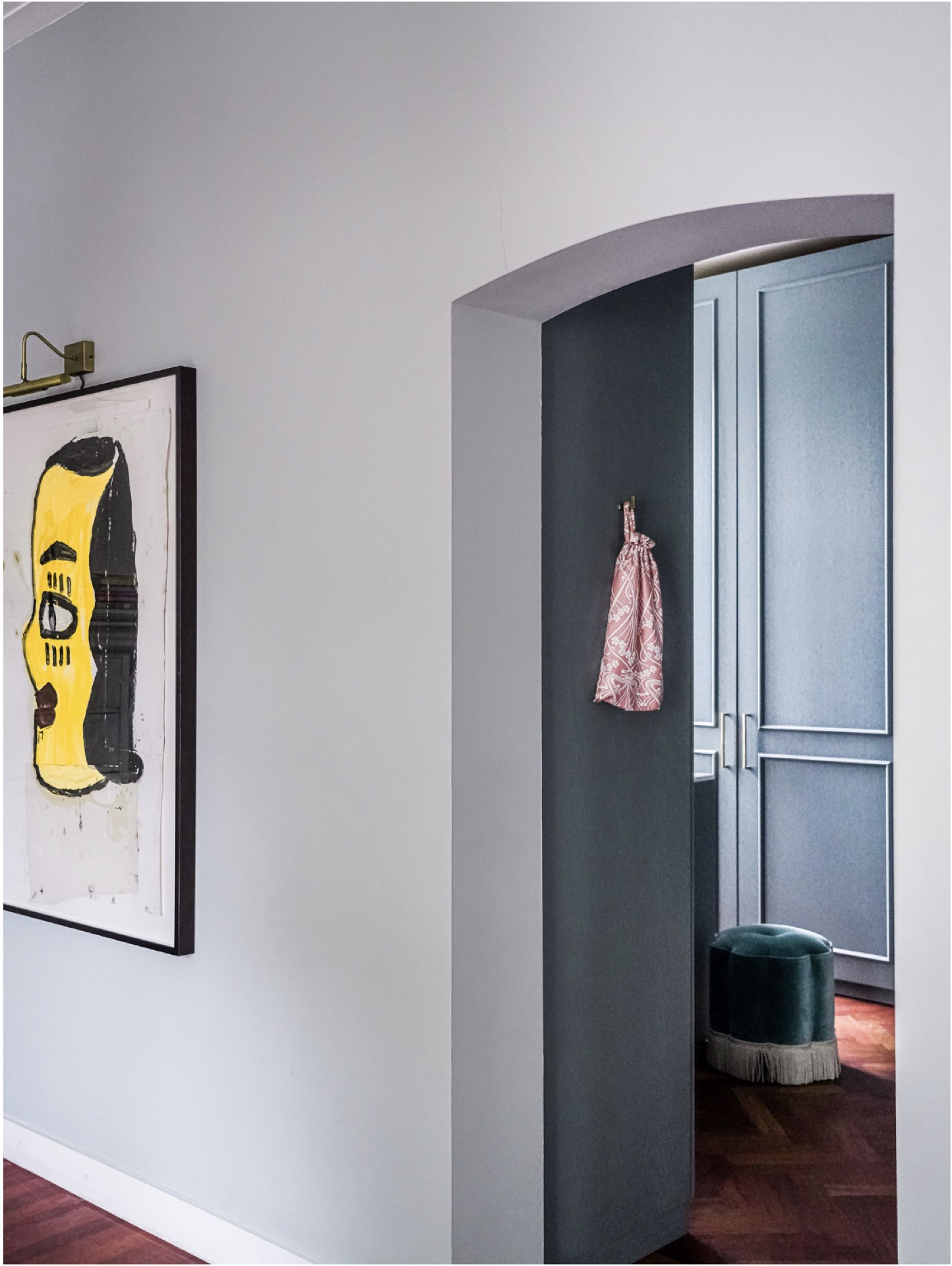
Modern eclectic interior with classic details
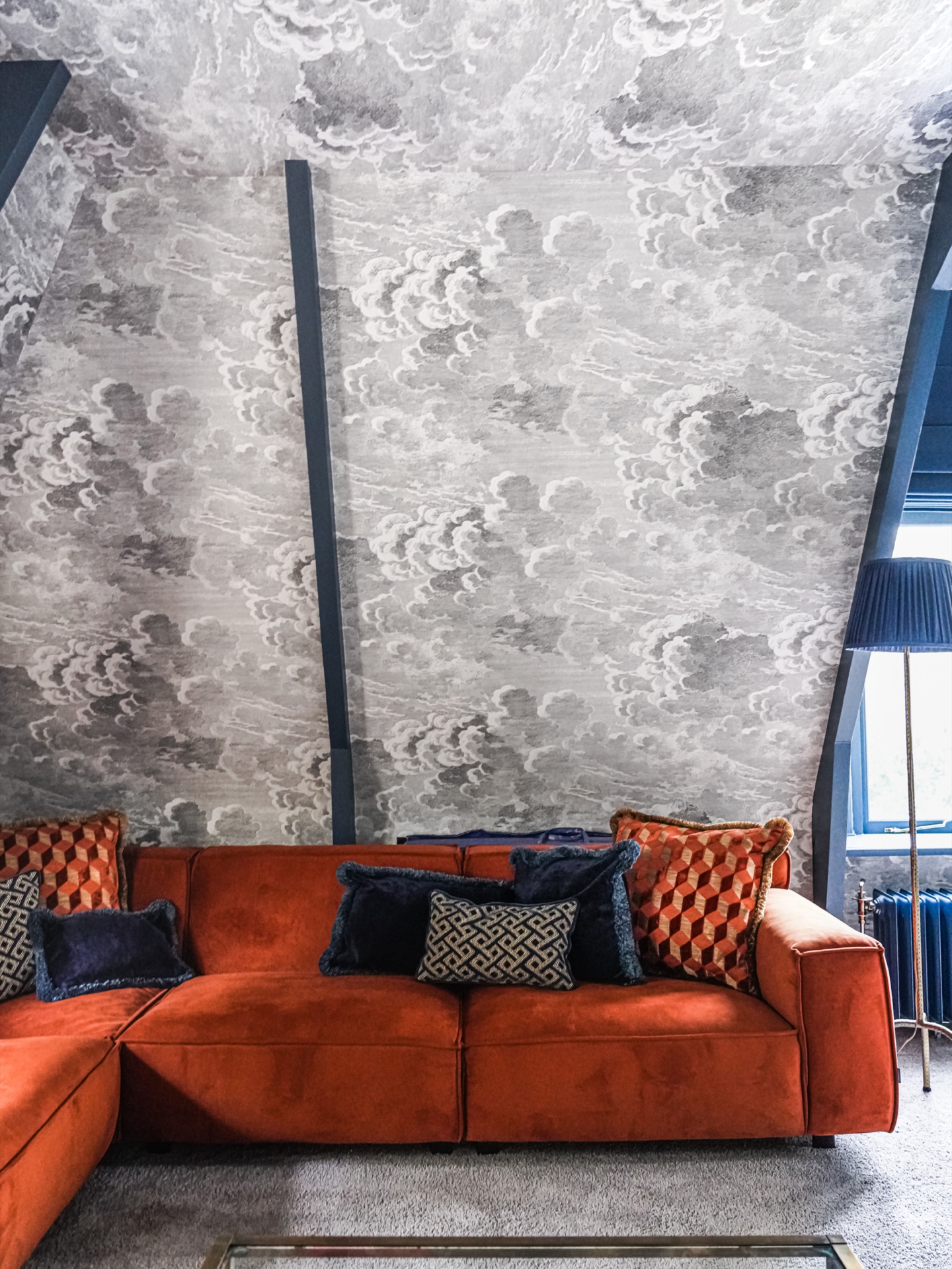
White trim runs through the rooms like a drawn line, cutting across dark blue walls, patterned paper, and painted panels. That contrast gives the house its rhythm. Behind the classical shell, the rooms shift between restraint and emphasis: a paneled living room wall, an arched opening over the kitchen side, and a reading corner where the surface treatment becomes part of the furniture. It is a modern eclectic interior built from visible decisions rather than display.
Classic architecture, left in view
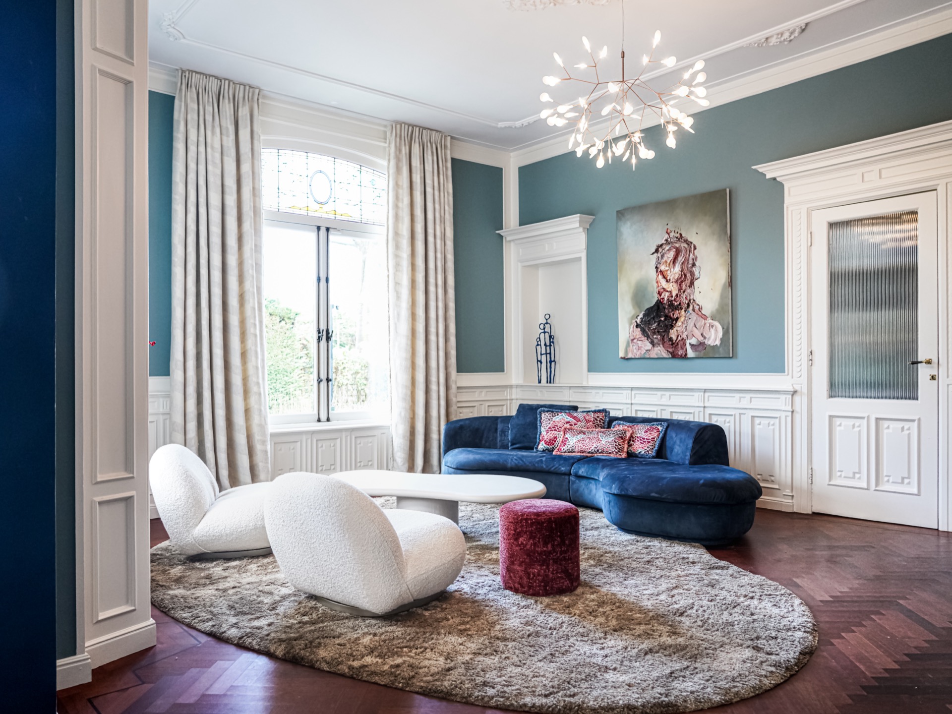
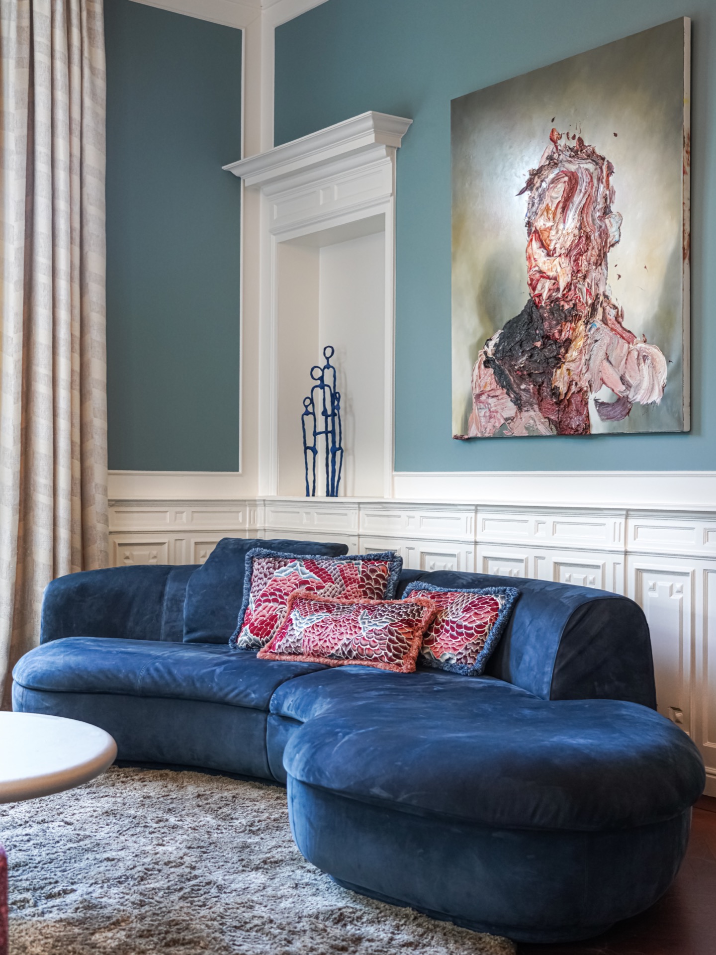
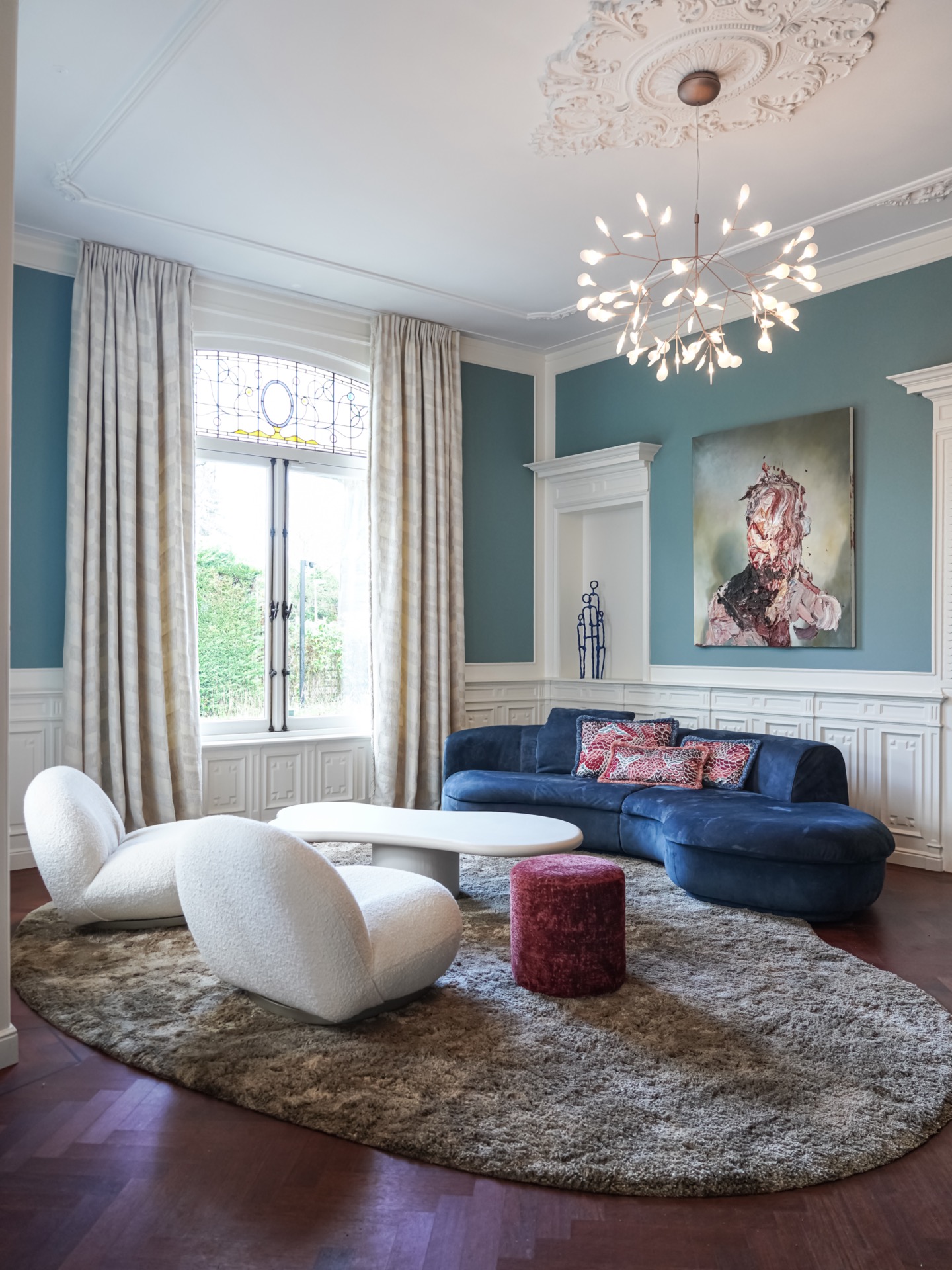
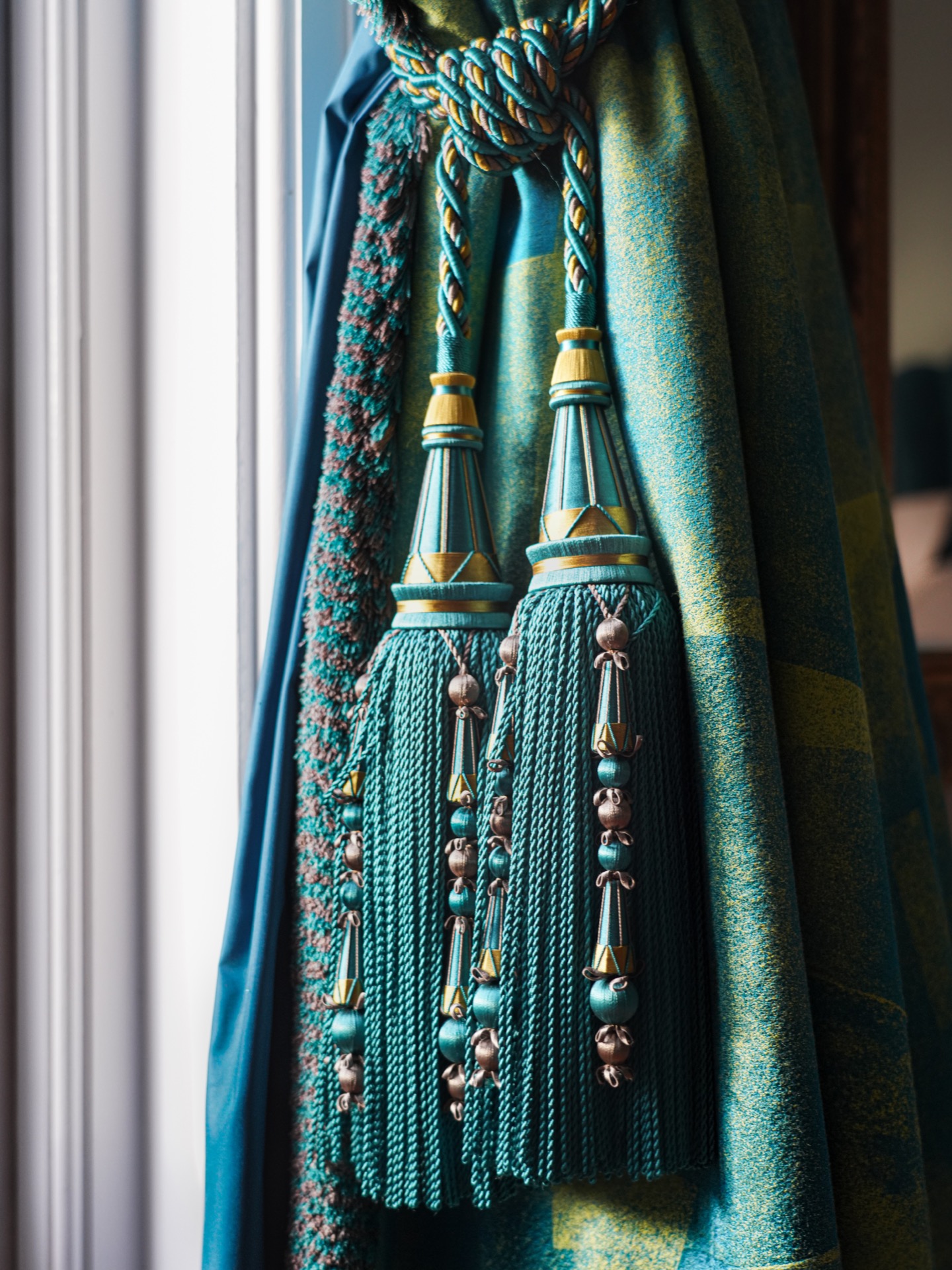
The starting point is architectural. Cornices, panelled walls, and arched windows interior details keep the original structure legible, even when the color palette moves toward deeper tones. In the living room, a blue wall sits behind crisp white moldings, while curtains soften the window height without hiding it. The room does not flatten its history; it keeps the outlines clear and lets new pieces work around them. That is what gives this eclectic interior design its tension.
Elsewhere, the same approach repeats with small shifts. A painted panel below a large window, a trim line that wraps a niche, a ceiling edge picked out in wood. These are not decorative afterthoughts. They set the pace of the room and allow stronger surfaces to land without feeling detached from the house itself. The result is a modern eclectic interior that reads as layered, not assembled.
Color placed against wood and plaster
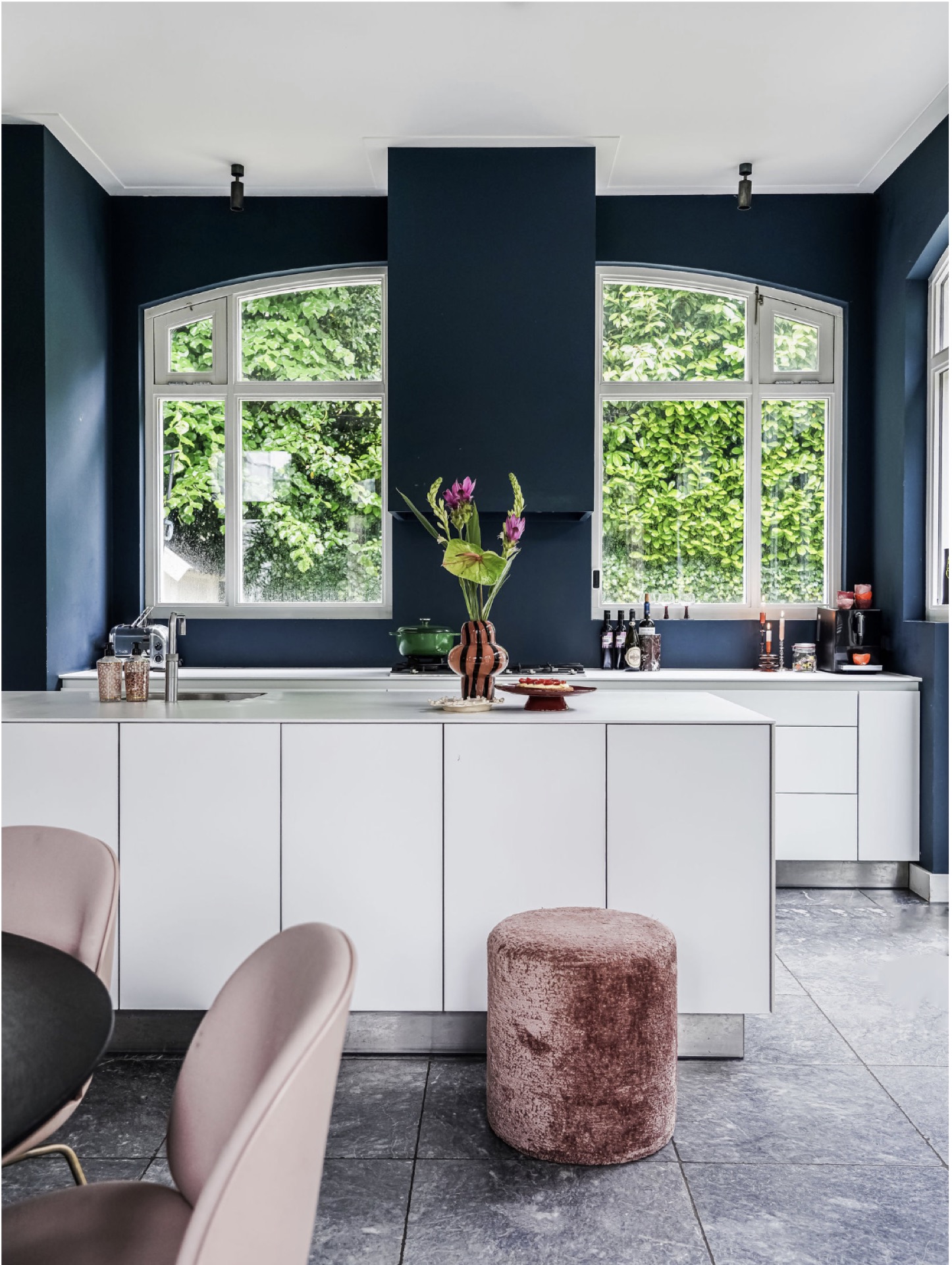
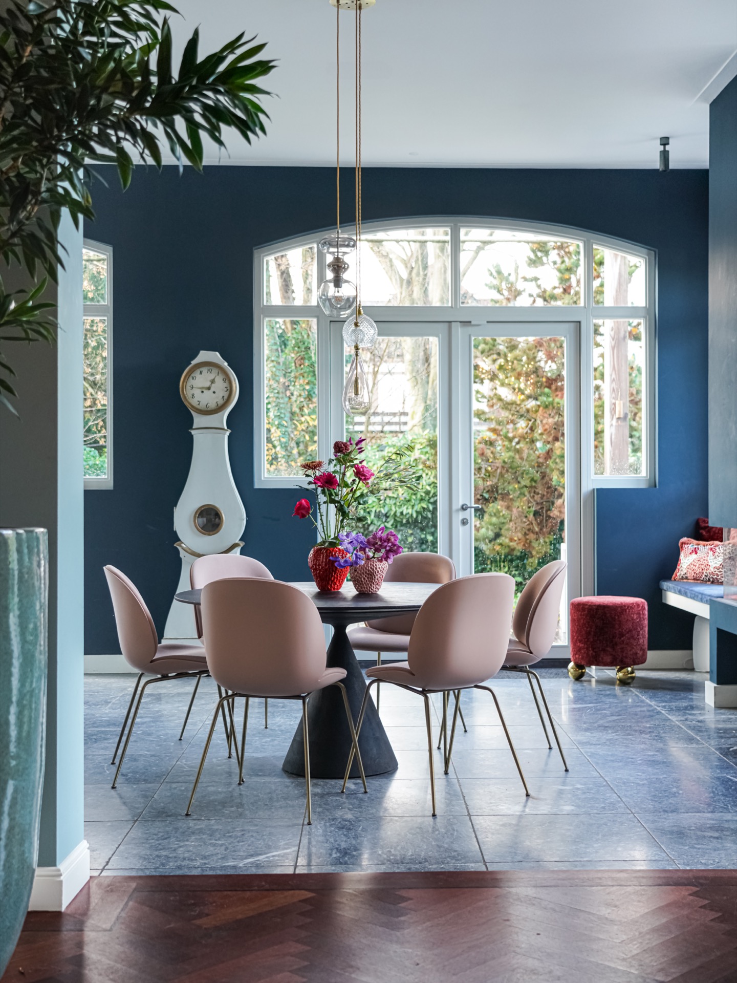
Dark blue accent wall surfaces do a lot of work here. They draw attention to the geometry of the room, especially where the walls meet the white woodwork and the window frames. In the kitchen and living areas, the darker fields sit beside warm timber, and the change in tone makes the cabinetry and the built-in edges easier to read. The palette is restrained in quantity, but not in effect: blue-green, white, black, and wood each hold their own place.
That same discipline shows in the way materials touch each other. The designers did not rely on one finish to carry a room. Instead, painted plaster meets panelled joinery, and glossy surfaces are balanced by matte walls. A dark blue accent wall can feel heavy if it stands alone; here, it is offset by pale trim, by light through the windows, and by furniture with rounder edges. The eclectic interior design stays grounded because each hard line is answered by something softer.
Pattern enters through walls and floors
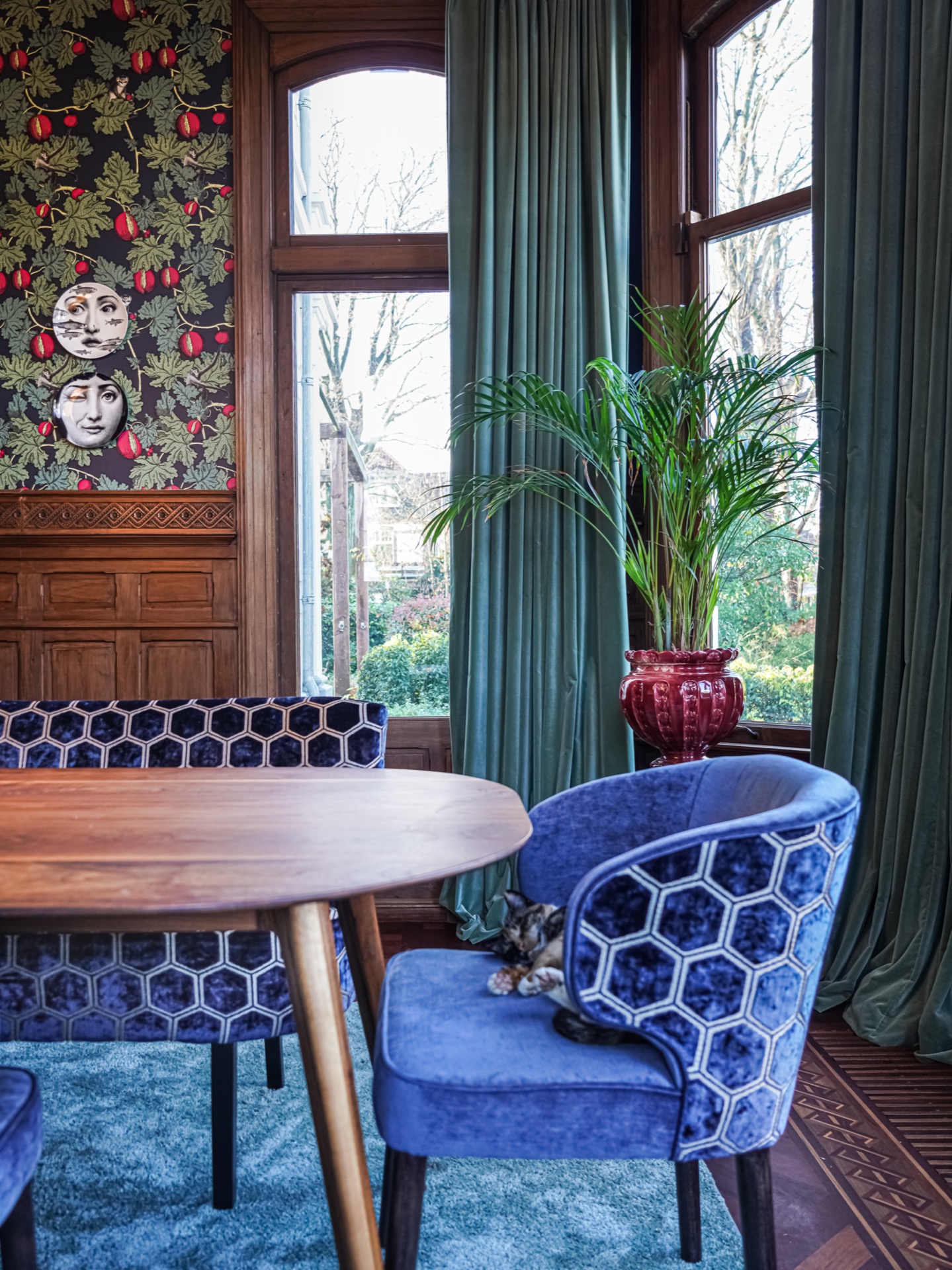
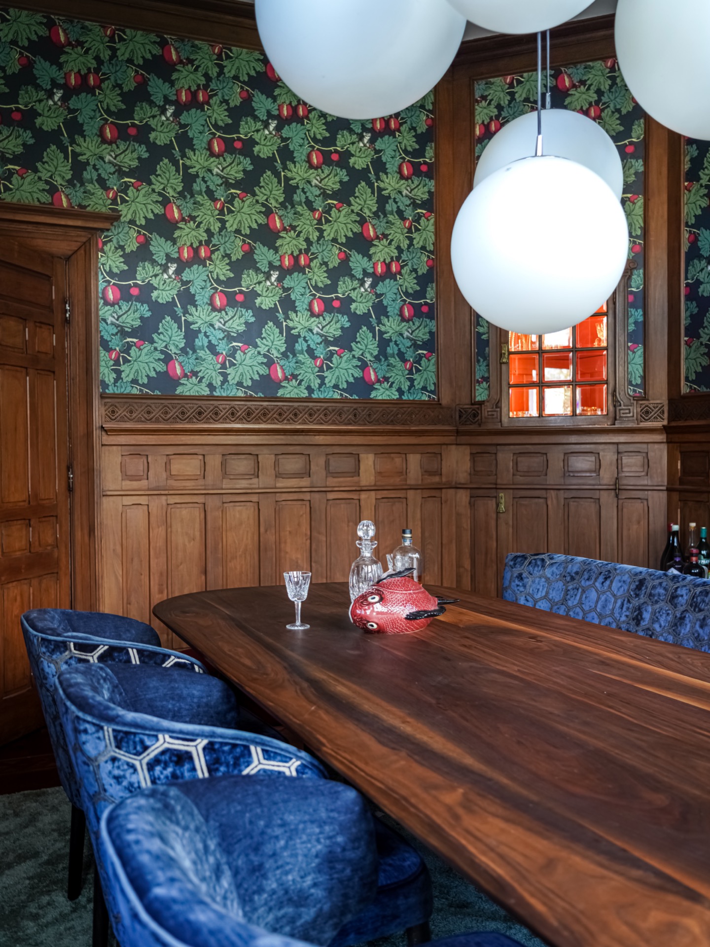
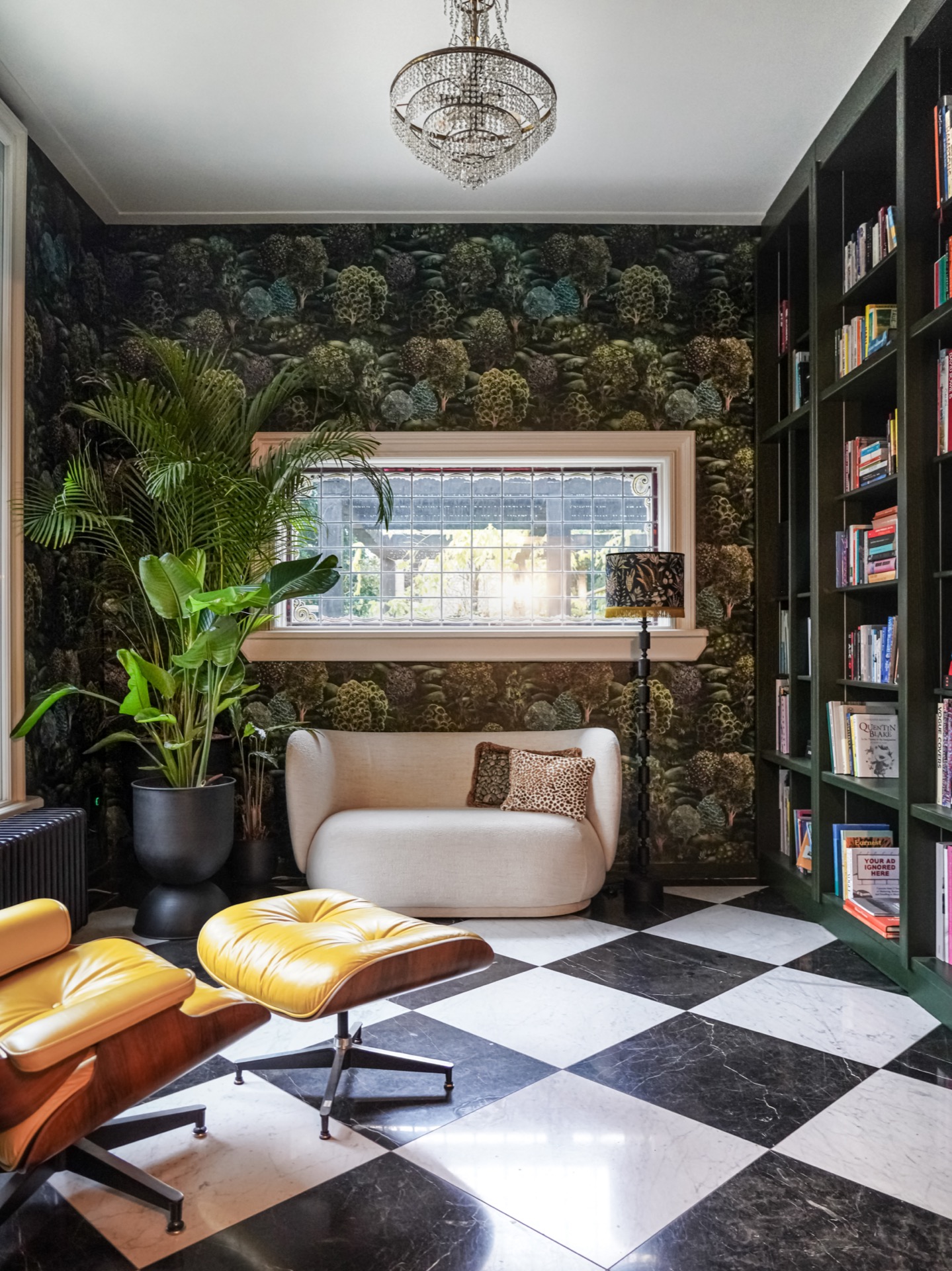
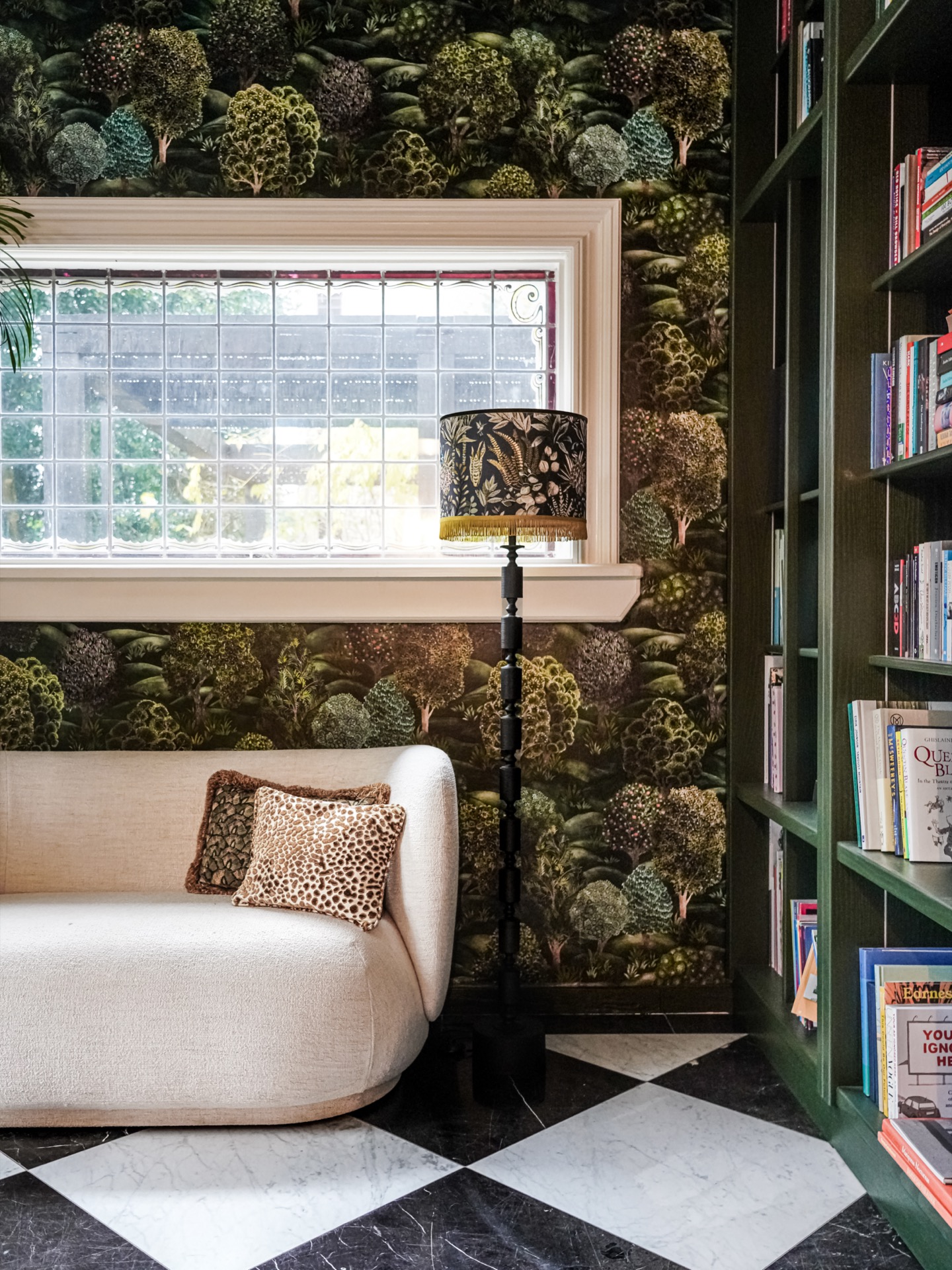
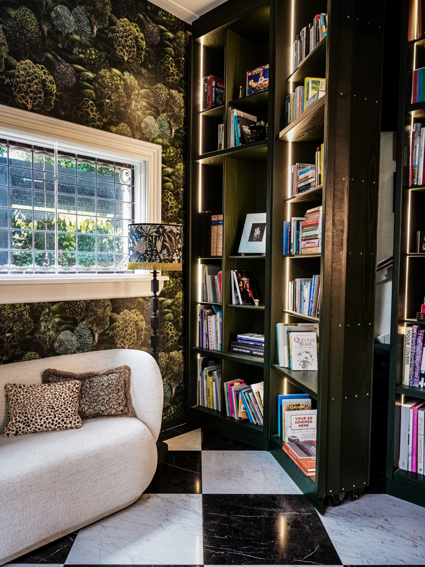
Botanical wallpaper brings in the strongest visual break. In the reading and dining areas, the pattern rises behind shelving and wall paneling, turning the background into part of the composition. One wall carries a dense green motif; another uses a darker, more graphic surface that sits behind books and built-in lights. The paper is not applied everywhere. It appears where the architecture can hold it, which keeps the room from tipping into excess.
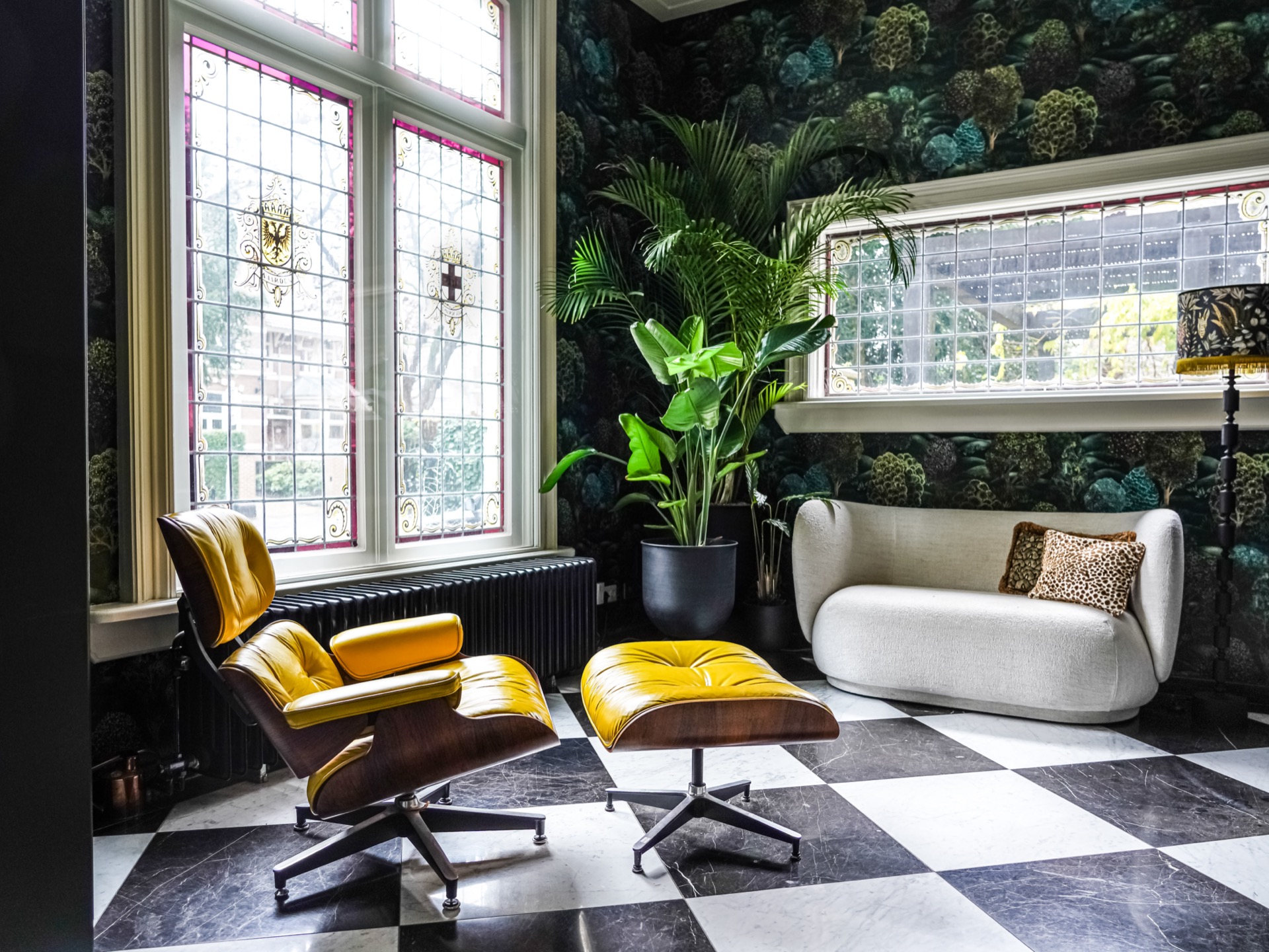
Flooring carries a different kind of pattern. Black-and-white tiles appear in a check-like arrangement, then shift the tone of the room from polished to more grounded. In one corner, a yellow chair sits against the dark wall and pale floor, making the color contrast easy to read. These moves are small, but they matter. They are the places where the modern eclectic interior becomes specific: in the meeting of print, tile, and straight-lined joinery.
Arched openings and built-in order
Arched windows interior views bring softness to the sharper room edges. The curve sits above low cabinetry in the kitchen, and in the dining zone it frames the outside light without turning the view into the main event. That allows the room to keep its formal structure while still feeling open. The arched openings also break up the wall plane, which matters in a house with so many strong finishes. They give the eye a pause between the darker surfaces and the white trim.
Built-in shelving and niche lighting add another layer of order. In the darker rooms, books and small objects sit in recessed openings rather than on loose freestanding furniture. The effect is practical, but it also keeps the surfaces controlled. Light strips inside the shelves pick out the depth of the wall, so the room changes after dusk without needing more decoration. It is one of the quieter moves in the house, and one of the most effective.
A bathroom with marble-look surfaces and brass edges
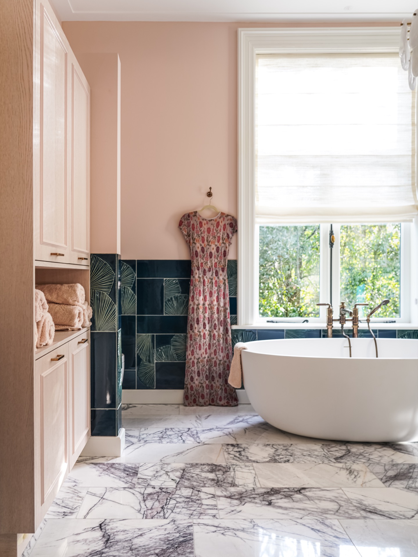
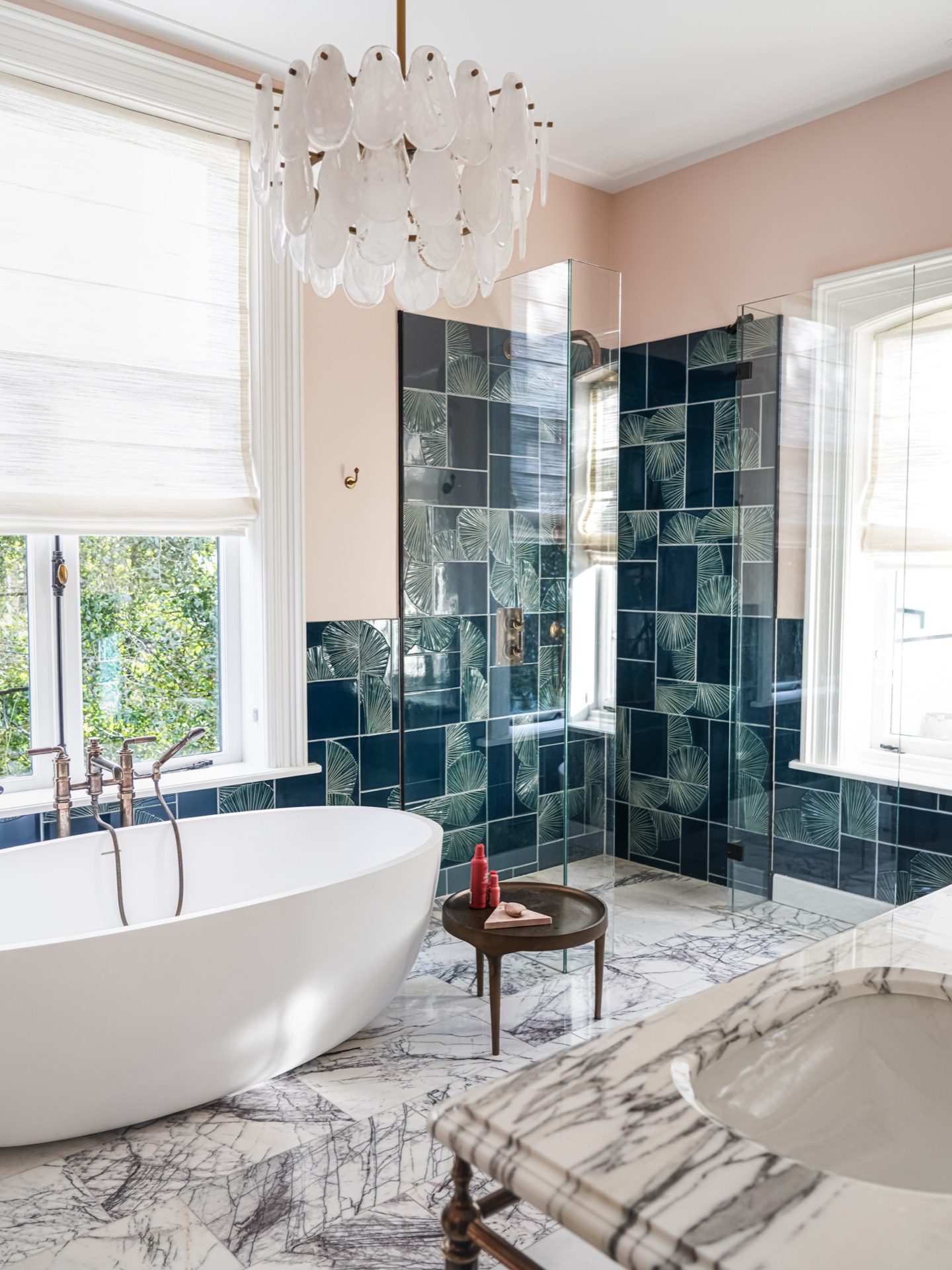
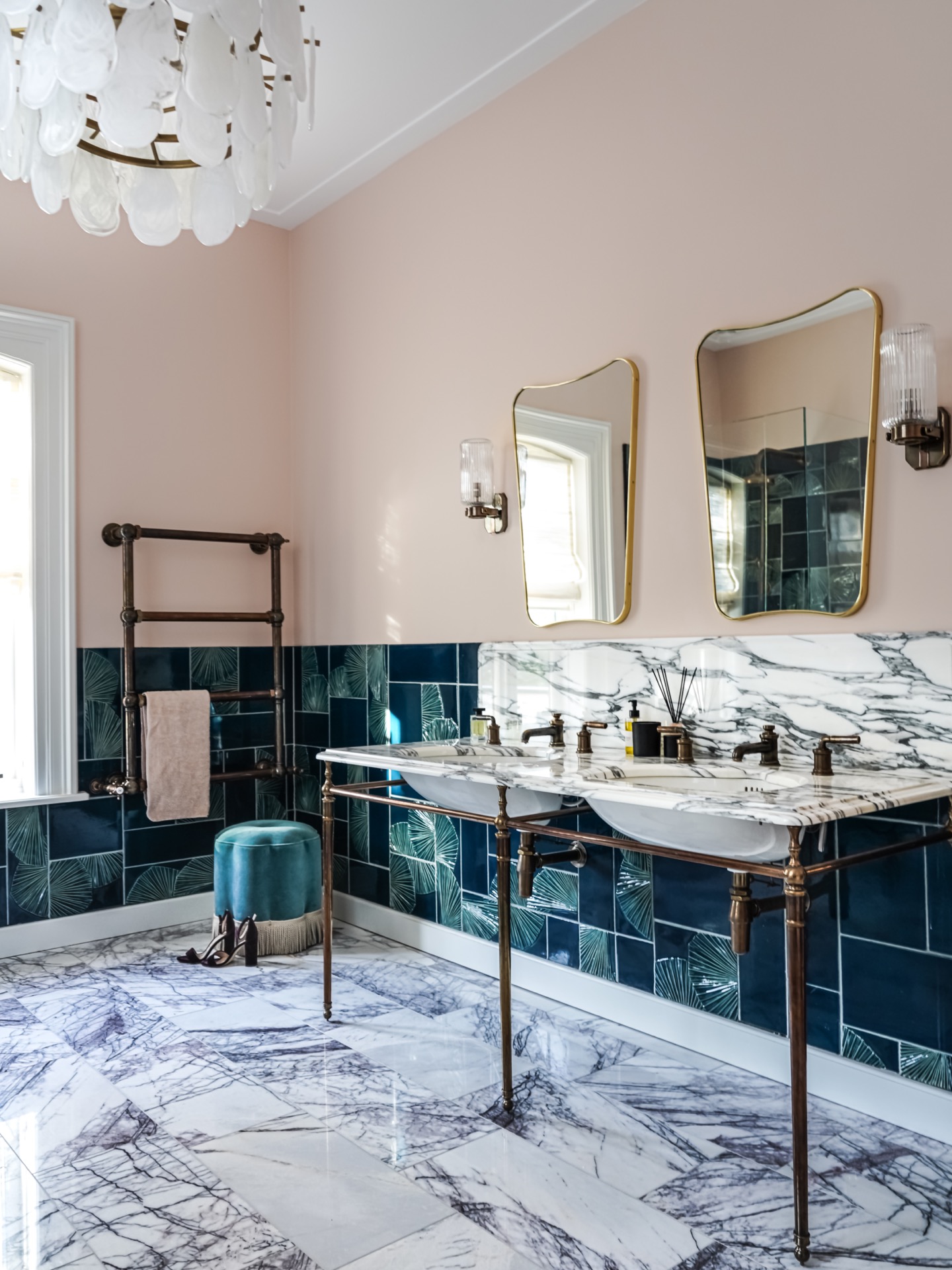
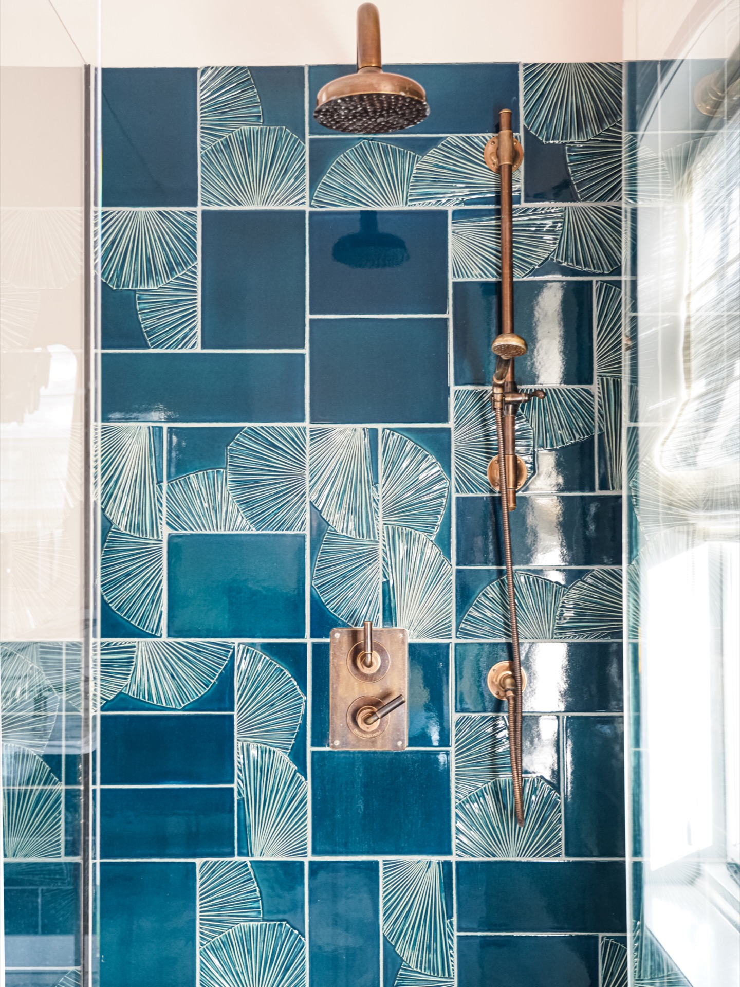
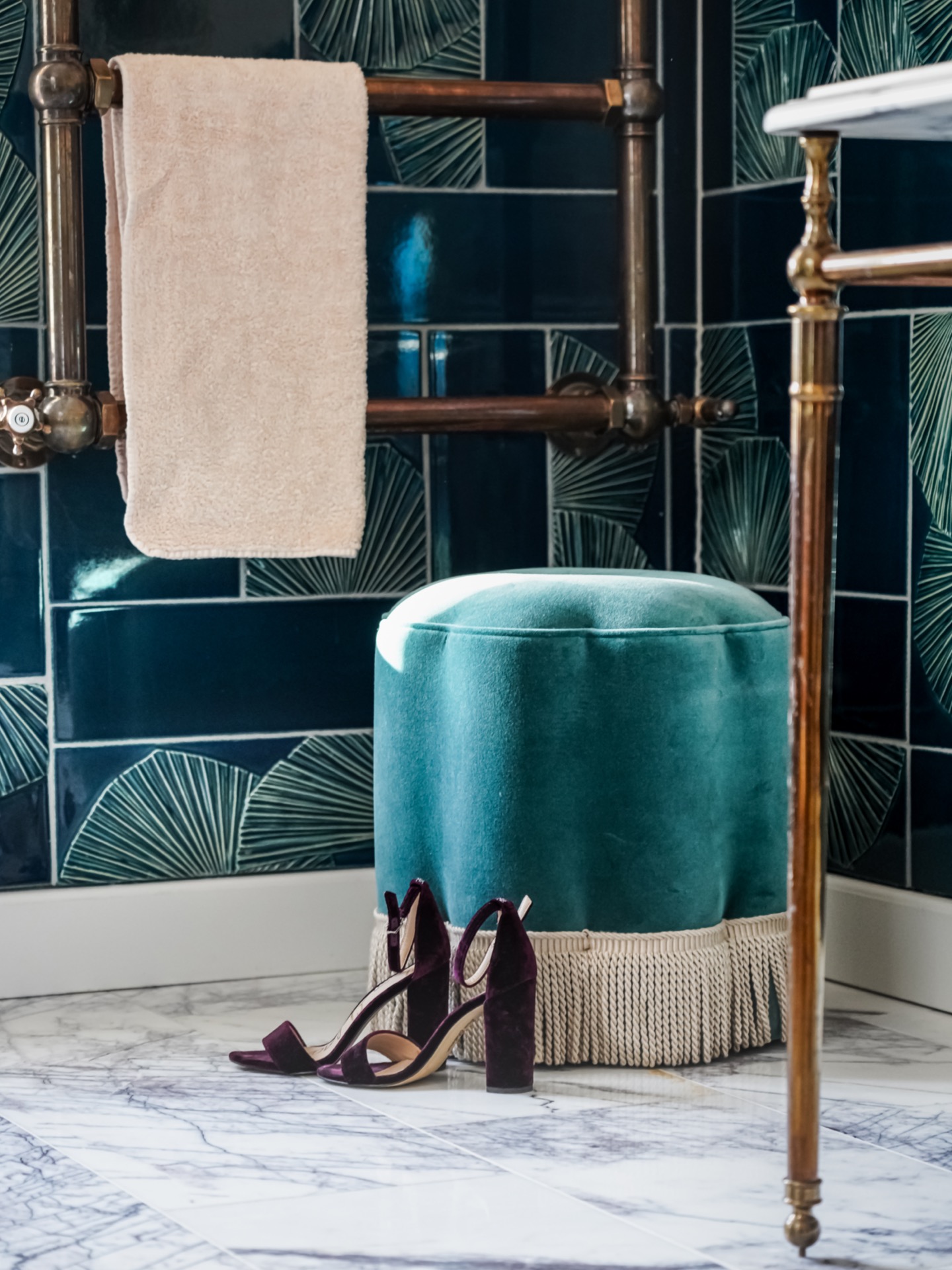
The bathroom chapter shifts the material register again. A marble-look bathroom composition sets the base, with a vanity in stone-like veining and brass fittings that catch the light. The room feels more restrained than the living spaces, but not plain. Raw handmade tiles add texture around the shower area, while a glass shower enclosure keeps the layout visually open. The surfaces are varied enough to stop the room from reading as a single block of white.
A double vanity bathroom setup gives the wall a wider presence, and the mirrors do a lot of visual work. Their wavy shapes soften the rectangular tile lines, while the pale pink wall color behind them changes the temperature of the room. In the shower, fan motif tiles introduce a more decorative layer without taking over the space. The metalwork, the tiles, and the mirrored forms stay close enough to each other to read as one composition, even with their different textures.
Small gestures that hold the rooms together
Some of the strongest moments are also the smallest. The color of a snooker-table cloth is matched to the wooden window ledges in the playroom, a move that is easy to miss until the eye catches the repetition. Elsewhere, a sofa with rounder lines is placed against more stately detailing, so the room does not harden around its own architecture. These choices keep the house from becoming a museum of period features. They make room for everyday use, but they do it through shape and tone, not through explanation.
The project works because the details stay connected. Patterned walls, arched openings, white moldings, and brass accents are not treated as separate themes. They move from room to room and change scale as they go. In the end, the house reads as a modern eclectic interior shaped by classical structure, but also by the specific preferences visible in the finishes, the furniture lines, and the way light lands on each surface.
Photography – Roel Marius Brouwer
Want to see more of Even Eleven? View the page of Even Eleven for even more great projects and company information.



NEW 2026 Jubileum Edition The Best Interior Designers Benelux
Order Now €125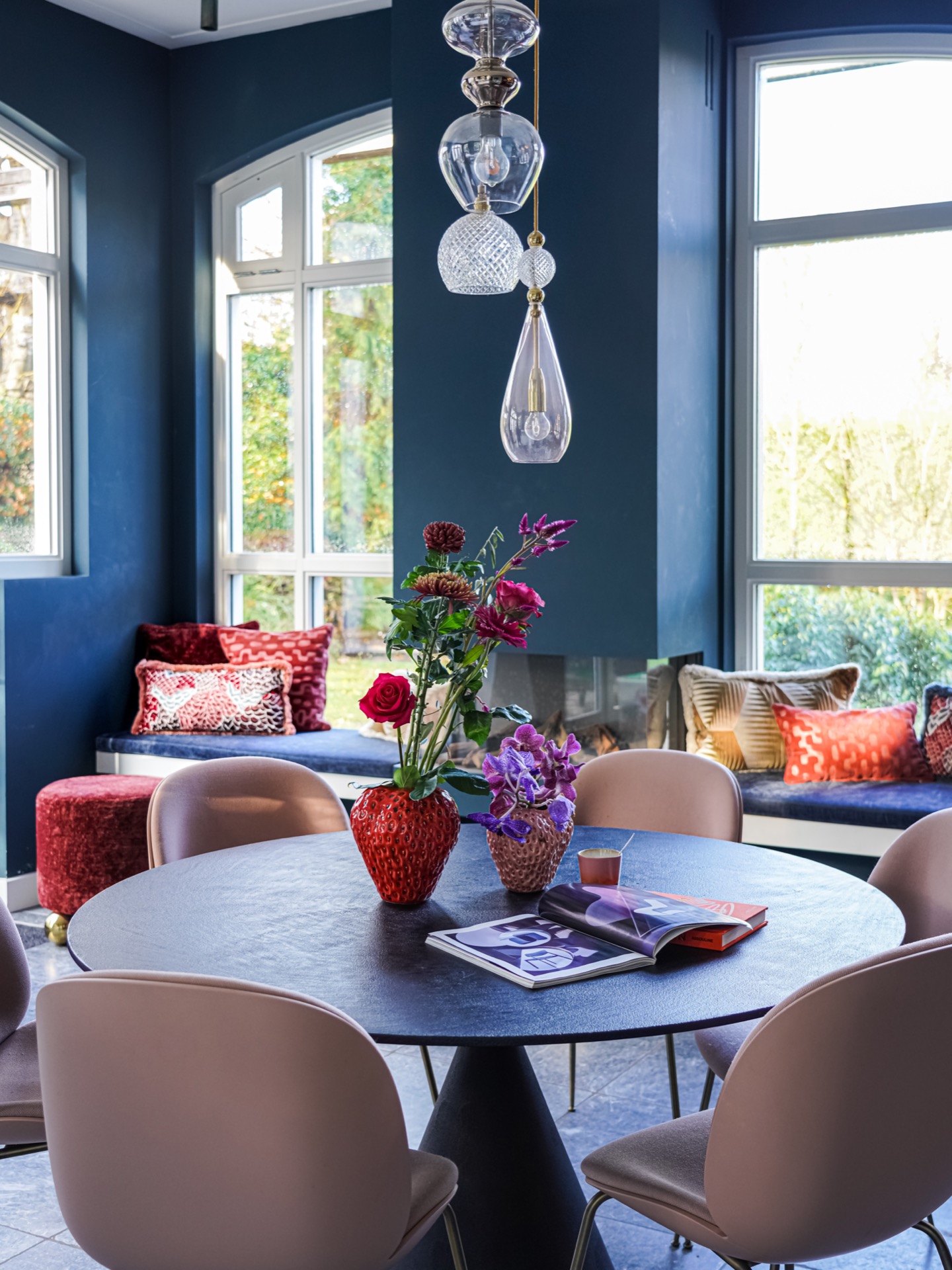
NEW 2026 Jubileum Edition The Best Interior Designers Benelux
Order Now €125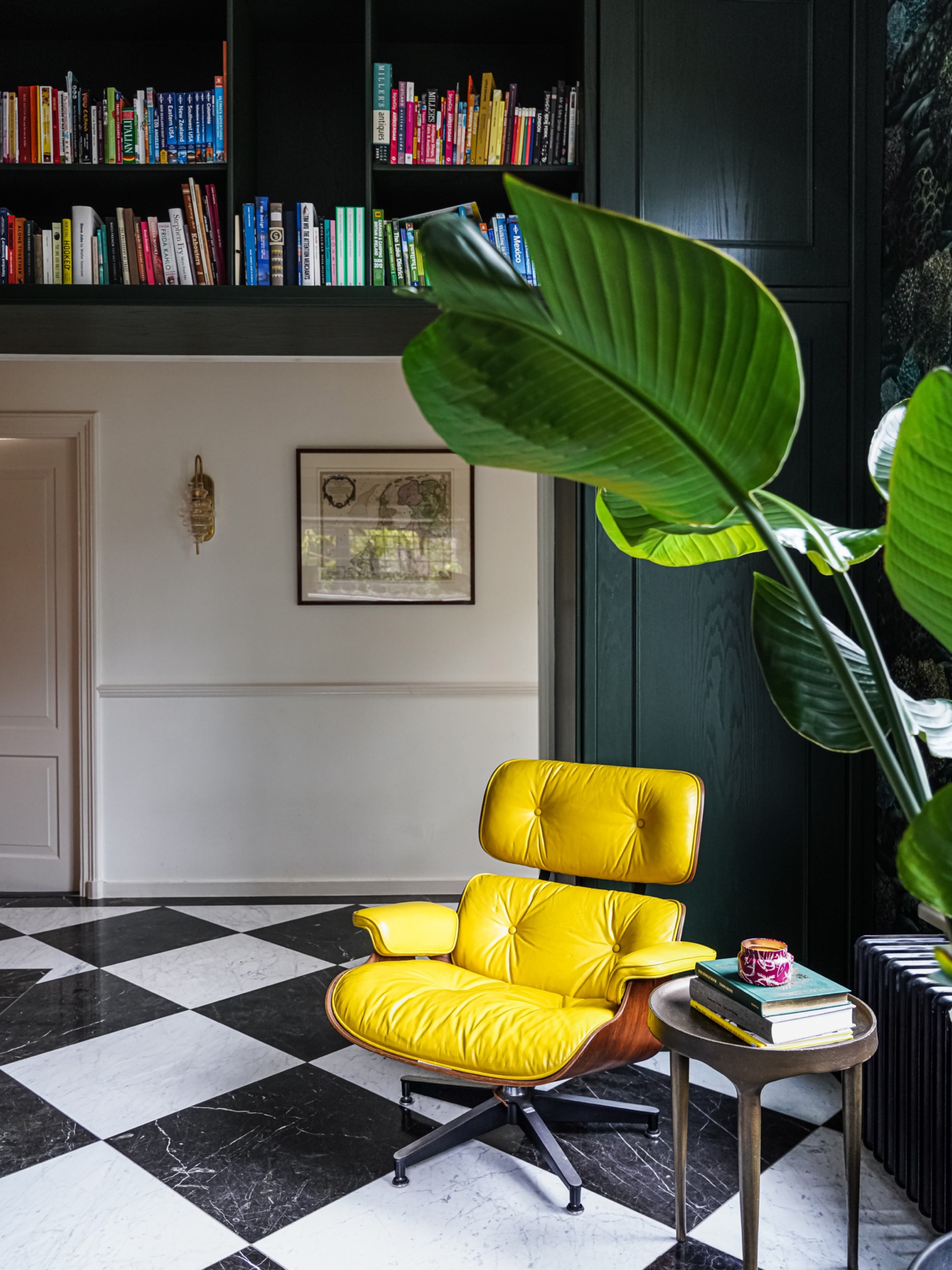
NEW 2026 Jubileum Edition The Best Interior Designers Benelux
Order Now €125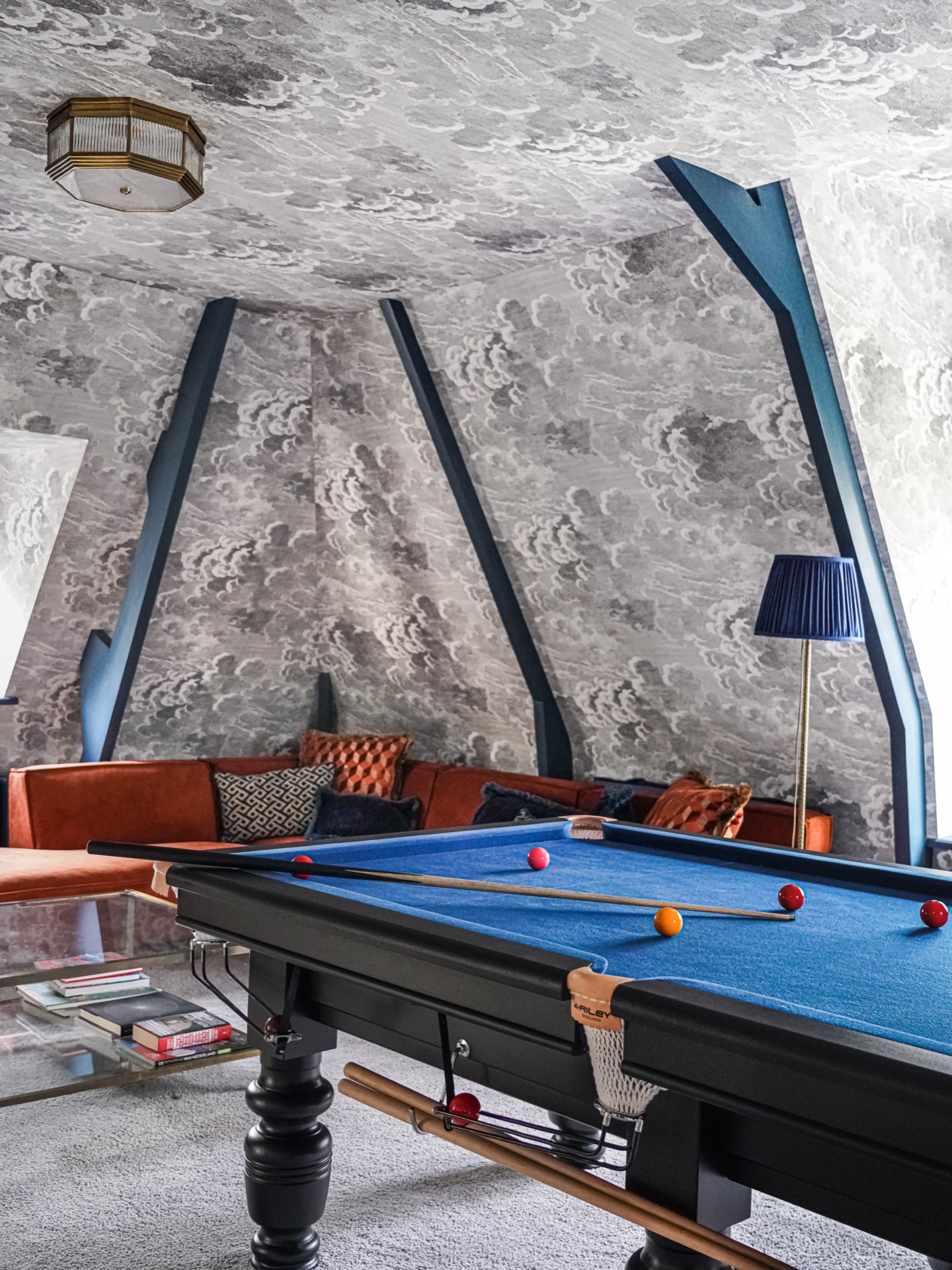
NEW 2026 Jubileum Edition The Best Interior Designers Benelux
Order Now €125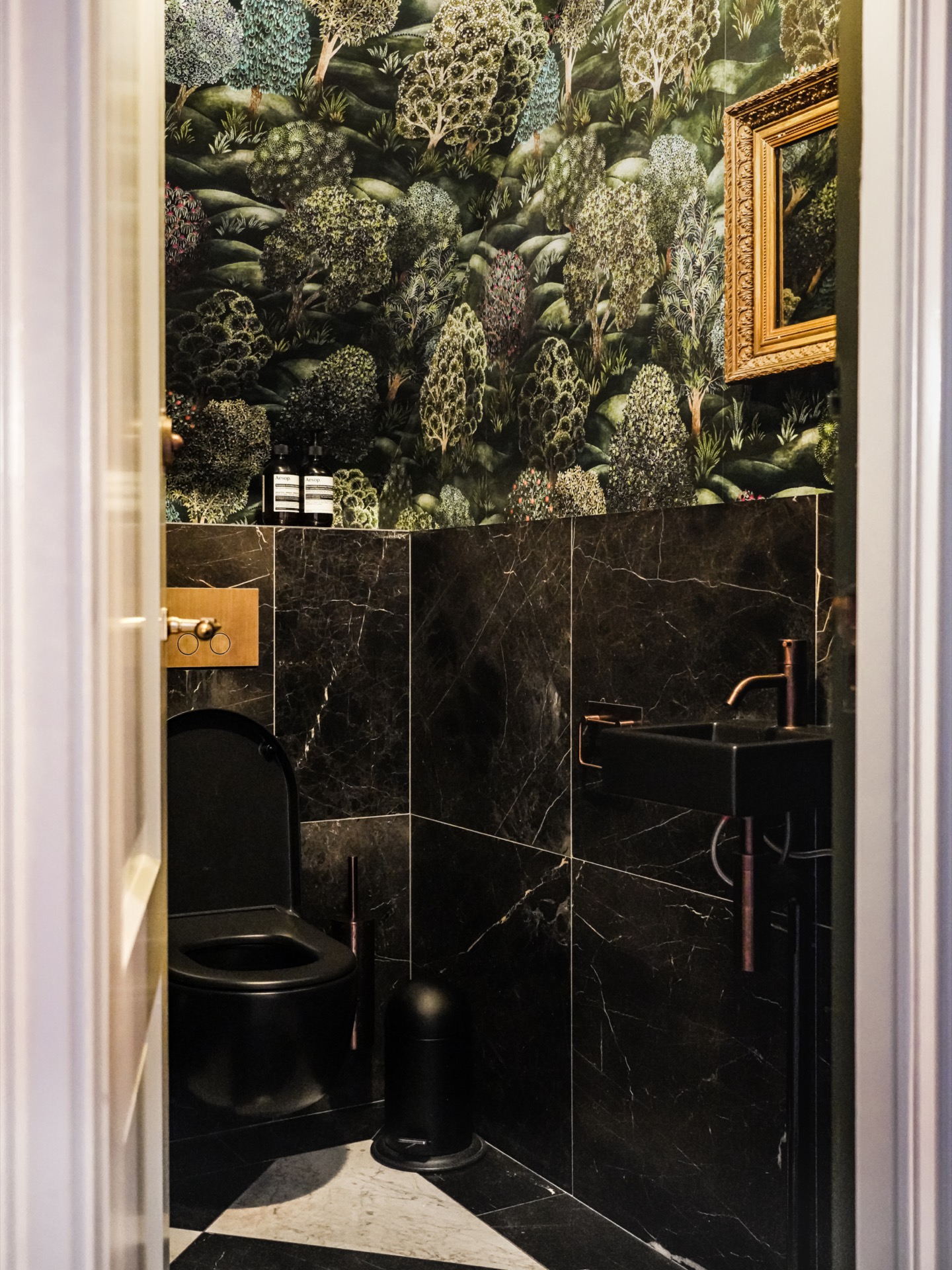
NEW 2026 Jubileum Edition The Best Interior Designers Benelux
Order Now €125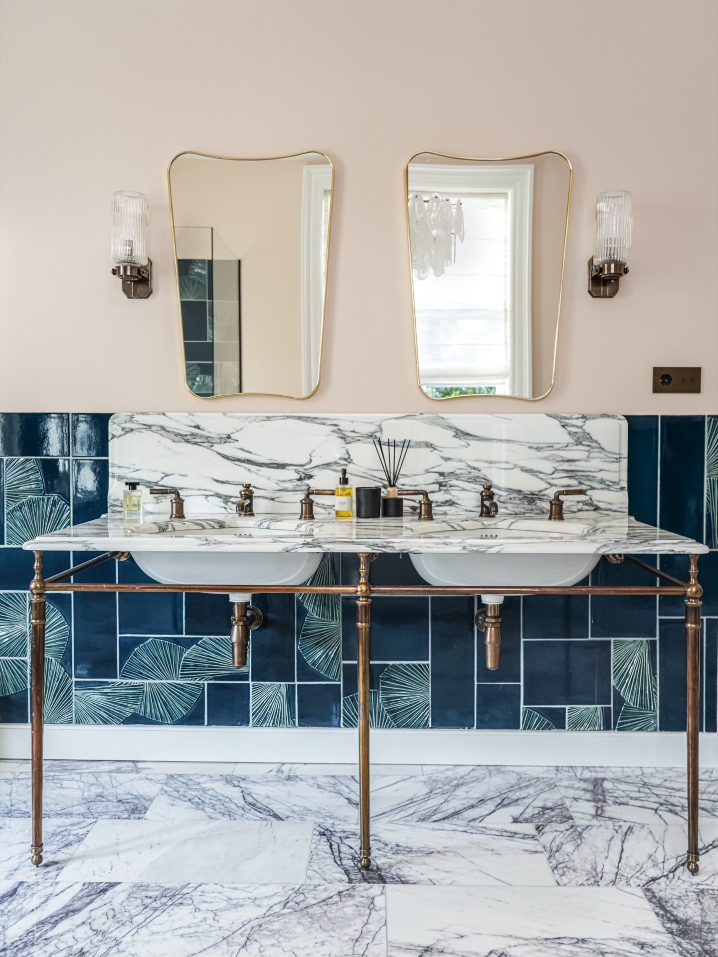
NEW 2026 Jubileum Edition The Best Interior Designers Benelux
Order Now €125