










Modern family home with extension, void and bespoke interior
Dark stone, pale walls and a run of glass set the tone from the first step inside. The historic house has been turned into a modern family home with extension and void, and that change is visible in the way the rooms now open toward the courtyard. A renovated interior with new layout gives the house a different rhythm, while the original shell still reads in the proportions and in the details that were kept in place.
From historic shell to family house
The interior architecture for historic home was handled with a clear focus on space rather than decoration. Rooms were reorganised, surfaces were renewed and the existing character of the building was left intact where it mattered. Instead of smoothing out every trace of the past, the project lets the old structure remain legible. That gives the house its tension: a familiar frame, but one that now supports a different way of living across four floors.
The rear extension over four floors adds 2.5 metres to the back of the house. It is not read as a separate gesture, but as part of the new plan. The added depth changes how the living spaces sit within the building, creating more room for sightlines, daylight and movement between levels. The result is a family house that feels opened up from within, not merely enlarged.
A glass facade and void bring light deeper inside
On the first two floors, the living areas are edged by a glass facade and a void. That pair of moves does most of the spatial work in the project. Light reaches further into the plan, and the eye travels upward and across instead of stopping at a wall. The void also makes the house feel connected between levels, so the daily movement through it becomes part of the experience of the interior architecture for historic home.
Seen from the living room, the courtyard becomes part of the interior sequence. Large glass doors open the room toward the outside, while the pale terrace surface and built-in planting keep the view structured rather than blurred. The courtyard with large glass doors is not treated as a separate scene; it extends the floor visually and gives the open living zone a clear edge. From there, the house reads as a series of linked volumes rather than a chain of closed rooms.
Open living space, measured by light
The open living space is shaped by the amount of daylight rather than by a fixed decorative scheme. White walls, light ceilings and darker fixed elements make the openings feel even larger. A long line of glazing catches the outside and reflects it back into the room, while the void above keeps the centre of the house from feeling compressed. It is an efficient spatial move, but also a calm one: the eye can pass through the house without meeting abrupt stops.
Custom furniture interior pieces keep the rooms visually settled. Built-in elements sit close to the walls, and the joinery follows the lines of the architecture rather than competing with them. In the kitchen, the marble kitchen island acts as a dense centre. Its veining gives the room a clear material focus, especially next to the darker fronts and the more matte surfaces around it. The kitchen does not ask for attention by colour; it does so through mass, reflection and line.
Kitchen, stair and the route between levels
The steel staircase with wooden treads is one of the strongest vertical elements in the house. The dark metal structure is slim enough to keep the space open, while the timber steps soften the climb with a warmer surface underfoot. Because the staircase sits near the void, it also becomes a viewing point: from one floor to the next, the house remains visually linked. The stair is not hidden away. It helps organise the plan and gives the renovated interior with new layout its internal direction.
Elsewhere, the materials stay restrained. Dark kitchen fronts, stone surfaces and integrated lighting define the main rooms without crowding them. In the kitchen, the black stone and the long worktop read as one continuous plane, interrupted only where the cooking zone cuts in. That makes the room feel precise, but not overdesigned. The eye moves from stone to glass to wood, and each material keeps its own role in the composition.
Room details that stay close to the architecture
Because the house was re-planned rather than simply fitted out, the details sit close to the architecture. Light strips are tucked into ceilings and wall lines, so the rooms are lit from edges rather than from obvious central fixtures. In the bedroom, a built-in bed and surrounding joinery hold the room together around one clear volume, while a high opening brings daylight from above. The composition is quiet, but the geometry remains visible.
The bathroom follows the same approach. A natural stone vanity, a broad mirror and round wall lights are arranged with enough spacing to keep each element readable. Nothing is overdrawn. Even the surfaces with a stone look are used to set a clear rhythm across the room, letting the light catch the edges of the basin and the wall fittings.
A house that now works from the inside out
What changes most here is not just the size of the house but the way its rooms relate to one another. The rear extension over four floors, the glass facade and void, and the new layout all work together to pull daylight through the building. The historic structure remains present, but it now frames a family house that moves more freely between living, cooking, circulation and the courtyard. In that sense, the project is less about a single gesture than about a set of precise spatial adjustments that make the house function from the inside out.
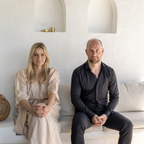
Want to see more of I+Y Interior Architecture? View the page of I+Y Interior Architecture for even more great projects and company information.



NEW 2026 Jubileum Edition The Best Interior Designers Benelux
Order Now €125


