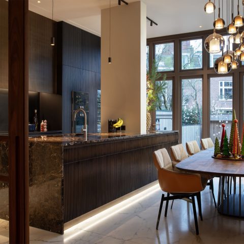
Modern house with a clean exterior and minimalist interior
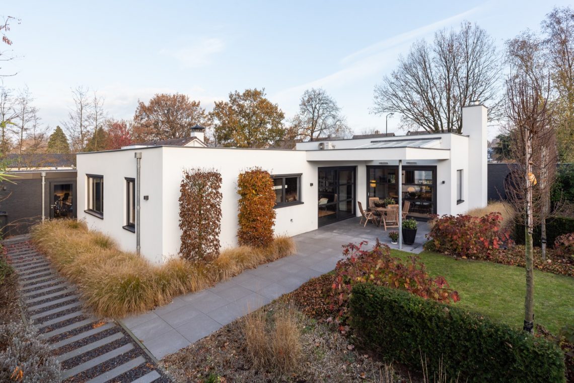
The white surfaces catch the light first, while dark window frames cut across the facade and a darker base grounds the volume. Wooden accents soften the sharper lines, so the modern house exterior reads as a composed series of planes rather than a single flat front. In the glazing, the interior already shows through: pale floors, white walls and a quiet palette that starts outside and continues inside.
White facade with dark frames and a low dark base
The house facade is built from clear contrasts. White wall surfaces sit above a dark plinth, and the entrance door is finished in the same deeper tone, which makes the opening read clearly from the street. A pitched roof in tiles gives the outline a familiar profile, but the detailing stays restrained. From the front and side views, the modern home exterior is shaped by rectangular windows, tight corners and a measured use of wood in the cladding and accents.
At the rear, the house shifts again. Dark timber cladding wraps part of the extension, and large openings pull the outside edge back. Grass, paving and a narrow path run along the wall, so the volume never feels isolated from the garden. Seen from the side, the modern exterior is less about ornament and more about the way each material marks a different zone: plaster, wood, glass and the darker roof edges.
Large window openings pull daylight deep inside
Inside, the large window openings living room scene is shaped by light first. Black frames hold the glass in sharp rectangles, and daylight lands on the wooden floor before reaching the gray seating area. The room stays open and spare, with a low L-shaped sofa, a simple TV wall and a pendant above the dining zone. Nothing competes with the windows, which is exactly why the space reads so clearly in photographs.
A glazed connection between rooms keeps the views open. Through the glass, one room borrows light from the next, and the sightline reaches toward the terrace. The result is not a showpiece interior, but a sequence of clear transitions: outside to inside, front to rear, public room to circulation. That movement is a constant thread through the project, and it gives the modern house exterior a direct relationship with the daylight-filled interior.
A living room framed by pale floors and spare furniture
The living room is defined by what is left out. White walls stay plain, the floor has a light wood tone, and the furniture sits low against that neutral background. A built-in white storage wall appears in the circulation and living zones as a calm block of doors and flat fronts, hiding everyday use behind a continuous surface. Instead of breaking up the room, it keeps the eye moving toward the larger openings and the black window frames.
Small shifts in material do the work here. Gray upholstery, a dark lamp and a few wooden details are enough to break the whiteness without crowding it. The room is open, but not empty; the edges are controlled through joinery and alignment. That is where the built-in white storage wall becomes more than storage. It sets the line for the room and links the living area to the rest of the house.
Kitchen with clean-lined cabinets and a dark worktop
The kitchen uses a sharper contrast than the living room. White fronts run in long, clean-lined cabinets, and a dark worktop defines the working surface. In one image the kitchen island sits in the middle of the room, with the work zone facing the windows. In another, tall cupboard doors rise beside an oven niche, so the kitchen reads as a continuous composition rather than separate units. The look is plain in the best sense: each line has a clear function.
Light reaches the kitchen from several directions. It falls across the wooden floor, catches the edges of the white cabinet fronts and lands on the darker counter. Above the work area, the black window frames repeat the same visual language used in the rest of the house. The kitchen therefore feels tied to the rest of the interior, but the materials keep it distinct: white cabinetry, dark worktop, glass, wood and the steady rhythm of rectangular openings.
Open circulation between kitchen and hall
The route beside the kitchen remains visible, which helps the layout feel easy to read. A doorway and the staircase opening sit close to the cooking zone, so movement through the house is never hidden. The kitchen with clean-lined cabinets is not an isolated room; it sits alongside the stairs and hall, where the same light walls and wood details continue. Even the ceiling lights and the hanging lamp above the table reinforce that sense of a measured interior route.
Staircase with wooden steps and a built-in wall along the landing
The staircase with wooden steps is one of the clearest interior details. White walls frame the run, while the treads add warmth through their grain and tone. Along the landing, a built-in cabinet wall follows the line of the corridor, turning a transitional space into a useful edge. The result is compact and precise. The stair zone does not ask for attention; it works through proportion, repeated white surfaces and the horizontal pull of the storage units.
That same restraint appears in the toilet and bathroom. The toilet is pared back to white walls, a simple fixture and a gray-toned floor finish, with the details kept almost flush. In the bathroom, the vanity shifts to a cement-look surface, and the mirror wall expands the room visually. One image shows a single basin, another a double vanity, but both keep the same quiet material language: white fronts, muted stone-like surfaces and clear reflections.
Bedroom storage and bathroom surfaces close the sequence
The bedroom continues the built-in logic. A large wardrobe wall fills one side of the room, with multiple white doors and little visual interruption. Curtains soften the window, but the room stays light and controlled. It is a practical end point to the house’s interior sequence, where storage, opening and wall surface stay in proportion. The built-in white storage wall from the living zones returns here in another form, turning the bedroom into a room defined by joinery as much as by furniture.
Across the project, the materials repeat without becoming repetitive. White plaster, dark frames, timber accents, pale floors and glass appear in different combinations from the modern house exterior to the interior rooms. The facade sets the tone; the rooms answer with daylight, storage and measured surfaces. What remains most visible is the way the house keeps its lines clear from entrance to bedroom, with each room carrying the same disciplined attention to surface and opening.
Want to see more of Van Boven Aannemers? View the page of Van Boven Aannemers for even more great projects and company information.




NEW 2026 Jubileum Edition The Best Interior Designers Benelux
Order Now €125


NEW 2026 Jubileum Edition The Best Interior Designers Benelux
Order Now €125


NEW 2026 Jubileum Edition The Best Interior Designers Benelux
Order Now €125