










Modern house project
Natural materials set the tone before the rooms even open up. The roofline is soft at the top, while the façades stay sharp and restrained, with large windows pulling in the green setting around the house. That contrast gives the modern house project its quiet presence. It reads as a home built around light, sightlines, and a careful use of surface, from the dark frames at the entrance to the lighter masonry below.
Thatched roof, straight lines, and a clear silhouette
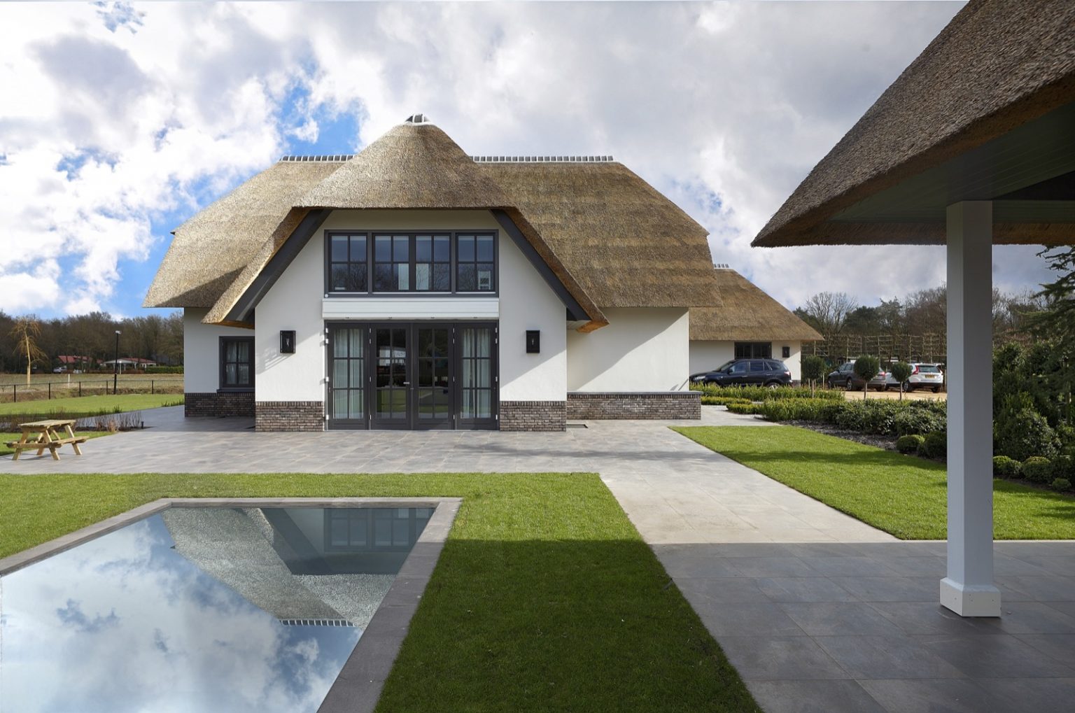
The thatched roof house form is easy to read in the exterior images: the roof continues across several angles, and the texture of the thatch sits against smooth walls and crisp edges. Glass takes up a large part of the façade, especially around the entrance zone, where dark frames cut into the white surface. The result is not decorative for its own sake. It is a house that uses contrast to define its shape, with riet, masonry, and glazing working as the main elements.
At ground level, the paving leads directly toward the terrace and the water feature. A low ornamental pond sits beside the approach, so the route to the house does more than connect door and garden. It sets the tone for the terrace and garden outside, where planting softens the hard lines of the paving. The outdoor composition stays controlled, but the view is not static: lawn, shrubs, and tree canopies give the front and side of the home a changing backdrop across the day.
A minimalist interior with room to breathe
Inside, the layout opens quickly. Wide openings and large windows keep the rooms visually connected, while the minimalist interior relies on pale walls, darker inserts, and wood accents to avoid looking bare. Light lands across the floor and the built-in surfaces, and the eye keeps moving from one room to the next. The plan feels open without becoming vague, because the furniture and joinery define each zone with enough precision to hold the space together.
In the living area, the window wall is doing most of the work. Full-height curtains frame the glass, but they do not block the daylight that fills the room. A low seating arrangement sits in front of the openings, and the built-in wall treatment on the side gives the room a clear edge. The palette stays close to grey, black, white, and wood, which keeps the focus on proportions, openings, and the way the room meets the garden outside.
Kitchen and dining zone with built-in detailing
The custom kitchen is one of the clearest expressions of the house’s interior approach. Surfaces are kept flat and compact, with integrated appliances disappearing into the cabinetry. A central pendant hangs over the work zone, and the kitchen wall reads as a piece of joinery rather than a collection of separate units. That restraint lets the materials speak: matte fronts, light worktops, and darker accents come together without turning the room into a display of finishes.
The dining bar extends the kitchen into daily use. It gives the room a place to sit, eat, and pause while the cooking zone stays close by. Because the kitchen connects directly to the rest of the open plan, the bar also acts as a hinge between activity and circulation. It is a practical move, but it also sharpens the room composition. The custom kitchen remains part of the architecture, not something placed on top of it.
Built-in storage and quiet transitions
Cabinetry and wall niches keep the interior visually controlled. In the images, the kitchen and adjacent rooms show recessed details, integrated storage, and surfaces that avoid unnecessary breaks. That matters in a modern house project like this, where small changes in depth and texture do the work that ornament might once have done. A wood panel, a dark recess, or a simple opening in the joinery becomes enough to mark a transition from cooking to living, or from public space to a quieter corner.
Terrace, garden, and the edge of the house
Outside, the terrace is wide enough to read as an extension of the interior rather than a separate zone. The paving runs cleanly away from the house and meets planting beds, grass, and the ornamental pond. The terrace and garden are not crowded with objects, so the geometry of the surface remains visible. This makes the transition from inside to outside easy to follow: from floor tiles and glass to paving, water, and greenery.
The garden planting brings in the softer material in the project. Trees and shrubs sit against the hard edges of the terrace, and the pond interrupts the straight route with a still reflective surface. It is a small move, but it changes the pace of the exterior. The house keeps its disciplined outline, while the landscape provides the irregularity that keeps the setting from feeling static.
Rooms shaped by light and material
The bedroom, office, and bathroom continue the same language in different ways. In the bedroom, the wooden wall behind the bed gives the room a clear focal point, while the curtains pull the window into the composition. In the office, broad windows bring in daylight around the desk and storage. In the bathroom, the oval freestanding tub stands out against a calm background of pale surfaces and a built-in washbasin niche. Each room uses a small number of elements, but none of them feels accidental.
What ties these spaces together is the way light lands on the materials. Wood picks up warmth from the daylight, while the darker finishes sharpen the edges of furniture and joinery. Even the bathroom stays close to the house’s wider palette, with stone, tile, and smooth wall surfaces keeping the room visually quiet. It is an interior that depends on proportion and placement more than on decoration.
Water, reflections, and a lower-lit zone
The indoor pool adds another layer to the project’s spatial rhythm. Dark edges hold the water in place, while a wall with wood relief and warm accent lighting changes the tone of the room. Reflections on the water soften the harder lines around it, and the contrast between the light on the wood and the dark pool surround gives the space a distinct atmosphere. It is one of the few rooms where the house becomes more enclosed, and that shift makes the rest of the plan feel even more open by comparison.
Across the whole home, the modern house project is shaped by the same decisions: large windows, natural materials, and surfaces that stay clear enough to let light and proportion carry the room. The exterior keeps the thatched roof and glazing in view; the interior keeps its focus on built-in storage, a custom kitchen, and a calm material palette. Maretti Lighting is mentioned in the source text and supports the project’s lighting specification without changing that restrained reading of the house.
Want to see more of de Bresser Schilderwerken? View the page of de Bresser Schilderwerken for even more great projects and company information.




NEW 2026 Jubileum Edition The Best Interior Designers Benelux
Order Now €125


NEW 2026 Jubileum Edition The Best Interior Designers Benelux
Order Now €125


