Modern House with White Brick and Wood Details
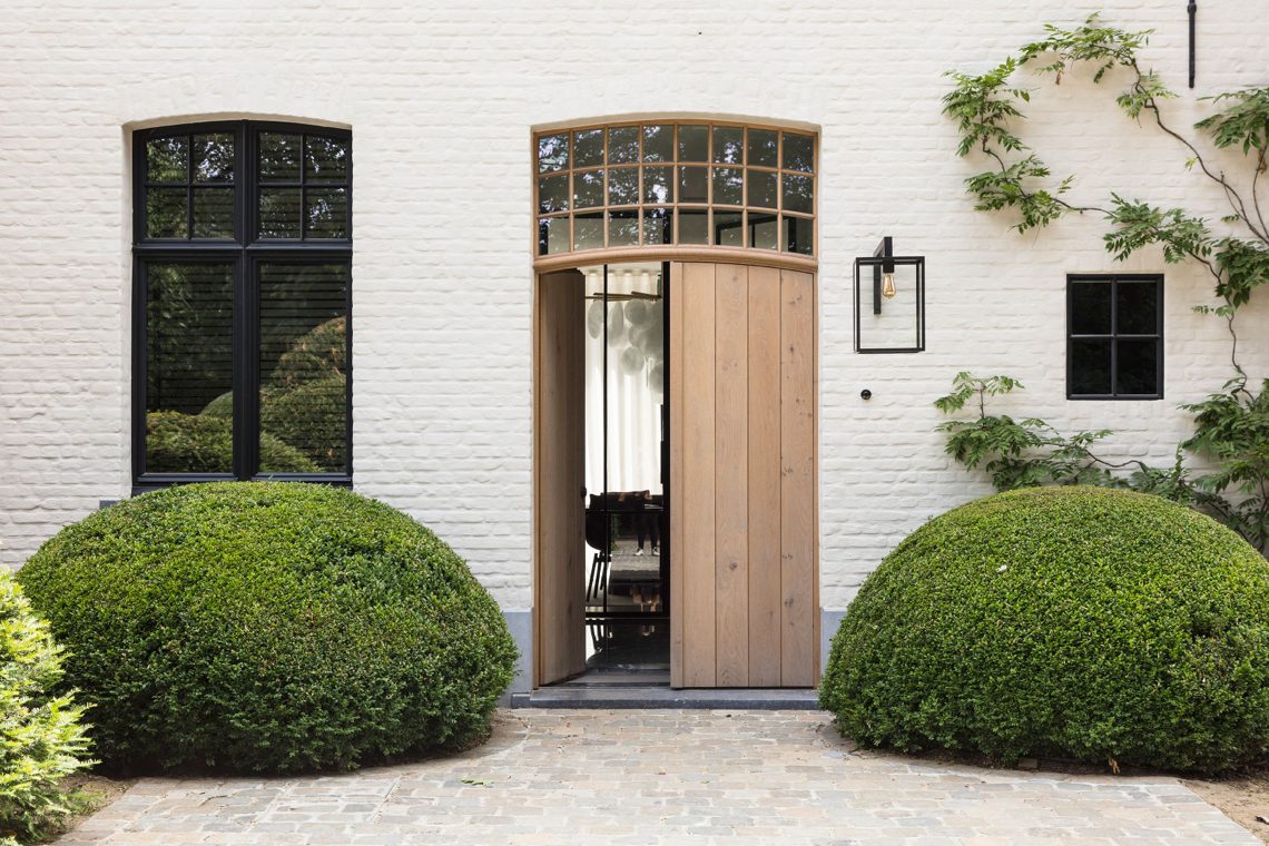
White brick and black window frames give this modern house its sharp outline from the first view. The front elevation reads in clean planes, but the entrance softens that edge with wood, a curved upper glass section and low, rounded shrubs set along the path. The result is not loud; it is precise. Inside, the same language continues through dark walls, custom woodwork, marble-look surfaces and natural stone floors that keep the rooms grounded.
White brick framed by black lines
The exterior uses contrast instead of ornament. White brick covers the main volume, while black frames cut into the facade and set off the larger window openings. That pairing gives the building a clear graphic rhythm. Near the entry, clipped round shrubs sit low against the path and echo the curved shape above the door. It is a small gesture, but it changes the way the front reads: hard lines at the walls, softened shapes at ground level.
The entrance makes the strongest shift in material. A wooden front door sits beneath an arched transom window, with the grain of the timber standing out against the pale brick around it. Exterior lighting is fixed close to the opening, so the doorway feels marked out even in a still frame. In one view, the black frame lines and the wood door are almost enough on their own; the rest of the facade stays quiet so those details can carry the composition.
A kitchen built around stone and dark cabinetry
Inside, the kitchen moves between dark cabinetry and pale stone surfaces. A marble-look kitchen countertop and matching backsplash bring veining into the room, while the lower units stay dark and compact beneath them. The long work zone feels measured rather than decorative. On another wall, a bar-like element repeats the same language in a darker register, with a stone-look front and integrated shelves or glazing that break up the surface. The materials do the talking here: wood, stone, dark lacquer and glass.
Close views make the joinery easier to read. A wooden panel marks one side of the kitchen, while a dark open niche and overhead storage sit above the worktop. The composition is strict, but not flat. Reflections in the stone, the edge of the counter and the shift from matte cabinetry to smoother surfaces create depth. This is where the modern house feels most architectural: not through display, but through how each layer meets the next.
Marble-look finishes without visual noise
The marble-look kitchen countertop appears again in bar details and backsplash surfaces, tying the cooking zone to the rest of the interior. Instead of spreading across every wall, the finish is used where it can sharpen a line or lighten a darker composition. That restraint keeps the room from becoming busy. A single round-edged stool or a slim shelf reads more clearly when the background stays disciplined. It is one of the reasons the house feels like a luxury modern home without relying on excess.
Custom woodwork in the living areas
The living spaces rely on built-in woodwork to hold the rooms together. Timber panels wrap walls and frames, and in several views they appear beside darker accent surfaces that pull the eye inward. A glass door and slim black framing divide one zone from the next without closing it off, so the plan can shift from kitchen to dining area to lounge with only light changes in material and furniture. Curtains soften the larger openings, but the structure of the room stays visible through the joinery and wall lines.
One lounge view brings that structure into focus with a round side table, a floor lamp and a low sofa placed over a dark floor. Another image shows a blue sofa with a marble-topped coffee table and a pale rug beneath it. These pieces are understated, but they matter because they show how the room works: low seating, hard stone surfaces, textured fabric and controlled lighting. In a contemporary house like this, the arrangement is built from surface and proportion as much as from furniture.
Dining space, light and long views
The dining area sits in clear relation to the kitchen and lounge. A large rectangular table anchors the room, and the cluster pendant above it breaks into several rounded shades that hang low enough to mark the zone. White curtains filter the daylight at the glazed edge, so the table does not sit in full glare. Warm brown and rust tones in the chairs add a narrow band of colour without disturbing the darker base of the interior. The effect is calm, but the details stay readable.
Across the open space, the sightlines remain open. You can look from the seating area toward the table and then back to the kitchen bar wall, where the dark joinery and stone finishes return. This repetition is useful: it gives the modern home a consistent material thread while allowing each room to keep its own function. The open plan is not treated as one broad room, but as a sequence of distinct settings linked by lines of light and wood.
Bathroom surfaces kept crisp and measured
The bathroom continues the same palette in a more compact setting. A double vanity sits against marble-look wall and counter surfaces, with two oval basins set into the run. Wood cabinetry runs below and beside the sinks, bringing warmth through material rather than colour. The veining in the stone is visible enough to animate the wall, but not so dominant that it takes over the room. Here, the finishes are doing a quieter job: reflecting light, dividing the plane and giving the sink zone clear edges.
Seen from the threshold, the bathroom reads as a precise cut-out in the interior. The stone-like finish meets timber panels and a clean white ceiling line, while the basins repeat the rounded forms first seen at the entry shrubs and the pendant shades. That repetition is subtle, but it helps the modern house feel continuous from one room to the next. The materials are different; the geometry stays related.
Wood steps and a light line on the wall
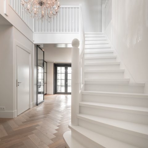
The stair detail is one of the most restrained moments in the project. Wooden treads rise beside a white wall that carries a thin indirect light line, and the effect is more about shadow than display. No heavy railing interrupts the view in the photographed detail, so the steps read as clean horizontal bands against the pale surface. The light line traces the wall and gives the stair a slight lift, especially where the wood meets the white finish.
That combination of timber, white plaster and a narrow illuminated edge sums up the interior well. Nothing is overworked. Each surface has a job: the stone holds the water and cooking areas, the wood softens the hard lines, the dark walls deepen the rooms, and the glass keeps the plan open. As a whole, the project shows a modern house that depends on proportion and material discipline rather than decorative layering.
Want to see more of Mieke Van Herck Architectenbureau? View the page of Mieke Van Herck Architectenbureau for even more great projects and company information.




NEW 2026 Jubileum Edition The Best Interior Designers Benelux
Order Now €125


NEW 2026 Jubileum Edition The Best Interior Designers Benelux
Order Now €125


NEW 2026 Jubileum Edition The Best Interior Designers Benelux
Order Now €125


NEW 2026 Jubileum Edition The Best Interior Designers Benelux
Order Now €125