









Modern interior with black metal frames
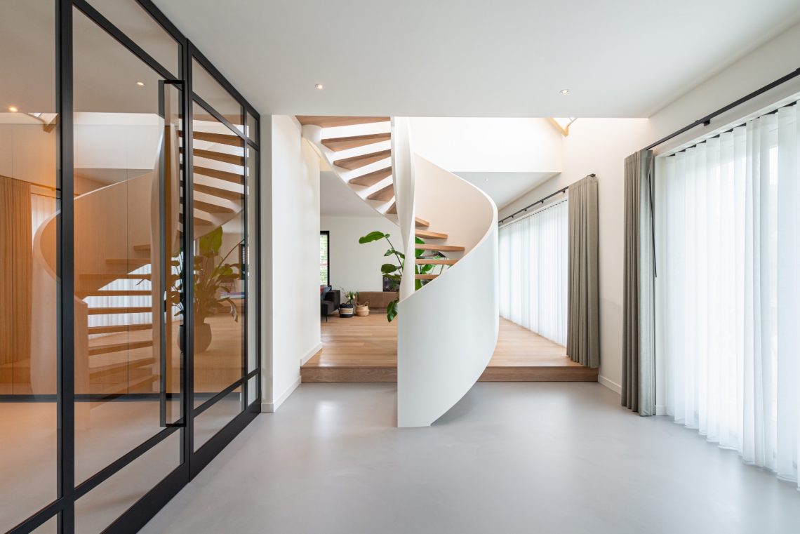
Black metal lines set the tone immediately. They trace the glass doors, frame the openings, and draw a sharp outline through an otherwise quiet interior. Daylight moves across pale floors and large wall planes, so the darker profiles read almost like drawn lines rather than heavy construction. The result is a modern interior with black metal frames that feels precise without becoming cold.
Glass doors and slim profiles
The glass doors with black profiles are the clearest structural gesture in the room. Their narrow framing keeps the view open while still marking out each passage with a strong edge. In several images, the doors sit beside light walls, grey surfaces, and wood-look cladding, which makes the metal stand out even more. The frames also repeat in close-up details, where rounded corners, handles, and lock points are set into the same dark finish.
That repetition matters. Instead of using metal as a single accent, the interior lets it return in door edges, passage frames, and wall openings. The eye catches those lines first, then follows them toward the brighter zones beyond. It gives the space a measured rhythm. Even where the surfaces change from glass to panel to painted wall, the black outline keeps the composition readable.
Metalwork that stays visible
The steel doors and frames do not disappear into the architecture. They remain visible as part of the room’s structure, especially in the passages where a black frame sits against a white wall or a darker built-in surface. One close-up shows the profile meeting a panel edge with a rounded corner, a small detail that changes the way the opening reads. It feels intentional, but not decorative in the usual sense. The metal simply does its job in the space and leaves a clear line behind.
Light, white surfaces, and a restrained palette
Most of the interior is held in a restrained palette: white, grey, black, and muted wood tones. That limited range lets the daylight do more work. In the brighter images, the floor reflects a soft wash of light, while the walls remain calm and flat enough to show the geometry of the opening around them. The contrast is strongest where a dark frame cuts through a pale surface. Those moments keep the interior from fading into one continuous white field.
The minimalist interior is not empty; it is edited. Inbuilt surfaces, smooth wall planes, and a few carefully placed openings keep the rooms from feeling overworked. A round-edged mirror and curved detail appear in one view, softening the straight lines without breaking them. The shape matters because it interrupts the dominance of rectangles. It gives the eye a pause before it moves on to the next frame or wall junction.
Custom wall panels with darker textures
Custom wall panels bring another layer into the project. Some surfaces read as dark cladding, others carry a wood-like texture, and a few lean toward a stone-like or concrete finish. The mix stays controlled. No single material takes over the room. Instead, the panels mark out zones, define transitions, and give depth to otherwise flat walls. That is especially clear where a broad wall surface meets the edge of a glass opening or an inset niche.
Several images show these panels beside large glass doors, where the textural surface catches less light than the surrounding paint. That contrast sharpens the room’s edges. A wall that might otherwise disappear becomes visible because of its finish. The change is subtle, but it shifts how the space is read: not as one large open volume, but as a sequence of surfaces with different weights and responses to light.
Edges, niches, and small alignments
The best details are often the quietest ones. A recessed line, a flush panel, a dark opening tucked into a wall: these are the elements that hold the composition together. In one view, a rectangular wall opening is framed in black metal, while another shows a darker niche set beside a lighter plane. The alignment of those parts gives the interior its discipline. Nothing is loud, but every edge is doing something visible.
A built-in fireplace wall as a fixed point
The built-in fireplace wall anchors the interior in several views. It sits within a larger wall surface, with a dark opening set against lighter surrounding panels. Because the fireplace is built into the wall rather than added in front of it, the whole composition stays flat and architectural. A nearby glass frame, a pale floor, and the darker inset all work together to pull attention toward that central band of the room. It is one of the few elements that clearly defines a pause in the layout.
Seen alongside the fireplace niche, the black metal framing feels even more deliberate. The two features share a similar logic: both are set into the architecture rather than placed on top of it. That shared approach gives the interior a calm structure. In the living area views, the fireplace wall sits near broad windows and glazed openings, so the room can shift between enclosed surfaces and outward views without losing its line.
Openings that keep the room connected
Large glazed panels connect the different parts of the interior while still preserving clear boundaries. In one image, the glazing looks onto a terrace or balcony, with the black profile continuing the same visual language seen inside. In another, a doorway frames a glimpse toward a brick surface beyond the glass. Those views suggest movement through the space, but they never turn the interior into one open blur. The frames keep each threshold legible.
This is where the modern interior with black metal frames becomes most convincing. The material contrast is not used for drama. It is used to control what the eye sees next. Glass opens the view, metal sets the edge, and the custom wall panels give the room a slower surface in between. The result is steady, structured, and easy to read, with enough variation to keep each zone distinct.
Photography: Frank Verbruggen.
Want to see more of Preferro? View the page of Preferro for even more great projects and company information.




NEW 2026 Jubileum Edition The Best Interior Designers Benelux
Order Now €125


NEW 2026 Jubileum Edition The Best Interior Designers Benelux
Order Now €125


NEW 2026 Jubileum Edition The Best Interior Designers Benelux
Order Now €125


NEW 2026 Jubileum Edition The Best Interior Designers Benelux
Order Now €125


