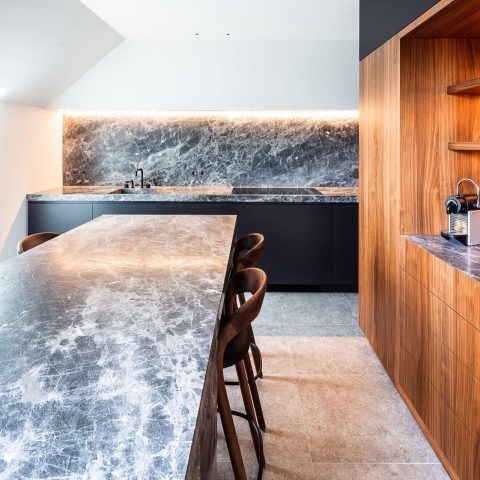
Home with a modern kitchen and minimal interior
Dark wall cabinets set the tone before the rest of the room reveals itself. Their flat fronts run across the kitchen in a single measured line, with built-in appliances sitting flush inside the composition. Against that darker plane, the white kitchen island reads as a clear counterpoint. It carries the working center of the room, while the surrounding surfaces stay visually quiet and controlled.
Sleek lines around the kitchen wall
The kitchen is drawn with restraint. Cabinet doors sit level, handles stay out of sight, and the dark finish lets the volume of the furniture come forward instead of its decoration. An open niche with shelves is worked into the same front colour, so the wall cabinetry does more than hold storage; it shapes the room’s rhythm. The modern kitchen feels built as one continuous piece, but the details keep it from becoming monotone.
Integrated ovens and a microwave disappear into the tall units, leaving the wall to read as a composed block rather than a collection of separate machines. That decision keeps the eye on the horizontal and vertical lines of the joinery. The effect is especially clear where the dark custom cabinetry meets the lighter island. One side absorbs light, the other reflects it, and the contrast gives the room a precise center.
The white island as a working anchor
The kitchen island stands out immediately because of its white top and lighter body. It breaks the density of the dark wall units and gives the room a place to gather around the work surface. A visible sink area is part of the island, which turns it into the practical core of the kitchen rather than a freestanding object placed for effect. Around it, the surfaces stay uncluttered, so the island remains easy to read from the adjoining space.
From the living area, the island appears almost like a block set against the darker background. That contrast is not decorative noise; it clarifies the layout. You can see where the cooking wall ends and where the social part of the room begins. The kitchen island also softens the strictness of the wall composition by giving the room a second material register, one that catches daylight and opens the plan visually.
Clean interior details in the transition spaces
The entrance takes a different tone, but it keeps the same discipline. A dark door composition sits between large windows, and the grey ceramic floor tiles draw the route through the space with a cool, even surface. The panels of the door read as a solid interruption in a zone otherwise shaped by light and openings. Instead of ornamental gestures, the hall relies on proportion, shadow, and the sharp edges of the frames.
Those large windows matter because they keep the entry zone from feeling enclosed. Light comes in from both sides, catching the tiled floor and the dark metal lines around the openings. The view outside stays secondary, but it adds depth to the threshold. As a result, the entrance hall details are not isolated from the rest of the house; they already introduce the same measured language seen in the kitchen.
Wood and light in the living space
In the living area, the material palette loosens slightly without losing its precision. A wooden ceiling finish, seen as slats or lamellae, introduces texture overhead and breaks the harder surfaces below. The large window beside it brings in a broad strip of daylight, which makes the white island look brighter and the dark kitchen wall even more defined. This contrast between wood, glass, and lacquered fronts carries the room.
The living space also shows how the minimal modern interior works across different zones. Nothing here tries to compete with the kitchen; instead, the materials step back and let the layout speak. The ceramic floor continues the sense of order from the hall, while the ceiling treatment adds depth above. You read the room through surfaces rather than through objects, and that keeps the plan calm without flattening it.
Material contrast that stays legible
Hout, keramische tegels, metal accents and the dark joinery all appear in distinct layers, each with its own task. The wood softens the overhead plane, the tiles hold the ground level together, and the metal lines around doors and frames sharpen the transitions. In that setting, the dark custom cabinetry does not feel heavy. It gives the kitchen weight, but the white island and the large window nearby keep the composition open enough to read from multiple angles.
The same clarity carries through the project’s more secondary views. Even where the exterior appears briefly, it serves mainly as a backdrop to the interior sequence rather than as a separate statement. The real subject remains the way the rooms are assembled: dark wall units, integrated equipment, a bright island, and entrance details that continue the same restrained logic. That is what gives the home its focus. The modern kitchen anchors it, but the surrounding spaces complete the picture.
A home shaped by measured contrasts
What stands out most is not decoration, but the way each surface supports the next one. The dark cabinetry frames the kitchen; the island interrupts it with light; the doorway cuts a firm line through the hall; the timber ceiling brings a warmer grain above the living area. These elements are simple on their own. Together they create a home interior where every part has a visible role, and where the modern kitchen remains the clearest point of orientation.
Want to see more of Strakk Interior Design? View the page of Strakk Interior Design for even more great projects and company information.