









Modern luxury interior with attention to detail
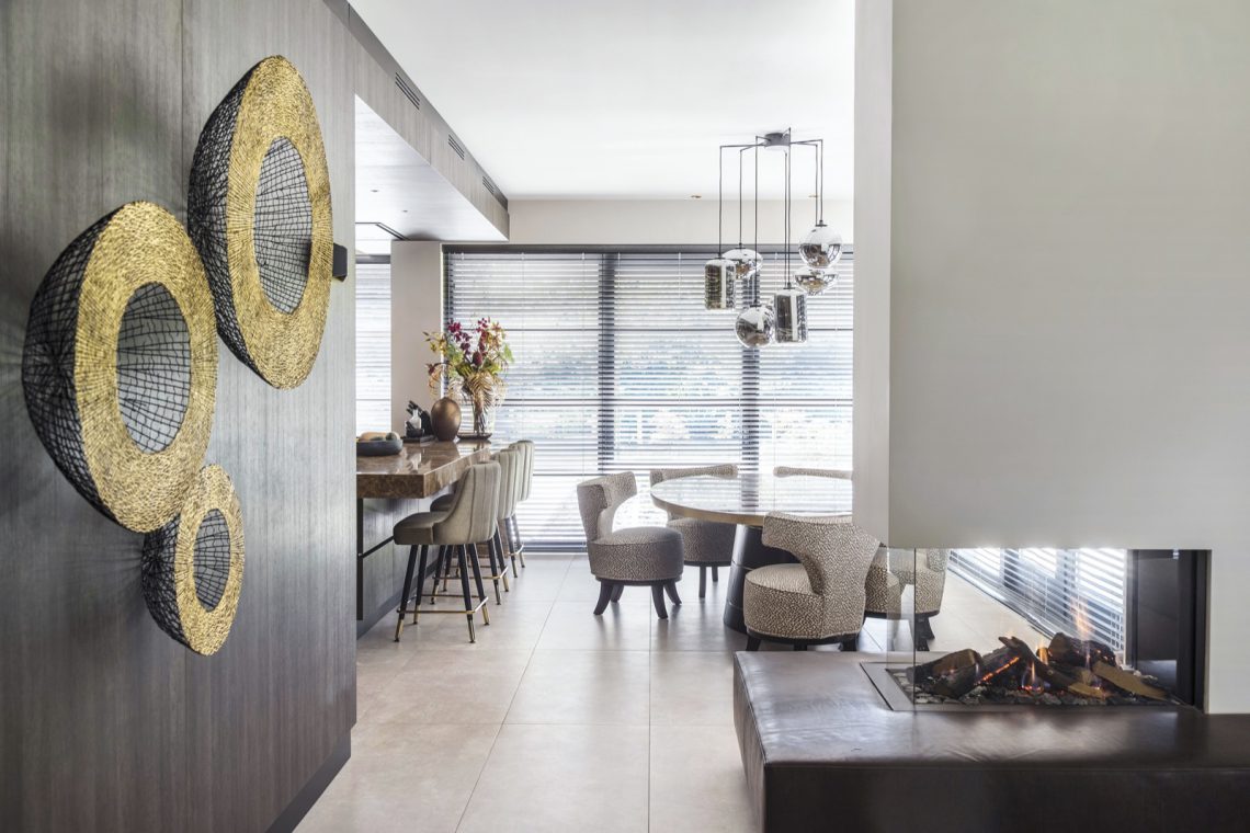
Horizontal shutters set the rhythm before anything else. Across the large windows, their narrow lines cut the light into bands, while the low fireplace wall holds the room in place. The palette stays quiet: pale walls, dark frames, stone surfaces and wood, each material clearly separated so the details can do the work. Seen together, these rooms read as a modern luxury interior details story, built from precise joins rather than decoration.
Living room lines drawn by light and fire
The living area is shaped by the long horizontal run of the shutters and the low, built-in fireplace beneath them. In one view the fire sits behind glass in a shallow niche, with a stone or marble-look ledge wrapping the base. In another, the same wall is read as a TV wall, with the screen tucked into a dark opening. The effect is not loud; it is measured, and the room feels organised by those strong horizontal lines.
From a second angle, the seating arrangement becomes part of the composition. A light sofa, a rug and low tables sit in front of the fireplace wall, while the hanging lamps mark the dining zone nearby. The openings between the living and dining areas stay generous, so the eye can move from the shuttered windows to the hearth and on to the table without interruption. That openness gives the finishes room to show.
Wood panels, niches and the TV wall
Wood wall panels bring a warmer register into the living space, but they are used with restraint. One wall is clad in timber-toned surfaces that also frame a recess and window opening, so the joinery reads as architecture rather than furniture. Another image shows the TV niche set into a darker surround, with the screen recessed instead of mounted flat on the surface. These wall details keep the room visually clean while still giving it depth.
The wood slat wall appears in the kitchen zone as well, where vertical panels break up the storage runs and soften the height of the cabinetry. Because the grain and panel rhythm stay visible, the surfaces do more than hide storage. They set a measured pattern against the smoother wall planes, and they connect the living spaces to the cabinetry language used elsewhere in the interior.
A luxury kitchen with wood fronts and stone surfaces
The kitchen uses the same calm material mix in a more compact composition. Wood fronts line the tall cabinets, while the worktop and island shift toward a marble-look surface. One image shows the island stretching out as a long, pale plane, with the darker timber cabinetry rising behind it. Another view brings the work zone closer: a dark backsplash, open shelves and integrated appliances sit between the vertical wood elements, so the kitchen reads as a sequence of clear surfaces.
Glass appears here too, not as a decorative feature but as part of the storage layout. A wine niche with illuminated shelving is built into the cabinetry, and the surrounding doors keep the composition strict and vertical. In the luxury kitchen with wood fronts, the contrast between the warm fronts and the cooler stone-look top is what gives the room its definition. Nothing is overdrawn. The joinery, the edge of the island and the appliance wall all stay visibly distinct.
Kitchen island marble look and concealed storage
The kitchen island marble look surface catches the light differently from the timber around it. It breaks the cabinet block into lighter and darker layers, which makes the room feel longer and more open. At the same time, the storage volumes remain dense and practical in appearance: tall doors, fitted appliances and open compartments are aligned in straight runs. The result is a kitchen that relies on surface contrast rather than ornament to hold attention.
Bathroom details in glass, tile and round forms
The bathroom shifts the focus from long horizontal lines to clearer partitions and rounded basins. A glass partition divides the space without shutting it down, and two round sinks sit on a continuous vanity top, their curved rims standing out against the straight edge of the counter. Ceiling spots keep the light even across the white surfaces, so the glass profile and the basin shapes remain easy to read. The room is spare, but not bare; each element has a clear place.
In the shower area, the surface treatment changes completely. Small mosaic tiles cover the walls, and a rain shower drops from above behind a glass door with slim metal profiles. The tile pattern adds texture where the rest of the bathroom stays smooth. It is a direct contrast: glossy glass, fine grout lines and a compact shower zone. Among the modern luxury interior details, this is the most tactile one, because the tile scale changes how the light lands on the walls.
Material contrast that holds the interior together
Wood, stone, glass and mosaic are used as separate layers rather than blended into one finish. That decision gives the rooms their clarity. In the living area, the shutters and fireplace wall set out the structure. In the kitchen, the wood fronts and marble-look top define the working zone. In the bathroom, the glass partition and small-format tiles make the boundaries visible. Across the whole interior, the details are not added on at the end; they are what gives each room its shape.
Seen as a series of connected spaces, the interior stays consistent without becoming repetitive. The TV wall, the wood wall panels and the wood slat wall each use the same controlled language of recesses, lines and panel breaks, but they appear in different ways from room to room. That variation keeps the eye moving. It also makes the modern luxury interior details feel deliberate in the smallest places: at the edge of a cabinet, around a fireplace opening, or where a glass panel meets the vanity top.
Want to see more of Studio de Blieck Interior Design? View the page of Studio de Blieck Interior Design for even more great projects and company information.





NEW 2026 Jubileum Edition The Best Interior Designers Benelux
Order Now €125


NEW 2026 Jubileum Edition The Best Interior Designers Benelux
Order Now €125


NEW 2026 Jubileum Edition The Best Interior Designers Benelux
Order Now €125


