









Modern luxury interior design: home renovation project
Black-framed glass, pale walls and a floor that shifts between wood and stone-look surfaces set the tone from the first view. The home renovation reads as a sequence of clear moves rather than one fixed style statement. Doorways open the sightlines, built-ins sit flush with the walls, and the darker details give the rooms definition without closing them off. Light lands differently on each surface, from the glazed partitions to the matte stair finishes and the kitchen’s dark worktop.
Glazed passages that keep the house open
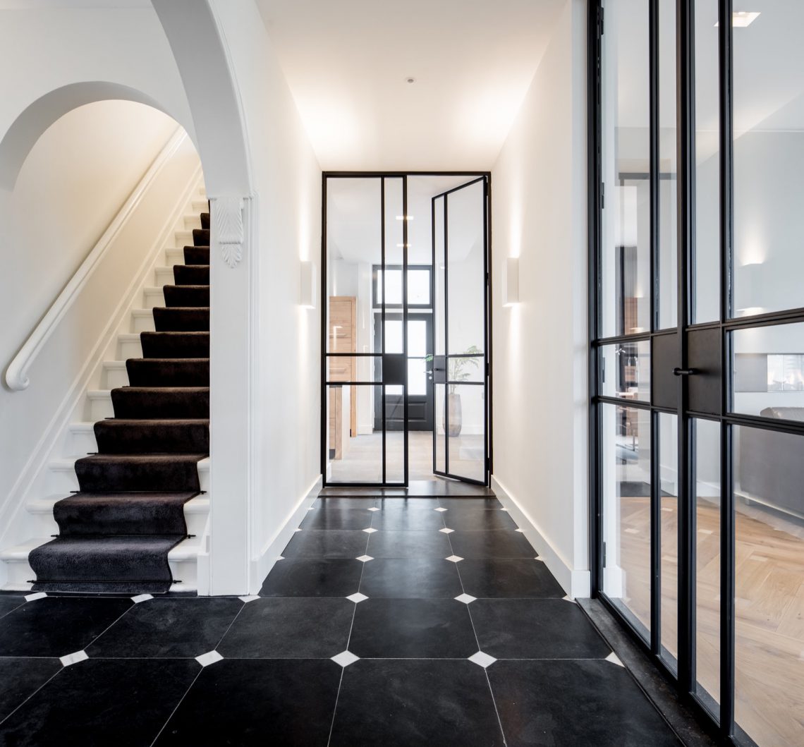
The first rooms rely on contrast. Black framed glass features mark the transition from hall to living areas, and the metal lines sit lightly against white plaster and darker floor tiles. In the entrance, the staircase rises beside a glazed opening, so the route through the house stays visible instead of hidden away. That sense of movement continues on the landing, where the white stair walls with dark treads draw the eye upward and keep the composition crisp.
A rounded opening appears in one of the hall views, softening the straight lines of the glazing and stairs. It is a small shift, but it changes the pace of the space. The dark-framed glass panels, the tiled floor and the white trim work together as a quiet frame for the circulation route. Rather than breaking the house into separate rooms, the layout lets each zone borrow light from the next.
An open living concept with clear sightlines
The open plan living concept is most legible where the kitchen, seating area and passage lines all sit in view at once. Large openings connect the rooms, and the furniture sits low against the architecture so the structure remains readable. Grey curtains soften the high windows, while the floor stretches through the space as a continuous surface. In some rooms it appears as wood; in others, as a stone-look floor with a cooler tone. That shift gives each zone a slightly different register without interrupting the plan.
One living area shows a grey sofa under a wide wall opening, with white walls and a long wooden floorboard direction pulling the room forward. Another view looks across the room toward the kitchen and fireplace zone through a generous opening. The eye moves easily from one end of the room to the other, helped by the repeated black lines of glazing and the restrained palette of white, grey, wood and dark trim. It is a measured home renovation, built around clarity of route and depth of view.
The kitchen uses wood to keep the composition grounded
In the kitchen, wood fronts meet a dark countertop in a straightforward combination that feels practical and composed. The cabinets are set against a bright room with a large window, so the darker worktop and integrated appliances stand out without dominating the space. The island or cooking zone gives the room a central anchor, while the wood grain adds texture next to the smoother dark surface. It is one of the clearest examples of the project’s modern luxury interior approach: few materials, carefully placed.
Seen from the living side, the kitchen remains part of the larger open sequence rather than a separate block. The black framed glass features nearby repeat the dark note of the countertop, while the floor continues uninterrupted beneath the transition. Curtains soften the daylight near the window, and the cabinetry keeps to straight lines so the room does not feel busy. The result is calm, but not sparse. Every surface has a role in how the room reads.
Built-ins and transitions do most of the work
Custom built-in details appear in the way the walls are fitted out, in the aligned openings, and in the cabinetry that sits closely within the room geometry. Nothing here depends on ornament. The strength of the home renovation lies in how thresholds are handled: a glazed passage here, a widened opening there, a wall finish that meets the floor cleanly. Those transitions make the house feel planned from one room to the next, with enough variation to keep each area distinct.
Even the smaller spaces carry the same discipline. A corridor with a long sightline ends at a dark-framed window or door, which pulls daylight through the plan. White walls and narrow skirting keep the route clear, while the wood floor adds a warmer note than the tiled areas below the stairs. The project’s custom built-in details are less about display than about how the house is held together.
Stairs and landings with a strong graphic edge
The stair sequence is one of the sharpest parts of the interior. White stair walls with dark treads create a clear contrast, and the dark surfaces absorb more light than the surrounding plaster. On the landing, the stair run appears almost symmetrical, with the balustrade and wall edges forming a clean path upward. This is where the home renovation feels especially controlled: the colours are few, but the geometry carries the room.
Elsewhere, the staircase is shown beside a glazed door with black metal framing and divided panes. That pairing of glass and solid wall gives the entrance a layered look without making it feel heavy. The dark tile underfoot strengthens the contrast, while the upper walls remain plain and bright. The stair zone does not try to be decorative. It works by line, shadow and proportion.
Bathrooms shaped by tile, wood and light
The bathroom shifts the mood through texture rather than colour. A mosaic shower wall bathroom appears in one of the views, where small patterning breaks up the larger tiled surfaces around it. Nearby, a wood vanity with twin basins adds length to the room, and the handles run horizontally to match the cabinet lines. The shower fittings are plainly visible, including the shower head and metal controls, which keep the space grounded in everyday use rather than display.
Another bathroom detail shows a contrast between big pale wall tiles and a darker patterned shower zone. The materials stay restrained, but the surfaces are handled differently so the room does not flatten out. The wood cabinet softens the tile edges, and the shower enclosure remains visually separate without needing a heavy partition. It is a practical room, but the layering of tile sizes and finishes gives it more depth than a simple wet room layout.
Where the project’s character becomes visible
Across the house, the strongest impression comes from the way black framed glass features, wood surfaces and stone-look flooring are repeated in different rooms. The repetition is not literal. Each area adjusts the balance: more glass at the thresholds, more wood in the kitchen and hall, more tile in the bathrooms and stair base. That variation is what makes the home renovation read as one project rather than a collection of isolated rooms.
The details are modest, but they are arranged with precision. Inbuilt lighting sits flush in the ceilings, white plaster keeps the rooms bright, and the darker accents stop the interior from washing out. Even the exterior view, with its white walls and dark window frames, reflects the same preference for clear edges and measured contrast. What remains in memory is not a single gesture, but the way the entire house moves from one material to the next.
Viewed as a whole, the project offers a modern luxury interior without relying on excess. It is built from sightlines, fitted openings and surfaces that do their work quietly. The open plan living concept keeps the rooms connected, the kitchen with dark countertop gives the central zone weight, and the stair and bathroom details extend the same discipline into smaller spaces. The renovation feels complete because the transitions are considered, not because the finishes compete for attention.
Want to see more of Medie Interieurarchitectuur? View the page of Medie Interieurarchitectuur for even more great projects and company information.



NEW 2026 Jubileum Edition The Best Interior Designers Benelux
Order Now €125


NEW 2026 Jubileum Edition The Best Interior Designers Benelux
Order Now €125


NEW 2026 Jubileum Edition The Best Interior Designers Benelux
Order Now €125


NEW 2026 Jubileum Edition The Best Interior Designers Benelux
Order Now €125


NEW 2026 Jubileum Edition The Best Interior Designers Benelux
Order Now €125


NEW 2026 Jubileum Edition The Best Interior Designers Benelux
Order Now €125


