Modern luxury interior in a monumental townhouse
The black-and-white checkerboard hall sets the tone at once. It runs past a long corridor, a door opening toward an old garden, and stucco details that still read clearly above the passageways. In this monumental townhouse renovation, the old shell was not smoothed away. Instead, the route through the house was used to frame new rooms, with dark and bright surfaces, glass, wood, and preserved ornament working side by side.
A hallway that keeps the house’s rhythm intact
The first impression comes from the floor. Large black-and-white tiles draw a clear line through the entry, giving the hall a graphic weight that suits the house’s length. White door surrounds and a decorative plaster element above the opening break the run of tiles without softening it too much. The sequence feels deliberate: threshold, corridor, garden view. Even before the larger rooms open up, the monumental townhouse renovation makes it obvious that the original layout still matters.
That corridor was one of the features that won the owners over during their first viewing. They saw past the dark, compartmentalized rooms and focused on the long axis, the old garden at the end, and the character in the details that had survived. The house had been altered before, but the underlying proportions were still there. The renovation works with that structure instead of fighting it, allowing the hall to remain a clear spine through the interior.
Wood, marble-look surfaces and black accents in the kitchen
The kitchen shifts the mood without breaking the overall language of the house. Warm wood panels line the tall storage wall, while the marble-look surface brings in a sharper veining across the worktop and island. Black floating shelves sit lightly above the work zone, making the wall feel more open than a closed block of cabinetry would. The result is a kitchen that reads as part of the modern luxury home renovation, but still keeps a measured connection to the townhouse around it.
What makes the room work is the layering of storage and open display. Recessed niches cut into the wood run in a strict vertical rhythm, and the darker shelf structure gives the wall a precise edge. From one angle the island appears as a solid base with a stone-like top; from another, the surrounding cabinetry and open voids take over. The balance is visual rather than formal. It lets the wood grain, the black profile lines, and the pale veining stay legible without competing for attention.
A pantry wall with wood and glass
One of the most distinct pieces in the house is the built-in pantry wood and glass cabinet. The glazed sections sit beside closed wooden fronts, so the storage reads as both practical and considered. Open compartments interrupt the surface and keep the wall from becoming too heavy. The reference to a cabinet of curiosities is visible in the way glass, depth, and framing are handled: not as decoration, but as a way to make storage feel part of the room’s architecture.
That same clarity appears in the smaller transitions around the kitchen. Glass partitions with black frames separate areas without sealing them off, and the dark lines of the frames echo the other black details in the house. In a townhouse where rooms once felt divided and dim, that matters. Light can travel further, and the eye can move between spaces without losing sight of the structure. The renovation uses that effect carefully, especially where the kitchen opens into the dining area.
The dining space opens through glass and strong lines
At the dining table, the composition becomes broader. A large wooden tabletop sits on a black metal base, and above it hang ring-shaped lights that keep the view centered. Behind the table, the black-framed glazing marks a clear boundary between rooms while still letting them connect. The room carries the same disciplined mix seen elsewhere in the monumental townhouse renovation: pale wall surfaces, dark structural lines, and timber used where the eye needs weight.
The dining zone also shows how the house was given a more coherent flow without erasing its older outline. The glazed sections, the open sightlines, and the framed openings make the plan feel easier to read. Instead of a series of closed boxes, there is a sequence of linked spaces with distinct materials. The effect is especially strong when the ring pendants are seen against the large panes and black profiles, because the lighting reinforces the geometry rather than softening it.
Historic details kept visible, not hidden
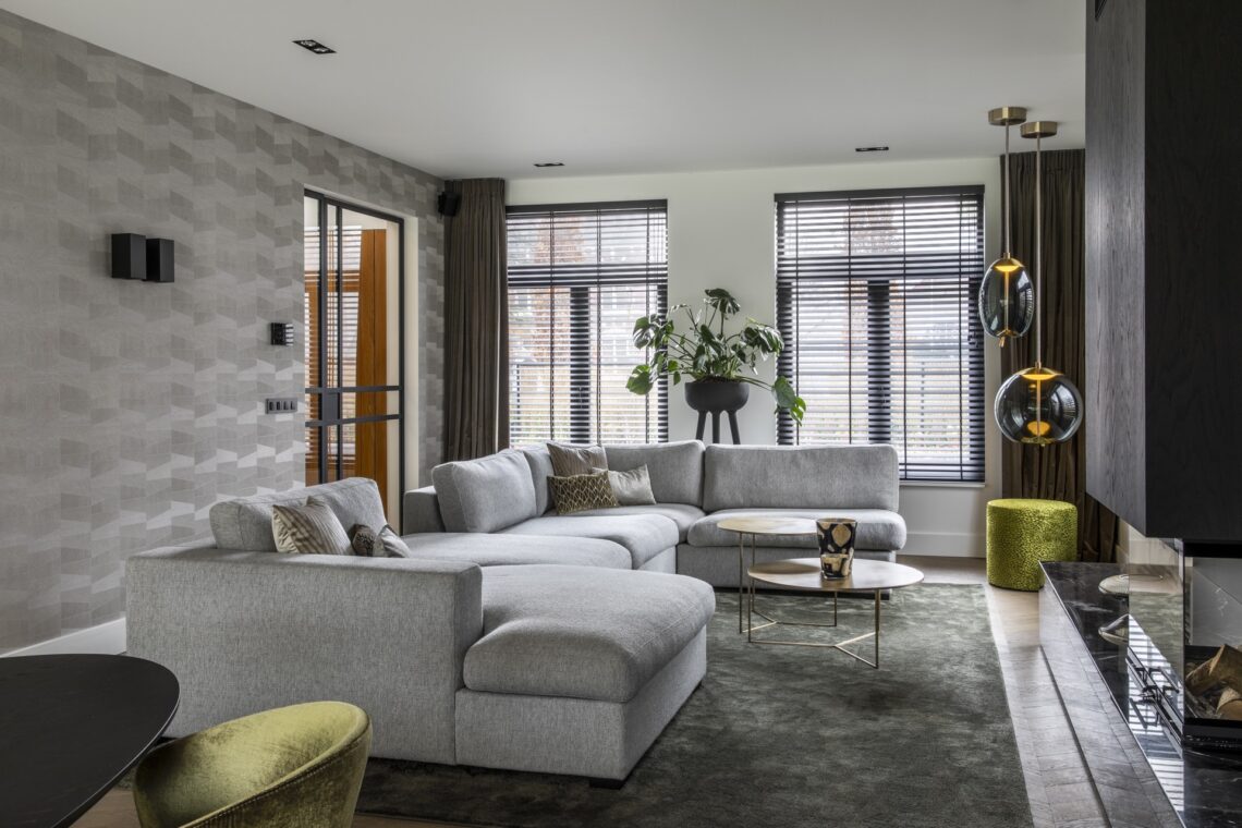
Elsewhere in the house, the older fabric is allowed to stay in view. Stucco ceiling ornament gives the passageways a sharper finish, especially when it catches light above the doors. In the living room, a fireplace niche sits inside a white surround, while a gray textured wall adds depth behind it. These are not isolated gestures. They show how the modern luxury home renovation was handled: new surfaces were introduced, but the older details were not treated as background noise. They remain part of the room’s structure.
The owners wanted that respect for the historic house to come through, and it shapes the whole project. Their initial attraction was not to a polished, finished interior, but to what the townhouse could become once the darker and more cramped parts were reworked. The renovation was planned on a larger scale with the contractor and carried through with the help of skilled trades and suppliers, but the visible result is still grounded in the original house: long views, strong thresholds, and rooms that keep their own character.
Modern wallpaper with a historic nod
In the decorative choices, the project becomes more playful. The modern wallpaper with chinoiserie reference adds pattern without taking over the room, and it sits comfortably beside the walnut and glass detailing. That pair of materials appears again in the ensuite cabinet inspired by a cabinet of curiosities, where the framing and glazing give storage a display-like quality. These are small moves, but they keep the interior from becoming too restrained. The house gains texture through surfaces, not through excess.
Seen as a whole, the monumental townhouse renovation keeps its focus on room sequence, material contrast, and the quiet weight of existing details. The black-and-white hall leads into the warmer kitchen, the glass partitions connect rooms without flattening them, and the preserved stucco and plaster details remind you of the house’s age at every turn. It is a modern luxury interior, but one that is built from the original proportions of the townhouse rather than set against them.
Photography: Denise Zwijnen
Want to see more of Danielle Verhelst Interieurontwerp? View the page of Danielle Verhelst Interieurontwerp for even more great projects and company information.

Contributors



NEW 2026 Jubileum Edition The Best Interior Designers Benelux
Order Now €125


NEW 2026 Jubileum Edition The Best Interior Designers Benelux
Order Now €125


NEW 2026 Jubileum Edition The Best Interior Designers Benelux
Order Now €125


NEW 2026 Jubileum Edition The Best Interior Designers Benelux
Order Now €125