Modern luxury villa interior with custom joinery and warm lighting
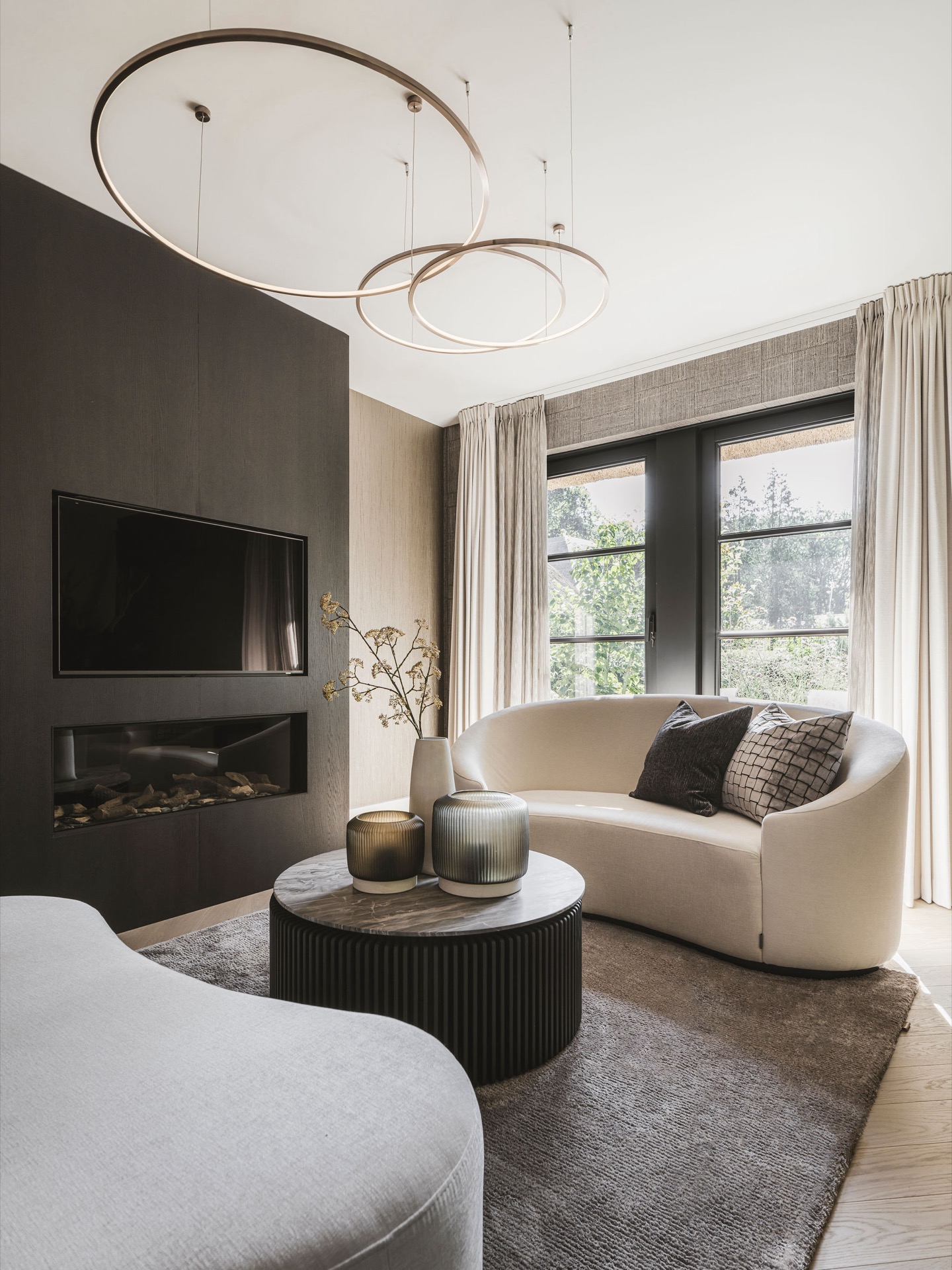
The first thing you notice is the light catching the dark fireplace surround and the pale walls around it. In this modern luxury living room, the seating area is set against a custom built-in wall unit that keeps shelves, storage and display space tightly aligned. Rounding off the view are large windows with heavy curtains, while round pendant lighting softens the geometry above the room.
Custom wall units that hold the room together
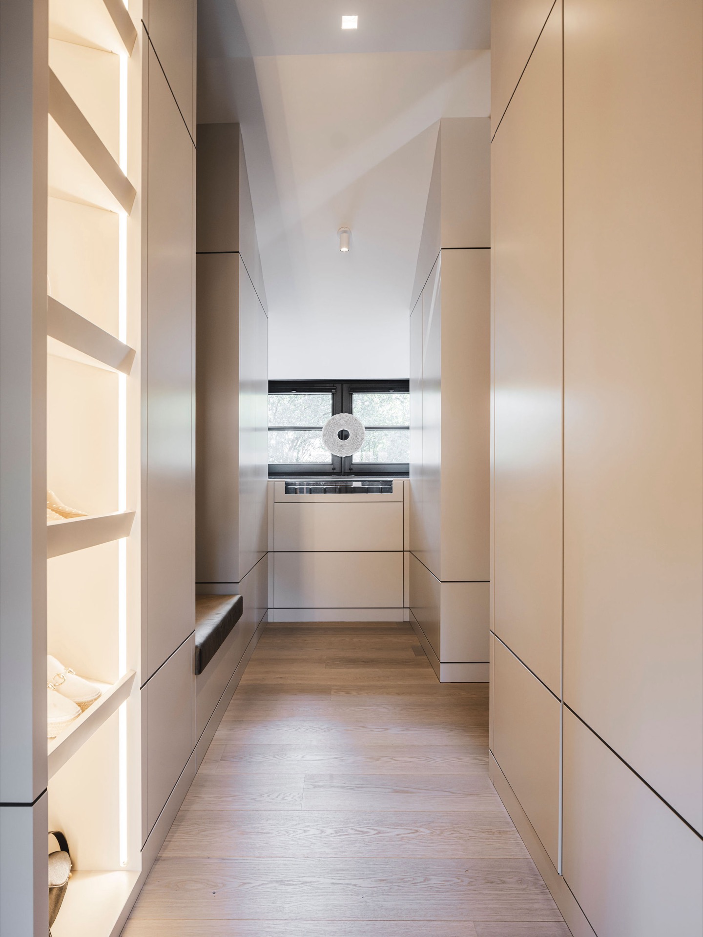
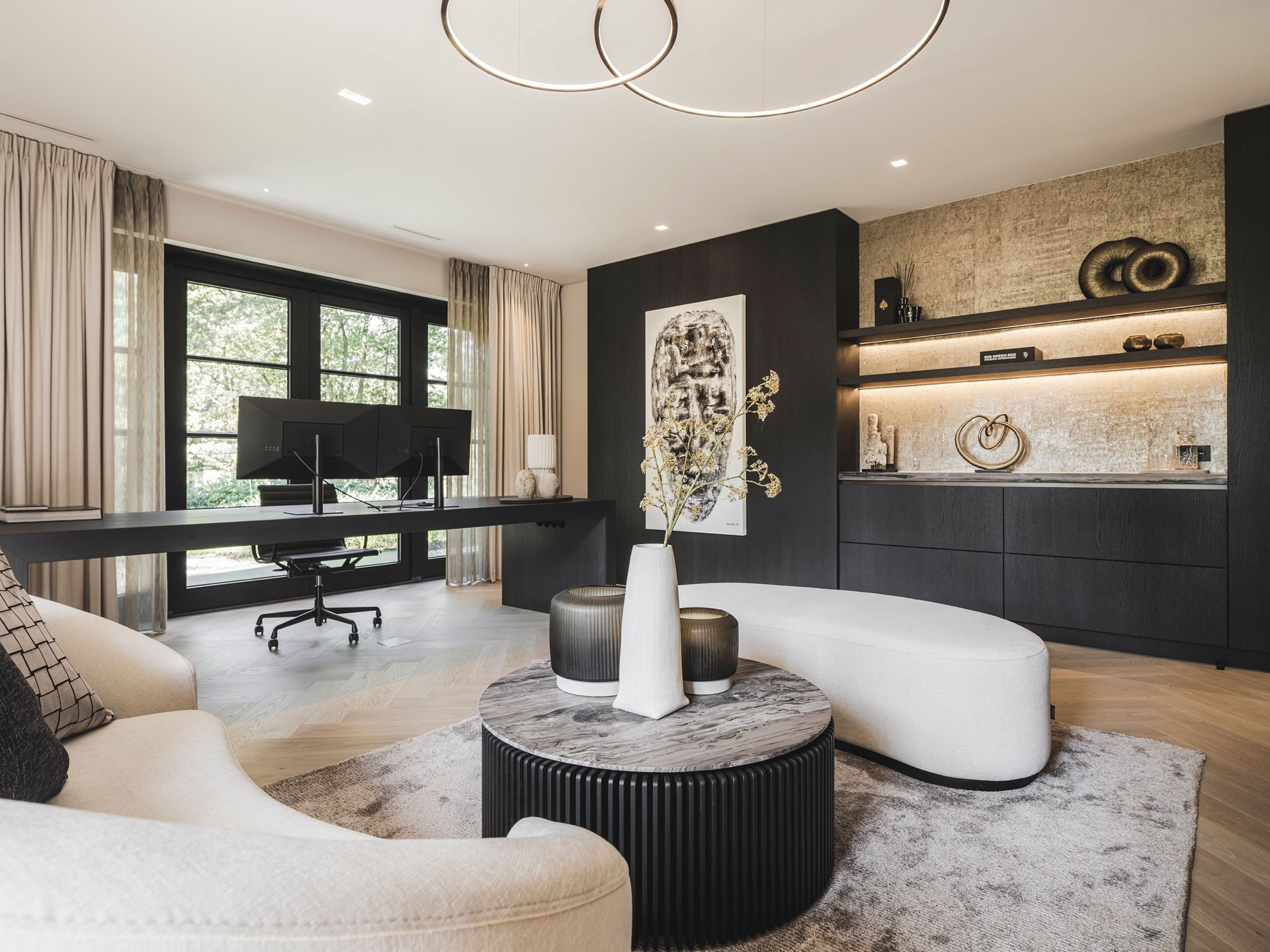
The custom built-in wall unit runs as a clear horizontal line through the living area. Open shelves, concealed fronts and recessed details keep the surface quiet, but the joinery still does a lot of work. On one wall, the darker cabinet fronts frame the television and fireplace zone; on another, the shelving shifts into lighter tones with integrated light. The result is not decorative clutter but a controlled backdrop for the room’s main pieces.
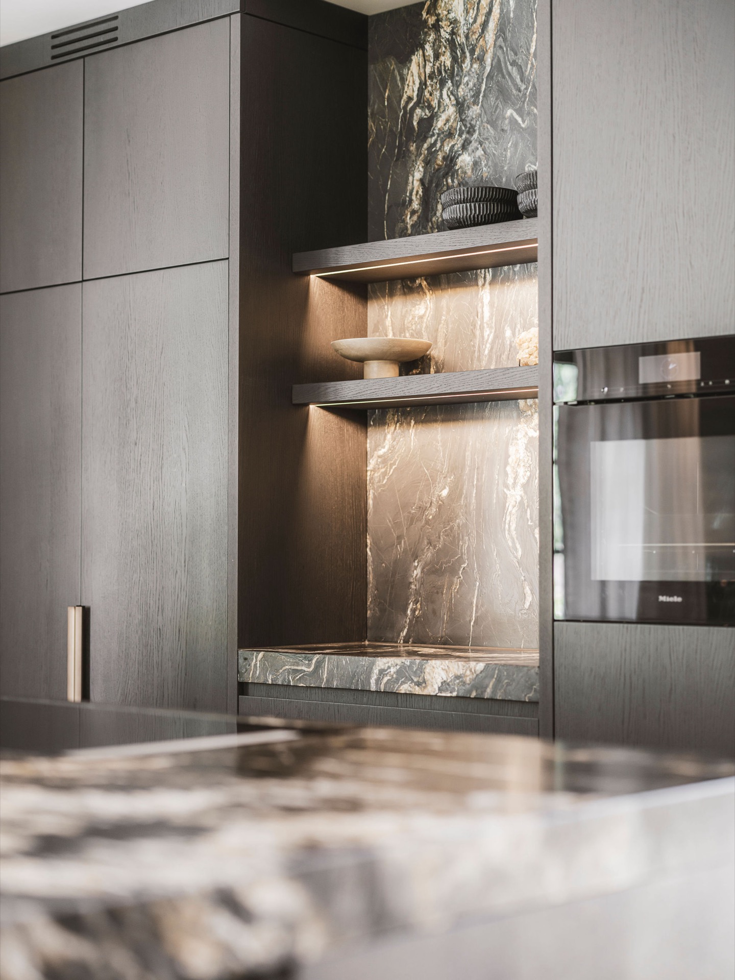
Warm light sits inside the shelves rather than spilling from the ceiling. It washes over the edges of the built-in wall unit and draws attention to the materials instead of the objects. That restrained lighting is one of the strongest elements in the modern luxury living room, because it allows the stone, wood and dark lacquered surfaces to read clearly, even when the rest of the room stays subdued.
The fireplace wall as a dark anchor
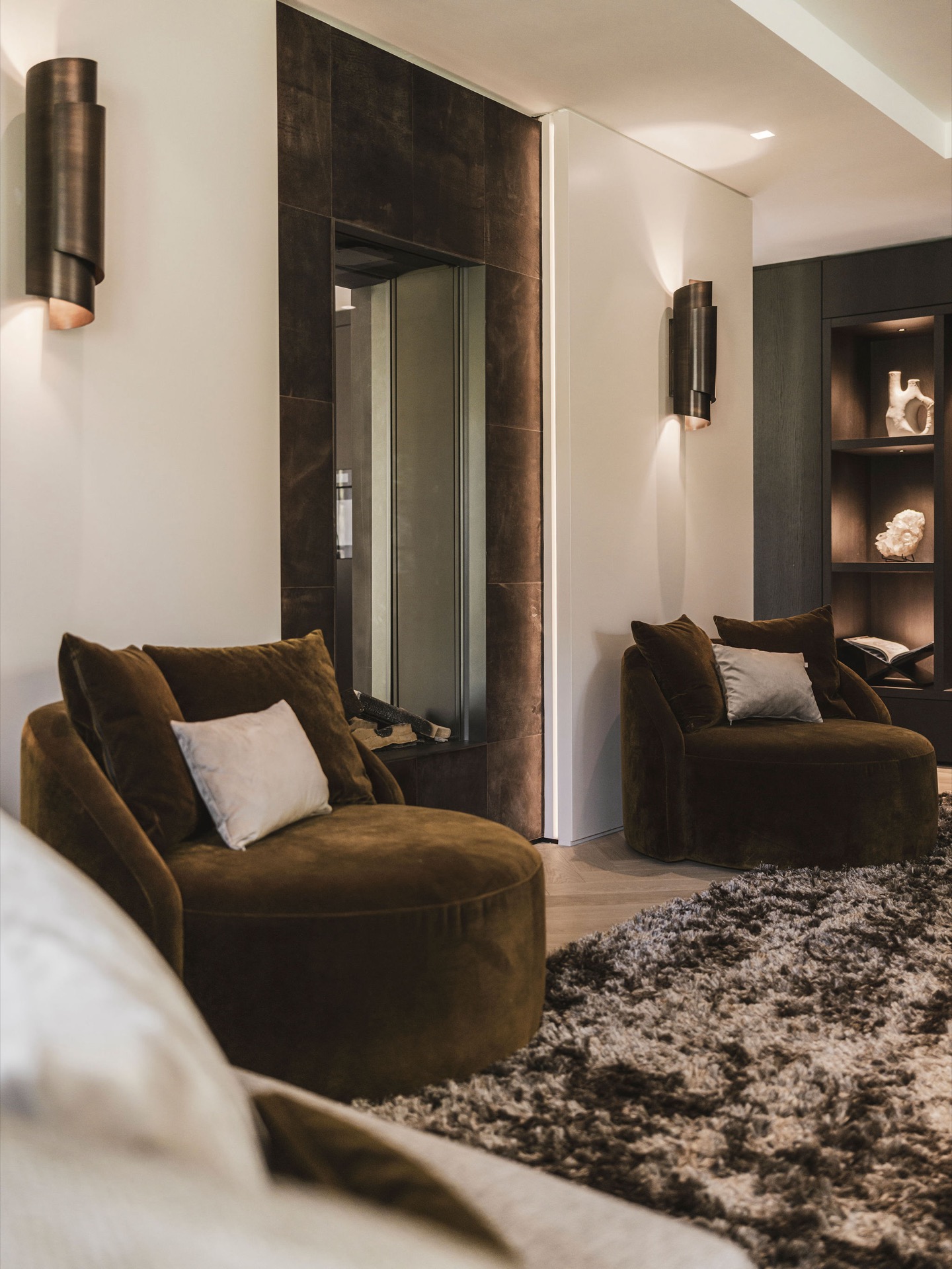
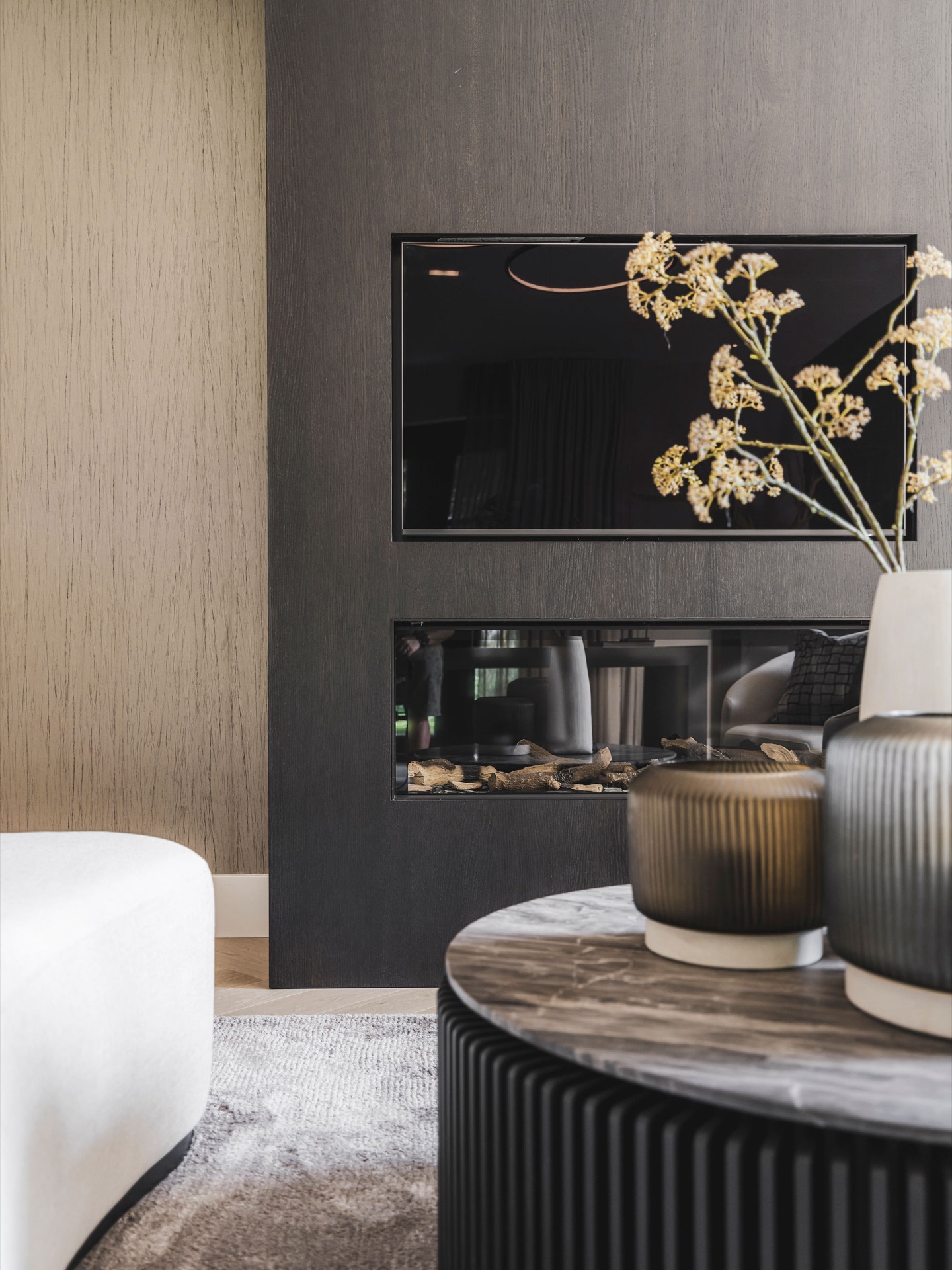
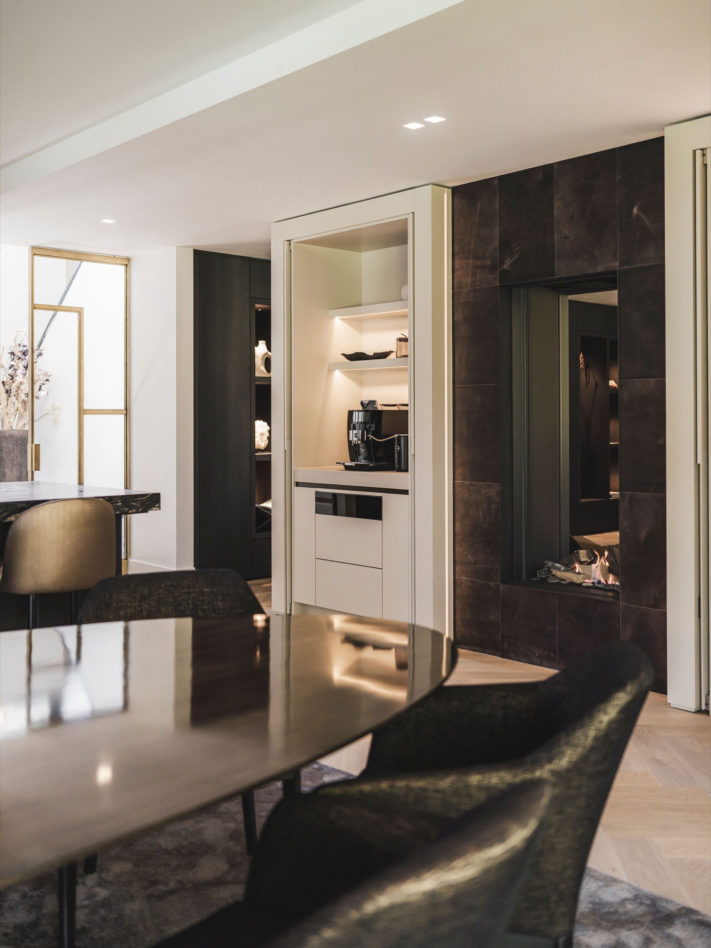
The built-in fireplace stone accent appears as a compact, grounded composition. Dark fronts, a black opening and a surrounding wall panel give the fireplace wall a strong outline, while the illuminated niche beside it prevents the zone from feeling heavy. In one view, the fire is placed beneath a straight, almost cabinet-like top edge; in another, the opening is shown more graphically, framed by crisp joinery and a lighter timber surface to the side.
That contrast between stone, black finish and pale wall surfaces gives the room its rhythm. The fireplace wall does not sit apart from the rest of the interior. It is folded into the same measured system as the built-in storage and the ceiling lighting, so the modern luxury living room reads as one continuous composition rather than a series of separate objects.
Neutral tones, timber grain and stone texture
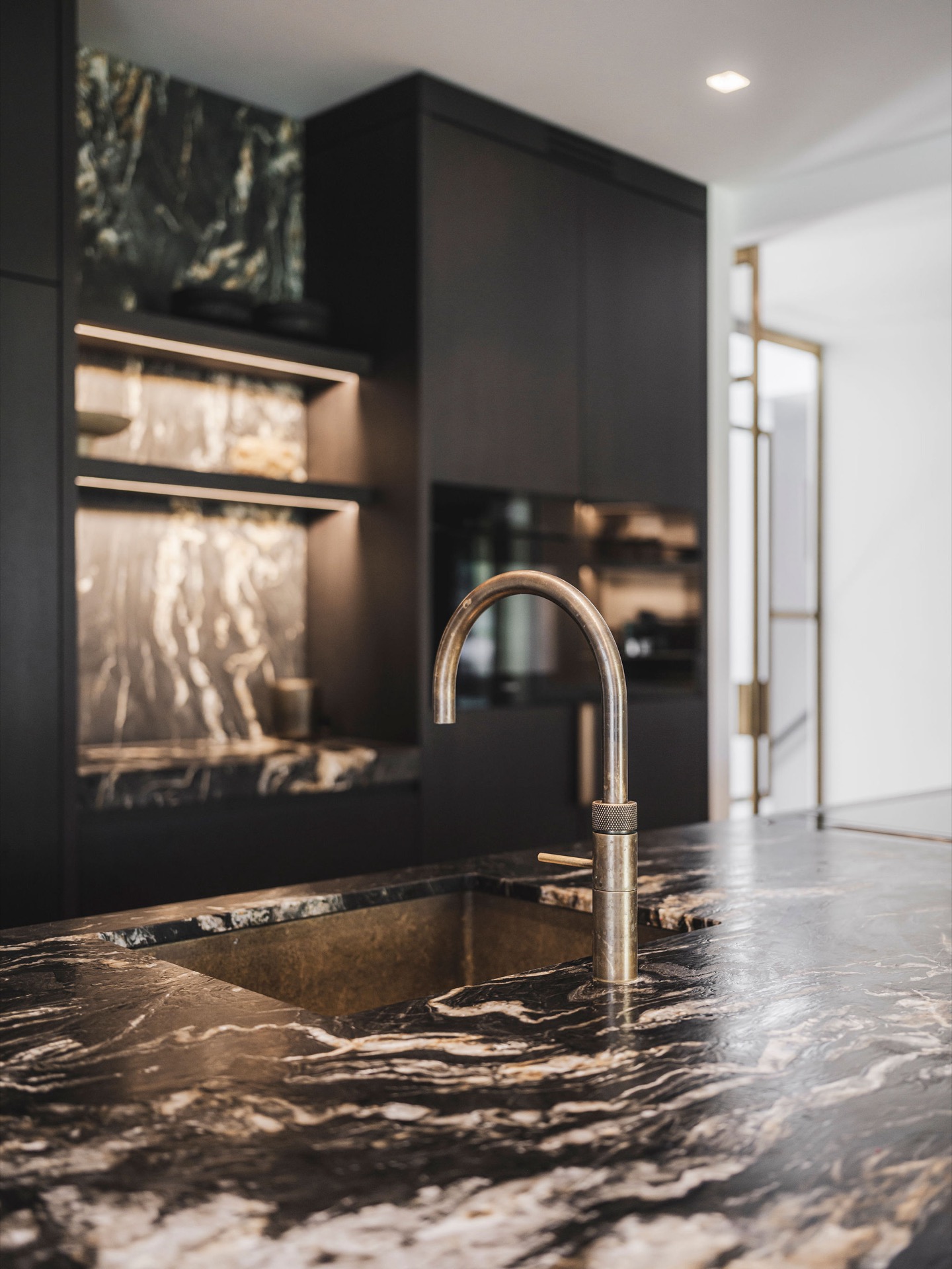
The neutral interior color palette stays within white, cream, beige, grey and black, with timber used to warm the harder edges. The wood grain appears in wall panels, shelving and lower cabinetry, while the stone brings in a more mineral surface with visible veining. In some rooms, the palette becomes slightly darker, with charcoal fronts and black profiles; in others, the same materials shift lighter and more reflective near the windows. The changes are subtle, but they keep the interior from settling into one note.
Visible seams matter here. The junction between wall panel and shelf, the edge of a stone slab, the slim profile around a doorway: each line stays deliberate and clean. A neutral palette can feel empty when the surfaces are flat, yet this one gains depth through texture. The wood catches daylight differently from the stone, and the black accents pull the eye through the room without interrupting it.
Round pendant lighting and low ceiling spots
Above the seating area, round pendant lighting adds a circular counterpoint to the long wall runs and straight cabinetry. The rings hang low enough to register as objects, not just sources of light. Elsewhere, smaller ceiling spots keep to the perimeter and the passage areas, leaving the center of the room open. That combination makes the lighting feel layered rather than showy, with each fixture serving a different part of the space.
In the stair zone and along the passage, the lighting becomes more architectural. Slim ceiling lines and recessed points guide movement past white walls, dark trim and built-in niches. The route is easy to read because the light changes with it. Entering the living area, the round pendants return as a softer signal, linking the circulation spaces to the main modern luxury living room without repeating the same gesture everywhere.
Large windows and measured openings
Large windows bring in the daylight, but the room does not rely on the glass alone. Black frames sharpen the edge of the openings, and the curtains soften the perimeter without hiding it. In several views, the window wall stands behind the seating or storage, so the room keeps a calm background even when the outside brightness is strong. The openings work like pauses in the layout, letting the materials breathe.
Openings deeper in the plan are handled with the same restraint. A dark-framed passage, a glazed door with brass-toned detailing, and a narrow view into another zone all use the same language of controlled transitions. They keep the interior connected while preserving distinct rooms and routes. That is part of what gives the page its architectural character: not spectacle, but a clear sequence of spaces and surfaces.
Bathroom surfaces with stone, tile and a freestanding tub
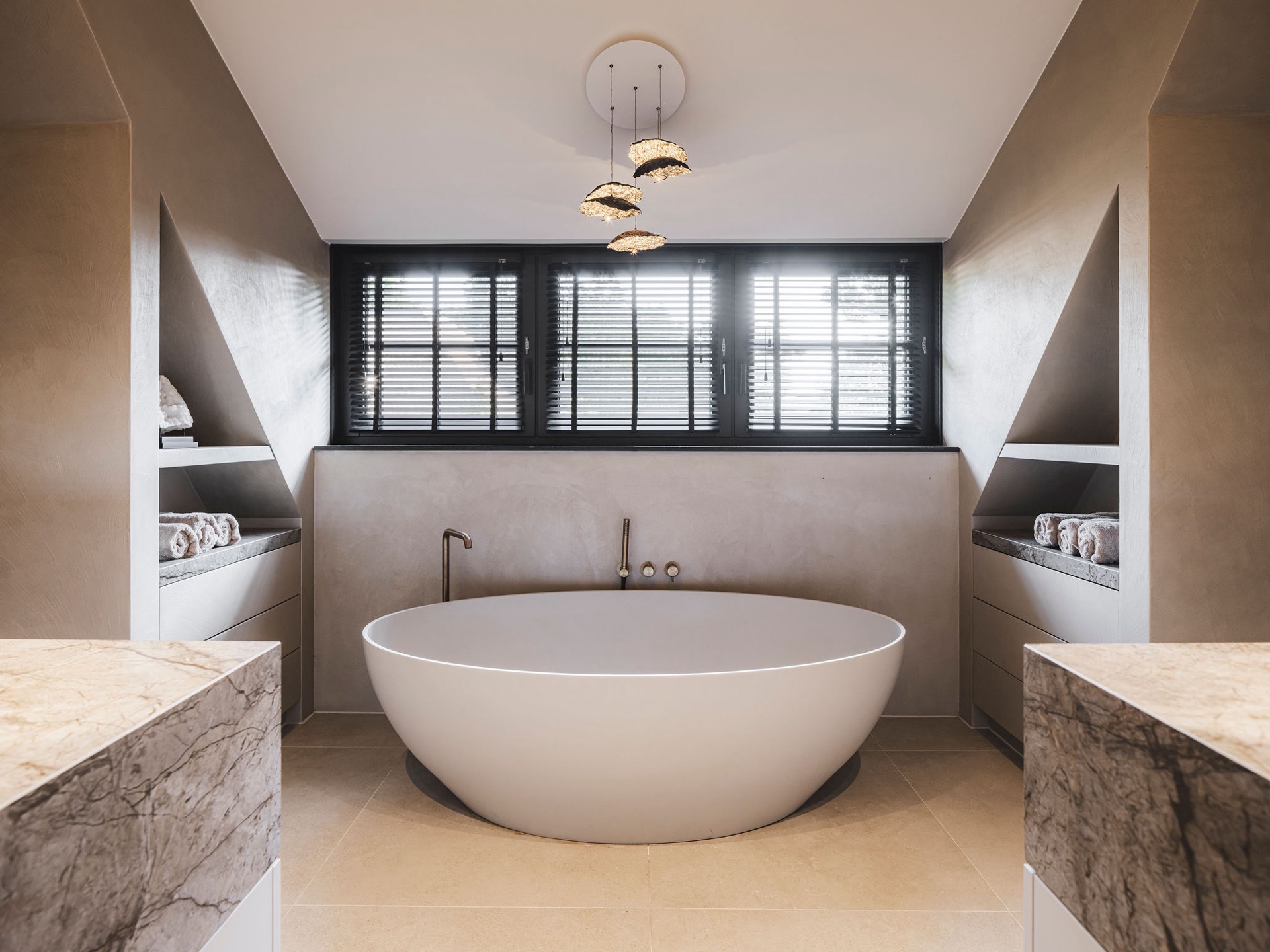
The bathroom images shift the material story into a more reflective setting. A luxury bathroom with freestanding tub appears against marble-look surfaces and pale wall finishes, with a round tub placed like a simple sculptural shape in the room. Nearby, a basin wall and surrounding cabinetry use the same light stone effect, while the darker details hold the composition in place. The bathroom never breaks from the rest of the project; it extends the same palette into a quieter zone.
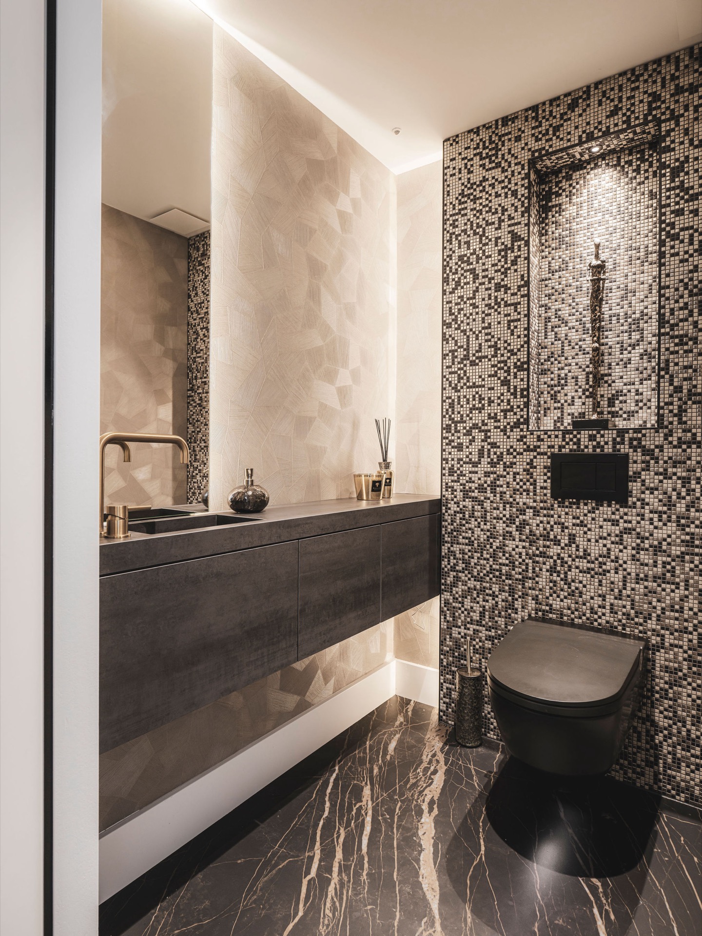
Another view introduces black-and-white mosaic tile and built-in niches, each one lit from within. The small pattern adds a sharper grain to the room, especially beside the smoother stone panels and the glossy surfaces around the wash area. In the same way the living room uses warm LED strips inside the joinery, the bathroom uses light to outline storage and depth. The materials stay restrained, but the surfaces keep changing from one zone to the next.
Bedroom details and the stair zone
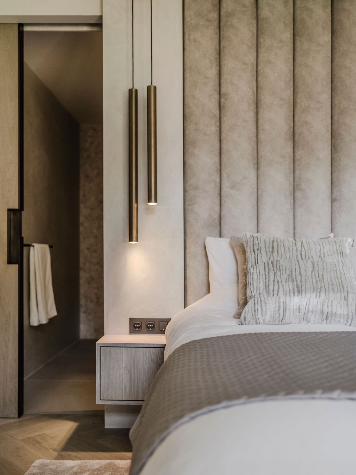
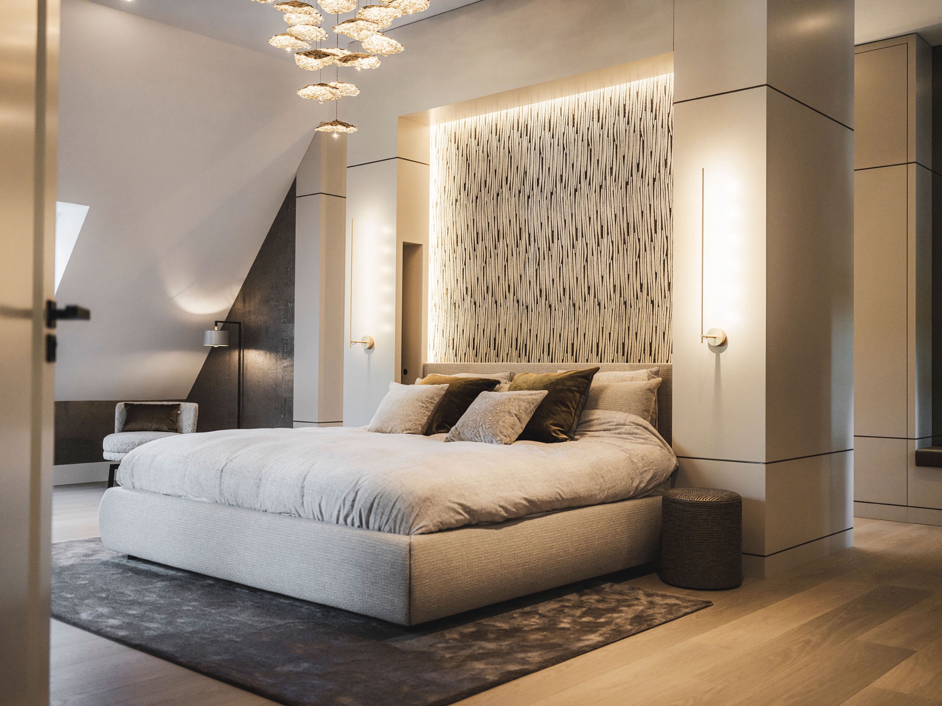
The bedroom images are defined by cylindrical wall lights and a textured wall finish that runs in horizontal bands. The bed sits low in the frame, while the wall treatment gives the room more presence than furniture alone could provide. Another bedroom view shows vertical woven-looking panels and a mix of dark and light surfaces, with ceiling spots placed to catch the texture without flattening it. The light is quiet, but it has enough contrast to register the surface.
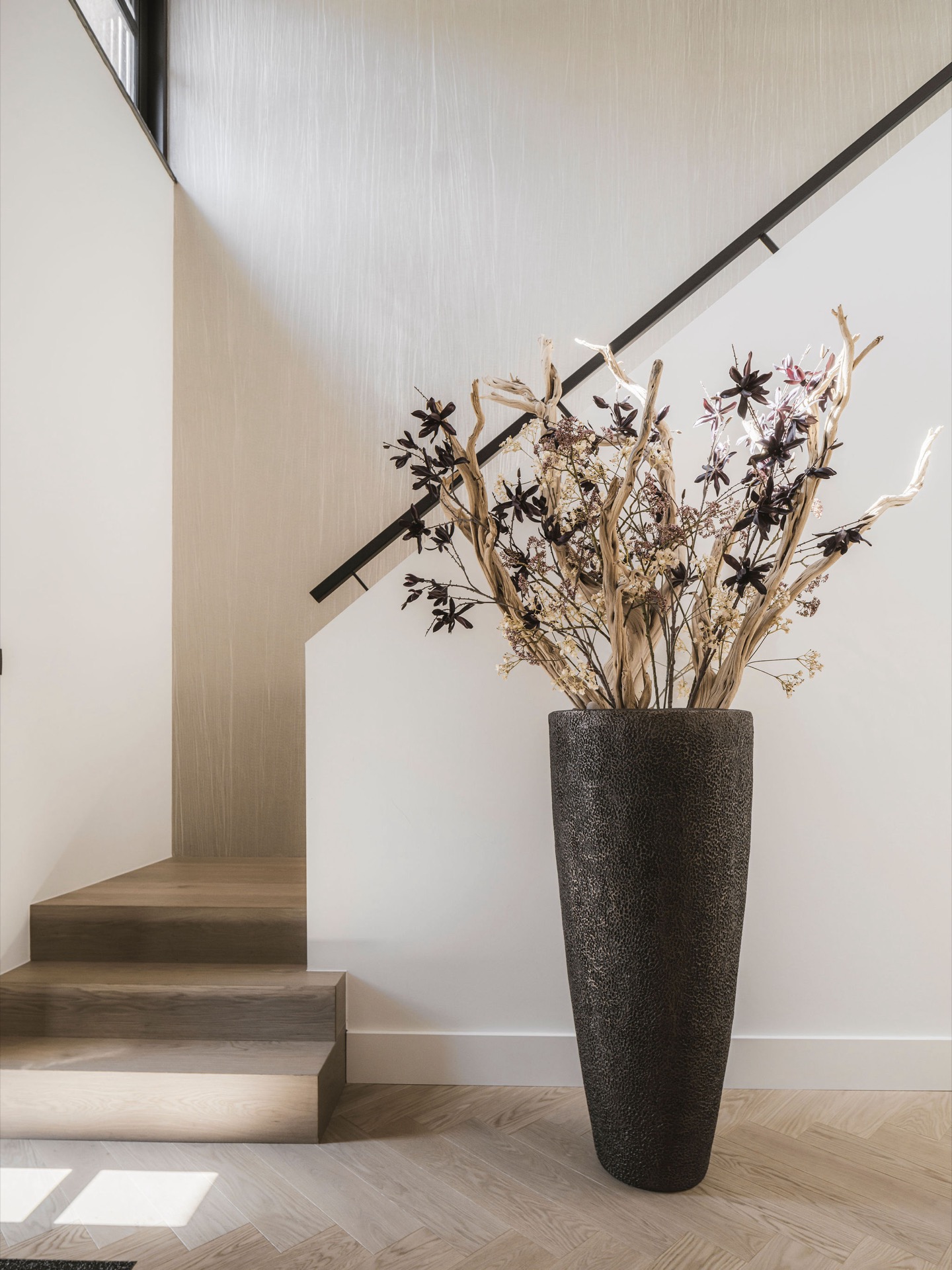
The stair zone is stripped back to the essentials: light wooden treads, white walls, dark linear trim and an inset niche along the side. It is a small sequence, yet it matters because it shows how the project handles movement between rooms. The same measured approach appears again in the hall and gallery views, where openings, niches and wall planes keep the interior organised. Across the whole villa, the custom built-in wall unit, the fireplace wall and the layered lighting repeat with variation, giving the modern luxury living room a clear architectural centre while leaving the supporting spaces fully legible.
Want to see more of Linda Pol? View the page of Linda Pol for even more great projects and company information.


NEW 2026 Jubileum Edition The Best Interior Designers Benelux
Order Now €125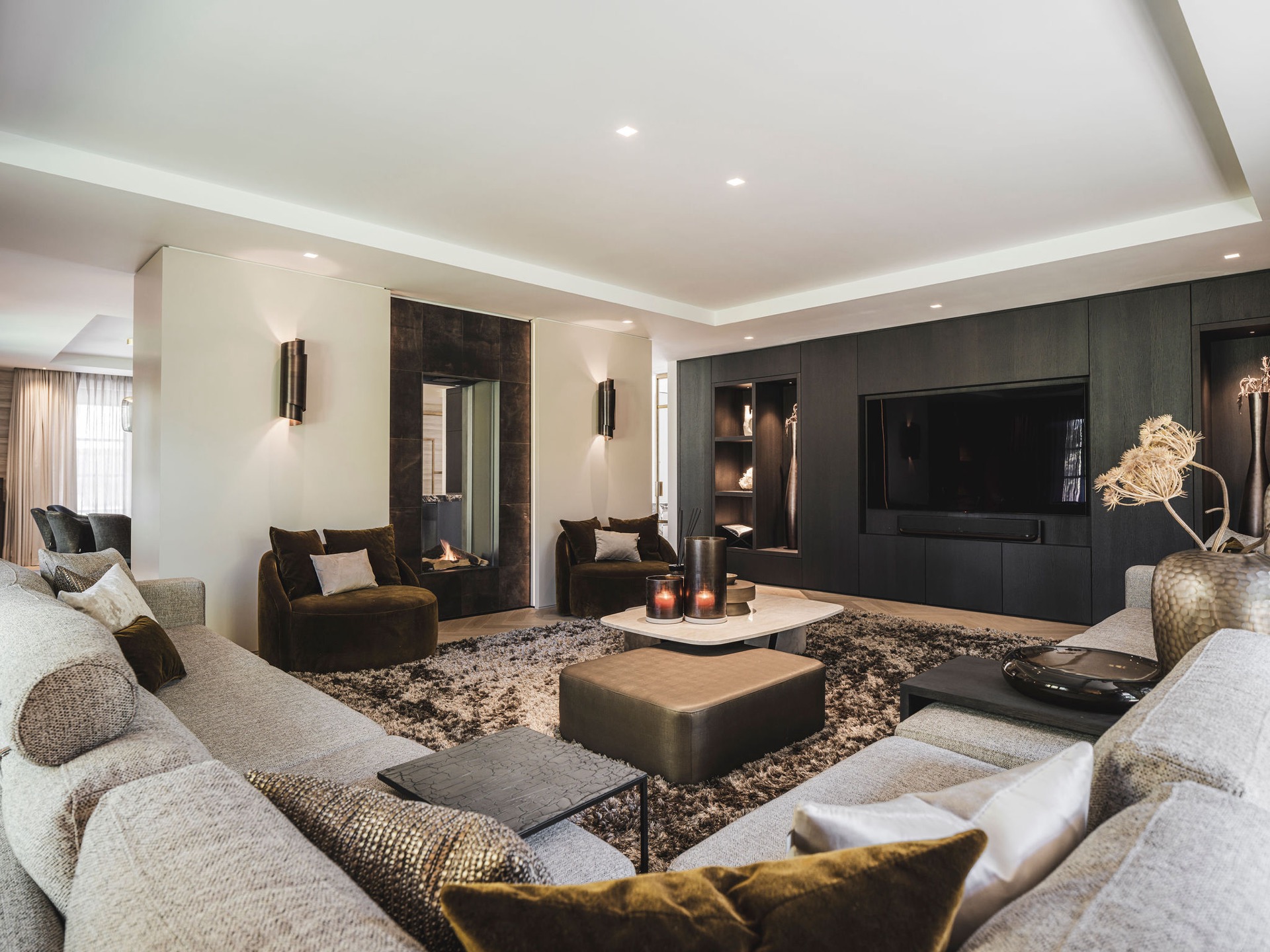
NEW 2026 Jubileum Edition The Best Interior Designers Benelux
Order Now €125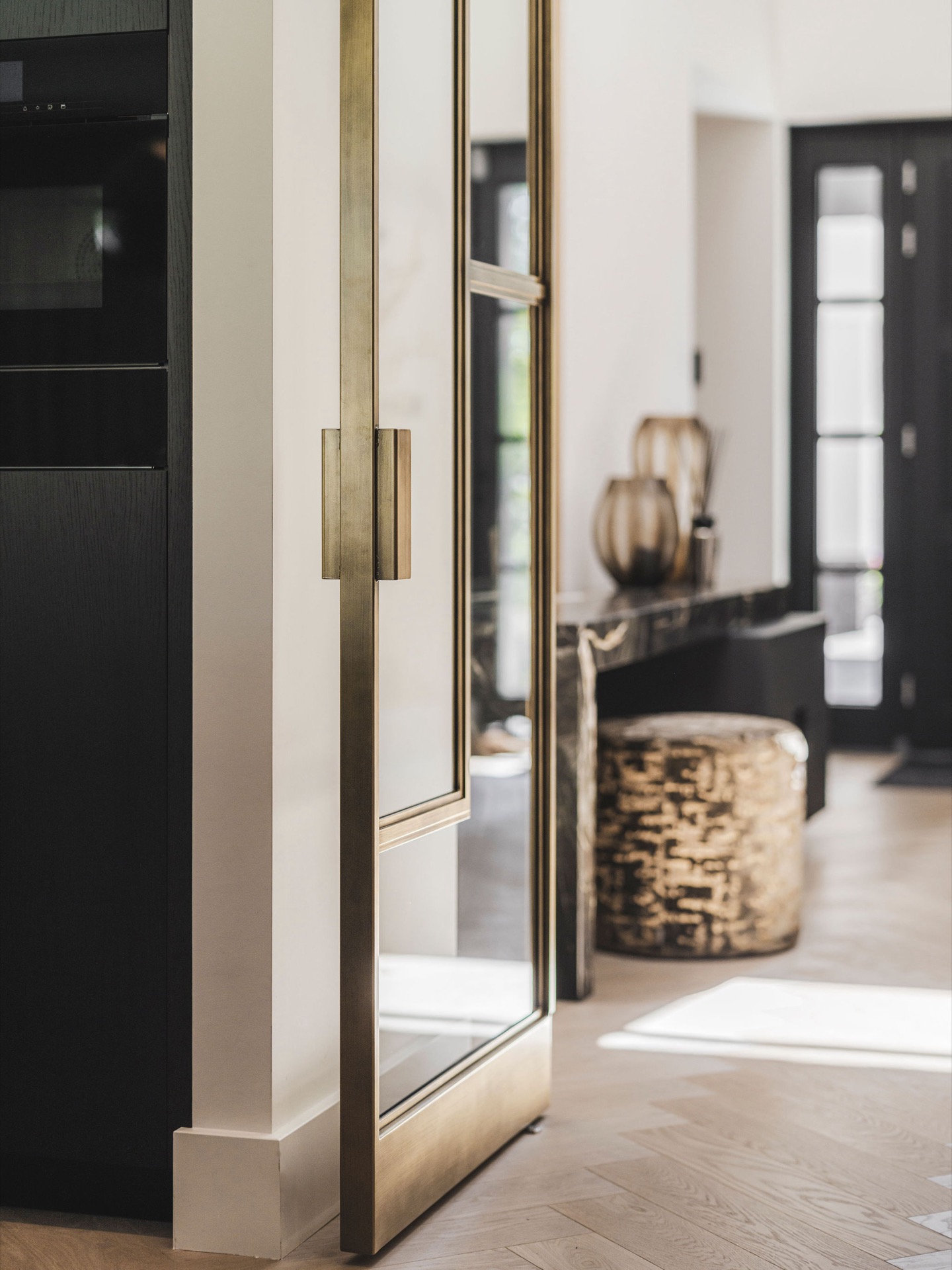
NEW 2026 Jubileum Edition The Best Interior Designers Benelux
Order Now €125