Modern minimalist interior with custom joinery
Light walls set the tone from the first step inside, but the room never reads as pale or empty. Dark tile floors draw a firm line across the plan, and the built-in elements carry that contrast through the living spaces. In this modern minimalist interior, the surfaces stay restrained, yet the details keep changing: a fireplace set into a wall unit, paneled doors in the hall, and kitchen joinery that runs as one measured composition.
Dark floor, pale walls, and the rhythm between them
The strongest gesture is the floor. Dark tiles with clear joints give the interior a grounded base, especially where daylight touches the surface and picks up the straight grid. Against that, the white plastered walls stay matte and quiet. The result is not flat; it depends on the tension between those two finishes. That is what keeps the modern minimalist interior from feeling spare. The eye moves from floor to wall, then to the built-in blocks that interrupt the long lines.
Wood appears in smaller doses, mostly as a finish around built-in parts and storage volumes. It softens the dark and white palette without changing it into something decorative. The image set shows how those materials sit close to each other: a black custom wall unit, a wooden lower cabinet, and smooth wall planes around them. The room works through joins and edges rather than ornament, which makes the custom interior joinery read as part of the architecture instead of as separate furniture.
A built-in fireplace wall that anchors the living space
The living area is shaped around an embedded fireplace zone. In one view, the opening sits inside a larger wall unit with wooden cladding; in another, the same idea becomes a black custom wall unit with a recessed fire opening and a darker surround. The opening is not framed as a decorative feature. It is cut into the composition, held by straight panels and tight corners. That gives the built-in fireplace wall a strong horizontal and vertical order, which suits the rest of the interior.
Seen from across the room, the fireplace area reads almost like an insert within a larger storage block. The dark tile floor continues right up to it, so the wall unit does not float away from the room. Instead, it stays tied to the base of the interior. Large windows nearby bring in daylight and prevent the darker elements from becoming heavy. The light lands on the matte wall finishes and on the edges of the joinery, where the form is easiest to read.
Custom interior joinery without loose ends
Several details point to the same approach: every built-in line stops where it should. The black custom wall unit uses wide panel divisions, while a separate niche detail appears as a dark insert with a low wooden base. In the corner views, the black panels meet the wall with crisp shadows and a narrow plinth. This kind of custom interior joinery does not try to disguise itself. It shows the joints, the recesses, and the thickness of the blocks, which gives the rooms a controlled, measured feel.
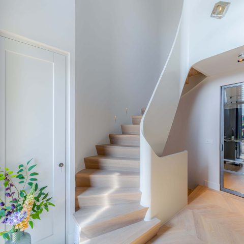
That clarity continues in the hallway. White paneled doors stand in a neat line, each one set into the wall with a clear profile. The doors are not treated as background noise; the panel rhythm and the surrounding trim become part of the interior language. A side view also shows a wooden floor with visible grain in this transition zone, which adds another layer to the material palette. Even there, the project stays disciplined: light walls, defined openings, and straight edges instead of visual clutter.
The hallway as a narrow sequence of panels and doors
The hall is one of the clearest places to read the project’s restraint. White paneled doors sit beside smooth wall surfaces and a sharp skirting line, while the framing around the openings remains slim. In the detail images, a black niche or storage recess interrupts the lighter wall, so the corridor gains depth without needing extra features. That mix of paneled white surfaces and darker recesses keeps the hallway design consistent with the rest of the house: simple in outline, exact in proportion.
Because the passage areas stay so calm, the larger rooms gain more presence. The hallway does not compete with the living zone or the kitchen. It prepares them. The panel lines, the straight edges, and the repeated door rhythm create a clear route through the interior. When the material changes, it is intentional: from the darker tile floor in the main rooms to the warmer wood tone shown in the hall, then back again to the hard, dark finish of the living and kitchen areas.
Dark kitchen cabinetry and an island set into the plan
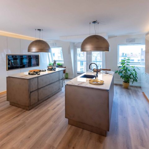
The kitchen continues the same contrast, but with a denser composition. Dark kitchen cabinetry runs across the wall in long horizontal bands, and built-in appliances sit flush within the front line. Some surfaces read as stone-like or dark mineral finishes, especially on the worktop and splashback zones. The windows are placed close to the work area, so daylight lands directly on the counter and breaks up the darker mass. Here, the kitchen island becomes the central piece, marking the middle of the room without adding visual noise.
Another view shows the island in relation to the full kitchen run. The underside remains dark, while the floor tiles keep their rigid grid below. In the ceiling, recessed spotlights underline the layout rather than drawing attention to themselves. This is a kitchen built from aligned planes: fronts, worktop, island, and ceiling lights all sit in a controlled sequence. The effect is more architectural than decorative, which suits the overall modern minimalist interior and the emphasis on custom interior joinery.
How the materials hold the composition together
What gives the project its clarity is not one single finish but the way they are repeated. White walls return in the living room and hall. Dark tile floor surfaces continue through the main spaces. Black panel work appears in the wall unit, in the niche detail, and around the kitchen fronts. Wood shows up as a counterpoint in the fireplace surround and in the hall. Because the palette stays limited, the changes in scale matter more: a full wall of cabinetry, a recessed fire opening, a slim door profile, a broad island top.
The architecture of the interior depends on that discipline. There is room for daylight, but no attempt to soften every edge. There is contrast, but no dramatic effect for its own sake. The rooms are instead shaped by built-in elements that follow the plan closely and by finishes that stay matte and legible. Across the living zone, hallway, and kitchen, the same language returns: a dark tile floor underfoot, white paneled doors in the passage, a built-in fireplace wall in the living area, and a dark kitchen with island that finishes the sequence.
In the end, the project is read through its junctions. The edge where the wall meets the floor. The recess around the fireplace opening. The line of the cupboard fronts. The frame around the paneled doors. Each detail is plain on its own, but together they build a residential interior that feels settled by structure rather than decoration. That is what gives this modern minimalist interior its strength: the rooms are composed from fixed lines, built-in volume, and a contrast that stays visible from one space to the next.
Want to see more of Strakk Interior Design? View the page of Strakk Interior Design for even more great projects and company information.



NEW 2026 Jubileum Edition The Best Interior Designers Benelux
Order Now €125


NEW 2026 Jubileum Edition The Best Interior Designers Benelux
Order Now €125