








Modern villa with a country-house-inspired facade
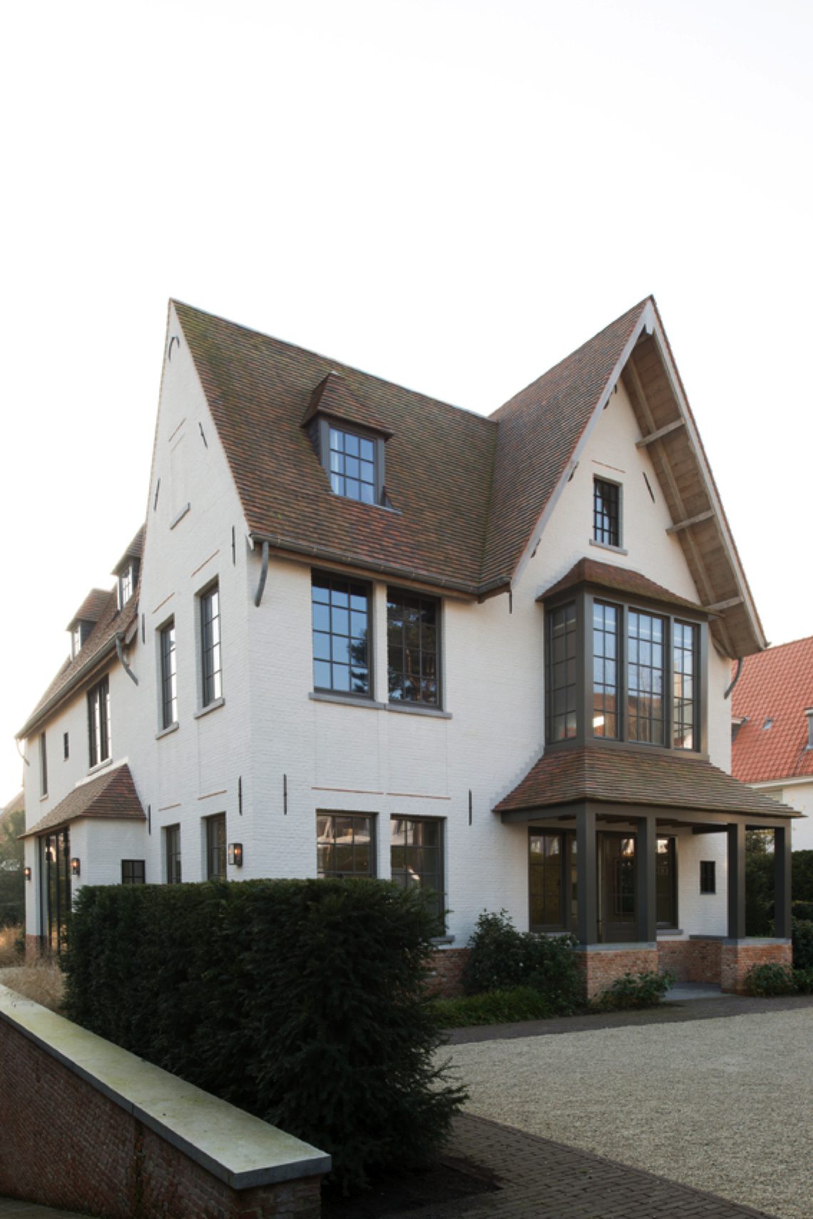
A white shell, dark roof tiles and black-framed openings set the tone before you step inside. The house reads as a modern villa with a country-house facade, but the mood is softer than the words suggest: calm for family life, clear in its lines, and attentive to the way rooms connect. Inside, every space has been drawn with a different light level and surface, yet the transitions stay measured. The result is a calm family home where glass, plaster, stone-like floors and built-in joinery keep the rooms visually linked.
Country-house references, translated into a cleaner profile
The exterior borrows from older country houses through its symmetrical composition, white rendered surfaces and pitched roof line. Dark tiles sharpen the silhouette. Black window frames cut into the pale shell and make the openings read as precise rectangles rather than decorative details. That contrast is useful here: it gives the house a grounded presence without pushing it toward nostalgia. The architecture keeps one foot in familiar country-house proportions and another in a more restrained, contemporary language.
Those same proportions continue through the interior planning. The project was conceived as a place where family and friends could move through the house without friction, whether they gather in one room or spread out across several. Large openings, long sightlines and repeated frame details keep the plan legible. The interior does not rely on one showpiece space; it is the sequence that matters, from the hall to the living areas, from quieter rooms to the more social parts of the home.
Black-framed glass walls and a measured way of opening up
Glass does much of the visual work. Black-framed glass walls and doors appear repeatedly, giving the rooms a crisp perimeter and allowing views to stretch through the house. In the kitchen and recreation areas, the glazing pulls in more light and keeps even wider rooms from feeling closed off. The frames are thin enough to stay in the background, but strong enough to define the edges of each opening. That balance is one of the clearest threads in the project’s interior language.
Several transitions are shaped with arches and rounded ceiling details, which soften the harder lines of the glass and stone-like finishes. In the hall and upper circulation spaces, an arched opening is set inside a dark outline, making the passage read almost like a frame within a frame. Elsewhere, the curve appears in the ceiling rather than the wall, and light traces the edge. These gestures are modest, but they change the tempo of the house. Straight runs are broken by a gentler movement through space.
A warm lighting scheme against concrete-look surfaces
Light is not treated as an afterthought. Warm recessed spots, linear strips and niche lighting shape the rooms after dark, catching the edges of plastered walls and built-in elements. The warm lighting scheme works especially well against the concrete-look interior finishes, which can otherwise feel cool or hard. Here, the lighting pulls a softer reading from the surfaces and reveals depth in the wall planes. Niche lighting around mirrors and storage recesses gives the bathrooms a quieter, more controlled appearance.
The palette stays close to white, grey, black and natural wood tones, with a stone-like floor underfoot in several rooms. That limited range makes the shifts in texture easier to read. A smooth plaster wall, a matte cabinet front, a reflective glass surface and a denser floor material each catch light in a different way. Instead of adding more colours, the project uses finish and reflection to create variety. It is a restrained approach, but not a flat one; the rooms change character as you move from one surface to the next.
Built-in furniture that follows the architecture
Custom built-in joinery keeps the larger rooms tidy and gives the walls a more deliberate edge. The cabinets sit flush, often running as long, uninterrupted planes rather than separate pieces of furniture. In the kitchen, white fronts line up with the room’s straight geometry, while the worktop and service zones stretch across a generous span. The joinery does not dominate the interior. It supports the plan, hides the practical parts of daily use and lets the openings, lighting and floor surfaces stay visible.
The same restraint appears in the more private rooms. Bathroom storage is tucked into niches and wall recesses, and the glazing to adjacent wet areas keeps the layout open without making it busy. A luxury bathroom concrete look is created here not through excess, but through a limited material register: pale walls, a clean basin line, dark frame elements and integrated light. The surfaces are easy to read at a glance, which suits the overall rhythm of the house.
The kitchen works with windows, not against them
The modern kitchen with large windows is one of the clearest examples of how the interior uses daylight. A broad opening sits above the work zone, and the surrounding cabinetry remains low and orderly so the view can stay prominent. White cabinets and a long worktop keep the room visually stretched. Above, small ceiling spots and a hanging fixture mark the centre without closing it in. The kitchen feels planned around use, but also around the movement of light across the counters and the floor.
Because the glazing is so present, the kitchen does not need much visual weight to hold the room together. The straight lines of the units, the restrained fronts and the stone-like finish below are enough. This is where the project’s calm family home brief becomes most tangible: a room that can handle daily activity, with enough openness for people to sit, talk and move without the space breaking into fragments. The windows do the heavy lifting, and the joinery simply keeps pace.
Rooms for play, pause and passing through
Not every space is about quiet. The billiards room gives the home a more sociable register, with the table set centrally and a large glass frontage drawing the eye outward. The room is spare, almost severe in its framing, which makes the green table surface stand out even more clearly. That openness also means the space can sit next to the rest of the house without feeling detached from it. It is a room for gathering, but also for seeing how the house breathes through its glazing.
Other parts of the plan work with lighter touch. A desk area uses wood flooring and a rounded opening, with daylight entering from a nearby window. In the circulation zones, the walls are quieter and the light is more concentrated, so the route through the house becomes easy to read. The project never forces every room to speak in the same tone. Instead, it keeps the materials and lighting consistent enough to connect them, while allowing each zone to hold its own pace.
Viewed as a whole, the house is less about display than about sequencing: a country-house-inspired exterior, black-framed openings, warm light, custom built-in joinery and a disciplined material palette. The rooms are distinct, yet they stay in conversation through repeated frames, reflected light and the same steady use of plaster, glass, wood and stone-like finishes. That is what gives the home its clarity. It feels planned for ordinary movement, but it also leaves enough space for people to gather, separate and return again.
Photography: Glenn Reynaert, Hendrik Biegs
Want to see more of Architectenbureau Glenn Reynaert? View the page of Architectenbureau Glenn Reynaert for even more great projects and company information.




NEW 2026 Jubileum Edition The Best Interior Designers Benelux
Order Now €125


NEW 2026 Jubileum Edition The Best Interior Designers Benelux
Order Now €125


NEW 2026 Jubileum Edition The Best Interior Designers Benelux
Order Now €125


NEW 2026 Jubileum Edition The Best Interior Designers Benelux
Order Now €125


NEW 2026 Jubileum Edition The Best Interior Designers Benelux
Order Now €125


NEW 2026 Jubileum Edition The Best Interior Designers Benelux
Order Now €125


NEW 2026 Jubileum Edition The Best Interior Designers Benelux
Order Now €125


NEW 2026 Jubileum Edition The Best Interior Designers Benelux
Order Now €125


NEW 2026 Jubileum Edition The Best Interior Designers Benelux
Order Now €125


NEW 2026 Jubileum Edition The Best Interior Designers Benelux
Order Now €125


