Modern villa interior with custom details and natural stone
Dark wood runs through the plan in long cabinet fronts, wall panels and built-in niches, giving the rooms a clear structure before the furniture even enters the scene. In this modern villa interior, the material contrast is immediate: deep timber surfaces sit against pale stone, while daylight lands on the edges of the joinery and lifts the darker elements forward. The result is not loud. It is precise, with every line drawn to hold the space together without closing it off.
Custom dark wood joinery shapes the circulation
Along the corridor, the custom cabinetry does more than store. It marks the route, frames openings and sets the pace between one zone and the next. Narrow ceiling lights run in line with the passage, and round recessed spots pick out the length of the walls. The dark finish absorbs part of the light, so the joinery reads as a solid band rather than a loose collection of units. That clarity is what gives the interior its measured rhythm.
Where the rooms open up, the same dark wood appears in larger built-in walls with integrated niches and appliance fronts. The composition keeps the surfaces calm, but it also introduces depth. Open shelves, closed fronts and recessed details sit in the same field, so the eye moves from one cut-out to the next instead of stopping at a single flat plane. The effect is restrained, but it is never empty.
Large windows and open sightlines keep the plan connected
Big windows pull daylight across the open-plan living space, making the black-framed mesh screens and dark walls easier to read against the lighter floor and ceiling. The interior opens in layers: a passage, a screened threshold, then the sitting area beyond. That sequence keeps views active without exposing everything at once. Through the openings, the sofa and low table appear as part of a wider field rather than as isolated pieces.
The mesh panels are one of the most distinctive elements in the house. Set in black frames, they soften the transition between kitchen, living area and corridor while still keeping the sightline alive. They are almost graphic in how they break the volume into sections. You notice the room beyond them first as shadow, then as furniture, then as a more complete space. That delay gives the interior its compositional tension.
Rail lighting and recessed spots trace the rooms
Lighting is handled with the same precision as the cabinetry. Long rail fixtures stretch across ceilings and guide the eye through the house, while recessed spots punctuate wider rooms and catch the texture of darker wall finishes. In a few places, the light lands on a vertical panel or a narrow edge of joinery, which is enough to reveal grain, depth and the cut of a corner. Nothing is overlit. The rooms are shaped by the beams themselves.
Warm wood versus cool stone in the open-plan living space
The strongest contrast comes from the material pairing. Dark timber gives the walls weight, while the stone surfaces hold a cooler note. In the open-plan living space, that contrast keeps the room from becoming visually flat. The wood absorbs the shadow around it; the stone reflects a cleaner light. Together they register as a controlled dialogue rather than decoration. Even the lighter floorboards participate, softening the shift between the darker built-ins and the brighter openings.
The kitchen carries that balance into a more active setting. Dark fronts run into a natural stone kitchen worktop, and the stone becomes the clearest surface in the room. Its edge is visible, its thickness is read at once, and the curved form of the central top gives the area a slightly softer profile than the straight cabinetry around it. As a working surface, it anchors the composition. As a visual plane, it breaks the darker field with a pale, continuous line.
A kitchen layout built around sight and surface
Because the kitchen is open to the living zone, the arrangement depends on how surfaces meet. The nature of the worktop, the height of the cabinetry and the placement of the mesh screens all help define the perimeter without erecting a hard boundary. From one point in the room, you can read the kitchen wall, the central stone element and the seating area at once. That kind of open-plan living space needs discipline, and here it is carried by material rather than by partitions.
A bathroom that repeats the same material logic
The bathroom takes the same contrast and narrows it down. Stone covers the wall in a muted pattern, and a matching basin or vanity surface holds the light more softly than the white wall planes around it. Dark accents keep the room from becoming purely pale. The layout is modest compared with the main living areas, but the detail is consistent: sharp edges, clear joins and a surface treatment that makes the materials readable even in a smaller room.
What stands out is how the stone is allowed to show its texture without overwhelming the space. The basin sits against the wall with little visual noise around it, so the grain of the surface and the join lines become part of the composition. It is a useful reminder of the wider project: this modern villa interior relies on repetition of material cues, not on repeated gestures. The same restraint appears in the larger rooms, only here it is compressed into a quieter setting.
Night light gives the exterior a secondary role
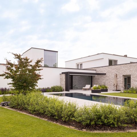
Although the page is led by the interior, the evening images show how the outer shell receives the same measured treatment. Horizontal slats, illuminated openings and a steady line of window light keep the exterior understated after dark. It reads as a continuation of the interior logic rather than a separate statement. The view at dusk confirms what the rooms already suggest: the villa is composed from material layers, not from one dominant gesture. The outside is there, but it serves the interior sequence.
That final impression comes back to the first one. Dark wood, mesh framing, stone and line lighting all work together in a way that is easy to follow but never blunt. In this modern villa interior, each room keeps a clear role: the corridor directs, the living area opens, the kitchen anchors, the bathroom quiets the material palette. The house is built from visible decisions, and those decisions remain legible from the first glance to the last.
Want to see more of ZOUT Ontwerphuis? View the page of ZOUT Ontwerphuis for even more great projects and company information.



NEW 2026 Jubileum Edition The Best Interior Designers Benelux
Order Now €125


NEW 2026 Jubileum Edition The Best Interior Designers Benelux
Order Now €125


NEW 2026 Jubileum Edition The Best Interior Designers Benelux
Order Now €125


NEW 2026 Jubileum Edition The Best Interior Designers Benelux
Order Now €125