Villa interior with a floating staircase
Daylight reaches deep into the hall before the staircase takes over the view. A glass railing keeps the line open, while the treads read almost as if they are lifted off the floor. That floating staircase effect sets the tone for the rest of the interior: clear routes, restrained surfaces and careful transitions between rooms. The design was shaped around the stairwell, so the plan does not hide it. It uses it as the main reference point.
A hall organized around the stair
The staircase is more than a connector between floors. In the hall, it becomes the central object, with a glass stair railing that lets the white walls and sharp geometry stay visible behind it. Because the treads are fixed only to the floor slabs above and below, the stair seems to hover in place. That detail is simple when seen from a distance, but it changes the whole room: light passes through, the eye keeps moving, and the space feels less divided.
The same logic appears in the way the house is composed overall. Interior and exterior were designed as one continuous idea, and the interior follows that thinking through its layout and sightlines. Open sightlines modern are not treated as a slogan here; they are built into the way the hall opens toward the living areas and the kitchen. The result is a plan that lets each space remain distinct without closing itself off.
Glass and structure working together
From the side, the stair has a precise, almost drawn quality. Wooden treads carry the warmth of the material, but the edges stay crisp, and the clear balustrade avoids adding visual weight. The glass railing does what the project needs most: it keeps the stair visible without interrupting the hall. In a house where light and route matter, that restraint is useful. It gives the staircase room to stand out while leaving the surrounding architecture legible.
Seen from the upper floors, the stair continues to work as a visual anchor. The opening between levels draws the eye through the house, and the white surfaces around it reflect that light back into the hall. Nothing in this zone tries to compete with the stair. Instead, the materials, lines and proportions are all directed toward it, which makes the floating staircase feel intentional rather than decorative.
Light, table and window line
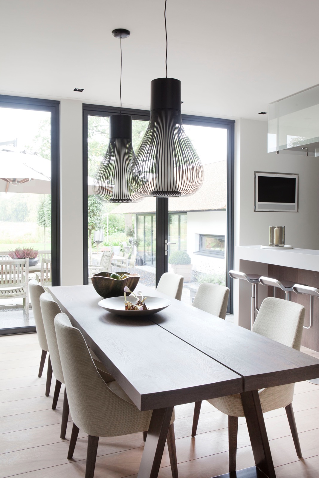
The dining area opens with a broad band of daylight and a clear view to the windows. Large panes set the table against the exterior edge of the house, while pendant lights hang low enough to mark the center of the room without flattening it. The space is modest in gesture, but exact in placement. Chairs, table and ceiling line stay close to the room’s structure, so the light can do the work of defining it.
That openness continues across the floor plan. Instead of breaking the room into separate scenes, the design lets the dining area sit between kitchen and living space with open sightlines modern in every direction. A glazed partition and open passageways allow the rooms to stay connected. The effect is practical, but also visual: the eye moves from table to kitchen front, then onward to the staircase and the quieter spaces beyond.
Built-in kitchen island and quiet detailing
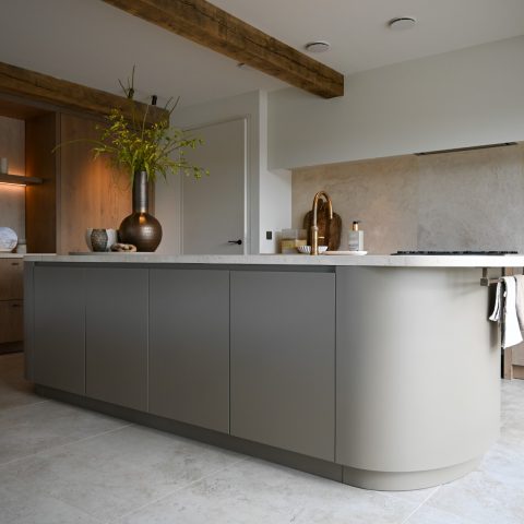
The kitchen is built as part of the architecture, not set into it as an afterthought. A built-in kitchen island anchors the room, with clean front panels and a clear working edge. Nearby, the cooking zone is marked by a visible hood and a darker arrangement of cabinets, while the white island surface keeps the center light. The composition is measured and direct, with enough contrast to make the island read from the adjacent rooms.
Custom wood wall panels add another layer of order. Their vertical rhythm softens the hard lines of the kitchen and hallway, and the joinery is tight enough that the surfaces stay calm at close range. The project uses these panels where a plain wall would feel incomplete. They frame openings, define transitions and give the interior a more tailored edge without drawing attention away from the main volumes.
Materials kept legible
Stone appears in the house where a harder surface helps the room settle. A stone-look fireplace wall gives the living area a grounded center, with the texture visible even in a neutral palette. Nearby, other natural-looking finishes are used sparingly, so the room does not turn heavy. Glass, wood and stone keep their own roles. None of them are forced to mimic the others, which helps the interior stay readable from one zone to the next.
That clarity is reinforced by the floor finish. Light tiles reflect the daylight and support the open layout without asking for attention. The combination of tile, wood and glass makes the circulation easy to read. You can see where one room ends and the next begins, yet the boundaries stay soft enough for the house to feel open.
The living room shifts the mood
In the living room, the composition becomes lower and quieter. Curtains soften the large windows, and a central sofa setting sits in front of the fireplace wall. A glass door leads toward the garden, so the room keeps one foot inside and one just beyond it. The furniture is kept close to the edges of the room, leaving the center open and making the path between seating, window and fire straightforward.
The fireplace sits in a stone-look niche and holds the room together without dominating it. Its surface gives the wall depth, especially beside the lighter plastered planes around it. This is one of the more effective moves in the project: instead of adding extra features, the design relies on a few strong elements placed carefully. The room feels settled because of proportion, not because of excess.
Panels, niches and the last layer of precision
Elsewhere, the custom wood wall panels return in more detailed forms. Vertical slats, narrow reveals and framed openings turn ordinary wall stretches into measured transitions. These surfaces do not shout for attention. They guide the hand and eye across the room, especially where the hall meets more private zones. In a project like this, that kind of joinery matters because it keeps the architecture from becoming flat.
Other images show how the same language continues in smaller moments: a wine display behind glass, a bathroom with a freestanding bathtub beside a wood slat wall, and a bedroom with a large opening and a recessed light in the wall niche. These are supporting spaces, but they confirm the same approach. The house depends on light, surface and alignment. The staircase may lead the story, yet the details around it keep the whole interior in place.
Want to see more of Remy Meijers? View the page of Remy Meijers for even more great projects and company information.





NEW 2026 Jubileum Edition The Best Interior Designers Benelux
Order Now €125


NEW 2026 Jubileum Edition The Best Interior Designers Benelux
Order Now €125


NEW 2026 Jubileum Edition The Best Interior Designers Benelux
Order Now €125


NEW 2026 Jubileum Edition The Best Interior Designers Benelux
Order Now €125