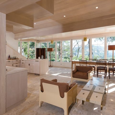
Neo-Gothic Penthouse Interior with Terrace
Dark wood, glass, and patterned tile set the tone from the first room. The neo-gothic penthouse interior reads as a sequence of strong surfaces and clear sightlines, with a terrace running the length of the apartment as a constant edge to the plan. Inside, the mood shifts between shadow and reflection: black window frames, glazed doors, and warm pools of light around the seating, dining, and passage areas.
Dark wood and glass carry the main rooms
The living area is anchored by a large corner sofa, a low table, and built-in cabinetry with glass-fronted sections. Dark timber wraps the storage walls, while the glazing breaks up the weight of the wood and keeps views moving across the room. This neo-gothic penthouse interior does not rely on ornament alone; it uses contrast. A kitchen wall with mosaic tile appears beyond the seating area, so the domestic functions stay visually linked rather than hidden away.
Light enters through tall windows and glazed openings, catching on the darker finishes and keeping the room from feeling closed in. In the dining area, the table sits close to the window wall, with wooden chairs placed in a line that follows the architecture. Behind it, a textured wall panel adds relief without competing with the furniture. The terrace remains part of the composition, but the interior still holds the focus through materials and alignment.
Ornate fireplace detail and framed openings
The fireplace appears as a carved focal point rather than a neutral insert. Its surround has a raised profile and a niche-like opening, and the detail gives the room a more ceremonial edge. Nearby, wall-mounted lighting and shallow shelving keep the surrounding zones legible. In the images, the fireplace is often read together with mirrors, art, and low seating, which makes the room feel arranged in layers instead of spread across one open volume.
That sense of layering continues in the hallway and lounge transitions. Glass partitions and doors create long views from one room to the next, so the circulation reads almost like a display route. In several angles, the open gallery hallway feels less like a corridor than a curated passage, with illuminated recesses, framed artwork, and repeated verticals in the joinery. It is one of the clearest expressions of the open gallery hallway idea in the project.
Decorative references without heavy display
The source material points to a mix of historical references, but the photographed interior stays grounded in visible surfaces. A repeating motif appears in the woodwork and openings, while the furniture and sculpture add texture to the rooms without turning them into set pieces. The result is more measured than theatrical. Even when the forms feel elaborate, the floor plan keeps pulling the eye forward through doors, mirrors, and reflected light.
Kitchen mosaic backsplash and patterned wet rooms
The kitchen uses mosaic tile to sharpen the wall behind the work area. Blue and white notes break up the dark cabinetry, and the backsplash turns a practical surface into part of the room’s rhythm. The worktop stretches across a broad span, with twin sink zones visible in the image analysis. Above and around it, open shelves and cabinet volumes keep the composition tight, while the tile pattern supplies the strongest visual movement in the room.
Bathroom areas continue that interest in pattern, but with a different tempo. One space shows geometric bathroom tiles across the walls, paired with a large mirror whose rounded frame softens the sharper tile geometry. Another corridor-like wash area uses striped tile to mark the transition into the room. The surfaces are busy only where they need to be; elsewhere, dark floors and plain fixtures let the tile do the work.
Bathing spaces under large windows
One of the most memorable views is the freestanding oval bathtub placed beneath large windows. The tub sits in the center of the composition, with dark floor finish below and pendant lights above, so the room reads upward and outward at the same time. The window wall brings in daylight, but the darker palette keeps the scene calm rather than bright and clinical. It is a practical arrangement, yet the placement gives the room a clear architectural focus.
Elsewhere, the bathroom vanity zone uses mirrored surfaces, an arched outline, and a recessed wall detail to organize the fixtures. A separate shower or niche area sits to one side, while the tile pattern stays consistent enough to tie the whole room together. In this part of the penthouse, the decorative language is not added afterward; it is built into the surfaces that handle water, storage, and reflection.
Gallery-like circulation keeps the apartment connected
The plan is strongest where movement becomes part of the interior story. The open gallery hallway links the rooms with glass doors, framed views, and shifts in ceiling light. From one angle, the circulation reads across the lounge, then out to the windows; from another, it connects to the art wall and the more intimate seating zones. That long sequence gives the neo-gothic penthouse interior its structure. It is not a set of isolated rooms, but a chain of spaces held together by sightlines.
In the entry and transition zones, decorative wall panels, mirrors, and integrated lighting prepare the change from one room to the next. The surfaces are darker here, and the proportions feel compressed before the plan opens again. That shift matters because it gives the apartment pace. The terrace, windows, and glazed doors keep the perimeter open, while the interior rooms pull back into shadow, wood grain, and patterned detail. The contrast carries through the whole project.
A penthouse with terrace, seen through materials
The terrace runs alongside the apartment, but the interior never treats it as a backdrop. It works as a boundary line, a source of daylight, and a way to extend the rooms visually without losing their density. Inside, dark wood and glass details, mosaic tile, carved openings, and repeated patterns give the penthouse its character. The strongest moments are also the simplest: a window edge, a tiled surface, a mirrored wall, a fireplace niche, or the route between them.
What stays with you is the way the rooms are edited. Furniture is placed to keep the views open, materials are chosen to sharpen the light, and the circulation has enough width to feel deliberate. The apartment’s references may reach back into older decorative traditions, but the experience is immediate: wood, glass, tile, and stone seen in long lines, under controlled light, with the open gallery hallway tying the whole sequence together.
Want to see more of Micah Heimlich? View the page of Micah Heimlich for even more great projects and company information.



NEW 2026 Jubileum Edition The Best Interior Designers Benelux
Order Now €125


NEW 2026 Jubileum Edition The Best Interior Designers Benelux
Order Now €125


NEW 2026 Jubileum Edition The Best Interior Designers Benelux
Order Now €125


NEW 2026 Jubileum Edition The Best Interior Designers Benelux
Order Now €125