New build apartment interior design with living space centered on the gas fireplace
Floor-to-ceiling cabinetry, a dark kitchen island and a three-sided fire line set the tone in this new build apartment interior design. The layout is clearly planned around the open living area, where the kitchen, seating zone and dining table all face the gas fireplace. That choice makes the fire visible from different points in the room, while the low feature wall keeps the composition compact and calm. Warm materials soften the clean lines without adding clutter.
Living, dining and kitchen arranged around the fire
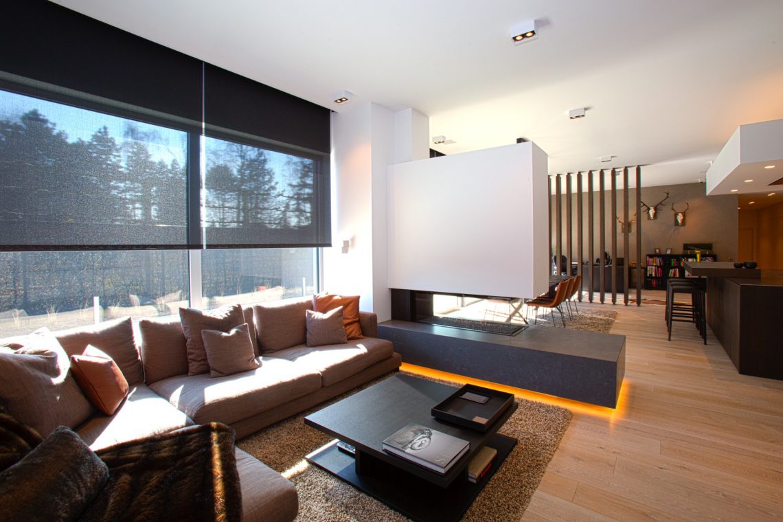
The open-plan living around fireplace is the strongest spatial move in the apartment. Instead of pushing the fire to the edge, the plan places it at the centre of daily movement. The kitchen island sits close enough to connect with the dining area, while the seating zone is pulled into the same axis. Large windows open the room to daylight, and the fireplace reads almost like a fixed point that organizes everything around it. The result is a clear total interior fit-out, with every part of the room responding to the same focal wall.
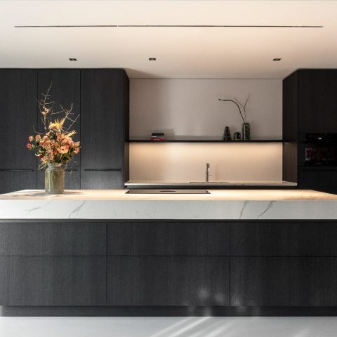
In the kitchen, the island introduces a darker mass against the lighter flooring and wall surfaces. Its stone-look top gives the working surface a harder edge, and the surrounding joinery keeps appliances and storage visually quiet. The built-in cabinets run in long, flat planes, which helps the kitchen sit within the room rather than compete with it. Under-cabinet and ceiling lighting sharpen the lines at night, when the island and the fireplace become the two most legible elements in the space.
A gas fireplace feature wall that stays low and restrained
The gas fireplace feature wall is not treated as a decorative object. It is built as a low volume, almost horizontal in its reading, with the flame line spanning three sides. That openness allows the fire to be seen from the kitchen, the dining table and the lounge. The surrounding wall surface stays visually quiet, so the fireplace can do the work of anchoring the room. In a large apartment interior, that kind of restraint matters more than ornament.
Details in the image analysis reinforce that sense of order. The openings are broad, the frames are slim, and the light lands cleanly across the floor. Dark front panels and stone-look surfaces keep the palette grounded, while the wood floor brings a softer reflection back into the room. It is a precise composition, but not a cold one. Every finish has a job: the glass opens the view, the cabinetry absorbs storage, and the fireplace closes the visual field at the centre.
Built-in storage that disappears into the walls
Throughout the apartment, floor-to-ceiling built-in cabinets keep the rooms visually contained. In the hall, the tall joinery reaches all the way up, leaving little interruption between storage and wall plane. In the dressing, the same logic continues, but with warmer light inside the shelving and hanging zones. The cabinetry is handled as architecture rather than loose furniture, which makes the total interior fit-out read as a single sequence rather than a collection of separate rooms.
The walk-in dressing with built-ins connects directly to the master bedroom and bathroom. That link keeps the private suite compact in use, even though the rooms are spread across different functions. Open shelving, enclosed fronts and illuminated niches make the dressing practical without adding visual weight. The bedroom itself appears quieter, with a large window and integrated storage wall that keeps the floor area open. Those built-ins are part of the planning, not an afterthought.
Children’s rooms with their own shower area
The kids rooms with shower area follow the same matter-of-fact approach. Instead of treating the children’s rooms as isolated sleeping spaces, the project adds a dedicated shower cell beside them. That means the practical side of the apartment is distributed clearly across the plan. The rooms can stay free of unnecessary furniture, while the wet zone is handled with the same straightforward materials used elsewhere: glass, tile and compact joinery. It is a simple move, but one that makes the layout easier to read.
In the images, the wet areas are defined by dark tiles and transparent shower screens, which keep the light moving through the rooms. The surfaces are clean and hard-wearing in appearance, without becoming visual noise. This is where the apartment’s discipline becomes most evident: each zone has its own purpose, but the material language stays consistent. That consistency gives the children’s rooms a clear place in the overall new build apartment interior design.
The master suite opens into a private bathroom sequence
The master bedroom does not end at the bed wall. It continues into a dressing and then into the bathroom, creating a short private route that feels measured rather than elaborate. The built-in wardrobes guide that movement, and the transition from sleeping area to storage to washing space is direct. Because the dressing sits between the bedroom and the bathroom, the suite gains a useful buffer. Clothes, light and reflection all have their own place in the sequence.
The master bathroom double soaking tub is set beside a large walk-in shower, so the room works with two distinct bathing moments. The tub has enough presence to read as a central piece, while the shower keeps to a broad, open format with a rain shower overhead. Dark tile surfaces and a glass shower screen sharpen the edges of the room, and the result is more structured than spa-like in the generic sense. The emphasis is on clear use of space and on how the fixtures sit within the plan.
Wellness features handled without excess
The source text mentions a set of wellness experiences in the bathroom, and they are integrated as part of the shower and bathing zone rather than as a separate spectacle. That detail matters. It means the room offers more than a basic wash area, but it does so inside a controlled composition of tub, shower and enclosed wet surfaces. The large format of the space allows those functions to sit next to each other without crowding the room.
What stands out most is the way the materials support everyday use. Glass keeps sightlines open. Dark tiles give the wet zone definition. The broad shower enclosure leaves space to move, and the double tub gives the room a slower point of pause. Nothing is overplayed. The bathroom stays tied to the same architectural logic as the rest of the apartment: direct lines, built-in order and a strong focus on how each room connects to the next.
Seen as a whole, this new build apartment interior design is shaped by one decisive idea: place the fire at the centre and let the plan follow. The kitchen island, the dining area and the seating zone all turn toward that point, while the private rooms are drawn out with built-ins, dressing space and carefully arranged wet zones. The apartment never relies on decoration to hold the rooms together. It uses walls, storage, glass and light to make each part of the layout legible as you move through it.
Want to see more of Interieurburo Claeys & Verbeke? View the page of Interieurburo Claeys & Verbeke for even more great projects and company information.





NEW 2026 Jubileum Edition The Best Interior Designers Benelux
Order Now €125


NEW 2026 Jubileum Edition The Best Interior Designers Benelux
Order Now €125


NEW 2026 Jubileum Edition The Best Interior Designers Benelux
Order Now €125


NEW 2026 Jubileum Edition The Best Interior Designers Benelux
Order Now €125


NEW 2026 Jubileum Edition The Best Interior Designers Benelux
Order Now €125