Oak veneer built-ins with a quartzite natural stone look kitchen in a bright minimalist interior
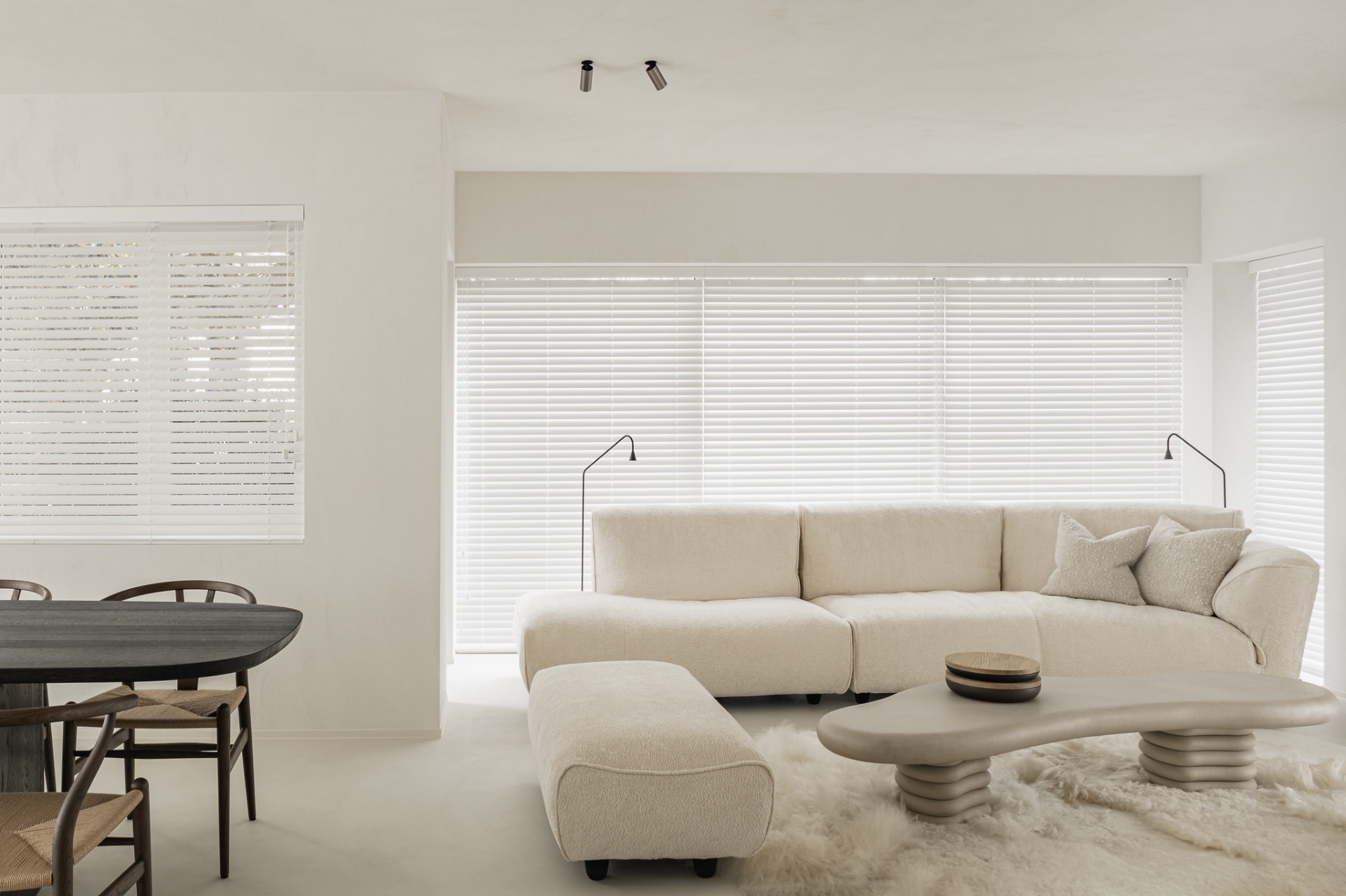
Oak veneer built-ins set the tone from the first view, with pale wood surfaces running through a calm, bright minimalist interior. The house reads as one composed plan rather than a sequence of separate rooms. Neutrals do most of the work: white walls, light beige tones, and the soft grain of oak sit beside stone surfaces that keep the palette restrained. Light from the large window openings lands on those surfaces and makes the transitions between living area, storage, and kitchen easy to read.
Built-in storage that stays close to the wall
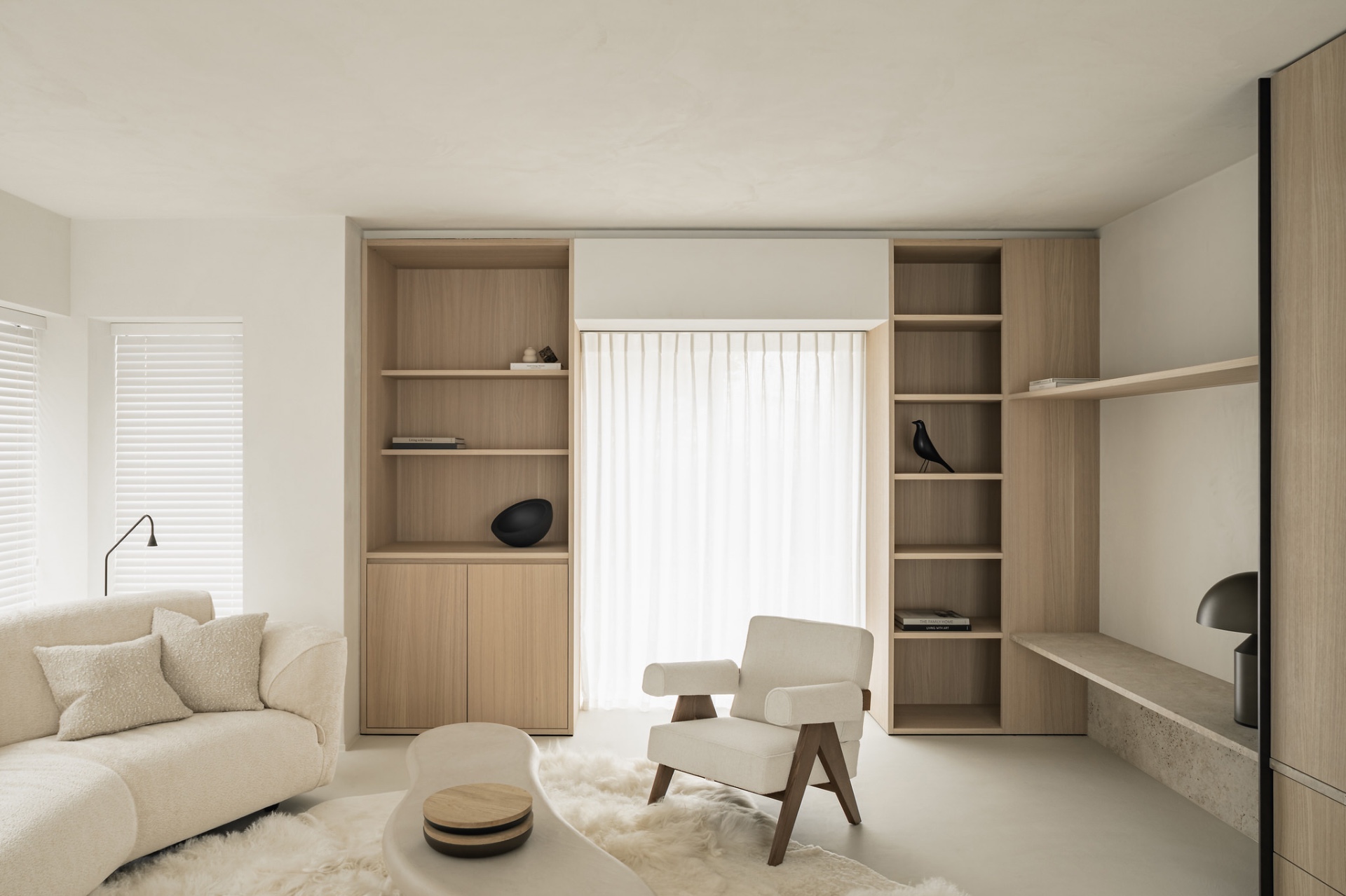
Much of the storage is folded into the architecture itself. Oak veneer cabinetry lines the walls with closed fronts, open niches, and measured recesses that break up the long runs of joinery. In one zone, a central curtain opening is framed by built-in units, so the window area remains visible even when the storage sits around it. The result is practical, but the more striking effect is visual: the cabinetry does not fight the room, it traces its edges.
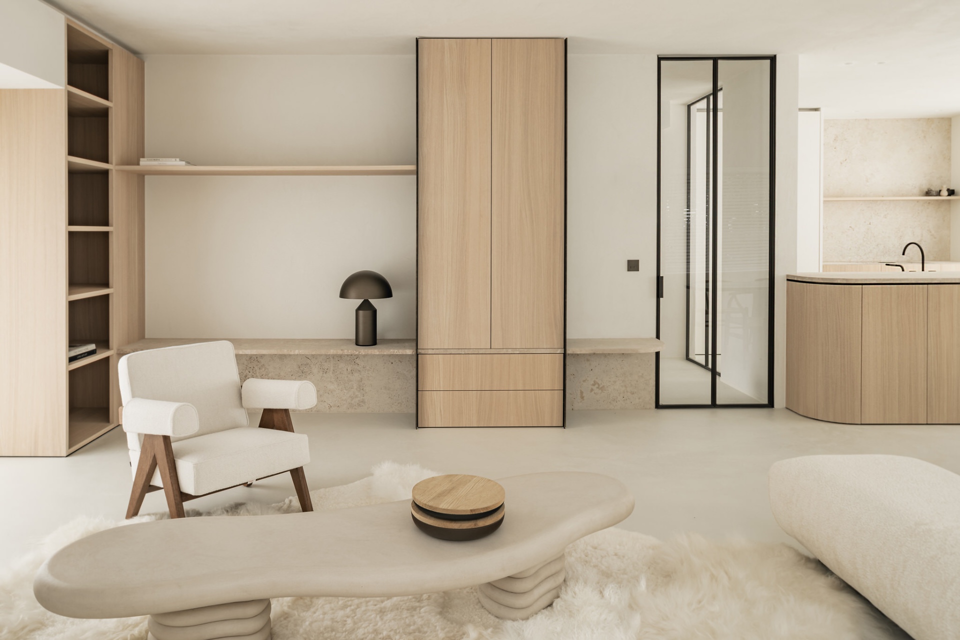
The same approach continues in the living spaces, where the oak veneer built-ins are used as low, precise elements rather than heavy furniture. Vertical handles, shallow shelves, and dark openings give the wall rhythm without interrupting the light palette. Because the cabinetry is repeated in different rooms, the house keeps a consistent line from one zone to the next. That continuity is one of the clearest themes in the project, and it is visible in every threshold.
Room-to-room continuity in color and line
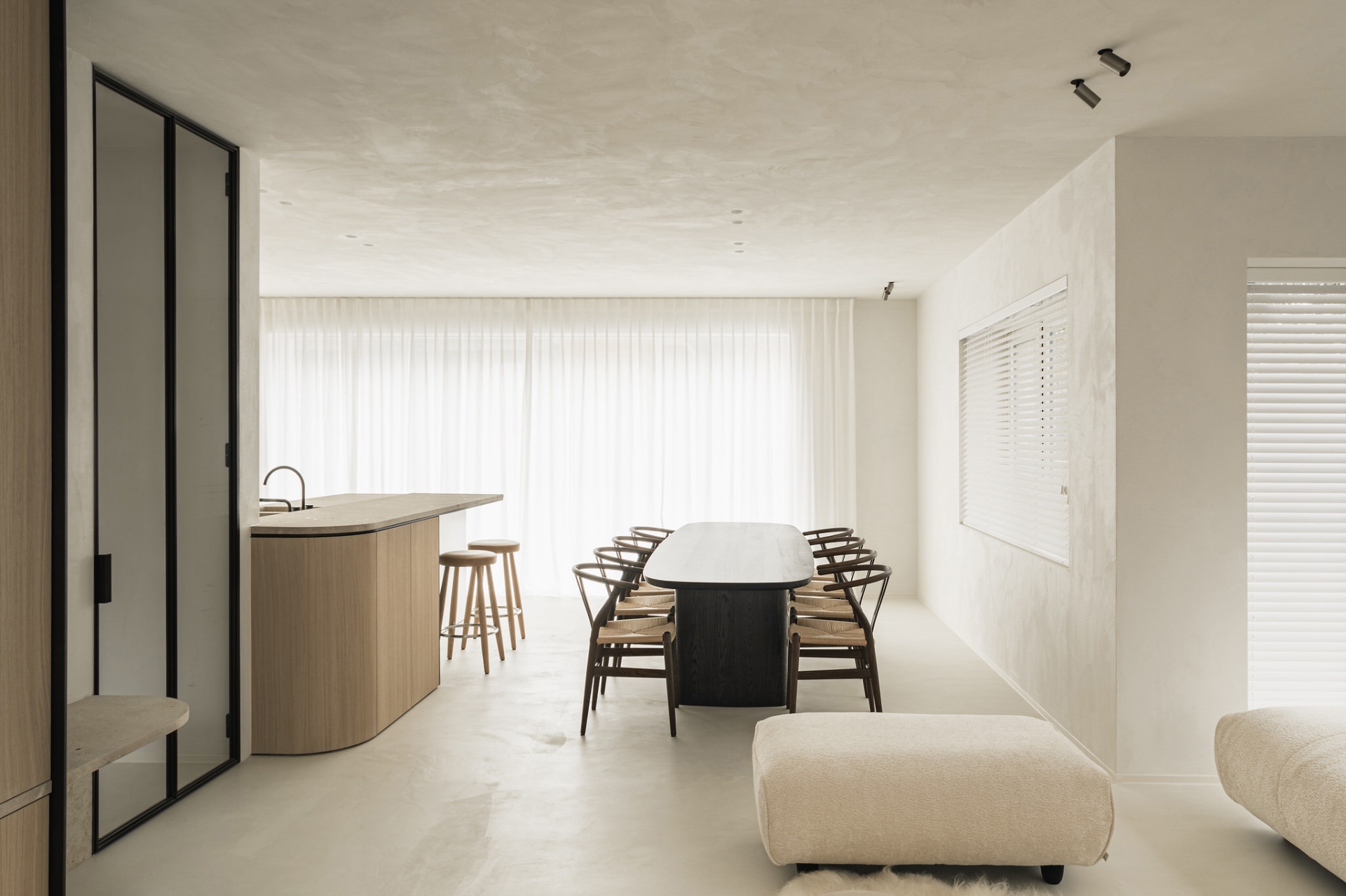
The transition between spaces is handled through tone rather than contrast. Pale oak, off-white plastered surfaces, and stone-colored finishes keep moving through the interior, so each room feels connected to the next. There are no abrupt shifts in color. Even the openings between living and kitchen areas stay visually quiet, letting the sight lines remain open. The effect is especially clear in the long views through the house, where the materials seem to carry the same sentence from one room to another.
This bright minimalist interior depends on restraint in the detailing. Ceiling spots are discreet, leaving the flat surfaces and wall planes in charge. Large window openings bring in a strong band of daylight, while curtain zones soften the edge of the glass without blocking it. In some rooms, blinds sit in front of the opening; in others, a sheer curtain drops in front of the wall of storage. Those small differences keep the interior from feeling repetitive, even though the material language stays consistent.
A kitchen defined by stone and a clean cooking niche
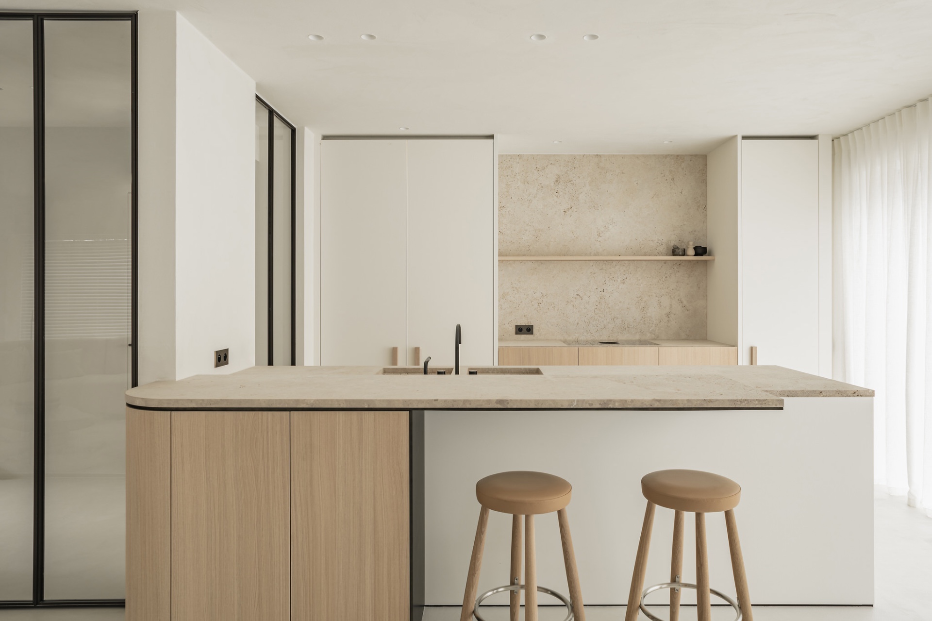
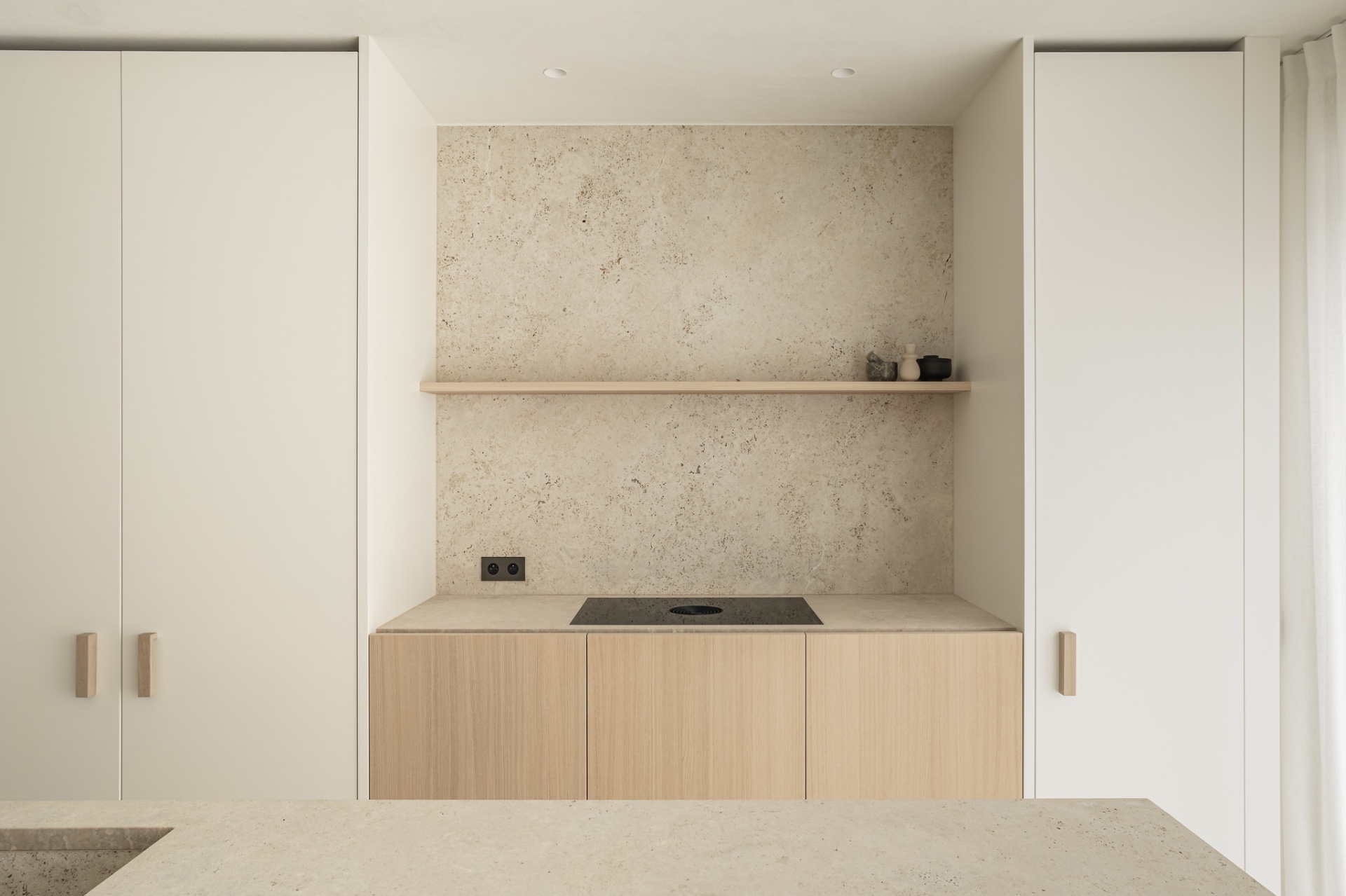
The kitchen shifts the focus to quartzite surfaces. The countertop and backsplash read as a natural stone look kitchen, with a pale stone grain that sits comfortably against the oak veneer fronts below. A recessed cooktop zone is integrated into the stone surface, so the working area stays level and clear. The stone does not act as a separate feature; it extends across the work zone and gives the kitchen a quieter, more compact presence.
Seen from the living area, the kitchen remains part of the larger interior rather than a closed-off room. The opening between spaces allows the eye to move from the cabinetry to the stone worktop and on to the window light beyond. This is where the project’s measured planning becomes most visible. Storage, work surface, and circulation all sit in a tight arrangement, yet the room still feels open because the lines stay straight and the materials stay limited.
Quartzite, oak veneer, and a low visual profile
The quartzite kitchen countertop carries the heaviest visual weight in the room, but it does so quietly. Its surface reflects light without becoming shiny, and the matching stone backsplash keeps splashes and seams under control. Below it, oak veneer cabinetry introduces warmth in a controlled way through grain and tone, not through decoration. The combination is plain in the best sense: it relies on proportion, edge thickness, and the relation between the stone slab and the lower units.
The integrated cooktop niche is one of the clearest examples of that restraint. Rather than drawing attention with extra framing, it is cut into the stone surface and kept visually low. Around it, the countertop remains uninterrupted, which makes the kitchen read as a work surface first and a display surface only second. That practical decision also supports the overall tone of the house: light, measured, and free from unnecessary interruptions.
Light, openings, and the way the house holds together
Large window openings are doing more than admitting daylight. They define the pace of the rooms. At one point, a wide span of glazing sits behind a curtain zone, creating a soft veil over the opening; elsewhere, white blinds break the light into narrow bands. These treatments matter because they control how the oak veneer and stone appear at different times of day. The same cabinet front can read pale and matte in one corner, then take on a deeper tone beside the window.
There is also a clear sense of depth created by the openings and interior frames. Black-edged glazing appears in one view, setting up a sharper line against the lighter wall finishes. In another, a central opening is wrapped by built-in storage, so the window reads almost like a pause within the cabinetry. Those shifts give the house its internal structure. Nothing here depends on ornament; the spatial movement comes from the way the rooms open, close, and borrow light from one another.
The material list is short, and that is part of the strength of the project. Oak veneer, quartzite natural stone, and smooth plastered surfaces are enough to build the whole atmosphere. Because the palette does not keep changing, the eye can settle on smaller details: the join between stone and wood, the shadow line under a shelf, the depth of a niche, the clean edge around a curtain opening. The house feels considered because each of those details is allowed to stay visible.
In the end, the project is shaped by subtraction. The built-in storage takes over the work of freestanding furniture, the stone surface sets a clear kitchen zone, and the openings keep the rooms connected without drama. Oak veneer built-ins appear again and again, but never in the same way twice. They frame a window, line a wall, or organize a corner. That repeated use gives the interior its order, while the light, the stone, and the narrow transitions keep it open and legible.
Photographer:
Bert Demasure
Materials:
oak veneer
quartzite natural stone
Want to see more of vers interieur? View the page of vers interieur for even more great projects and company information.


NEW 2026 Jubileum Edition The Best Interior Designers Benelux
Order Now €125