









Old copper metal wall panels in a modern kitchen
Patinated copper-toned metal catches the light first, not as a background finish but as the main surface in the room. The panels read as old copper metal wall panels: bronzebrown, slightly worn in appearance, and set against the calmer grain of wood veneer cabinetry. In front of that wall, a kitchen island extends into the space with a pale worktop and a dark edge, giving the composition a clear horizontal line.
What makes the room compelling is the way the metal shifts between reflection and mass. In one view it forms a broad wall system; in another, it breaks into rectangular compartments and door-like panels. The arrangement gives the surface a cabinet logic rather than a flat skin. That is where the patinated copper metal wall cladding becomes more than a finish. It organizes storage, frames openings, and turns the wall into a functional backdrop for the kitchen.
Wood veneer, island, and the wall behind them
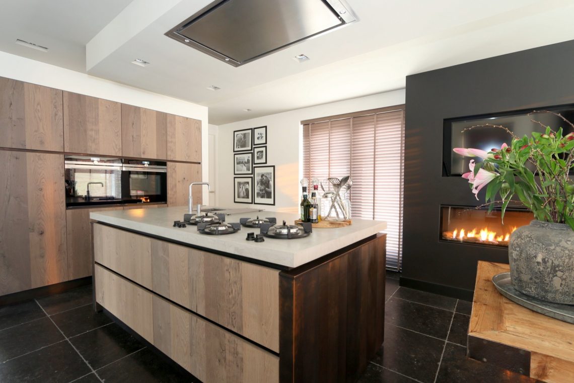
The kitchen itself stays restrained. Wood veneer cabinets run along the lower zone, their horizontal grain softening the harder metal nearby. The island sits slightly forward in the plan, with enough presence to anchor the room without blocking the view to the wall system. Its shape is broad and low, and the contrast between the pale top and the darker perimeter keeps the eye moving from one surface to the next. This is where the modern kitchen island reads as a piece of furniture as much as a working surface.
Behind it, the metal wall panels do the heavier visual work. Their old copper tone carries through several views, sometimes as a full cladding field, sometimes as a set of framed panels with visible seams and small round fixings. The repetition of rectangles gives the wall a measured rhythm. It feels built, not simply covered. The effect is reinforced by the way the panels meet nearby brick, which introduces a rougher texture beside the smoother copper-bronze surface.
A wall system with compartments and closed fronts
Close-up images make the construction legible. The wall is divided into rectangular doors and panel fields, with horizontal lines cutting across the surface at regular intervals. Some sections appear as tall, narrow compartments; others read as broader storage fronts. The result is closer to a metal wall cabinet than a decorative cladding idea. Even without seeing every opening, the layout suggests a built-in system designed to hold both enclosed storage and visual order.
At the top edge, open rectangular recesses appear in a few shots, and the use of glass or transparency is visible there. That lighter band breaks the density of the lower panels and gives the wall a second layer. Below it, the darker metal surfaces stay compact and grounded. The change in openness is subtle, but it matters. It keeps the wall from reading as one heavy block and allows the upper section to feel lighter than the storage below.
Material contrast at the edges
Brick appears beside the metal in several images, not as a backdrop for effect but as a second texture with its own weight. The brick accent metal wall pairing creates a rough-and-smooth contrast that is easy to read from a distance and even clearer in the detail shots. Near the edges, a wooden doorframe or timber surround interrupts the metal run and adds another warm-toned line. The space is built from adjacent materials, each one kept visible rather than hidden.
The floor changes with the view, shifting from dark rectangular tiles in one image to lighter grey tiles in another. That variation helps register the different zones of the interior. Against the darker floor, the copper-toned wall feels denser; against the lighter tiles, the same surface reads more sharply. The room relies on those shifts in value instead of decorative gestures. Even the smallest junctions, such as the line where panel meets tile, are left clear.
The dark niche that interrupts the wall
One of the quieter elements is the fireplace niche modern wall detail. Set into a dark section of the wall, the opening sits almost like a cut-out rather than a feature added on top. Its blackened interior absorbs light, which makes the surrounding surfaces feel brighter by comparison. The niche does not compete with the kitchen furniture; it sits alongside it, a separate pocket in the wall system that marks the room as more than a cooking space.
Seen with the island and the wood veneer cabinetry, that niche changes the reading of the whole plan. The kitchen extends into a living-like zone where storage, cooking, and a hearth opening share the same envelope. The old copper metal wall panels carry through that transition, keeping the material language consistent while the functions shift. The room is at its strongest when you see it in that wide frame: island in the foreground, metal panels and brick behind, and the dark opening holding the far wall in place.
Old copper as a visible structure
Across the project, the old copper metal wall panels never behave like a thin decorative skin. They are part of a wall system with doors, compartments, seams, and upper openings. That is what gives the interior its particular tone. The patinated copper metal wall cladding works because it is repeated at different scales: broad field, panel grid, close-up door face, and framed opening. Each view reveals another layer of the same surface logic.
What remains after all the detail shots is not a single gesture but a sequence of aligned parts. Wood veneer softens the kitchen edge. Brick brings roughness. The island holds the foreground. And the metal wall cabinet system, finished in old copper, keeps the room anchored from one end to the other. It is a kitchen built around surfaces that do not disappear, which is why the material story stays with you long after the plan has been read.
Want to see more of Grezzo Concrete | Exclusive Handmade Interior Finishes? View the page of Grezzo Concrete | Exclusive Handmade Interior Finishes for even more great projects and company information.





NEW 2026 Jubileum Edition The Best Interior Designers Benelux
Order Now €125


