Open Plan Living with Sightlines
The first thing you read in open plan living sightlines is the distance between one room and the next. Walls have been taken away, and the view now runs through the interior instead of stopping at it. Glass doors connect the rooms without closing them off, while the pale surfaces and wood floor keep the space visually quiet. It is a serene living space built from clear lines, soft transitions, and materials that do not compete for attention.
Rooms that stay connected
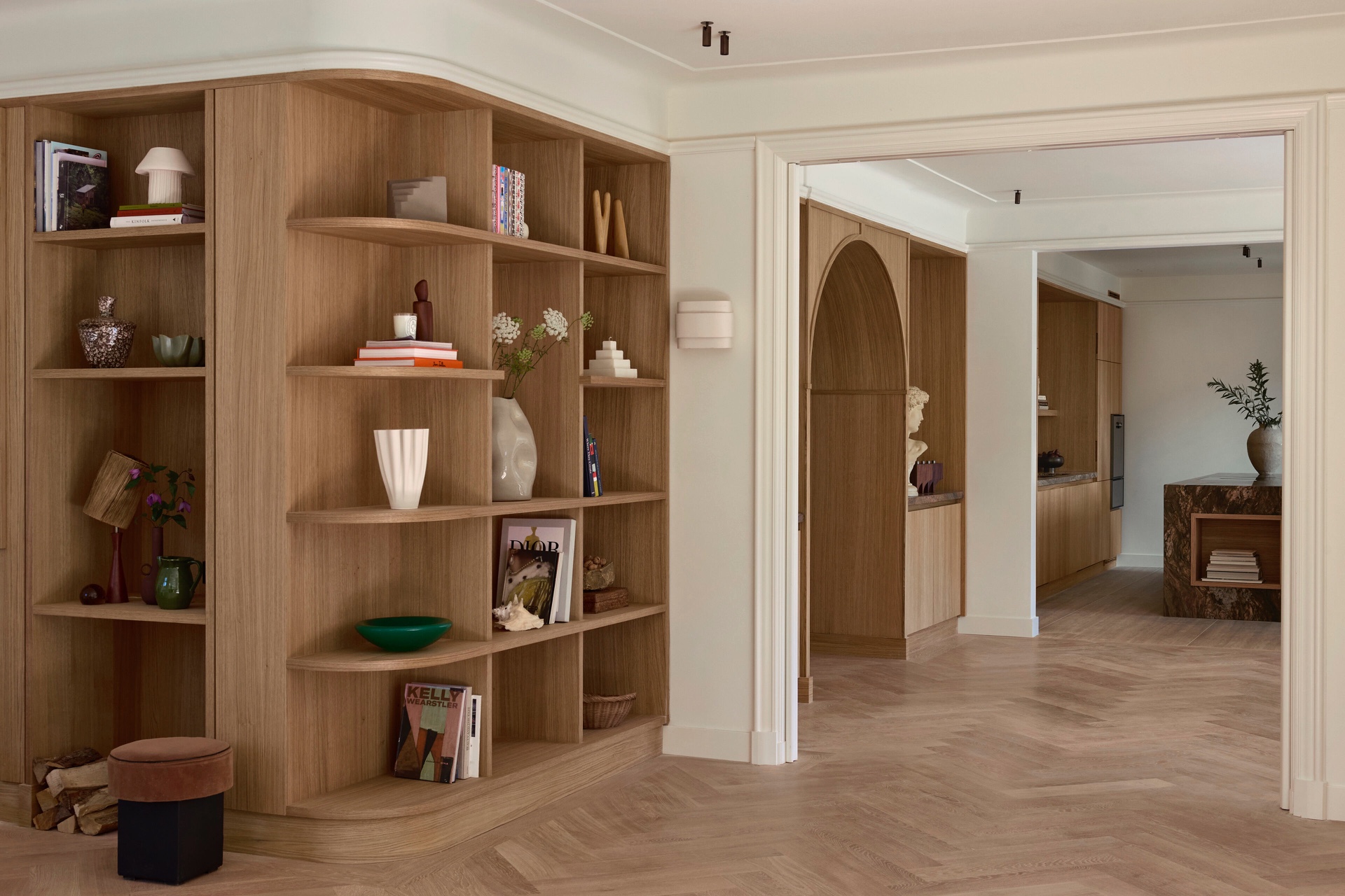
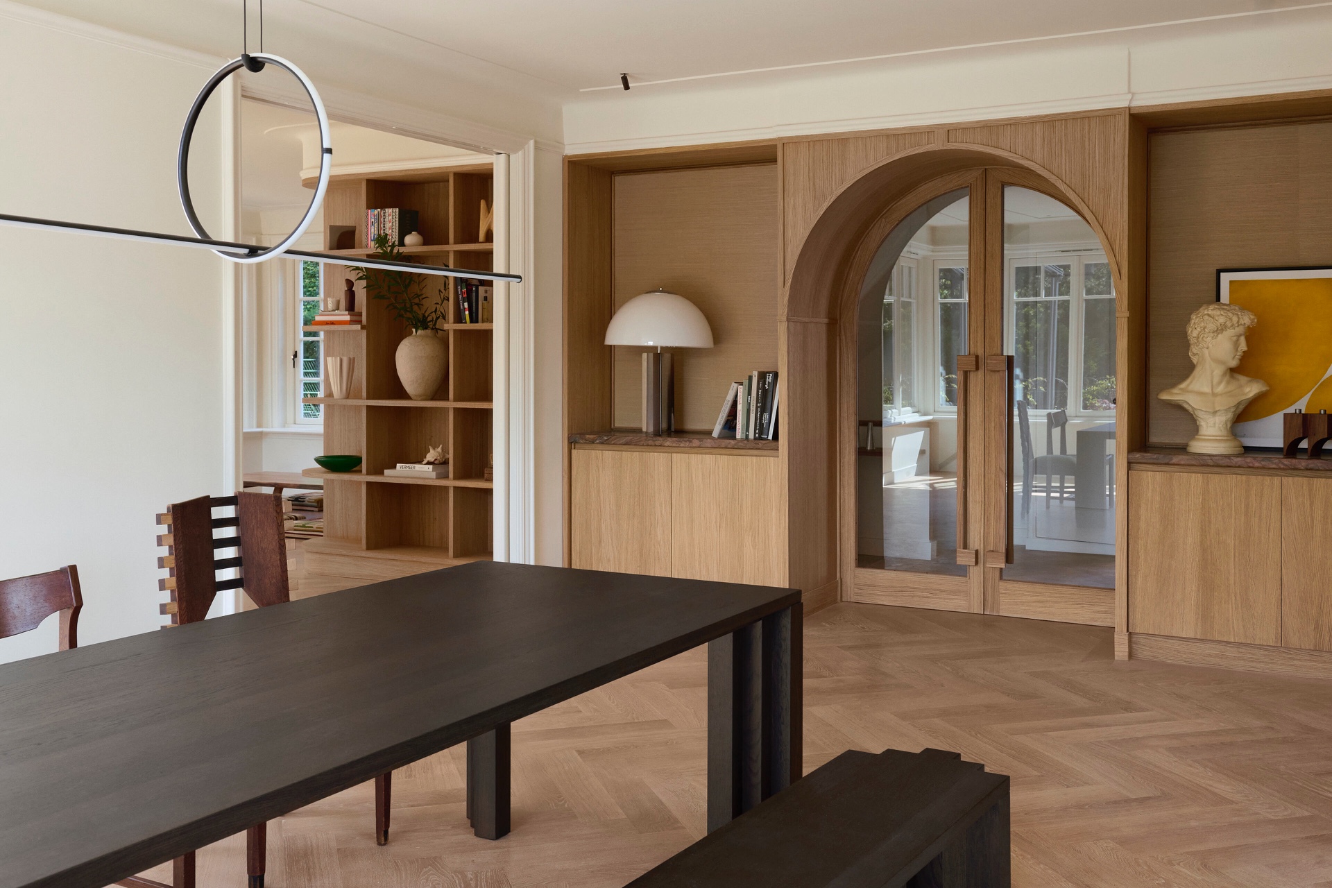
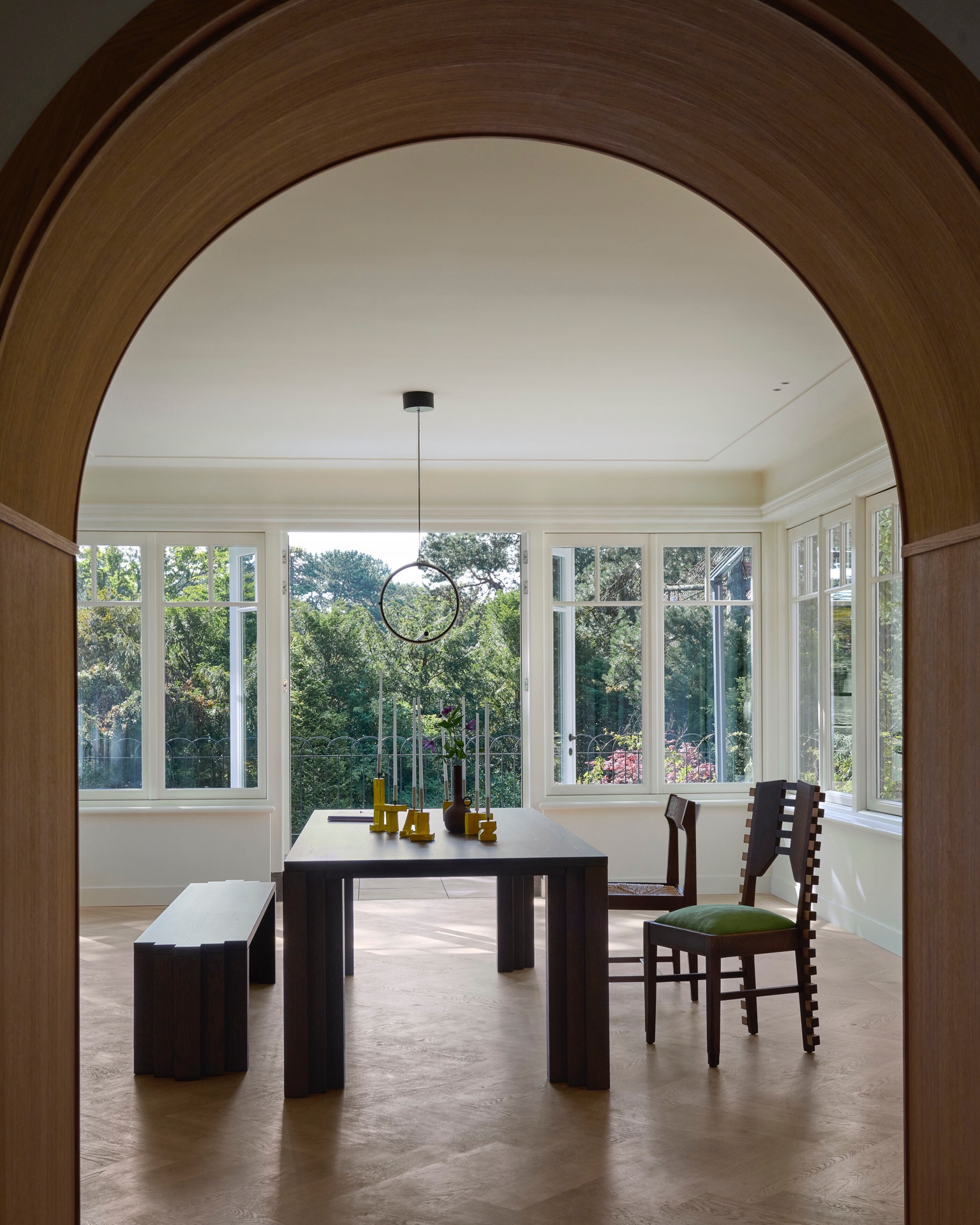
The layout is handled with restraint. Rather than dividing the plan into separate zones, the interior uses openings and transparency to keep movement visible. That approach gives the rooms a steady rhythm: one area leads into the next, but each still keeps its own scale. The effect is especially clear where the glass doors connecting rooms sit between heavier timber frames. They let daylight travel farther and make the sequence of spaces feel open without becoming vague.
Seen from a distance, the project depends on sightlines more than on decoration. A chair, a doorway, a niche, and a stone surface all register in the same frame. That long view gives the house its calm. It also makes the craftsmanship more legible, because the joinery and the wall finishes are not hidden behind layers of pattern or color. The result is an open interior design that feels measured rather than empty.
Wood arches and built-in moments
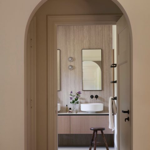
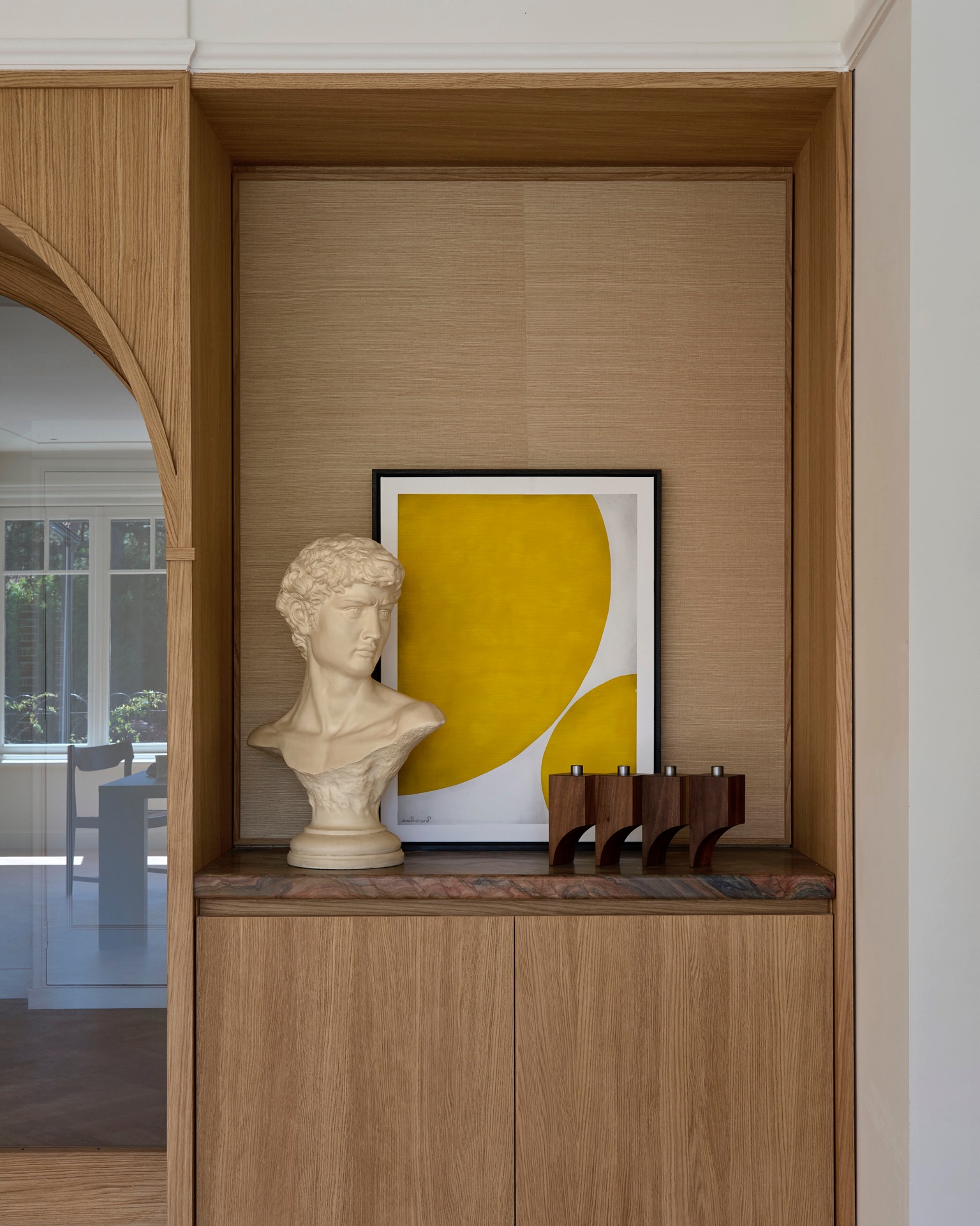
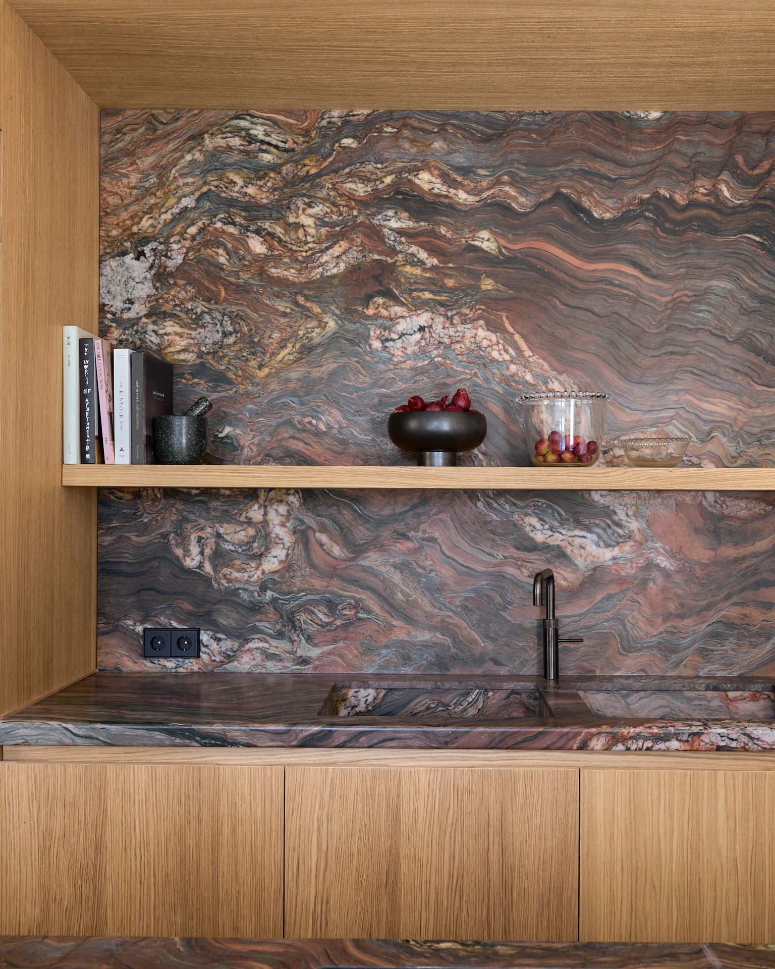
The custom wood arched openings give the interior its clearest architectural signature. Their curved profile softens the straight run of walls and frames the passages between rooms. In several places, the wood continues into built-in wood wall niches and shelving, so the same material controls both the opening and the storage. That repetition helps the eye move through the interior, while the warm grain keeps the white walls from feeling too stark.
One detail worth noticing is how the joinery works as architecture, not just furniture. The arched forms are thick enough to read as structural markers, and the built-in shelves sit neatly within them instead of floating as separate objects. In close-up, the edges and grain lines are precise, but the overall impression is still calm. This kind of open interior design depends on those small shifts in depth, where a wall becomes a frame and a frame becomes storage.
Material contrast at the edges
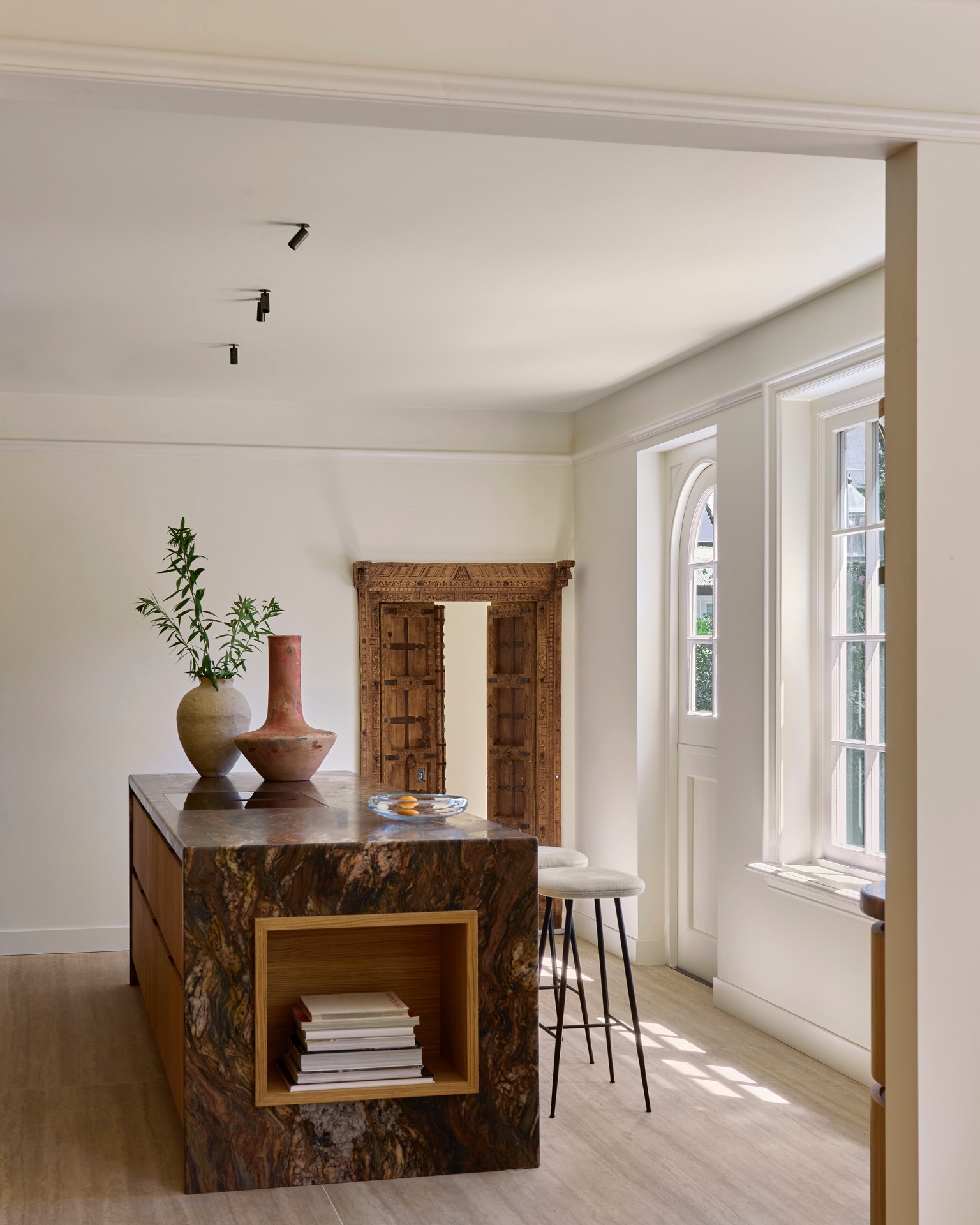
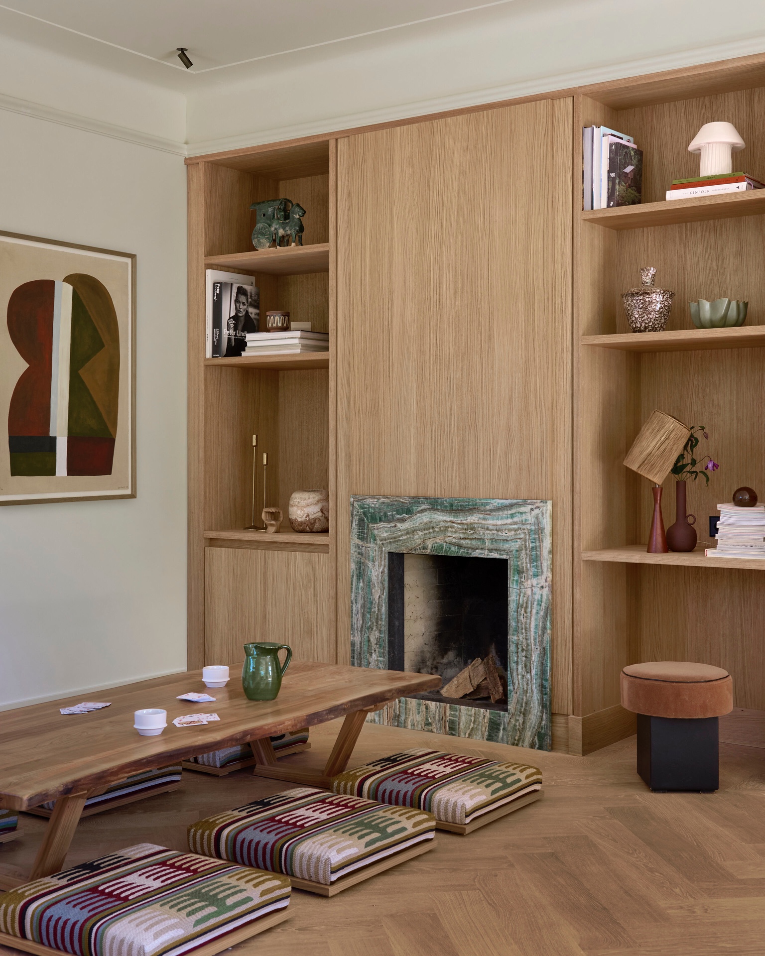
A marble-look stone accent appears where a wall unit or hearth zone needs visual weight. Against the timber, the stone reads as a firm, cool surface, with veining that pulls the eye sideways. It is not used as a showpiece; it sits into the room as one more layer in the composition. The contrast is important because it prevents the natural materials interior from becoming too uniform. Wood, stone, glass, and painted plaster each take a different role.
That mix stays disciplined. White walls and a white ceiling with cornice details hold the light, while the wood floor introduces a darker band at ground level. The materials are familiar, but they are arranged to emphasize depth, not effect. In the images, this is most visible where a stone surface meets a timber surround and the edge between them stays sharply defined. It is a small move, yet it anchors the room.
Light across the dining area
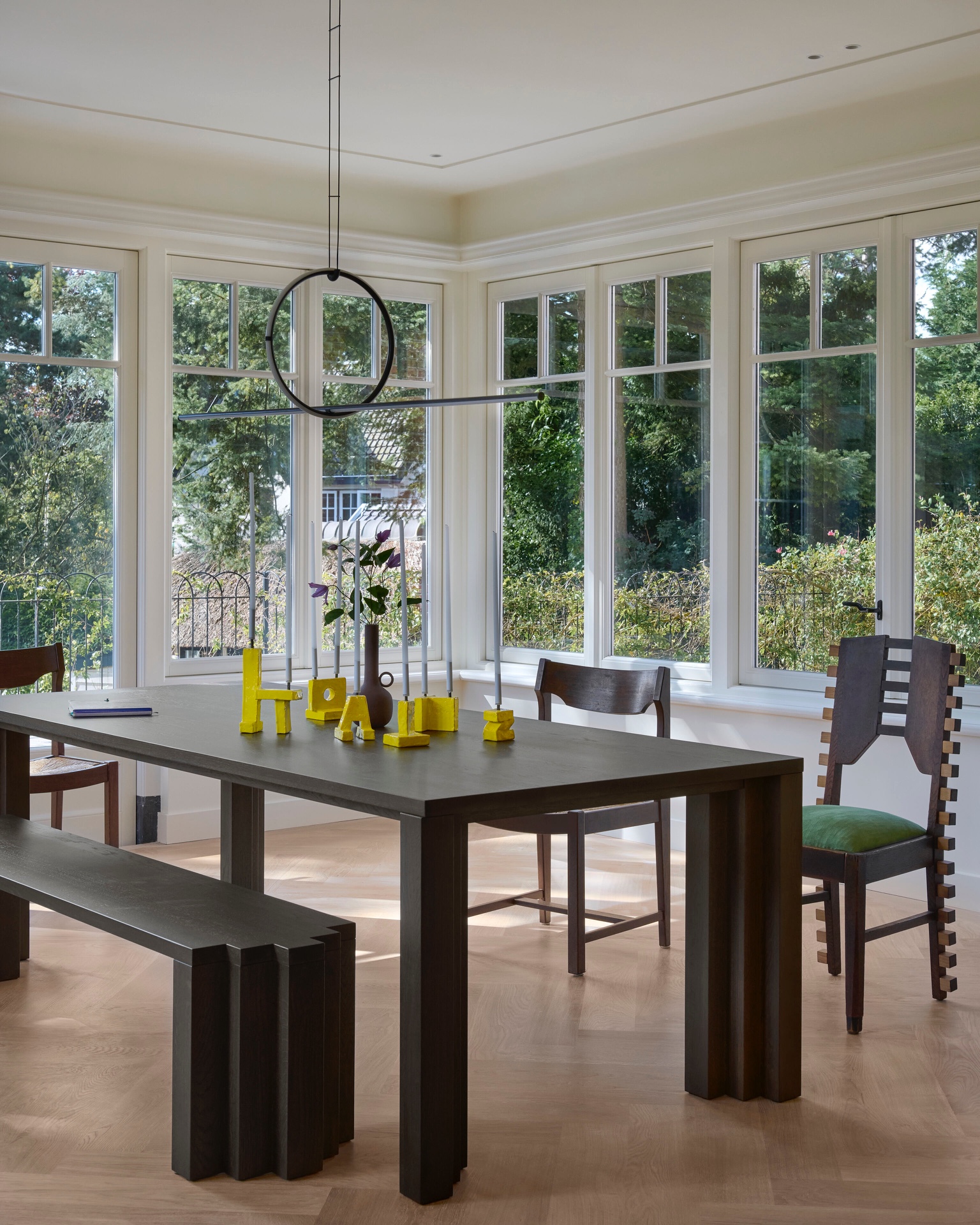
Daylight is strongest where the dining area sits near the tall windows. The room reads brighter there, and the vertical proportions of the glazing pull the gaze upward before it reaches the ceiling line. A ring pendant above the table marks the center of the zone, but it does not interrupt the openness around it. The surrounding walls remain pale and plain, so the furniture and the light are what shape the scene.
The dining space also shows how open plan living sightlines can work without a large amount of intervention. From the table, you can see back through the adjacent rooms, through the timber openings, and toward the glass doors. The route is readable at a glance. That matters in a plan like this, where the architecture is doing most of the organizing. The spaces stay connected by view as much as by circulation.
A discreet place for heritage
One of the most personal elements is the mandir, placed behind antique temple doors. It is tucked into the interior rather than announced from the main living area, which allows it to sit quietly within the room sequence. The doors add another layer of carved timber and historical reference, but they do not turn the space into a display. Instead, they mark a pause in the flow, a contained moment within the larger open plan.
That placement is important to the character of the house. The mandir element connects to the interior through material and position, not through scale or excess. It is part of the room, yet distinct from the everyday circulation around it. Against the broader language of glass, pale plaster, and warm wood, it introduces a more intimate register. The gesture is subtle, but visible enough to read in the composition of the space.
Why the plan feels so clear
What holds the project together is the discipline of the plan. Removing walls created the room to room openness, but the interior avoids becoming featureless because each surface has a defined job. Glass keeps the connection open. Timber gives the openings their shape. Stone marks a pause. White paint lets the daylight spread. Together they form a calm interior that relies on proportion and sequence instead of excess detail.
The strongest moments are the ones where several of these elements meet at once: a curved timber frame beside a stone surface, a niche cut into the wall, or a glazed opening that extends the sightline farther than expected. Those are the points that make open plan living sightlines more than a layout description. They show how the house is organized through visual continuity, material restraint, and a few carefully placed architectural details.
Want to see more of Archie? View the page of Archie for even more great projects and company information.


NEW 2026 Jubileum Edition The Best Interior Designers Benelux
Order Now €125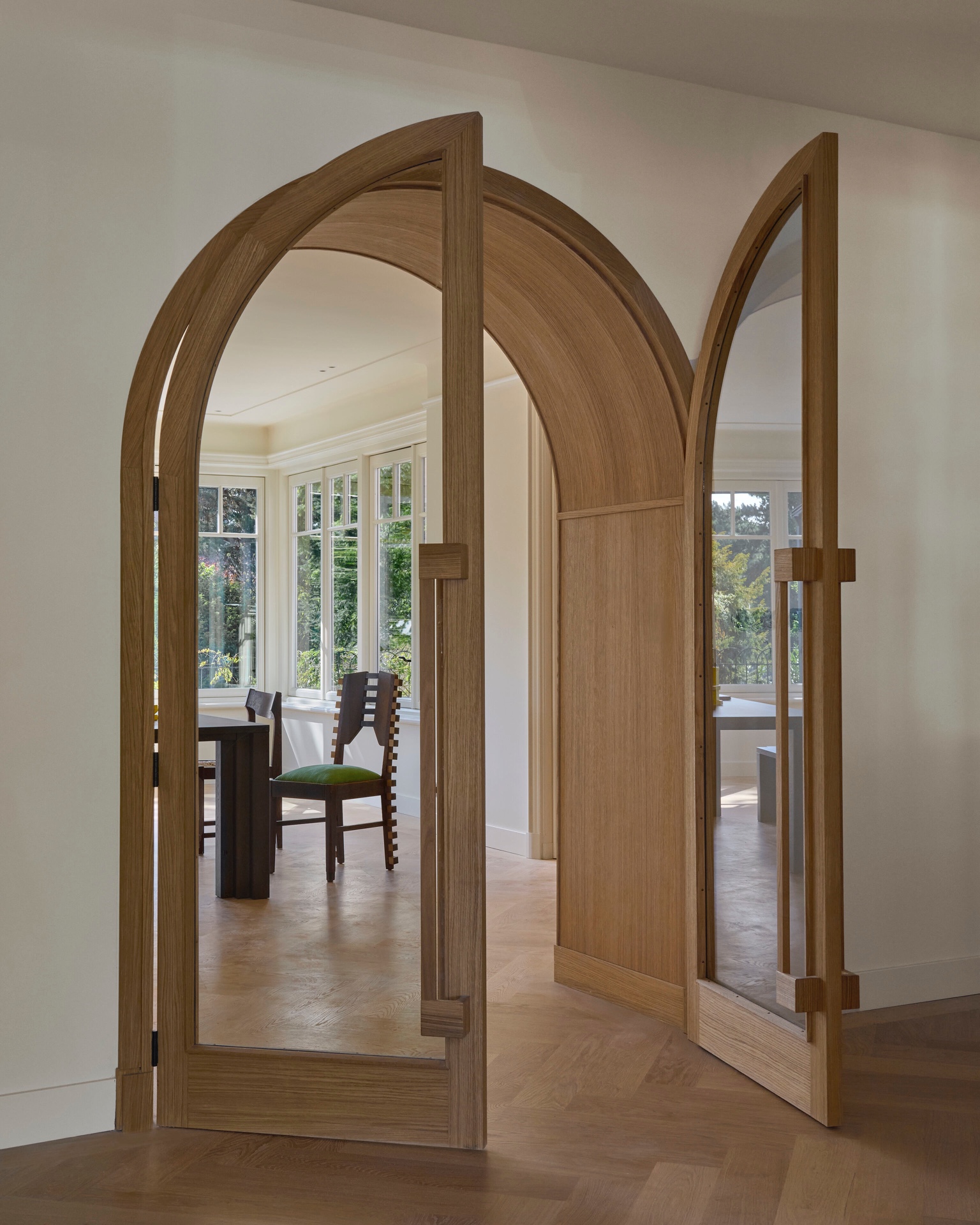
NEW 2026 Jubileum Edition The Best Interior Designers Benelux
Order Now €125