


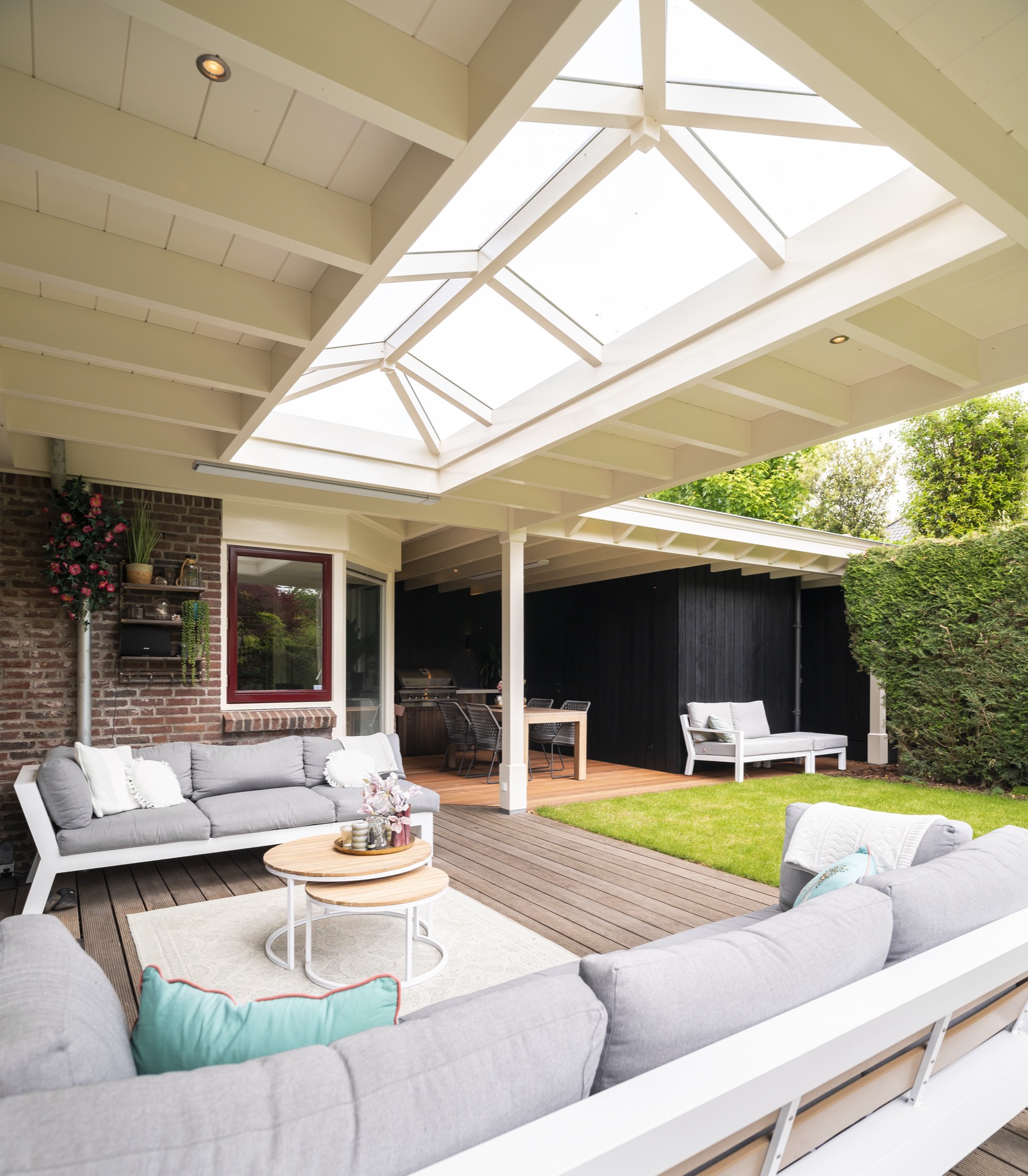
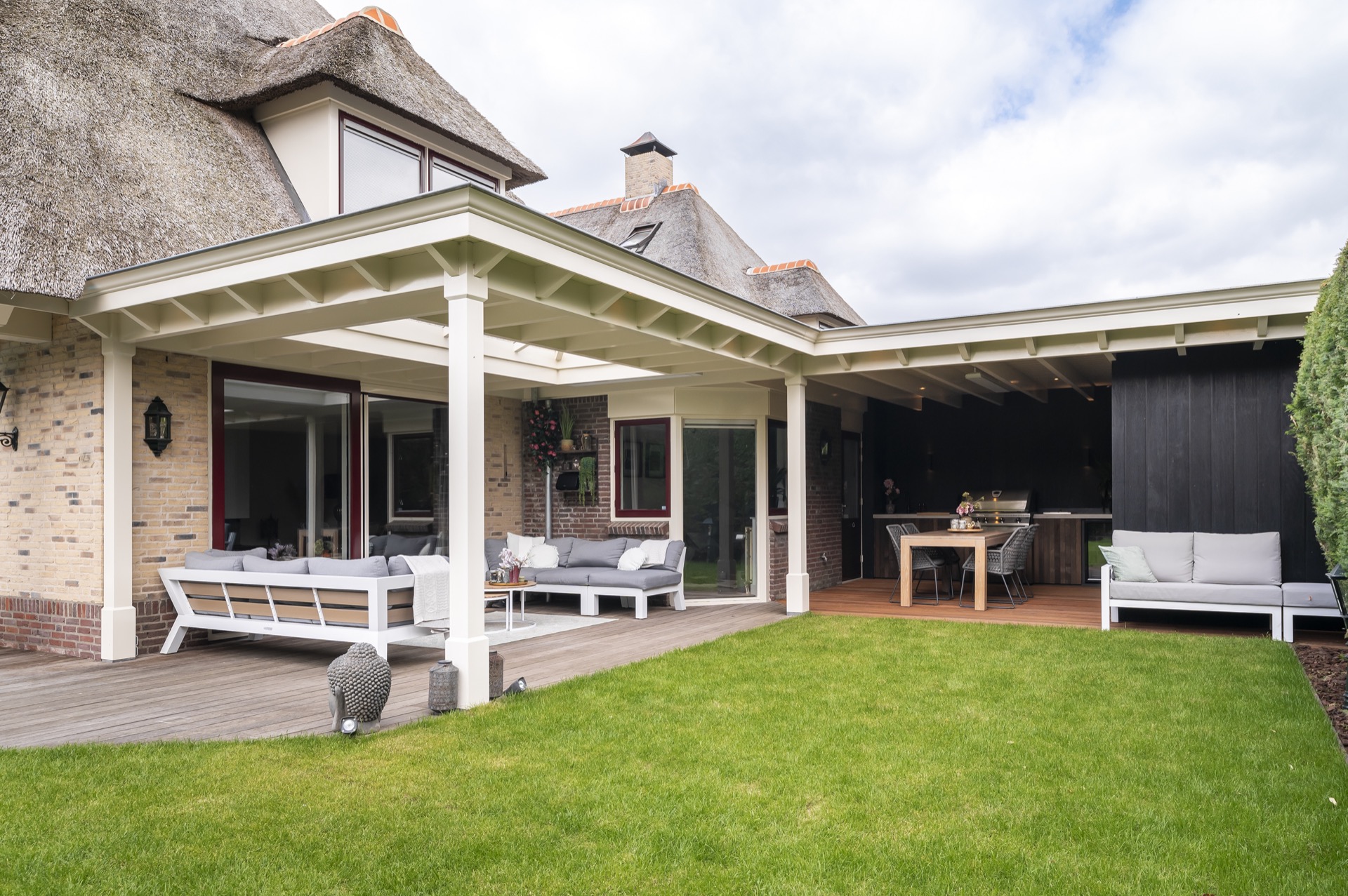
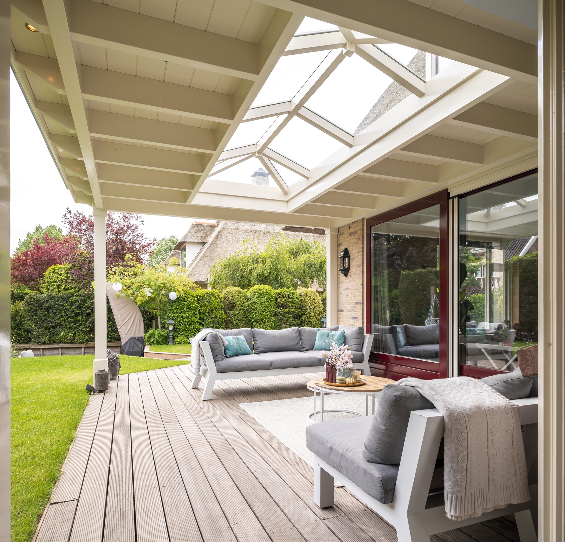
Outdoor living canopy with glazed skylight
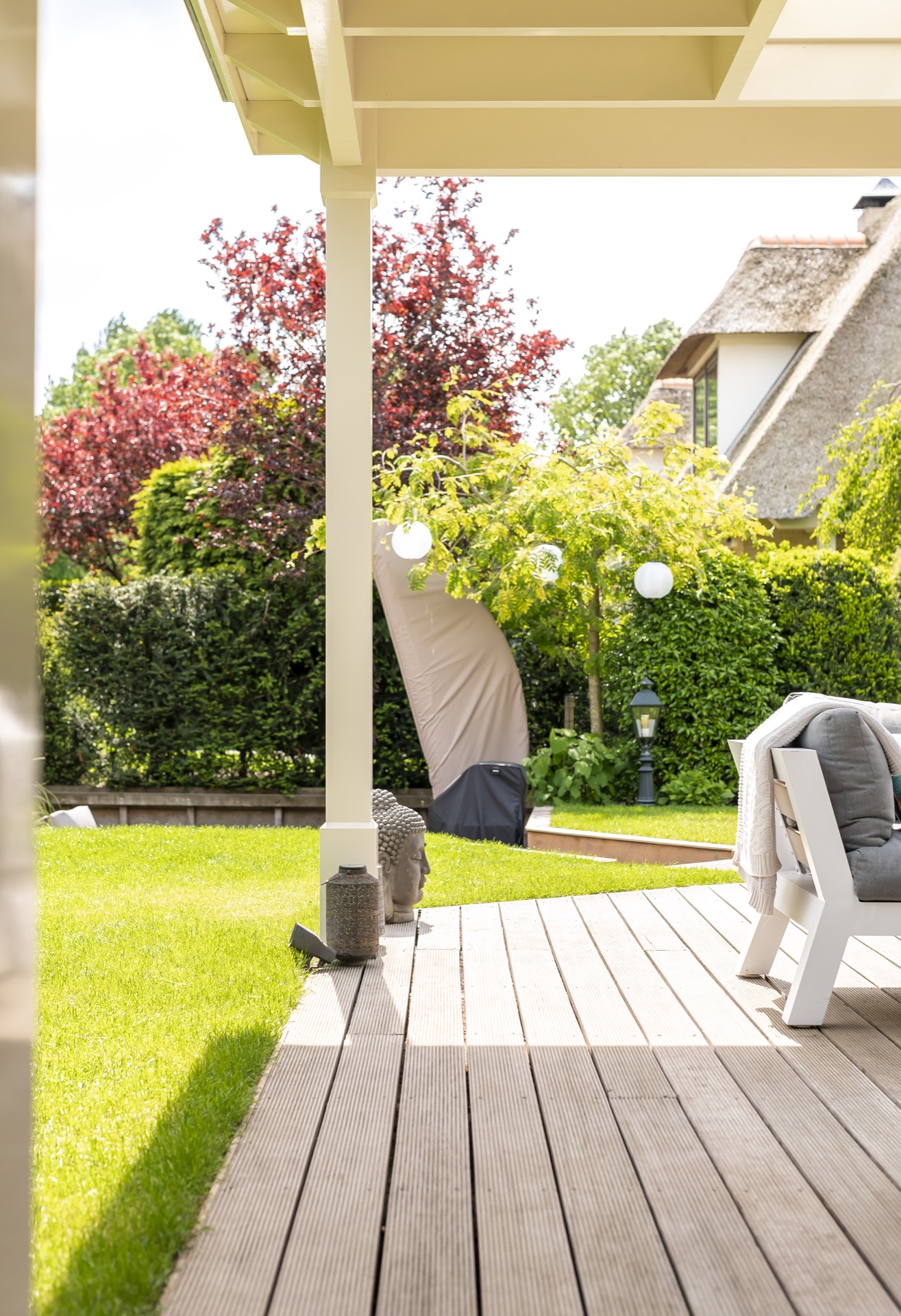
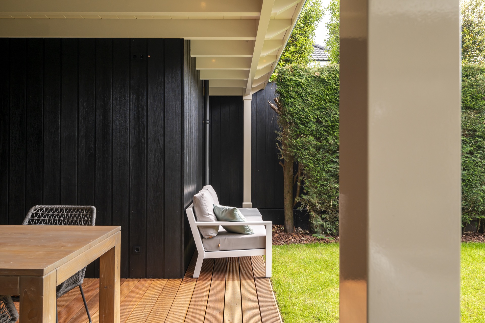
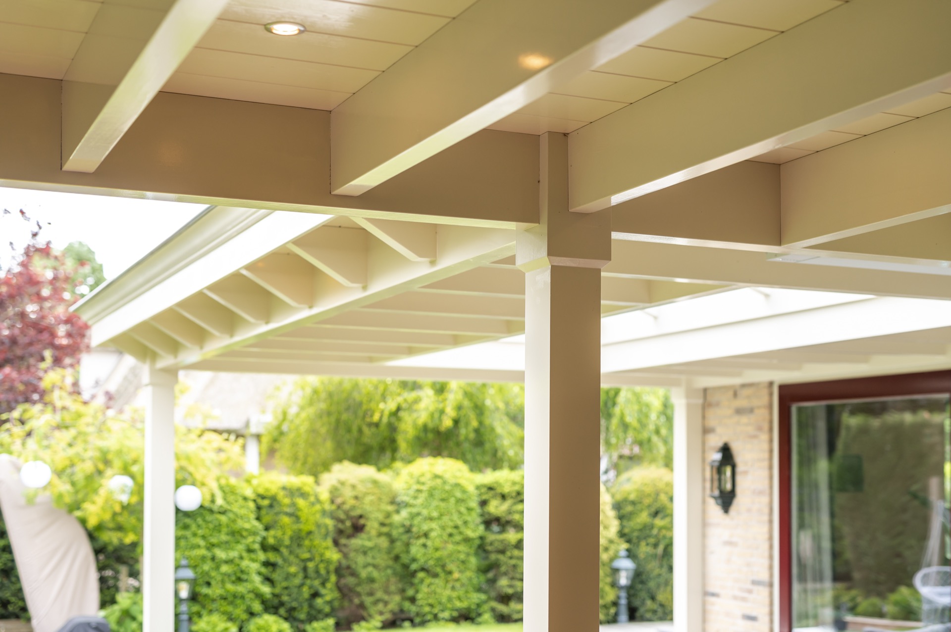
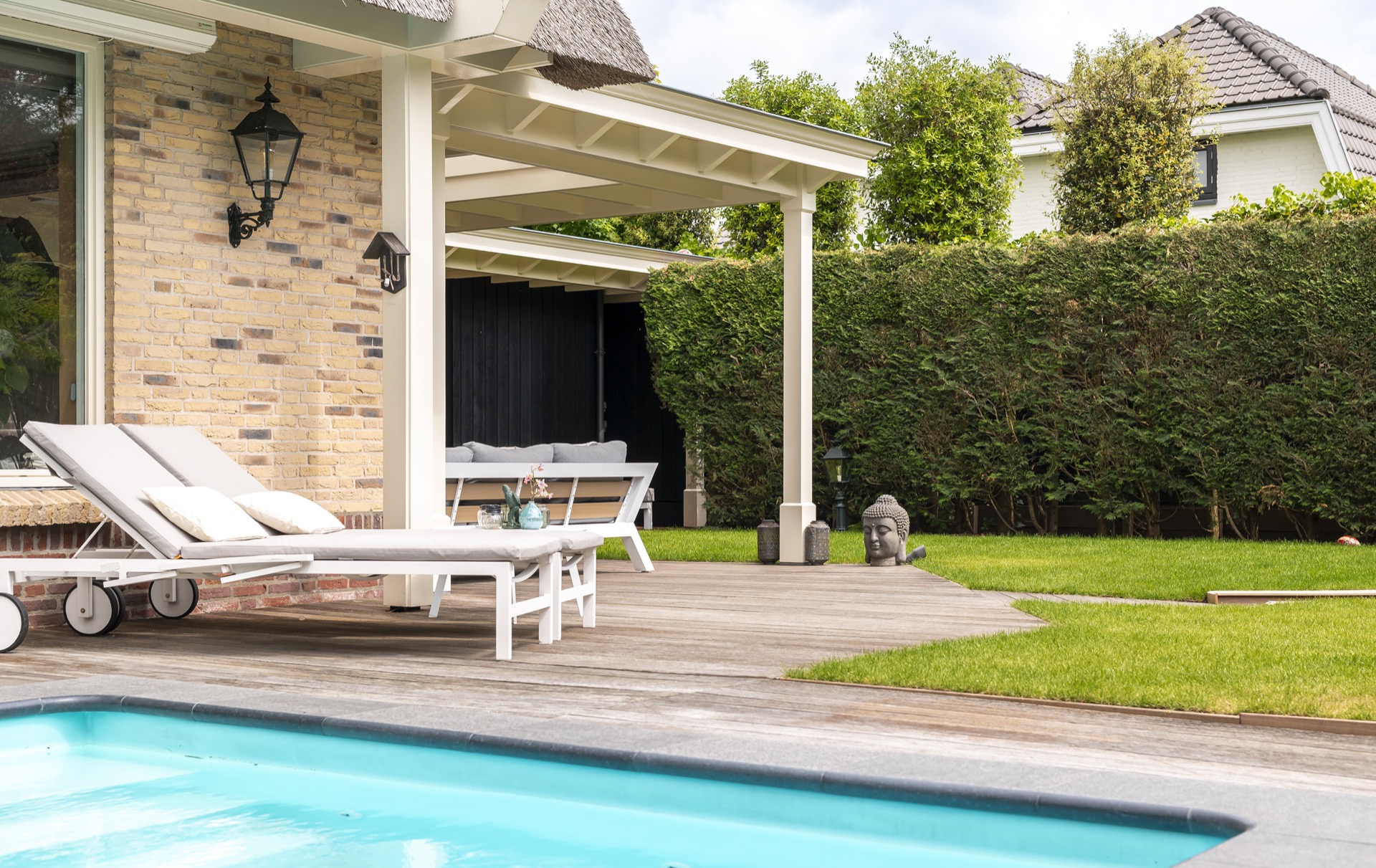
The light canopy sets the tone immediately: beams in a pale finish, a glazed skylight overhead and a terrace laid in wood beneath. The structure frames an outdoor living canopy rather than a simple cover, giving the space a clear centre and a strong line of sight toward the kitchen wall. White columns keep the edges open, while the darker surfaces inside the volume pull the eye inward.
outdoor living canopy as the architectural starting point
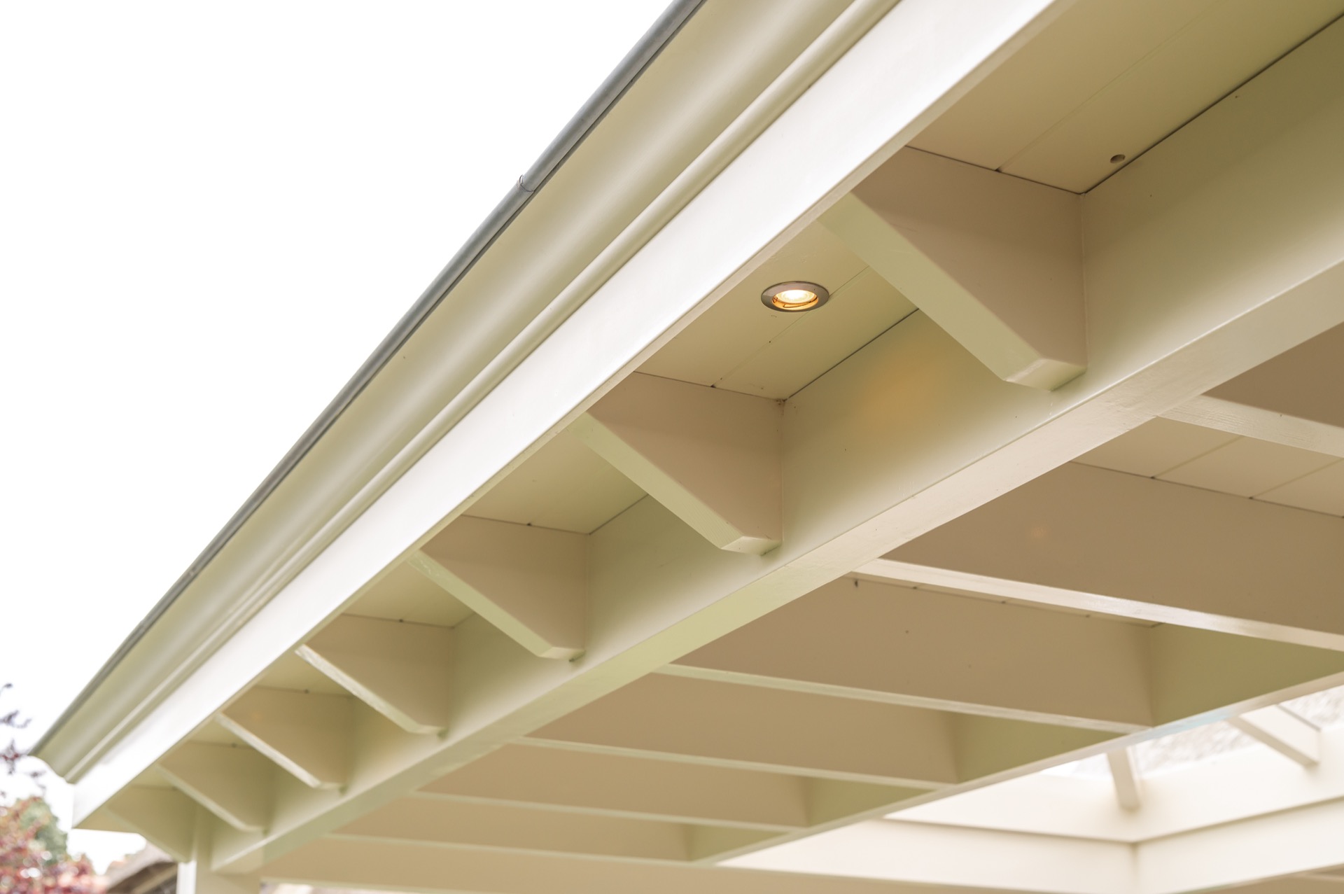
At the heart of the canopy, the glazed skylight brings daylight deep into the covered area. It breaks up the ceiling plane and makes the timber structure read more clearly, especially where the white members cross and meet the opening. The result is practical but also graphic: a roofscape that remains legible from the terrace below. This glazed skylight outdoor feature is one of the strongest visual markers in the project.
Seen from different angles, the light changes quickly across the underside of the roof. A recessed spot ceiling adds another layer after dark, but in daylight the opening does most of the work. It keeps the outdoor living canopy from feeling closed in and gives the seating and cooking zone a more generous reading. The effect is strongest when the sky reflects in the glass and the structural rhythm becomes visible around it.
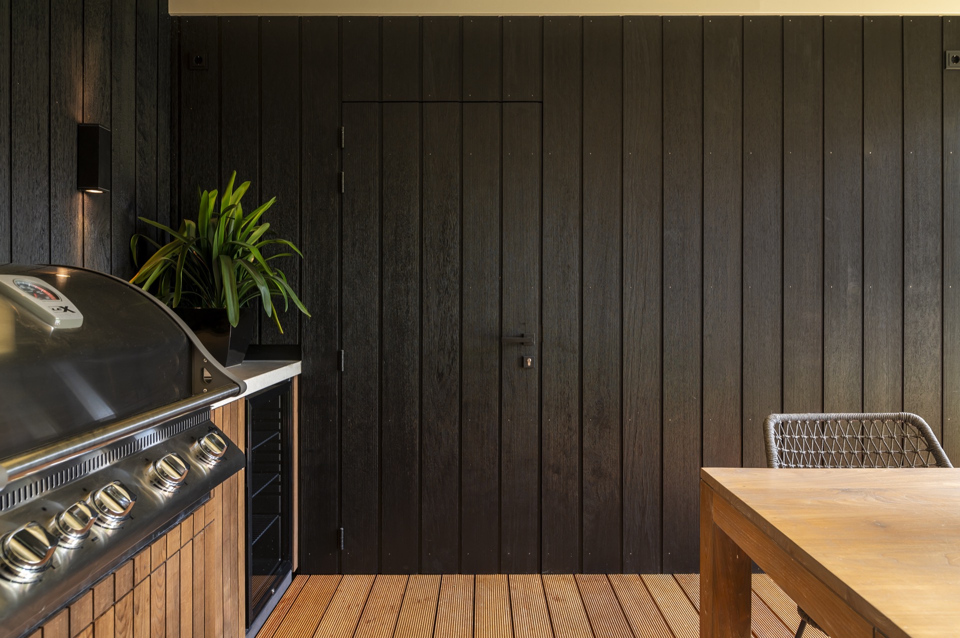
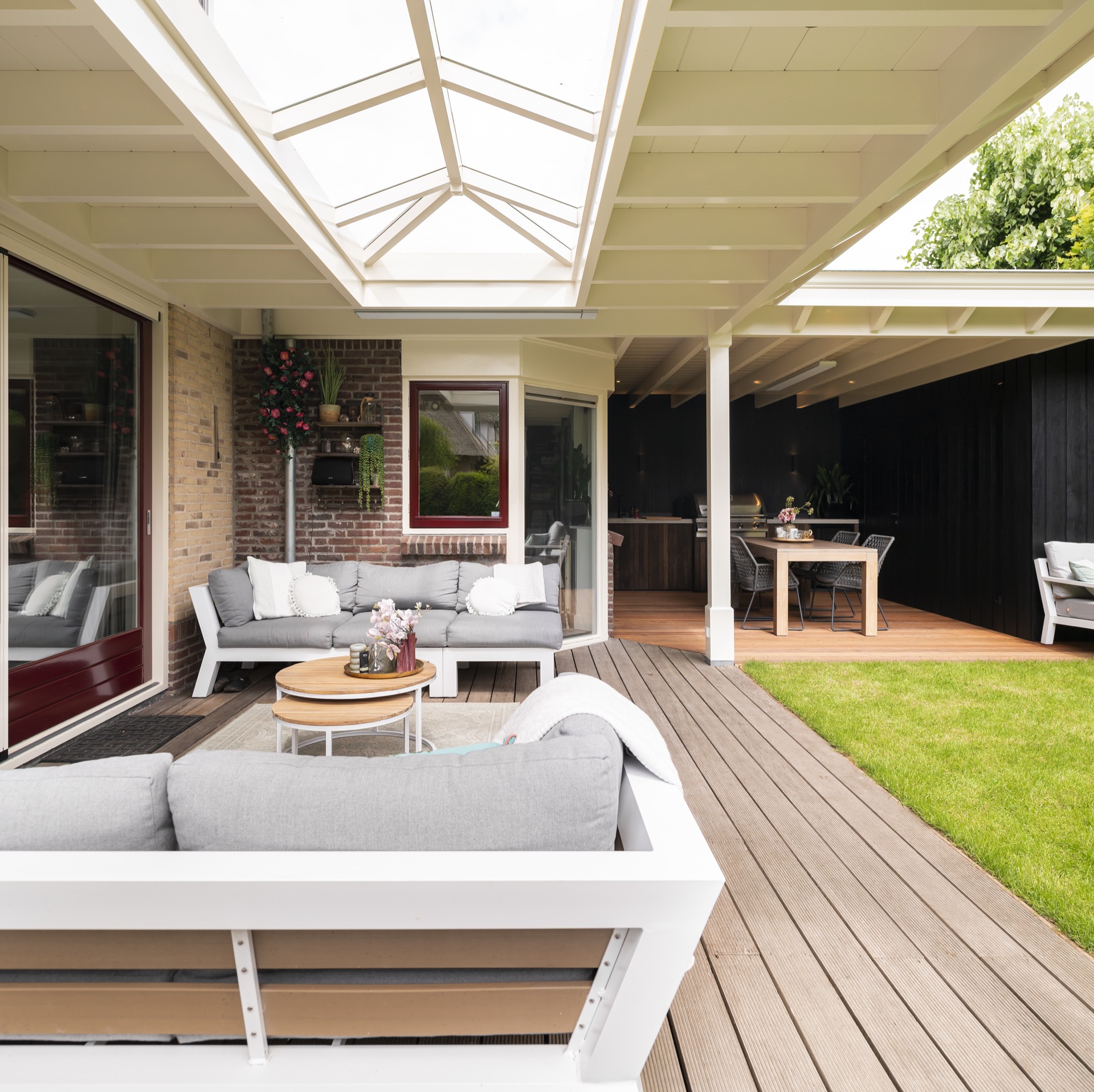
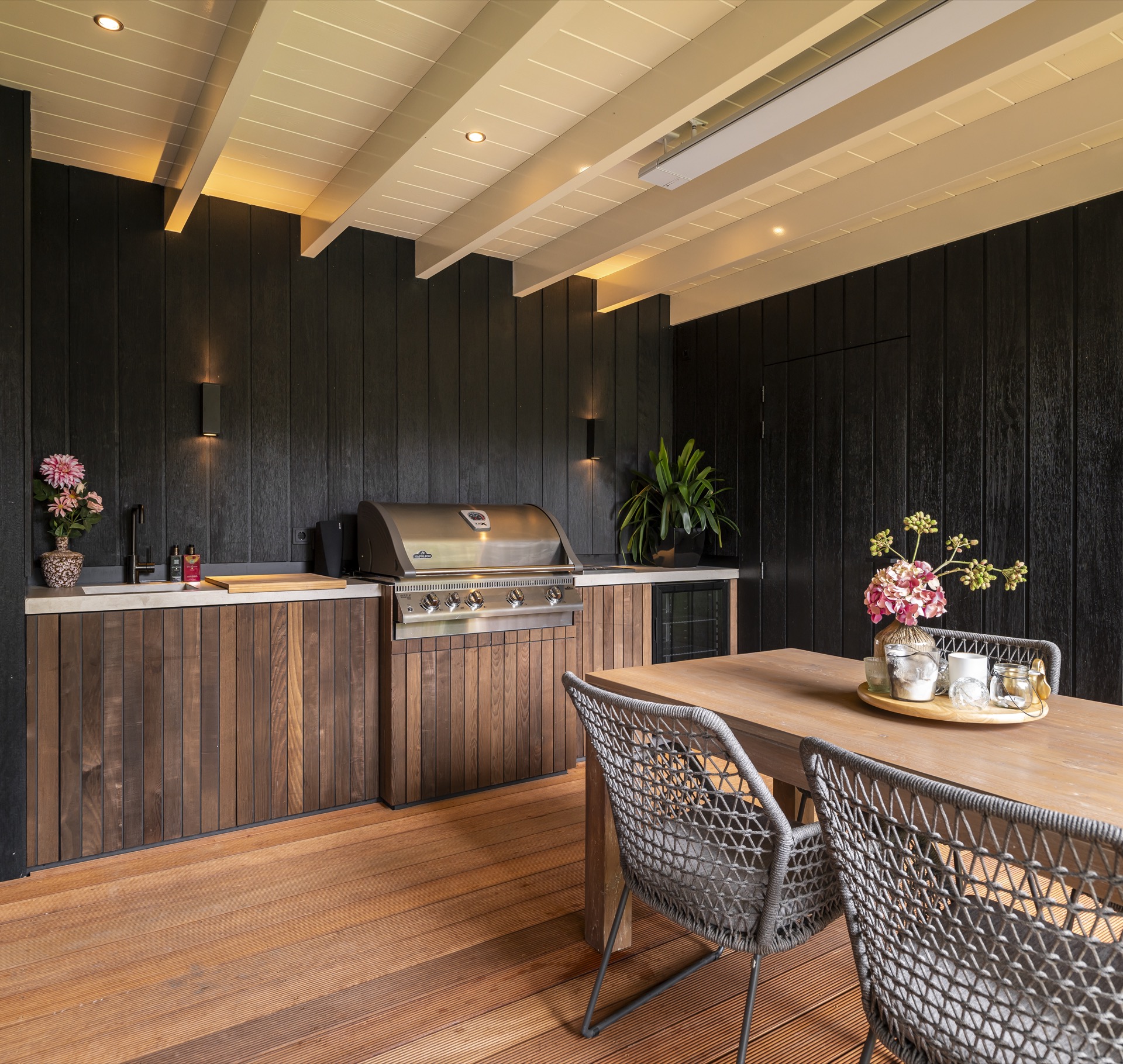
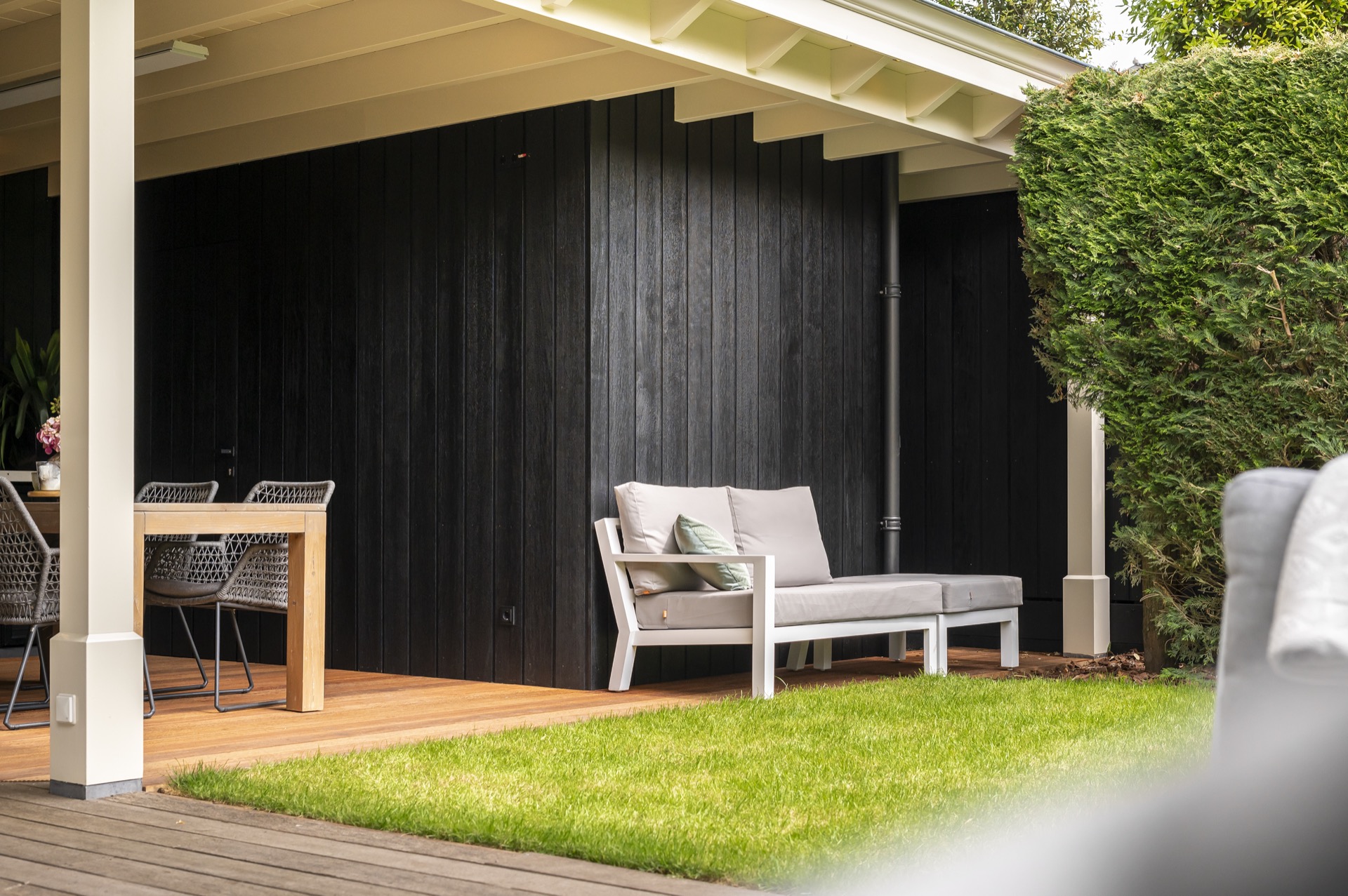
Dark wood panels as a backdrop for the kitchen
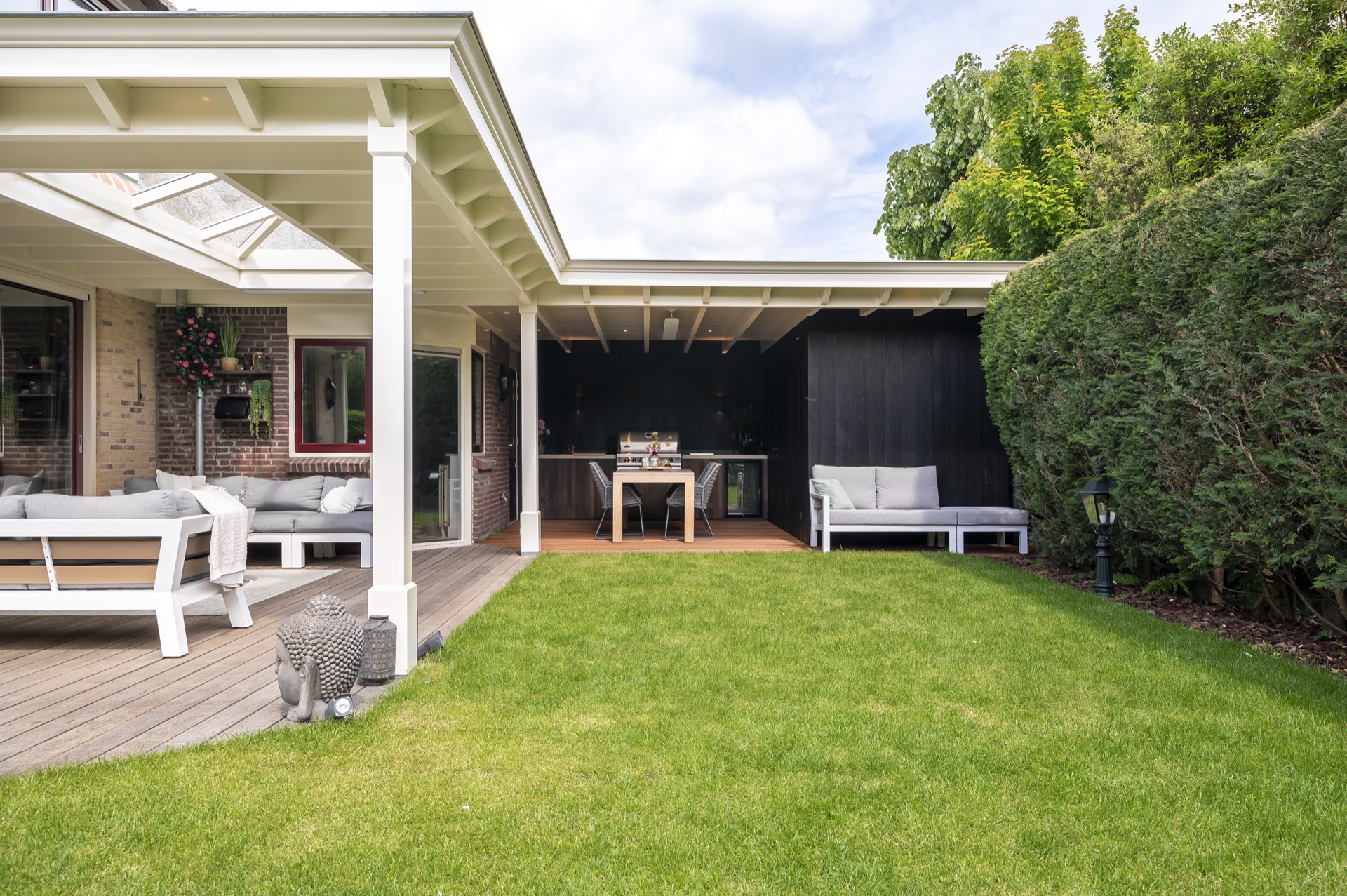
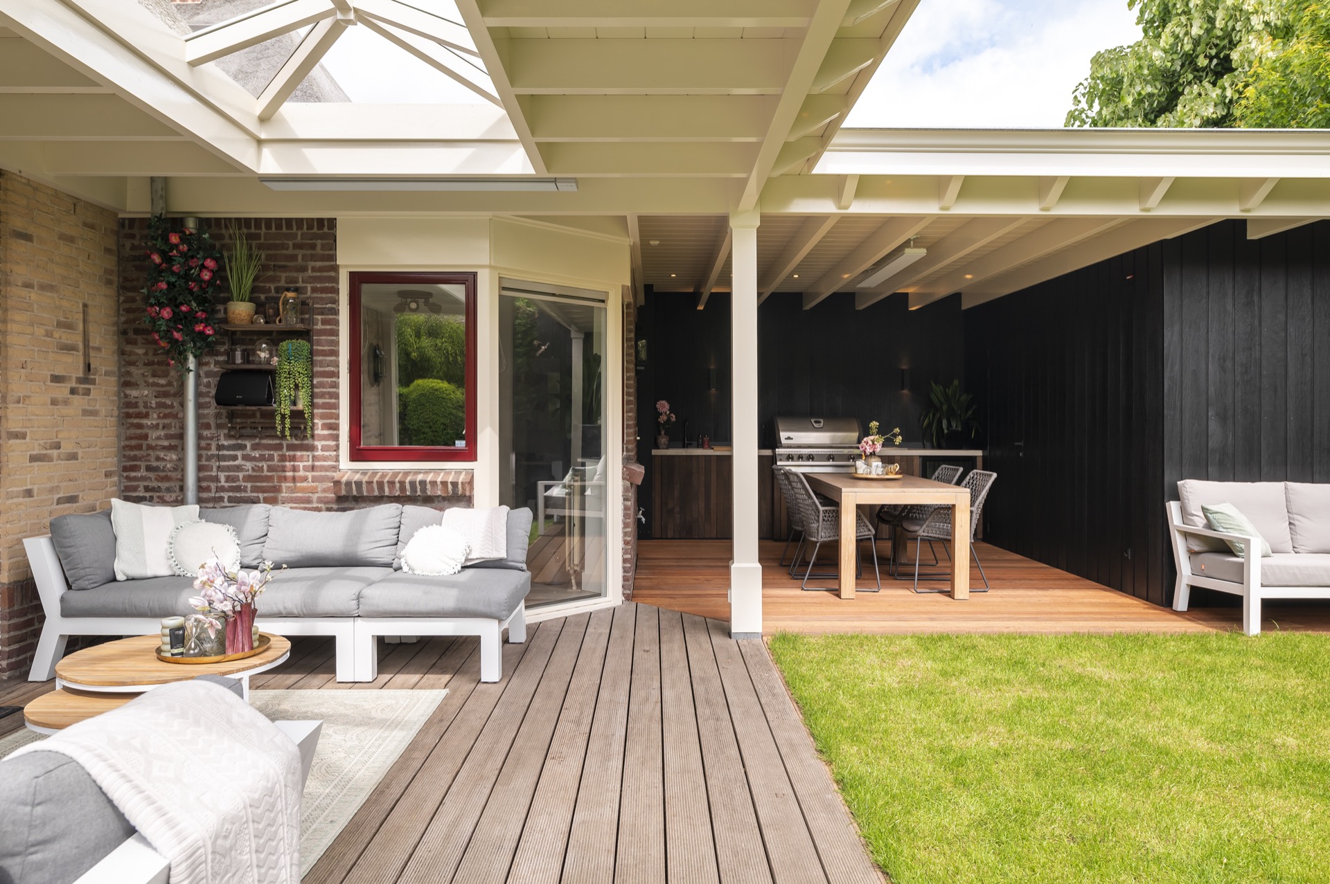
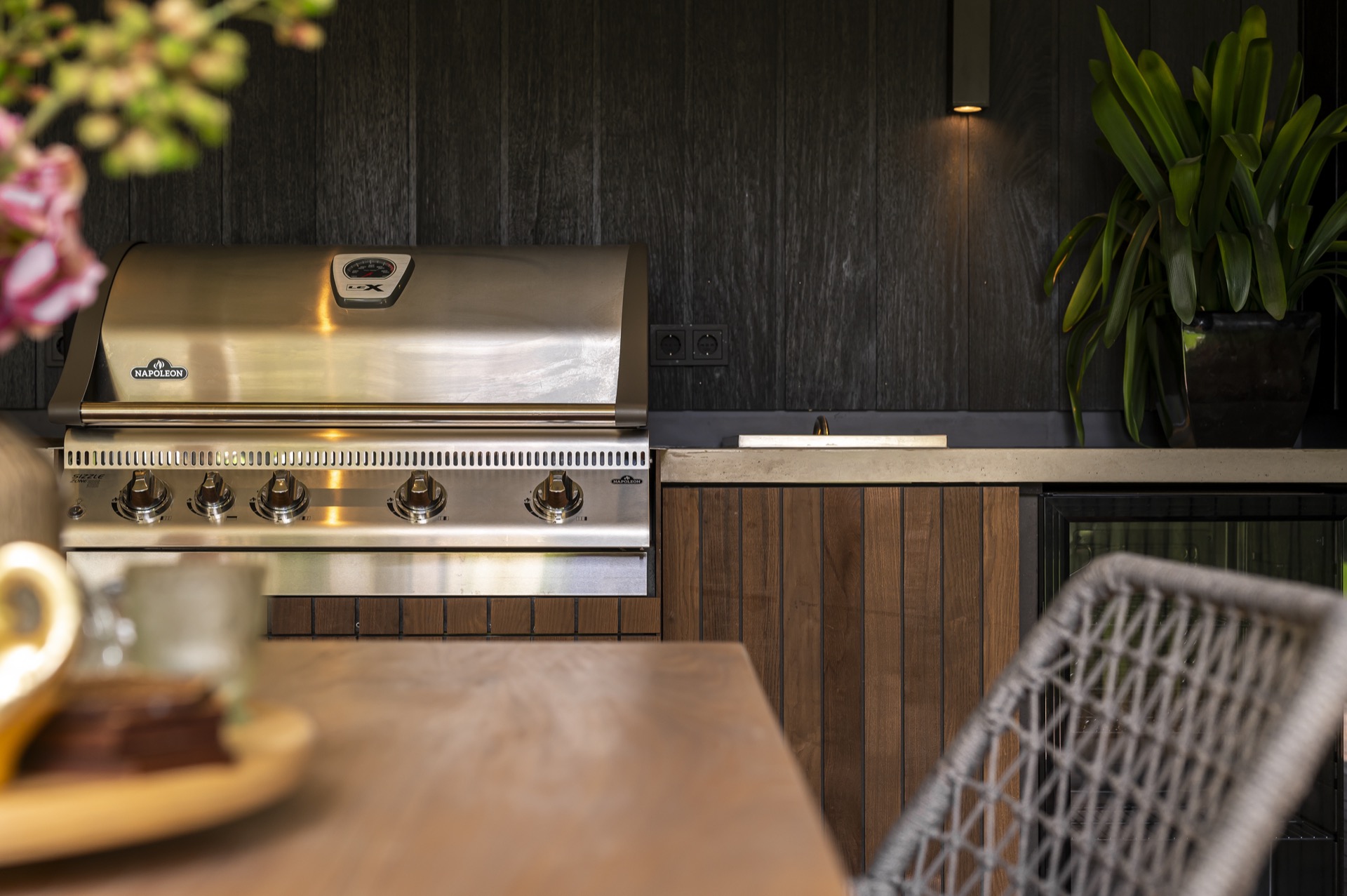
Against the pale roof, the dark wood outdoor wall creates a sharp contrast. Vertical boards run across the back zone and give the integrated outdoor kitchen a firm setting, almost like a piece of furniture fixed into the architecture. The wall does more than finish the space; it organizes it. Cabinets, a worktop and a few exposed details sit against the dark surface, so the kitchen reads as part of the room instead of an afterthought.
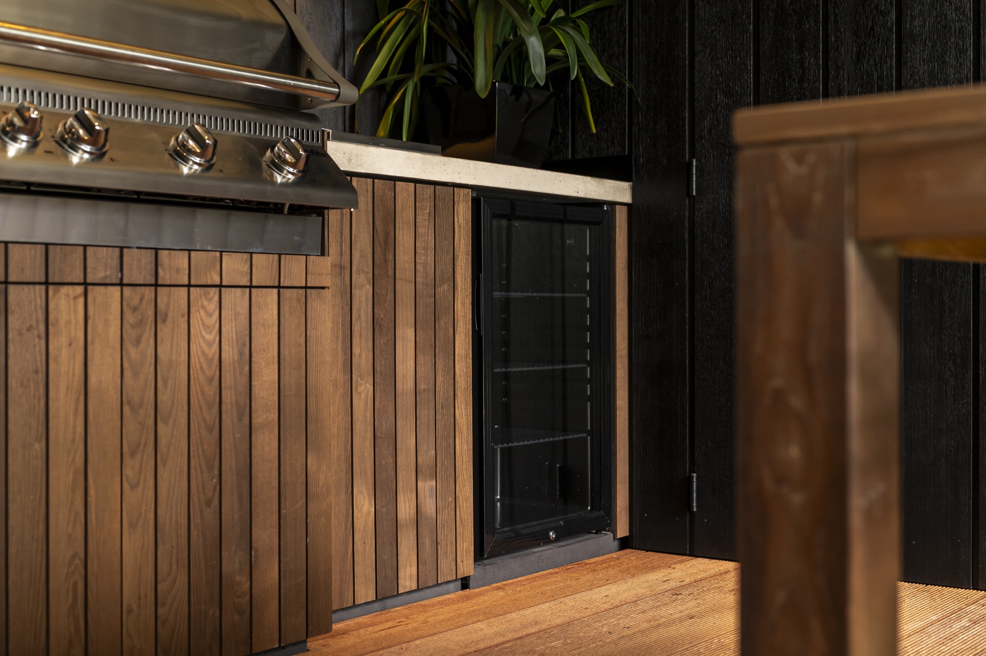
That contrast is easy to read in the wider views: white columns at the front, a darker interior band behind them, and the kitchen placed along that back line. The material shift is simple but effective. It lets the terrace stay open and bright while the cooking area has weight and focus. In close detail, the vertical grain and the seams between panels add texture without crowding the scene.
An integrated outdoor kitchen along the wall
The integrated outdoor kitchen follows the wall in a straight run, with a work surface and cabinet fronts aligned beneath the timber panels. Nothing is oversized or decorative for its own sake. The line stays clean, which helps the kitchen sit naturally in the outdoor living canopy. From the terrace, the set-up reads as a usable edge: a place to prepare, set down and move through, all within a covered perimeter.
Several images show the same wall from slightly different positions, and that repetition matters. One view emphasizes the kitchen front and the dark background; another picks up a small control plate and the wall lighting; a third shows the transition between the kitchen zone and the open terrace. Together they explain how the space works in practice, with the kitchen anchored to the long wall rather than occupying the middle of the room. That makes the outdoor living canopy part of the architectural character rather than a loose finish.
Wooden flooring that extends the terrace
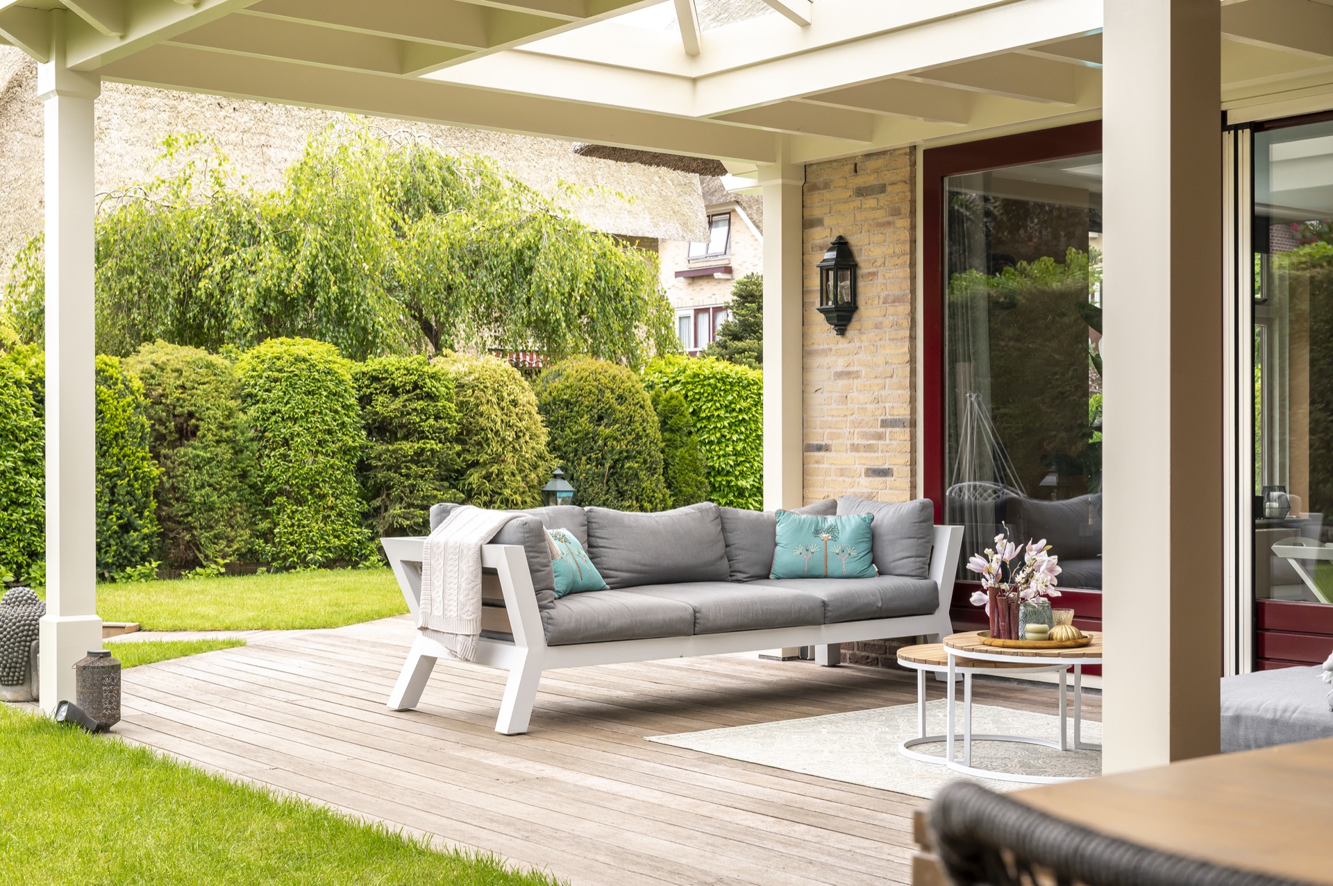
Underfoot, the wood terrace flooring runs in even planks and keeps the outdoor room visually calm. The boards lead the eye from the open edge toward the kitchen wall, which makes the route through the space easy to read. Their direction also softens the shift between house, canopy and garden. Along the edge, the terrace meets grass and planting, so the hard surface does not stop abruptly at the structure.
The flooring also helps the outdoor seating under cover feel settled. Chairs and table sit on the same plank field as the cooking area, which keeps the whole terrace tied together without needing extra gestures. White columns stand on the perimeter, glass openings appear in the surrounding house, and the dark wall holds the back of the composition. The floor is the quiet base that lets those elements register clearly.
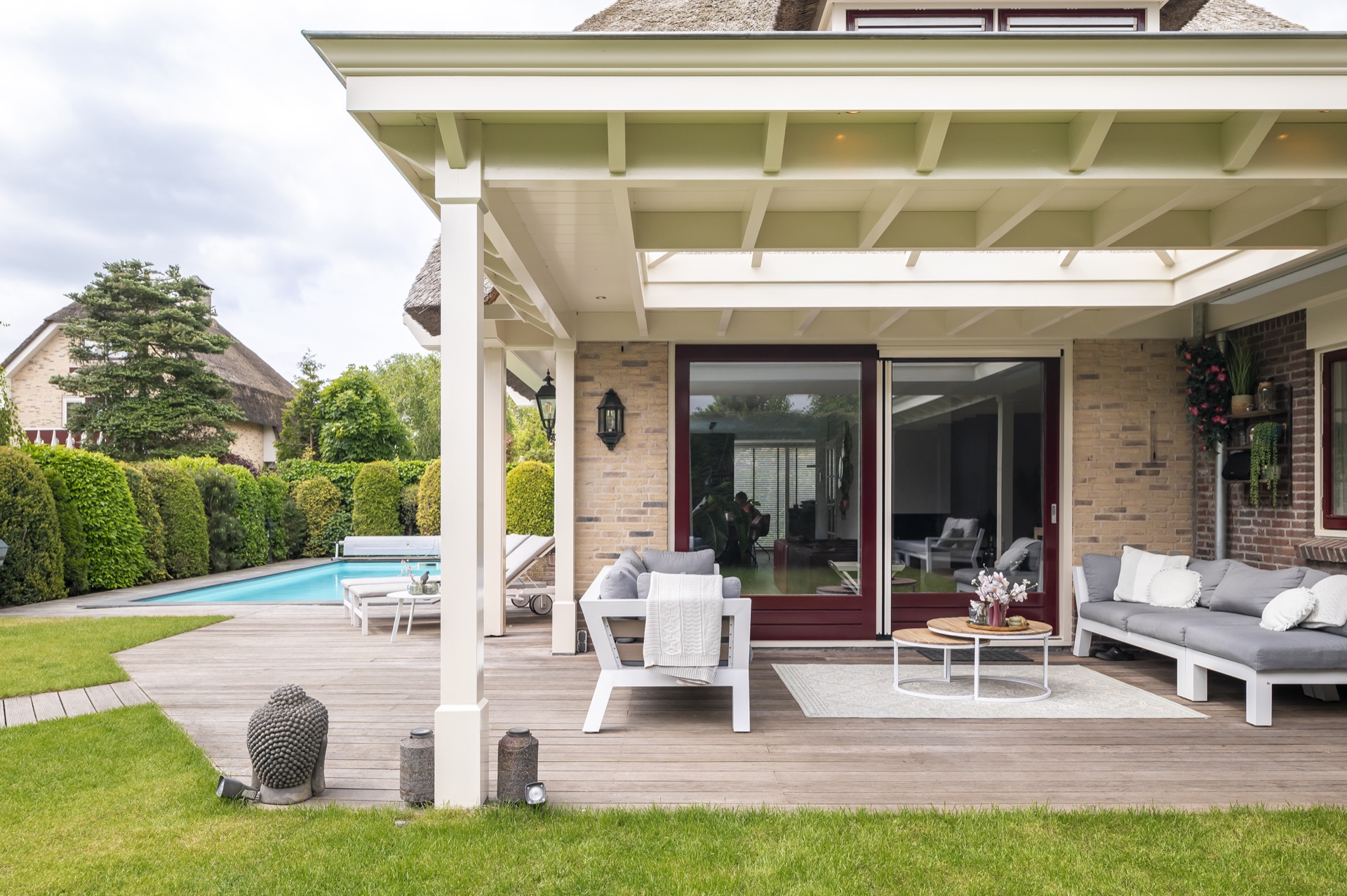
Structure, trim and the edge of the roof
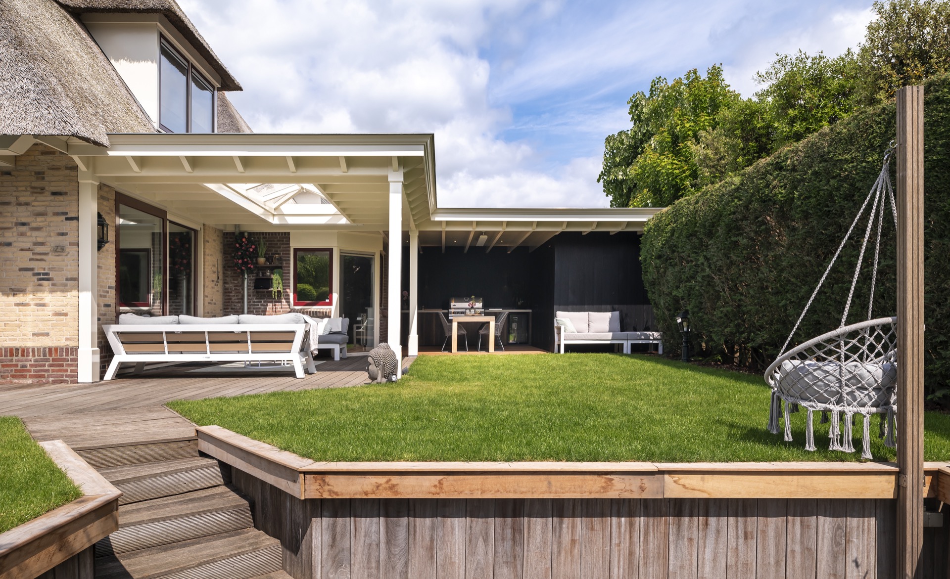
The canopy’s characteristic roof trim is visible in the outline of the structure. It gives the roof a distinct edge and helps the robust construction read as intentional rather than heavy. The pale beams, the open sides and the central glazed opening all contribute to that clear profile. Seen from the garden, the roof sits lightly above the terrace even though the build itself feels solid and grounded.
That sense of firmness is part of what makes the project persuasive. The outdoor living canopy does not rely on ornament. It uses proportion, contrast and a careful sequence of surfaces: glass overhead, timber below, dark panels at the rear. Even the round recessed spot in the ceiling becomes part of that composition, a small detail that confirms how thoroughly the space has been considered.
outdoor living canopy as the architectural starting point
From the wider views, the canopy reads as an outdoor room set between house and lawn. Red-framed glazing, brick surfaces and the lighter support posts appear at the edges, while the terrace opens toward grass and, in one view, water beyond. The covered zone does not seal the garden away; it creates a pause along the route between inside and out. That is where the project gains its strength.
The outdoor seating under cover sits in this threshold, protected by the roof and still in direct contact with the garden. Light shifts across the beams, the dark wood wall keeps the back side grounded, and the wood terrace flooring carries the eye from one end to the other. It is a compact project, but the parts are arranged with enough clarity that each one remains easy to read.
Photografie – Daan Blankesteijn That makes the outdoor living canopy part of the architectural character rather than a loose finish.
Want to see more of Donker Buitenkamers? View the page of Donker Buitenkamers for even more great projects and company information.


.png)
NEW 2026 Jubileum Edition The Best Interior Designers Benelux
Order Now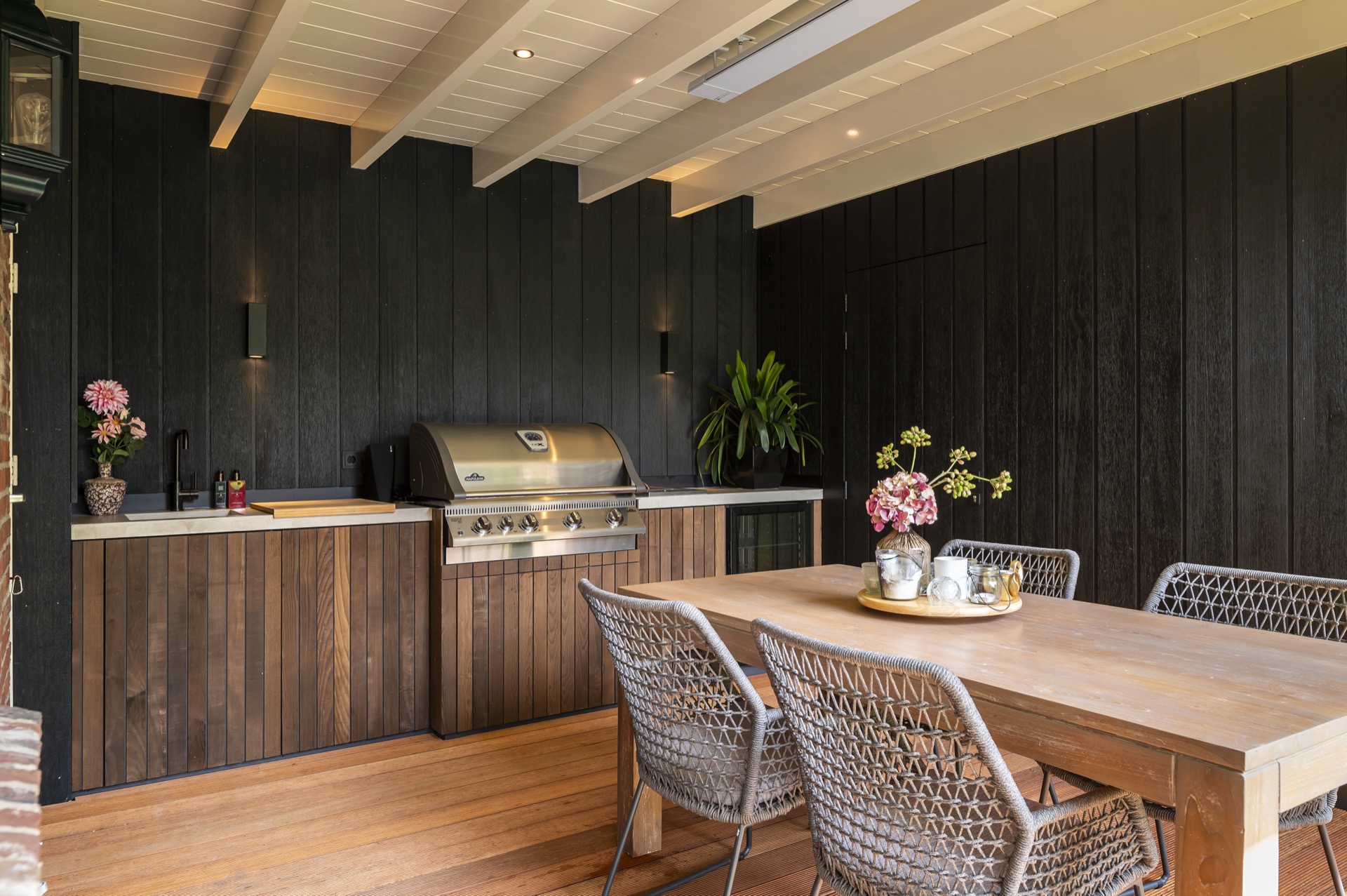
NEW 2026 Jubileum Edition The Best Interior Designers Benelux
Order Now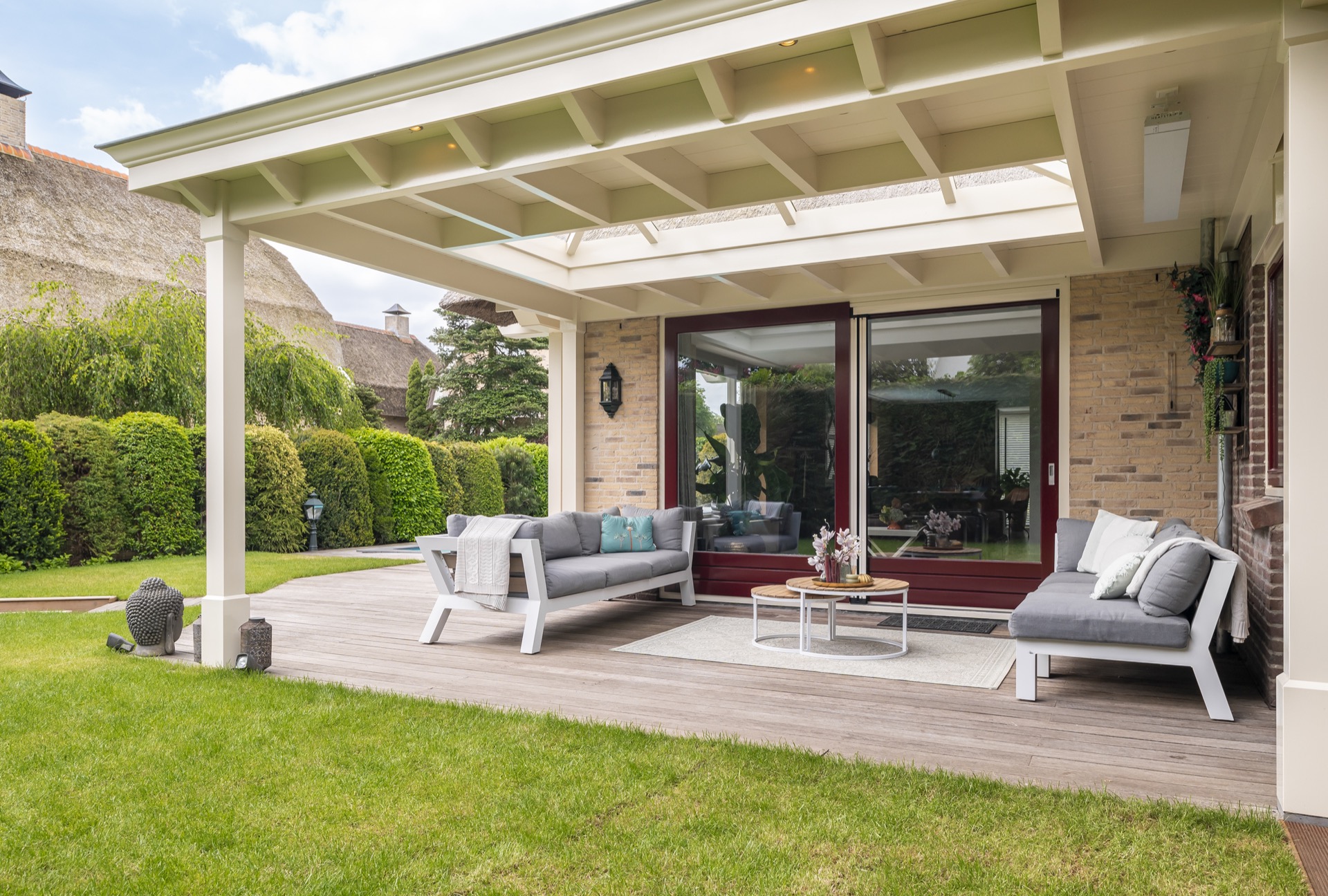
NEW 2026 Jubileum Edition The Best Interior Designers Benelux
Order Now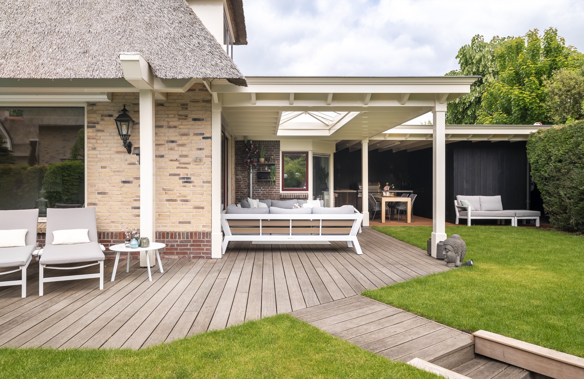
NEW 2026 Jubileum Edition The Best Interior Designers Benelux
Order Now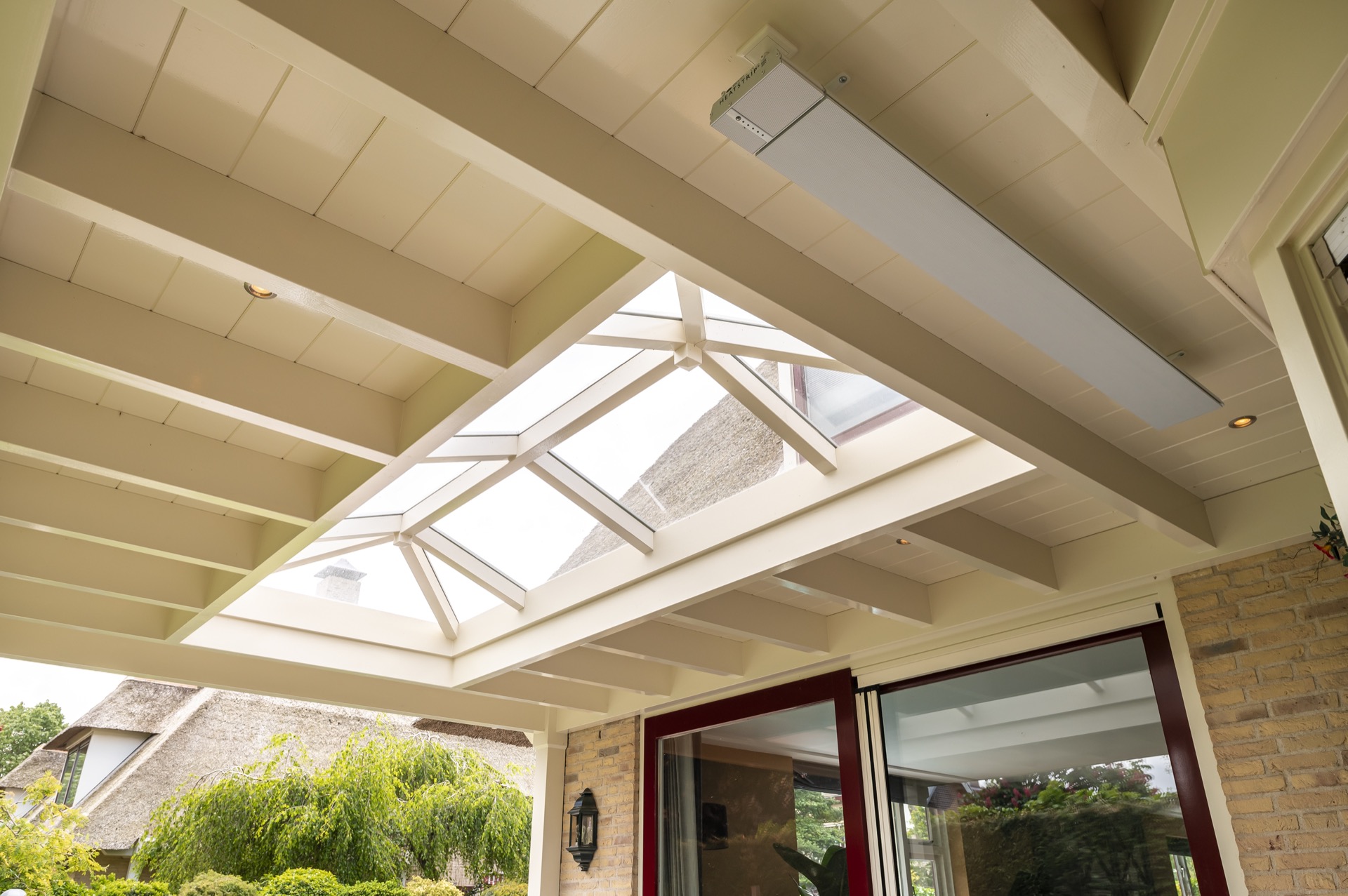
NEW 2026 Jubileum Edition The Best Interior Designers Benelux
Order Now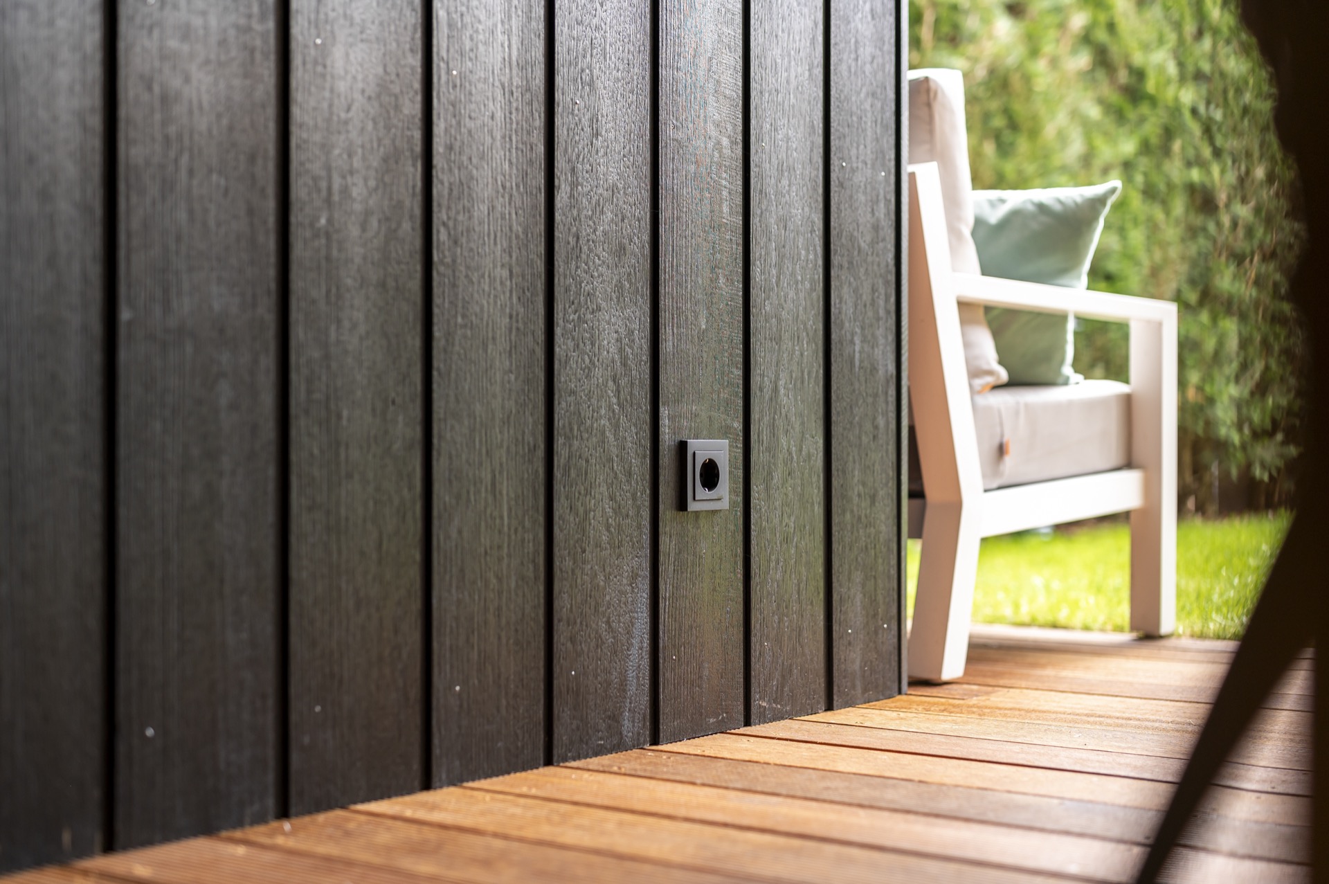
NEW 2026 Jubileum Edition The Best Interior Designers Benelux
Order Now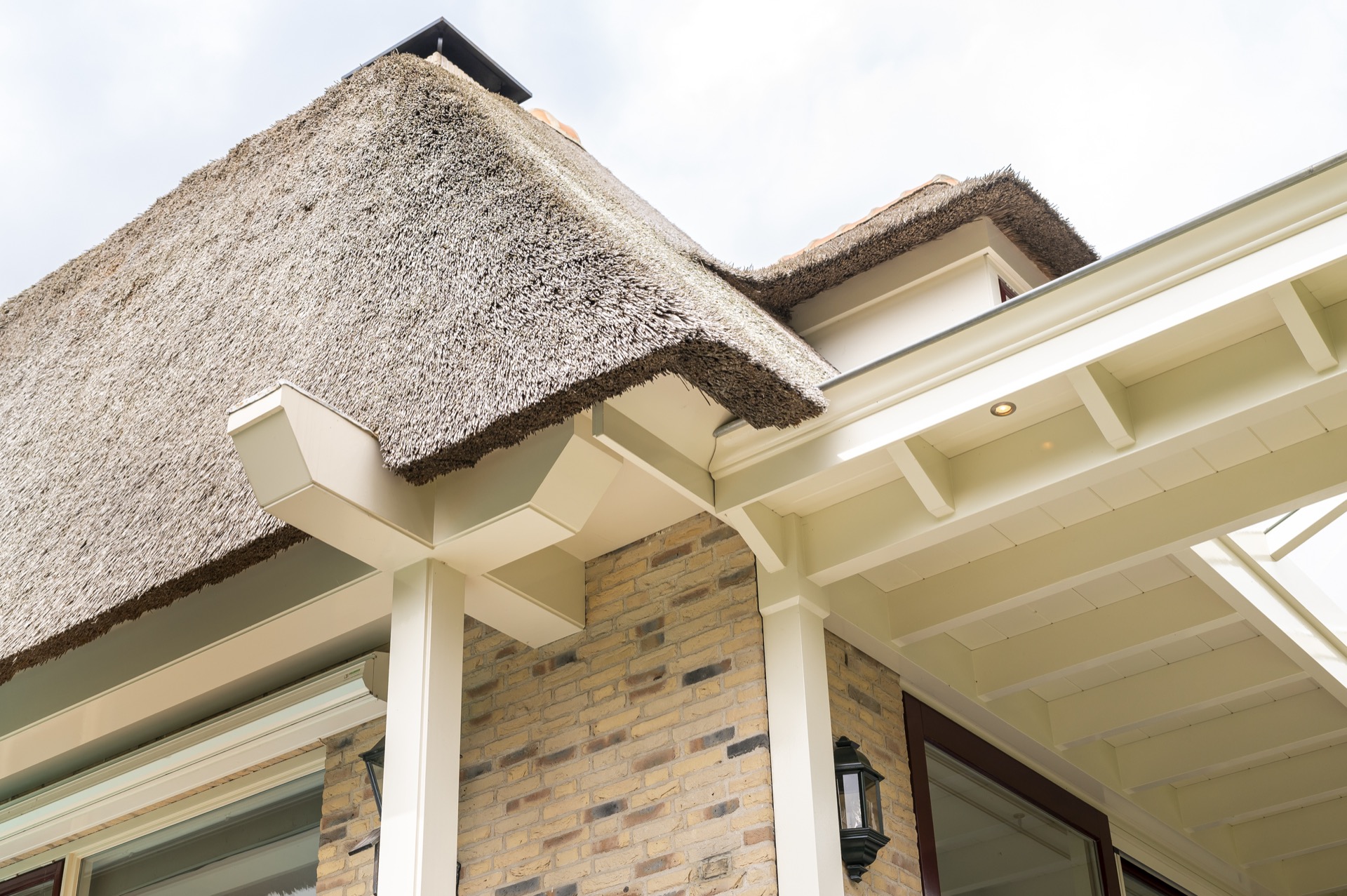


