Penthouse interior with dark oak and circular flow
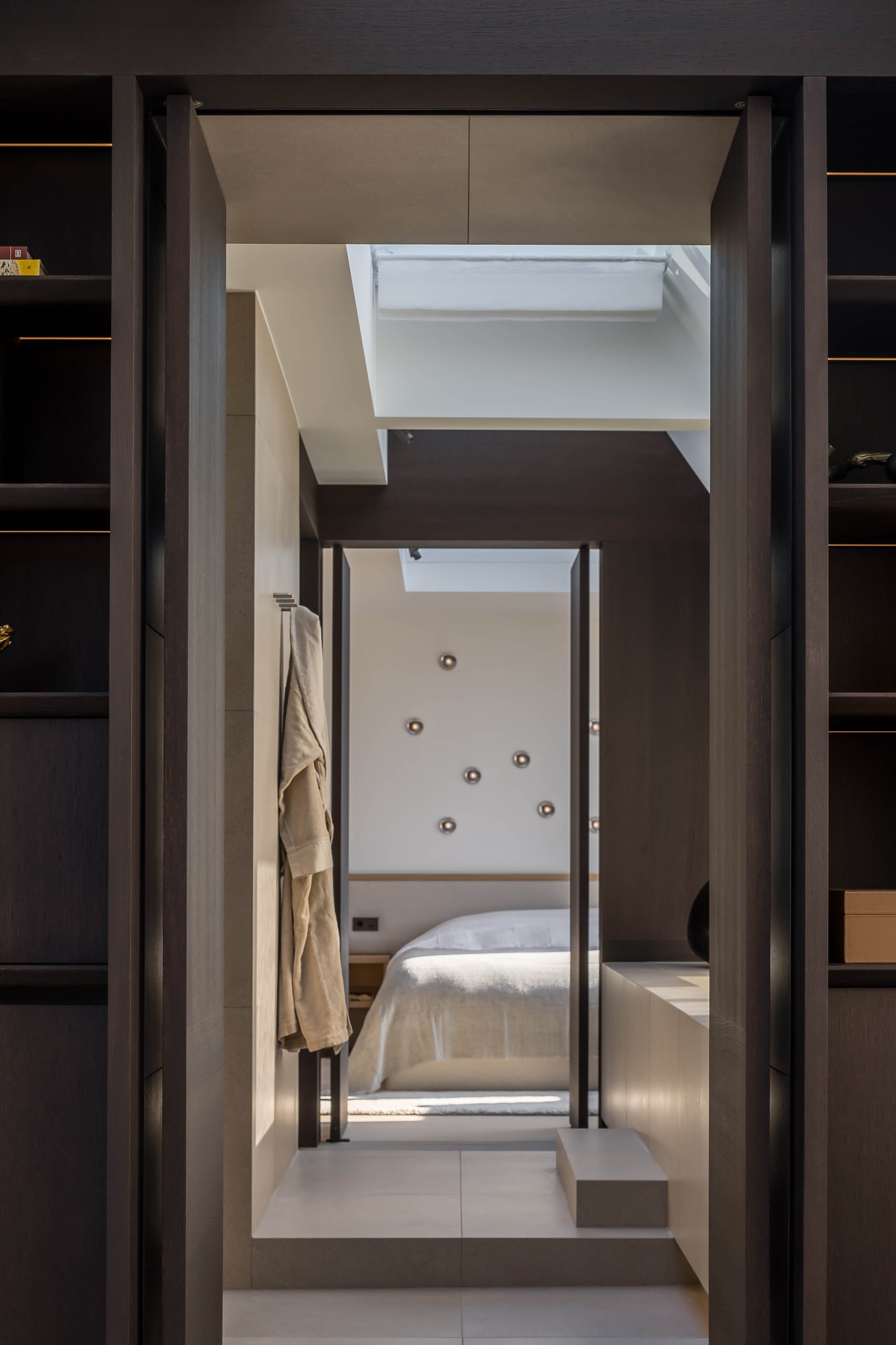
The dark oak core sits at the center of the penthouse interior, holding the stair and lift in one closed volume. Around it, the plan opens and turns rather than stops. That movement is the first thing you notice: no fixed route, but a circular circulation layout that lets the rooms unfold in sequence. In the penthouse interior design, the structure is not hidden. It sets the pace.
Dark oak as the anchor of the plan
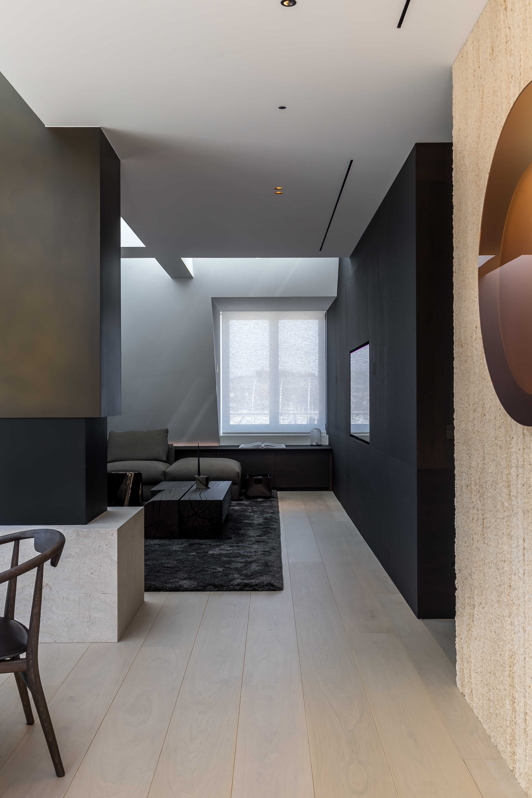
The closed core floorplan gives the apartment its order. Every function is arranged around the dark oak block, so the edges of the plan stay calm while the movement around it remains active. The result is easy to read in the long views from one zone to the next. A doorway aligns with a wall opening; a corridor leads into a wider room; a change in material marks the shift. The penthouse interior keeps those moves visible instead of smoothing them away.
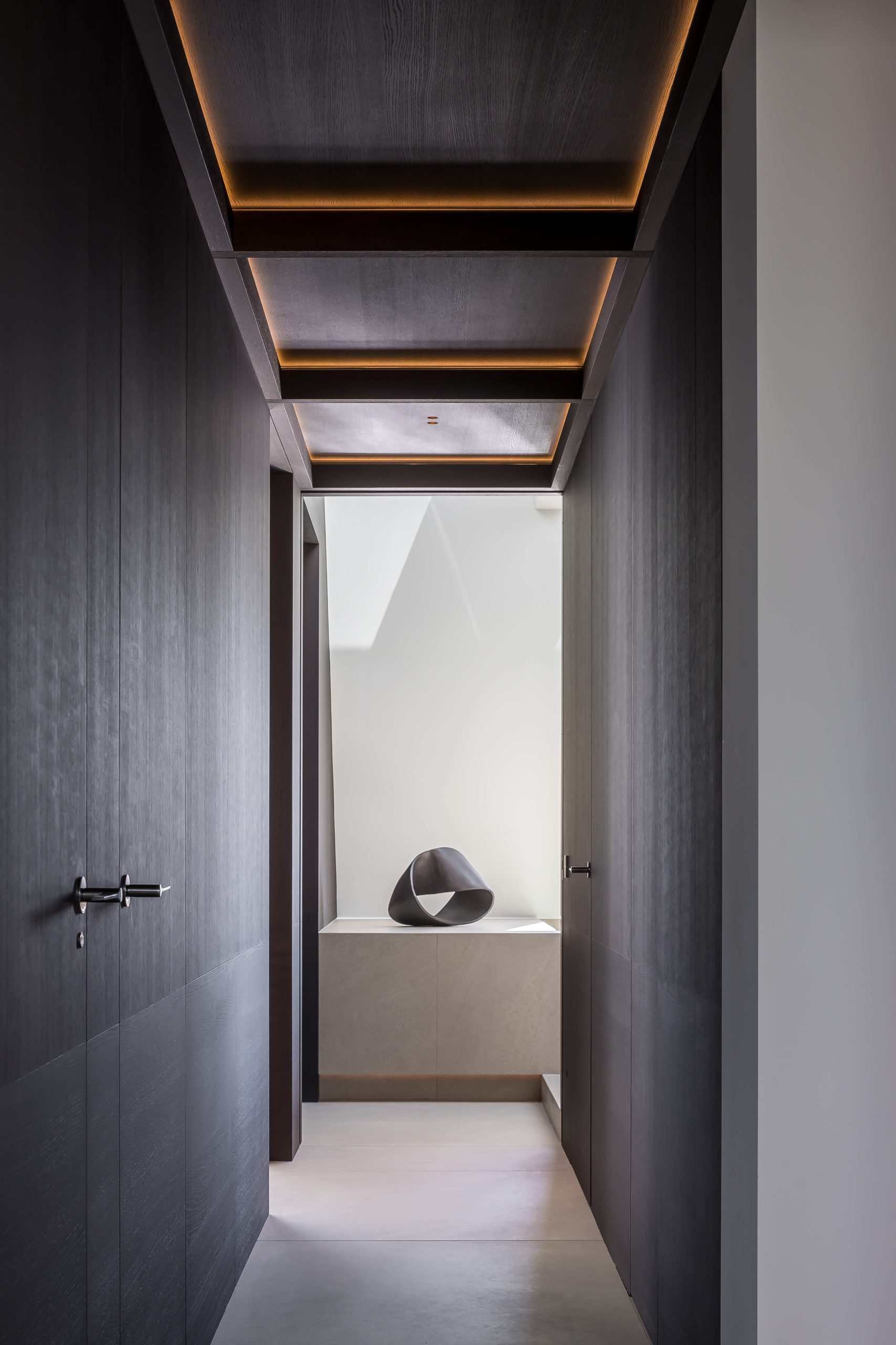
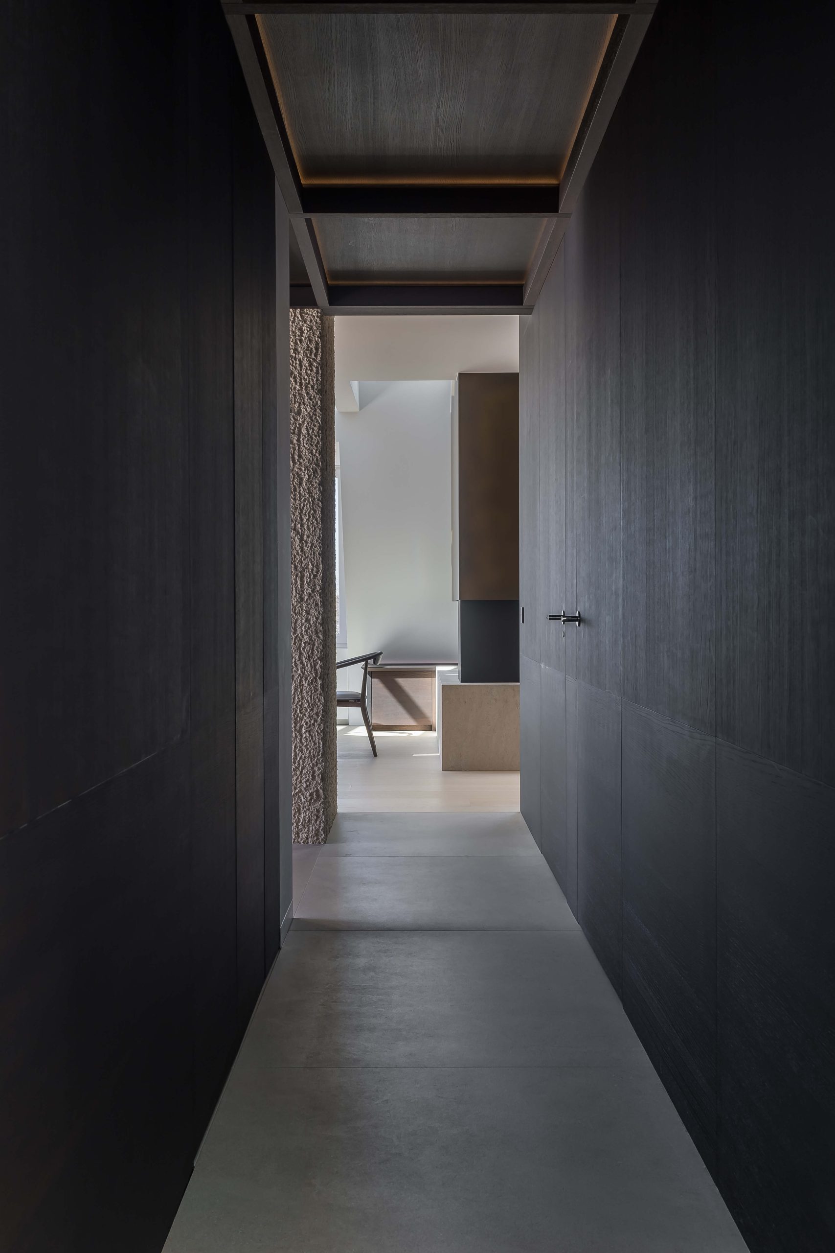
In the images, the dark timber is used as a solid counterpoint to lighter panels, stone-like surfaces, and glazed openings. It appears in the cabinetry, in vertical wall fields, and in the core that carries the stair and lift. Because the core is enclosed, the surrounding rooms can open and close without losing structure. That is where the penthouse interior design feels most deliberate: the plan uses restraint to create freedom.
Routes that curve, pause, and reconnect
The circular circulation layout gives the apartment a continuous rhythm. You move past a room, catch a view into another, and then turn back into the sequence. It is not a straight-through layout, and that makes the transitions more noticeable. The sightlines between zones are carefully staged. They do not force openness; they draw the eye forward just enough to make the next space feel present before you enter it.
Sliding and swing doors support that change in tempo. One moment a space reads as part of the whole, the next it can close off and hold its own. The doors are not treated as neutral fittings. They are part of the spatial language, helping the apartment shift between connection and separation. That gives the penthouse interior a measured flexibility without weakening the clarity of the plan.
Open views without losing enclosure
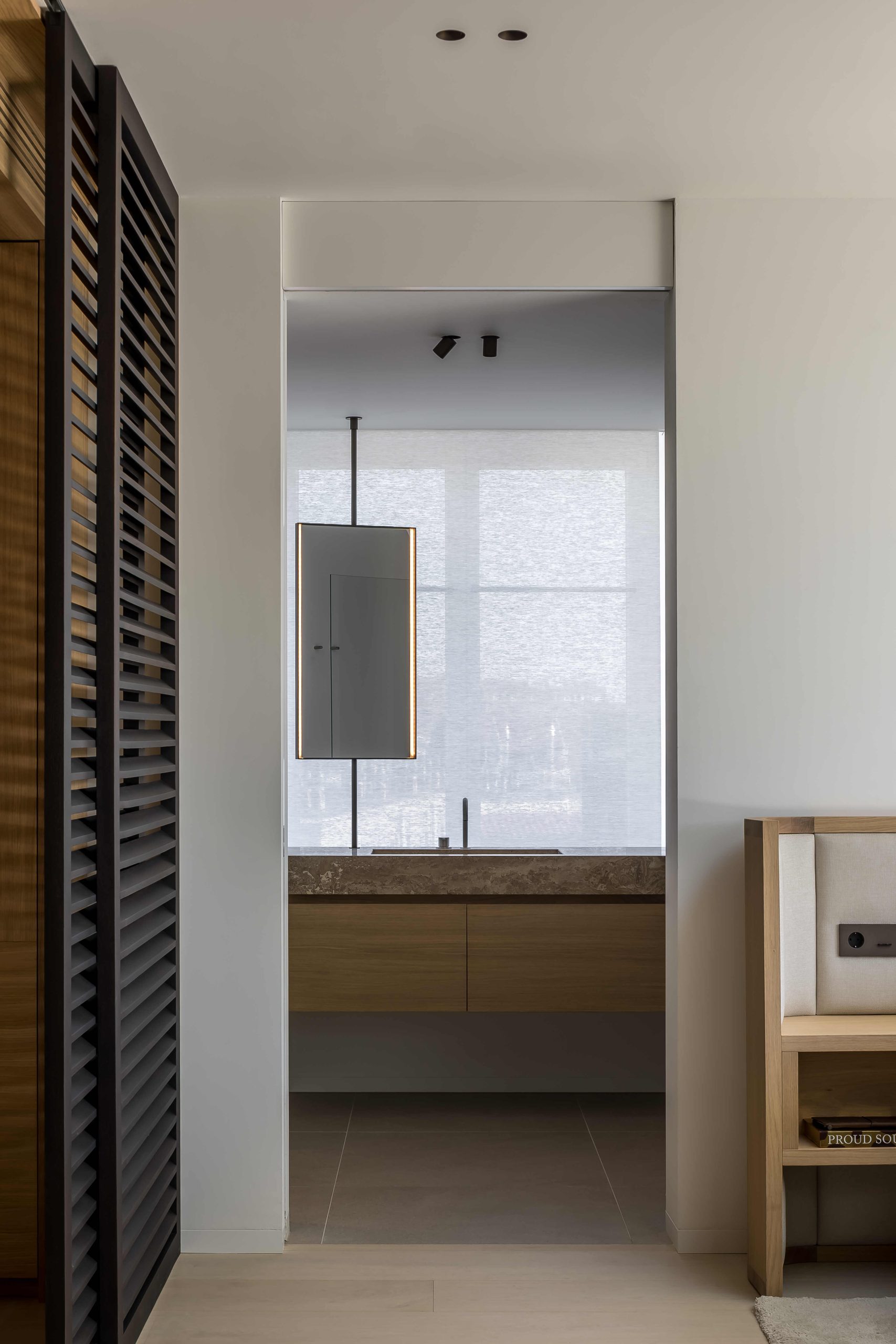
What makes the sightlines between zones interesting is their restraint. Glass openings, aligned thresholds, and partial views create a sense of depth without turning every room into one large field. The kitchen can be read from another area; the lounge opens toward a different volume; the route bends around the core and returns. This is penthouse interior design that works through control, not through exposure.
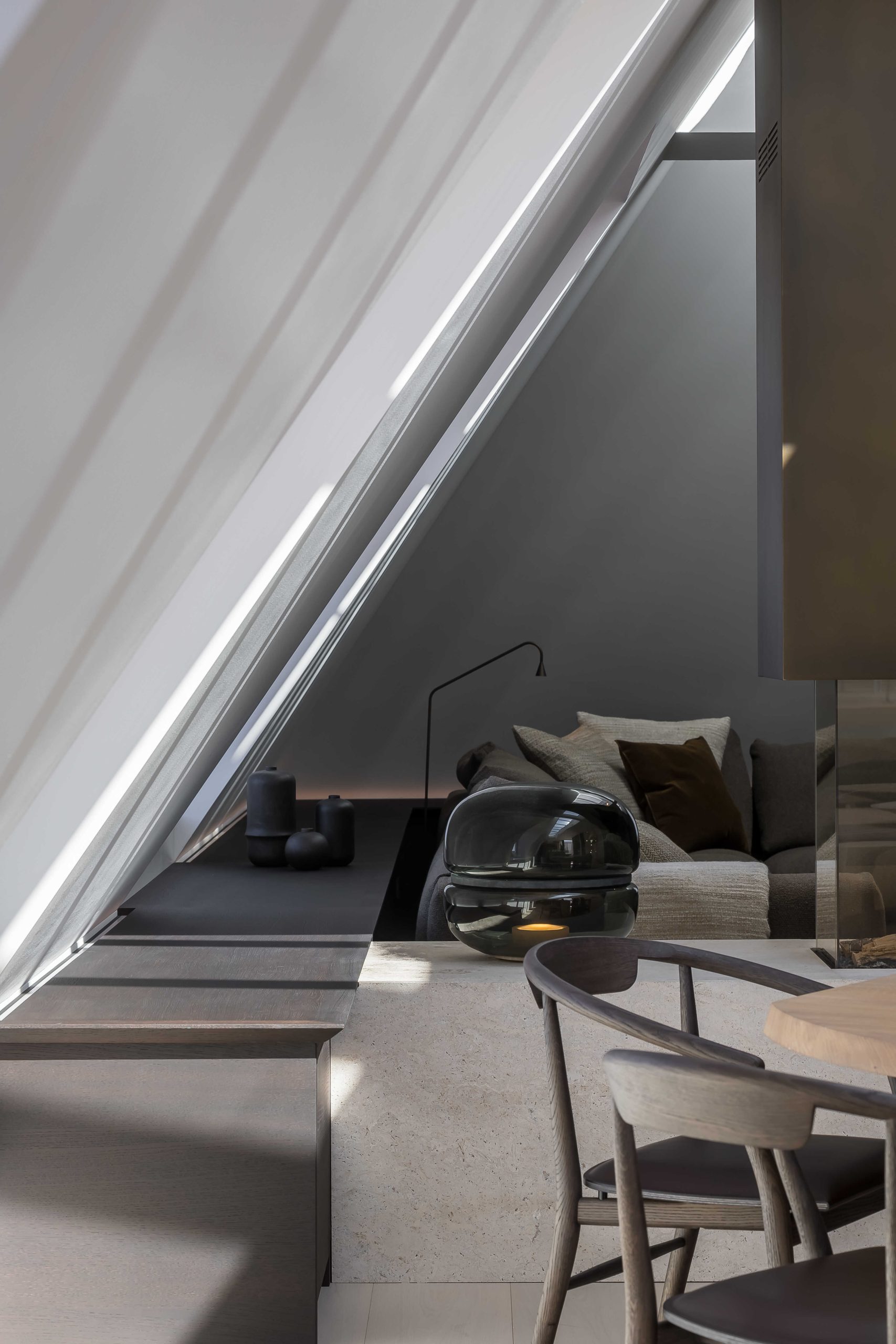
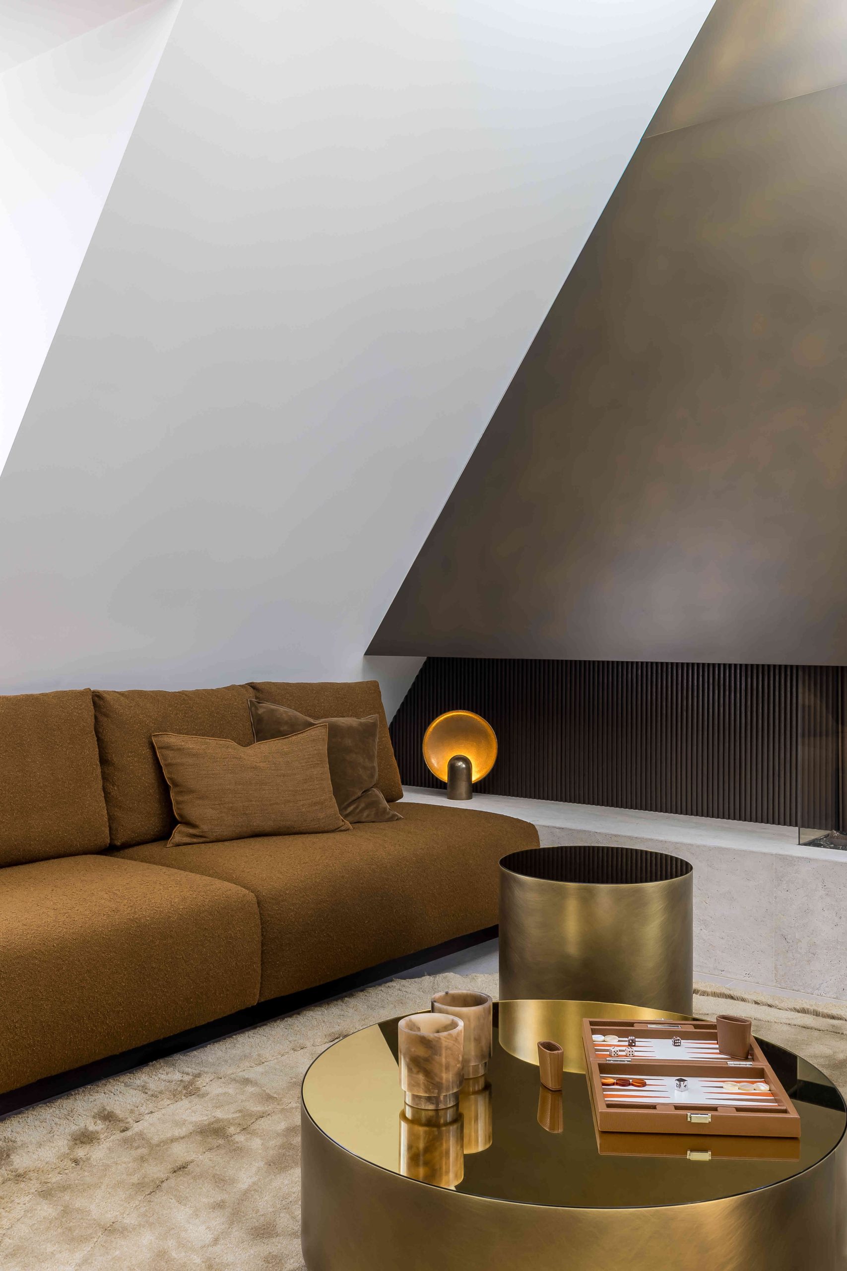
The effect is especially clear where the dark wood meets lighter surfaces and more reflective finishes. A matte panel sits next to a glazed edge. A stone-like plane meets a timber frame. These shifts give each room its own weight. The apartment never depends on one grand gesture. Instead, the composition builds through the repetition of openings, joins, and turns.
Materials that carry the rhythm
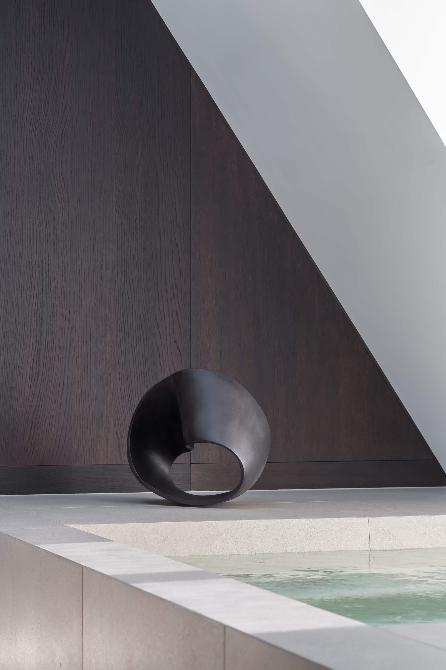
Pure, honest materials set the tone throughout the penthouse interior. Rough meets smooth. Matte sits beside gloss. Vertical planes are answered by horizontal runs of joinery. Those contrasts create rhythm without visual noise, which is exactly why the rooms feel composed rather than busy. Dark timber holds the stronger lines, while stone-like finishes and glazed surfaces bring in a cooler register.
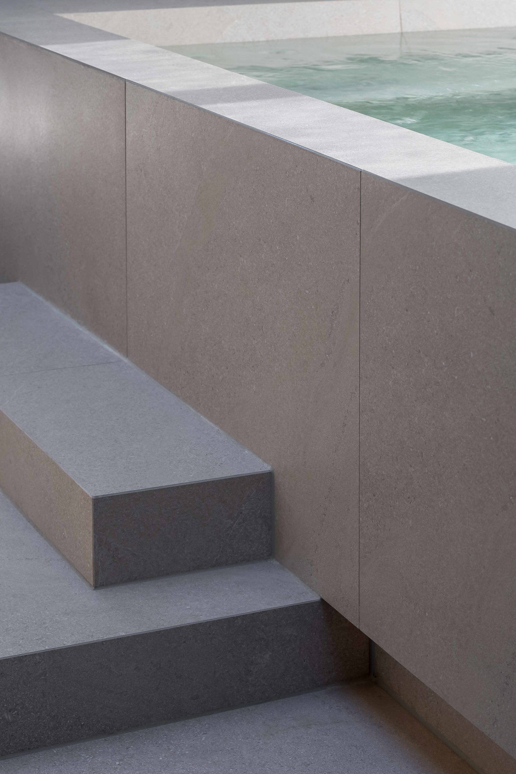
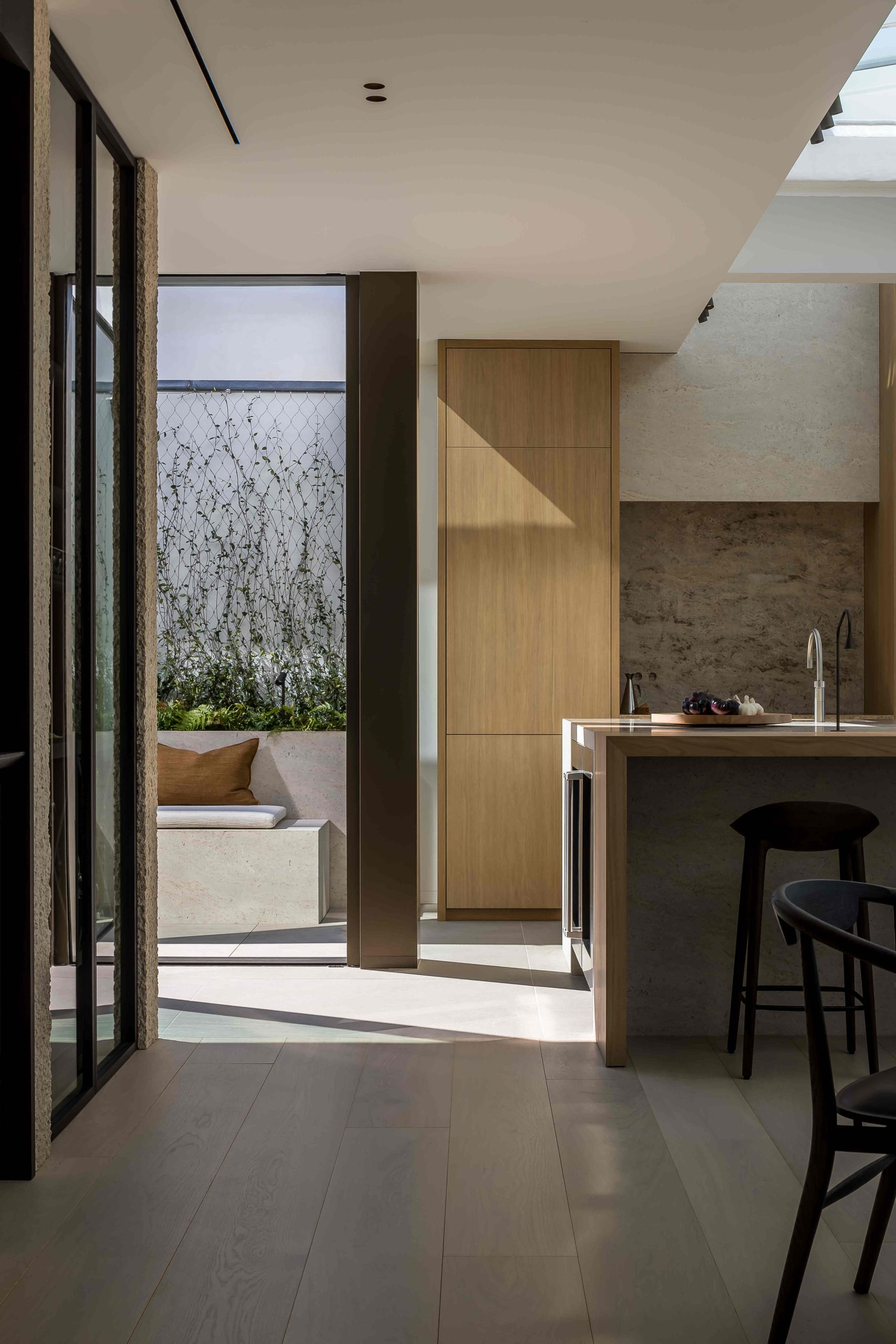
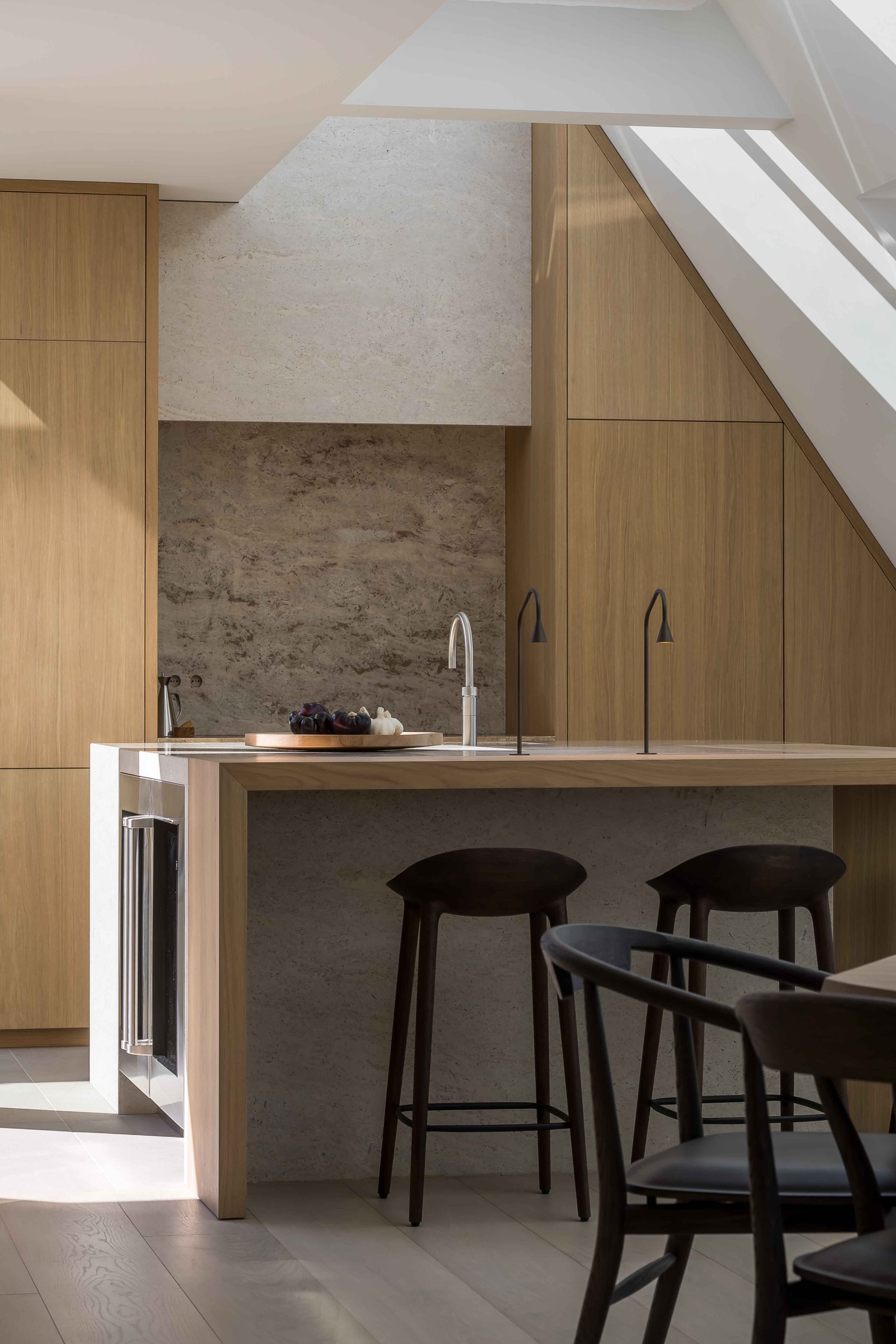
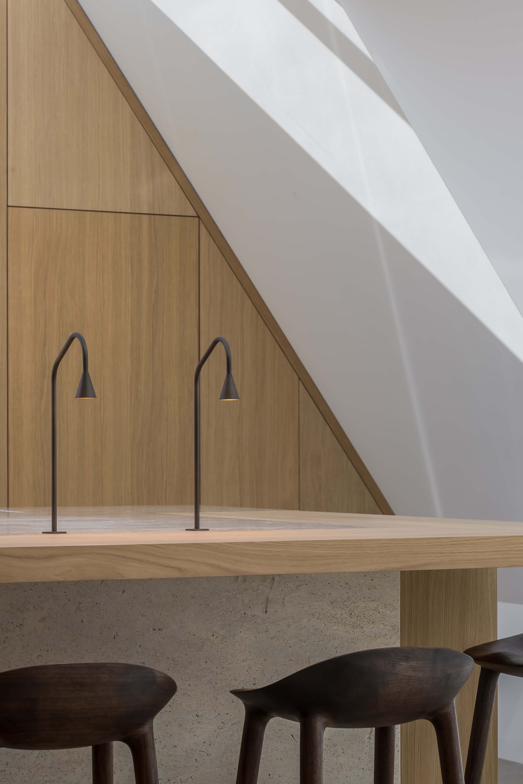
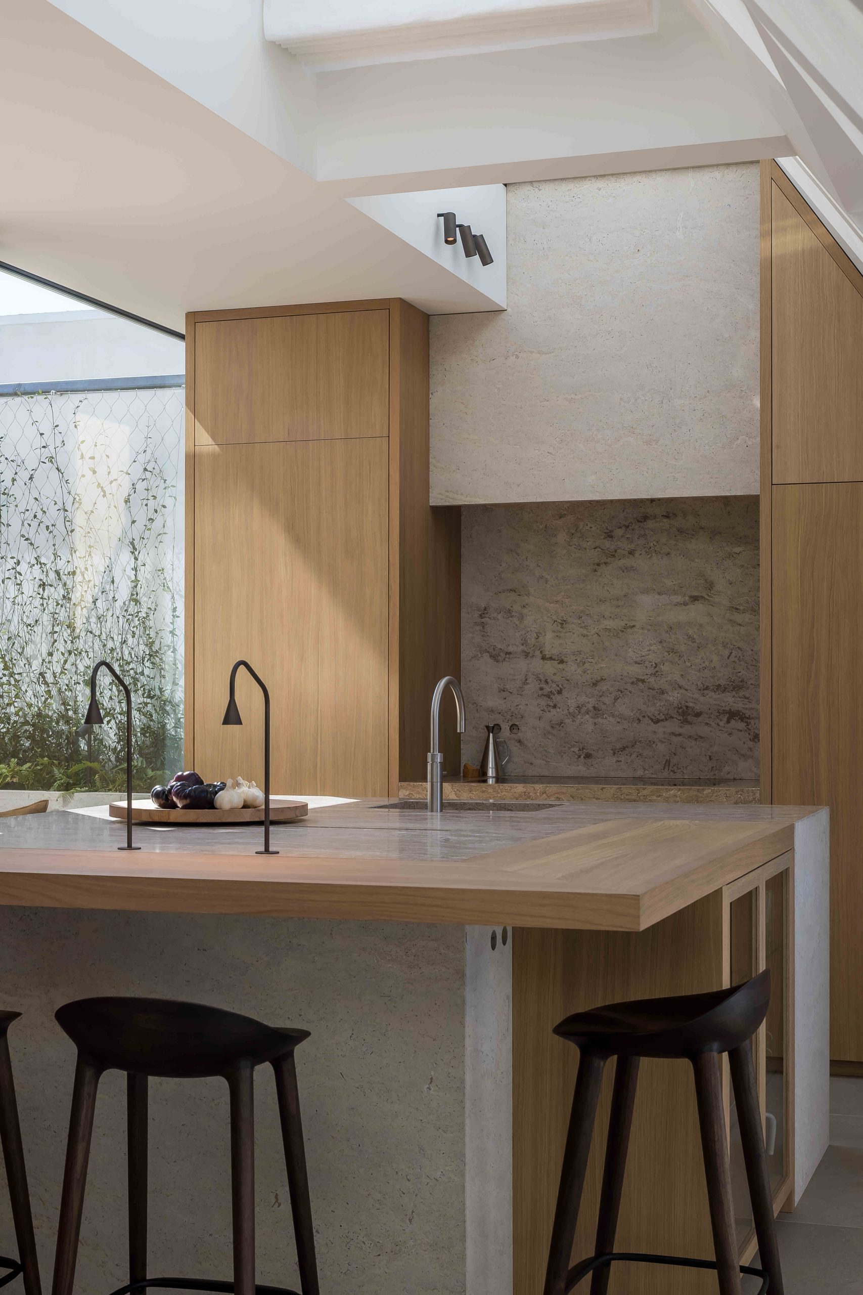
The custom joinery is detailed with care you can see at close range: panel joints, profiled edges, and repeated lines that give the rooms structure. In the kitchen and adjacent areas, wood fronts sit against a large textured wall surface, while a light stone-like top keeps the composition grounded. The same discipline appears elsewhere in the penthouse interior design, where materials are allowed to speak through touch and surface rather than decoration.
Joinery, stone, and light in close view
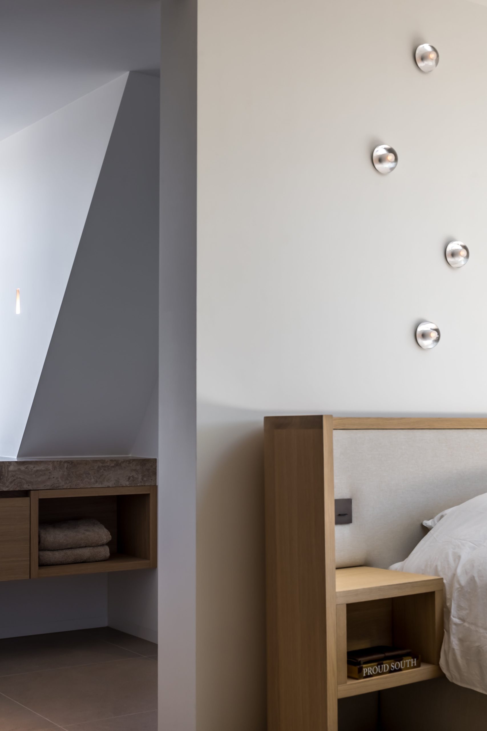
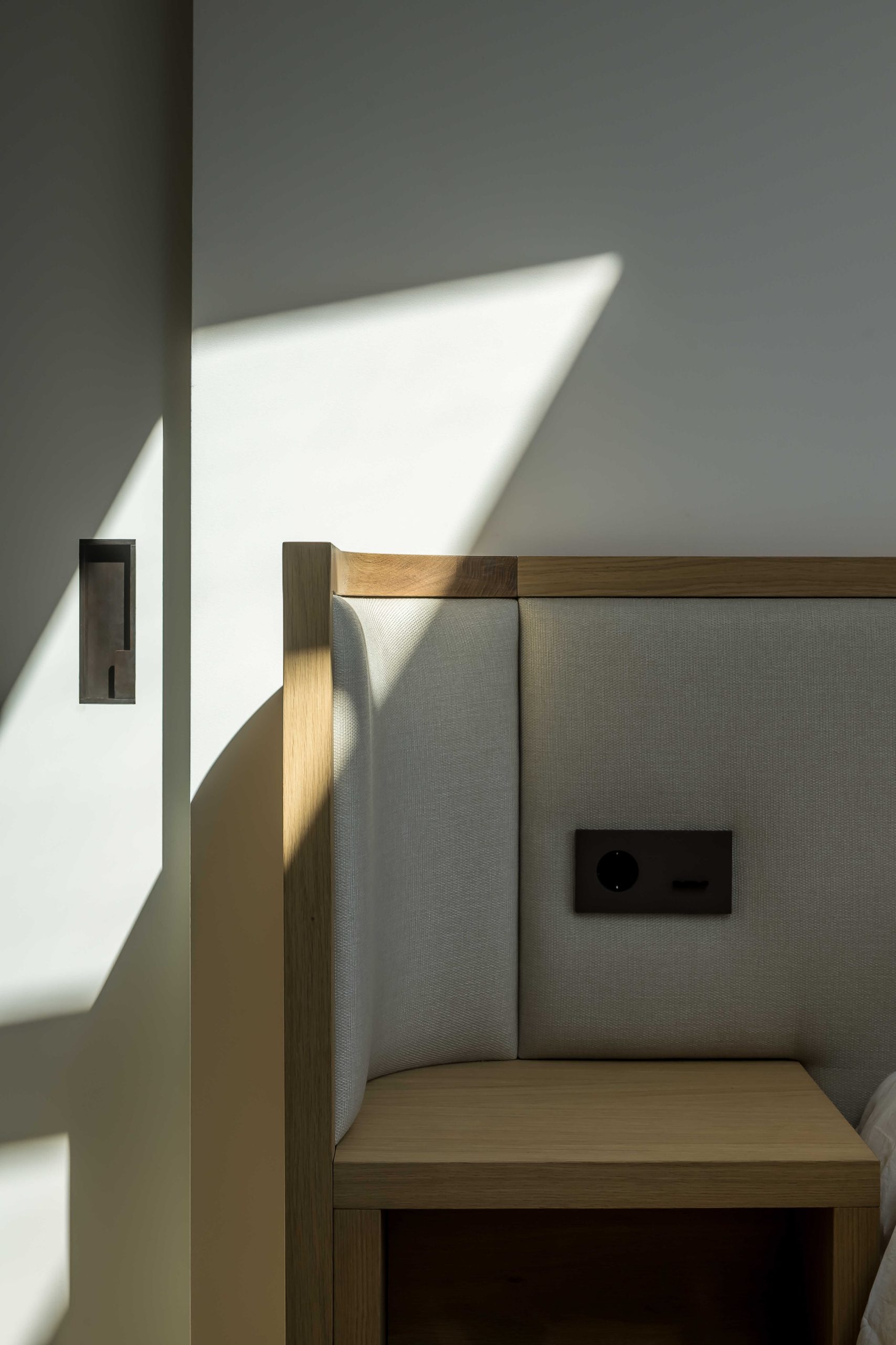
Several details reveal how the project is built around precise finishes. Recessed lighting runs through ceiling niches and narrow cuts in the timber. A textured wall surface catches daylight differently from the smooth cabinet fronts. Even the black metal accents are used sparingly, as thin lines that frame openings or define a piece of furniture. The penthouse interior keeps returning to these pairings: wood and stone, matte and shine, solid and void.
That same approach makes the custom joinery feel integrated rather than applied. It is not a layer added at the end. It shapes circulation, stores functions, and gives the rooms their visual cadence. The dark oak custom joinery links the entrance, the living areas, and the more enclosed zones through the same vocabulary of panels and profiles. The apartment reads as one interior, but each part still has its own surface language.
A wine display cabinet at the entrance
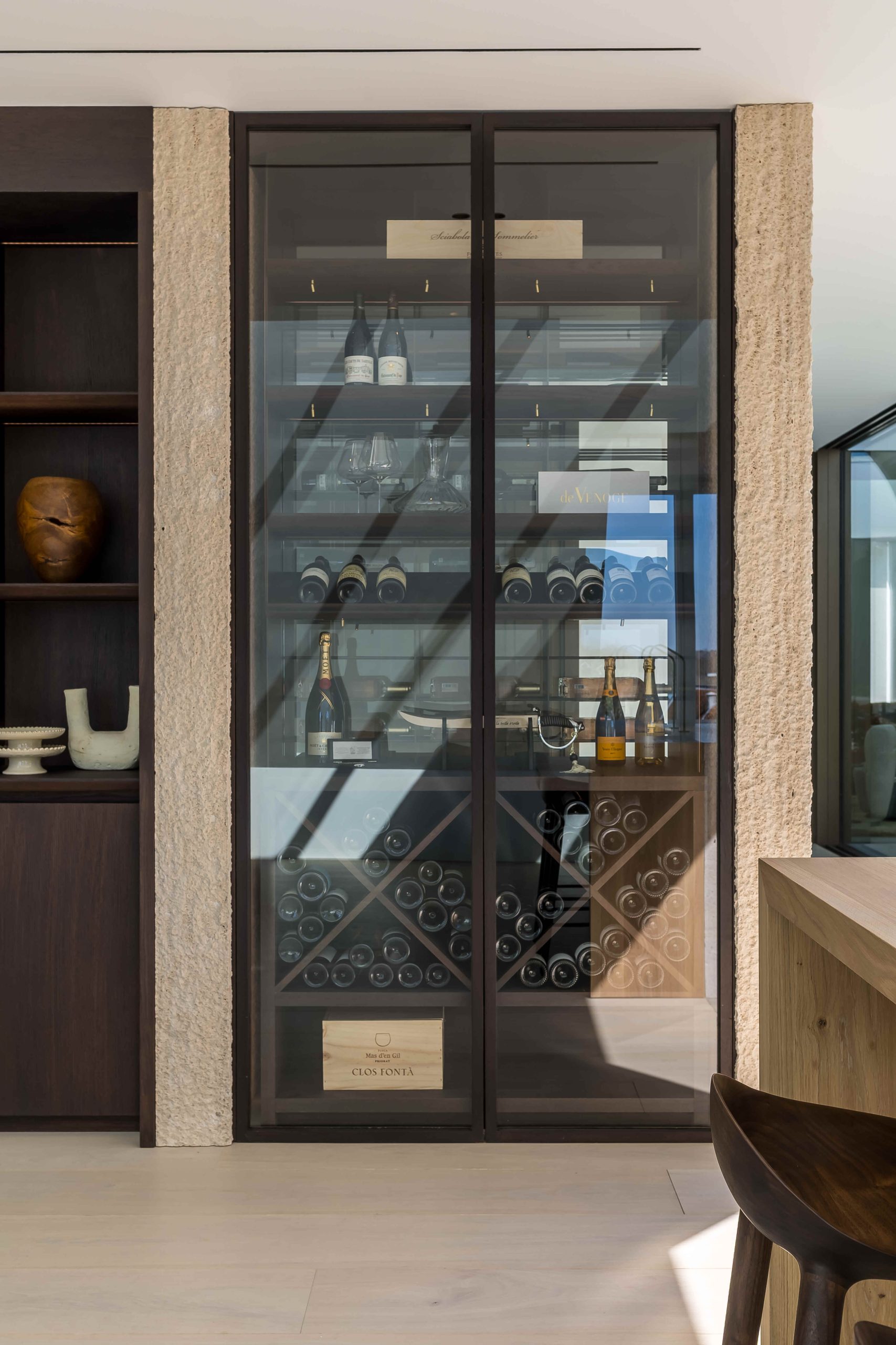
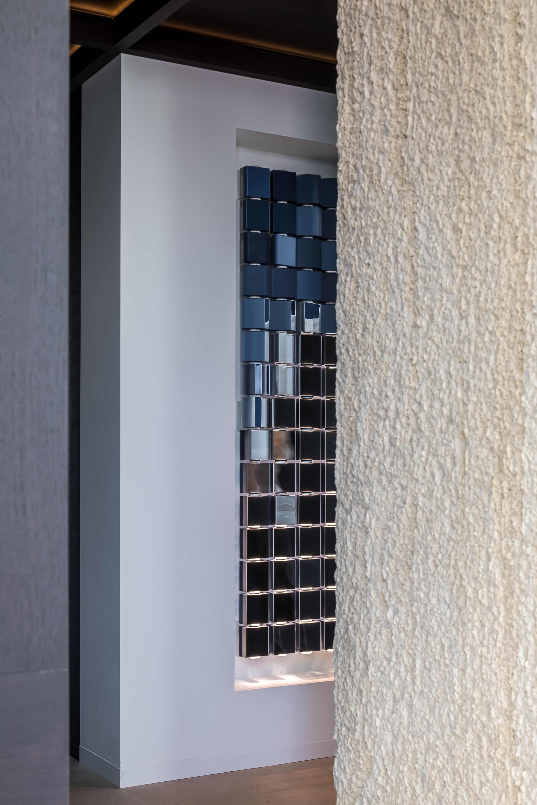
At the entrance, the wine display cabinet becomes a clear focal point. Glass doors reveal the bottles, while the internal grid of light gives the cabinet a precise, almost architectural presence. The handmade profiling of the surrounding joinery softens the edge of the display and carries that detail deeper into the penthouse. It is a practical piece, but it also acts as a threshold object: you encounter it before you fully enter the main rooms.
The placement matters. Instead of hiding the collection away, the penthouse interior brings it into view at the point where movement begins. The cabinet sits within the overall composition, so the display is read as part of the plan rather than as a separate feature. That is also where the project’s material discipline becomes clear. The wine storage is framed in wood, lit from within, and set against the quieter background of the enclosed core and surrounding joinery.
Terrace and patio integration at the edge of the interior
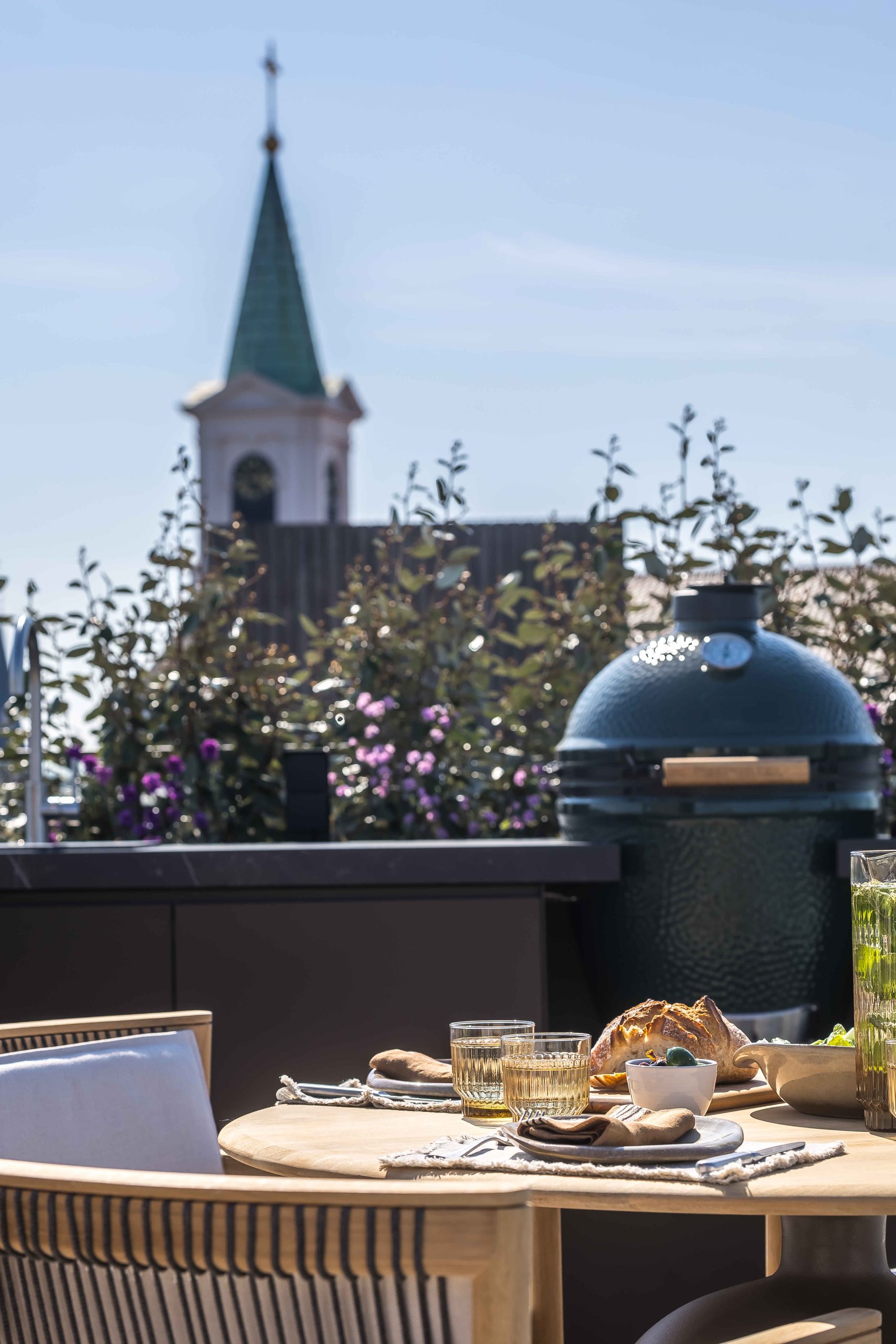
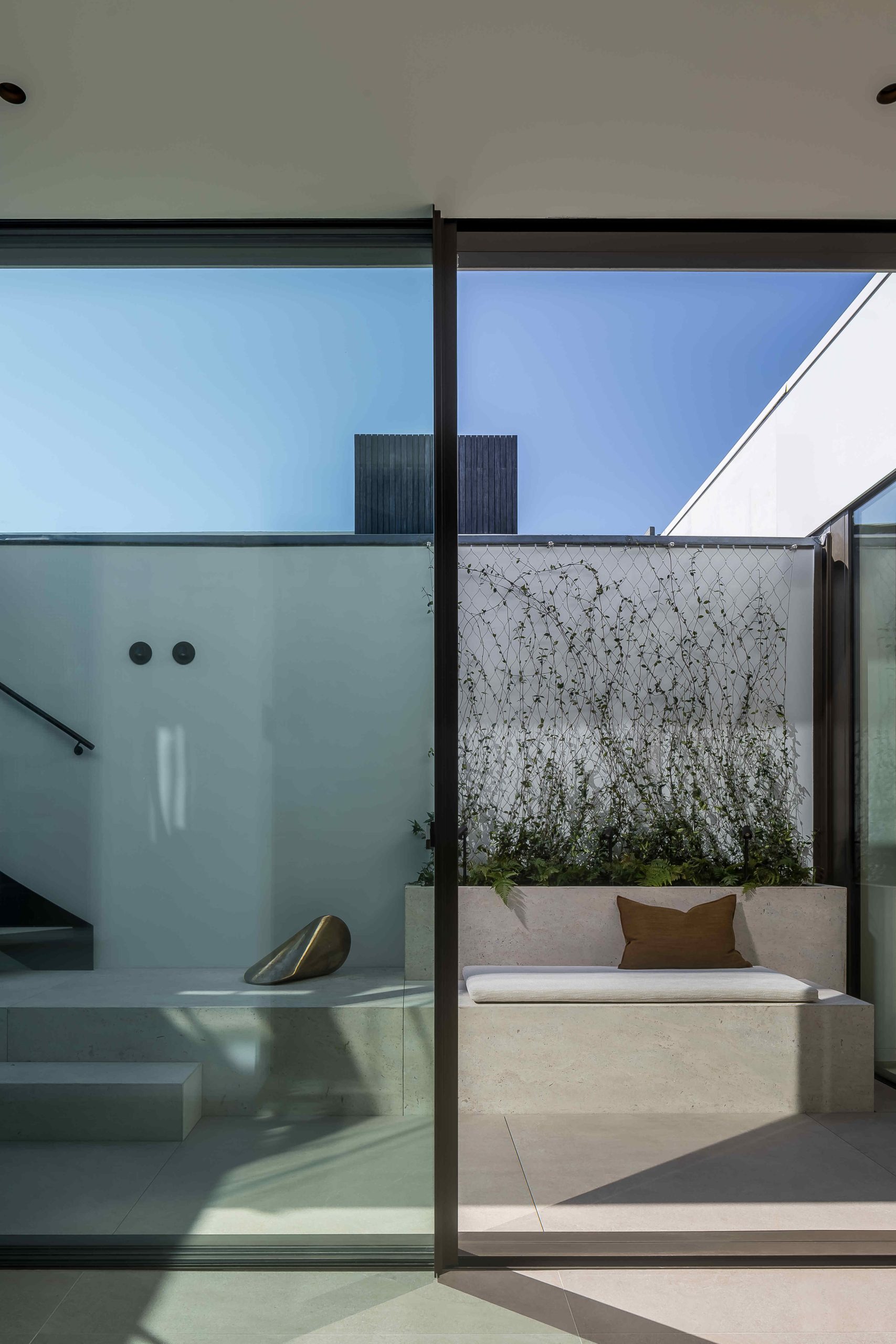
The terrace and patio integration extends the apartment without breaking its structure. Outdoor areas are not treated as separate episodes. They are folded into the same sequence of views and transitions, with glass openings and framed edges keeping them visually connected to the interior. Light reaches deeper into the rooms, and the city view becomes another layer in the composition. The penthouse interior opens because those exterior spaces are part of how it is read.
On the terrace, the surfaces shift to tile and metal, and the glazing creates a clear edge between inside and outside. A chain-link guard, raised seating levels, and broad paved areas give the outdoor space its own order. The patio works differently, but it serves the same idea: air, light, and a longer perspective. Together they keep the apartment from feeling sealed off, while still respecting the enclosed core at its center.
Rooms that reveal themselves in layers
The penthouse interior does not give everything away at once. It is built to be experienced in stages, through a sequence of openings, materials, and turns. A darker passage gives way to a brighter room. A fixed core leads to a more open edge. The circulation, the joinery, and the sightlines all support that layered reading. Even the more private zones follow the same logic, with light falling across timber, stone-like surfaces, and carefully placed openings.
That layered quality is what stays with you after the first view. The apartment feels measured, but not static. It moves through enclosed parts and open edges, through framed views and closed panels, through the quiet center and the more exposed perimeter. The penthouse interior design uses those shifts to hold the whole together, and the dark oak core remains the point around which everything turns.
Photography provided in the source material.
Contributors are listed in the source material.
Want to see more of I+Y Interior Architecture? View the page of I+Y Interior Architecture for even more great projects and company information.


NEW 2026 Jubileum Edition The Best Interior Designers Benelux
Order Now €125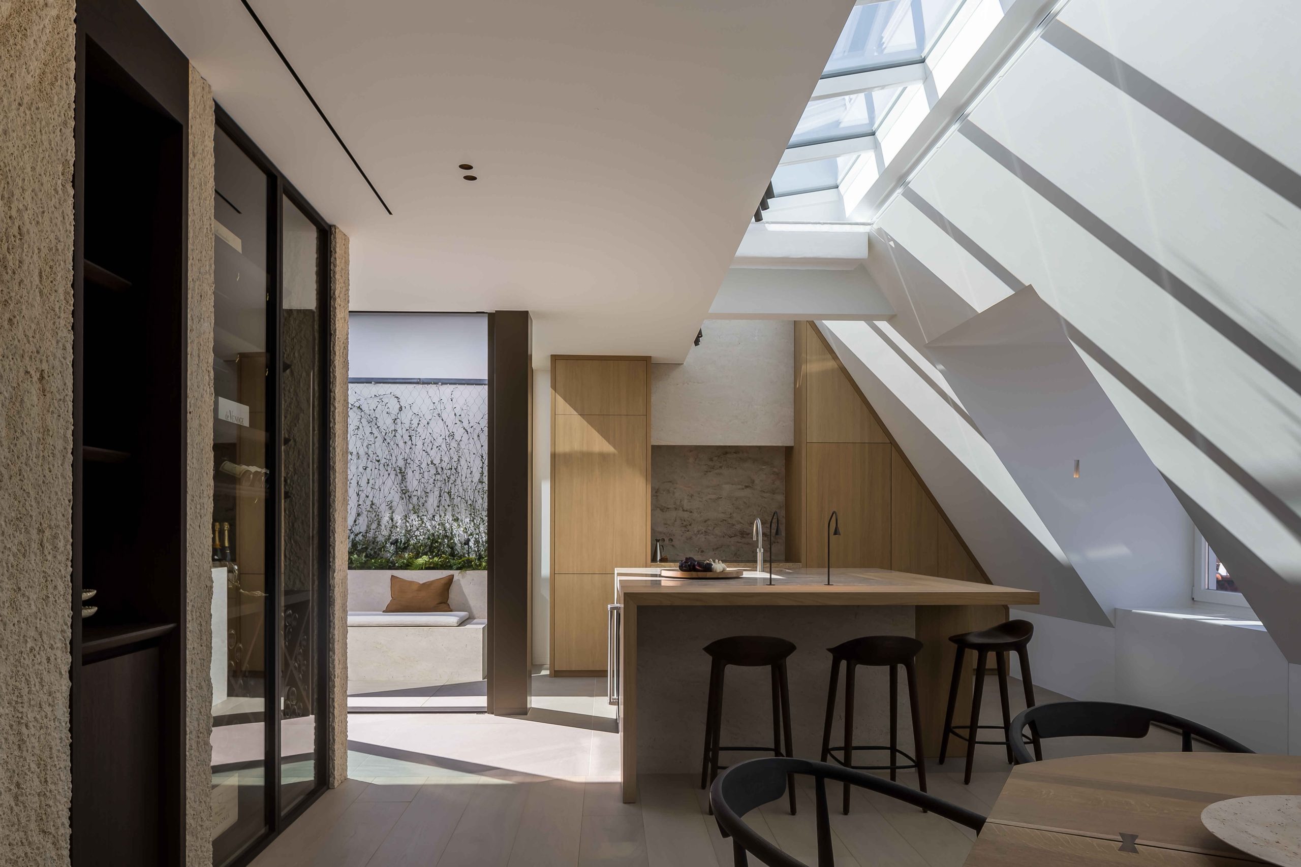
NEW 2026 Jubileum Edition The Best Interior Designers Benelux
Order Now €125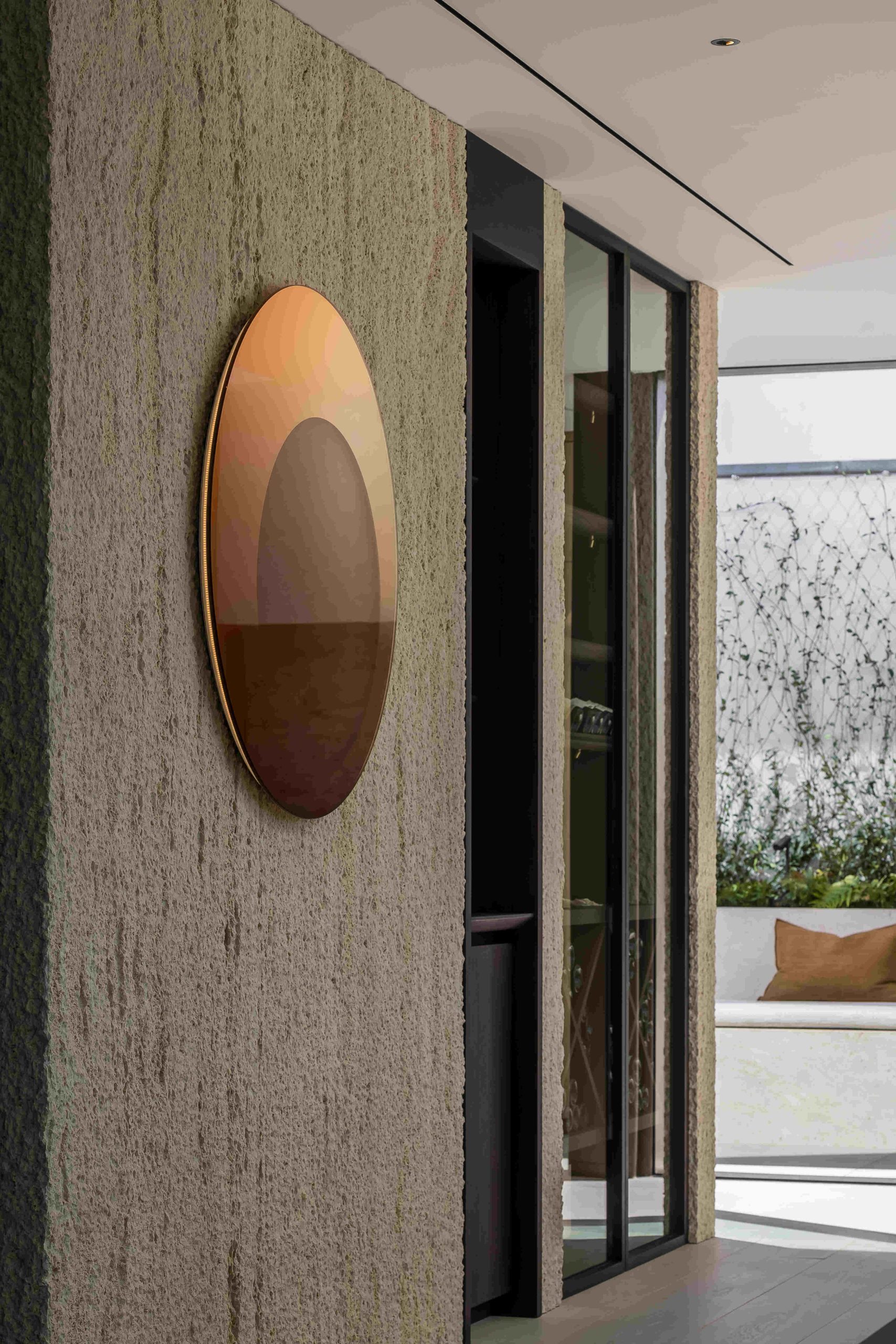
NEW 2026 Jubileum Edition The Best Interior Designers Benelux
Order Now €125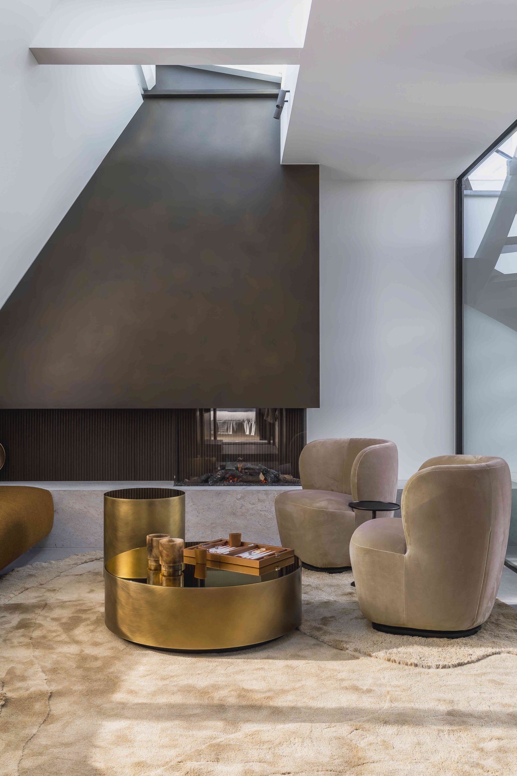
NEW 2026 Jubileum Edition The Best Interior Designers Benelux
Order Now €125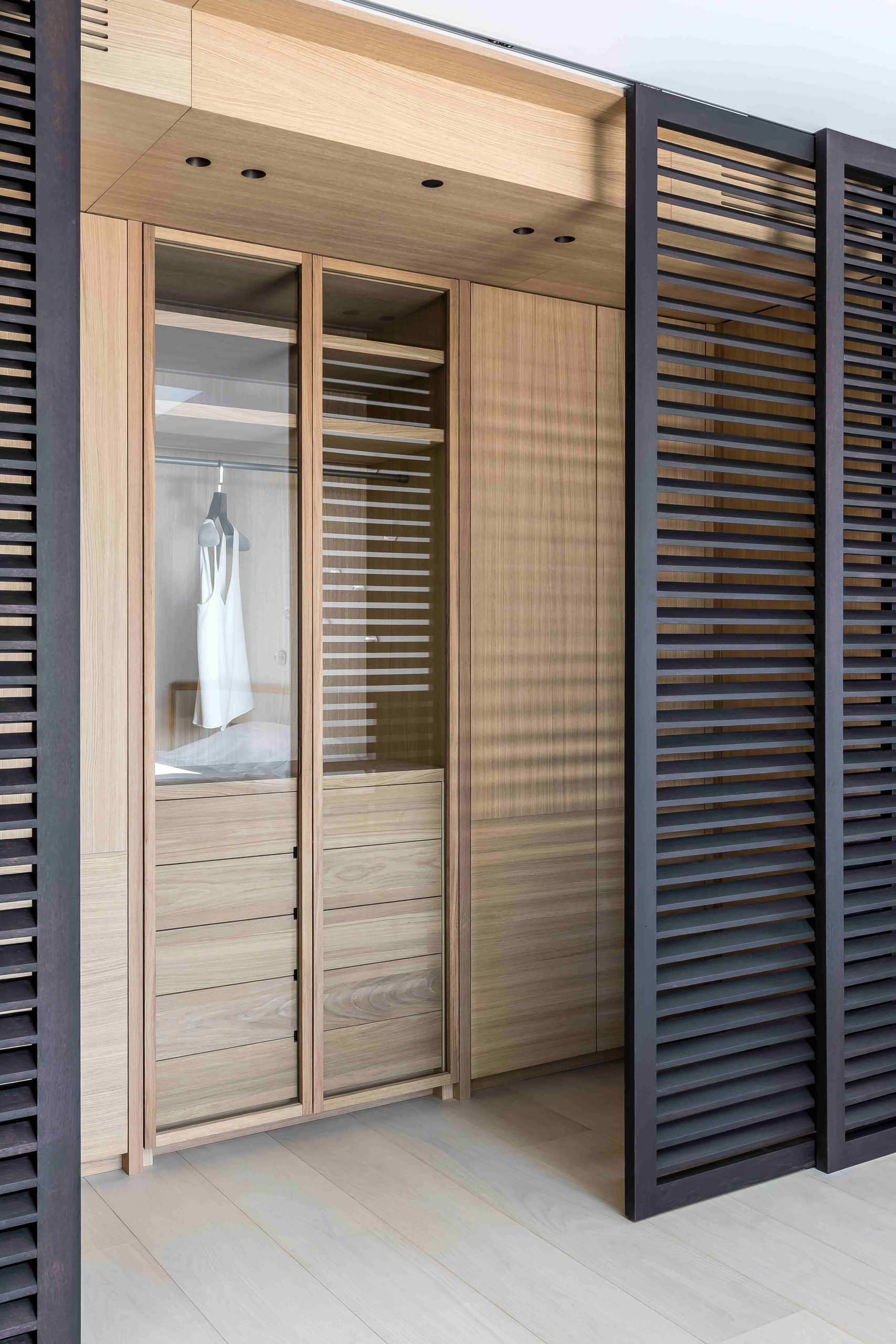
NEW 2026 Jubileum Edition The Best Interior Designers Benelux
Order Now €125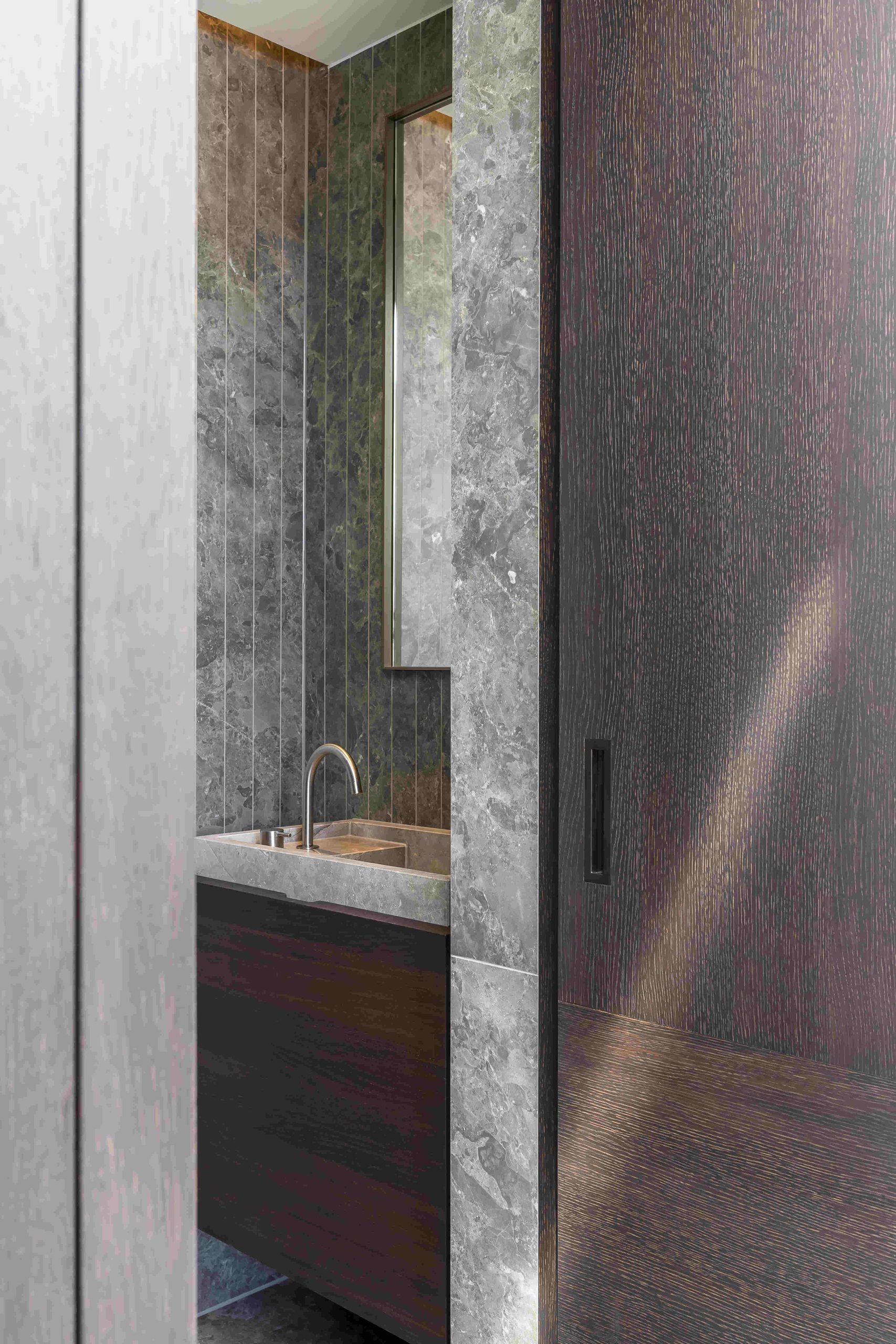
NEW 2026 Jubileum Edition The Best Interior Designers Benelux
Order Now €125